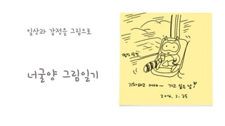
나라시(나라도 바꾸는 시간 18분)발표 20141127
그림으로 자유롭게 나를 표현하라!
'배워서' '좋은 도구로' 그리는 것만이 그림이 아니다
생활속에서 마주치는 것들에 다양한 표정을 입히면 삶이 더 즐겁고 감정이 더 풍성해지는 경험을 해보자
남들이 그린 그림을 보는 것에서 그치지 말고 나만의 표현을 해보자
너굴양의 그림일기
2015년 3월 25일
@홍대 가톨릭청년회관
Thank You Evernote+생산성
한 슬라이드에 15초씩 자동으로 넘어가는 이그나이트 방식
두 가지 직업을 가진 너굴양은 어떻게 에버노트를 쓸까?
노트북과 스택으로 관리가 부담스러워 질 때 쓰는 태그
태그테이블을 만들어 나만의 방식으로 태그를 관리하자!
태그와 검색목록이 일처리와 검색을 효율적으로 만들어준다
스마트워크는 '자유'다!
2015년 3월 25일
@홍대 가톨릭청년회관
Thank You Evernote+생산성
한 슬라이드에 15초씩 자동으로 넘어가는 이그나이트 방식
두 가지 직업을 가진 너굴양은 어떻게 에버노트를 쓸까?
노트북과 스택으로 관리가 부담스러워 질 때 쓰는 태그
태그테이블을 만들어 나만의 방식으로 태그를 관리하자!
태그와 검색목록이 일처리와 검색을 효율적으로 만들어준다
스마트워크는 '자유'다!
Infomation + Graphic = Infographic !!
다양한 데이터와 정보를 한 눈에 보기 쉽도록 만들어주는
인포그래픽!!
데이터 저널리즘에서 꼭 필요한 것이 바로
데이터 시각화 툴, 인포그래픽입니다!
뉴스젤리가 모아본 인포그래픽의 유형 총정리!!
1. 인포그래픽
1) 숫자 강조
2) 연도 강조
3) 그래프 강조
4) 순서, 방법 강조
5) 사진 강조
6) VS 강조
2. 인터랙티브 인포그래픽
3. 모션 인포그래픽
데이터 저널리즘의 새 바람, 뉴스젤리(Newsjelly)
http://newsjel.ly
Big Data and Data Visualization(Inforgraphics) 2012년 KISTI(한국정보과학기술연구원) 발표 자료Seul Koo
Presentation about Big Data and Data Visualization(Inforgraphics) at KISTI(Korea Institute of Science and Technology Information). Data Visualization Technology can analyze and find a hidden business opportunity through a systematic visualization tool for Big Data.
Beyond Usable | Mapping Emotion to ExperienceKelly Goto
Addiction or devotion? The complexity of our relationships between connected experiences, devices and people is increasing. Design ethnographer Kelly Goto presents underlying emotional indicators that reveal surprising attachments to brands, products, services and devices. Move past addiction and into meaning — using contextual research and Why-Finding methods to understand the connections and disconnects between your customer and the products they love.