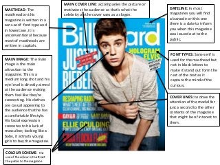
MASTHEAD: The
masthead onthis
magazine is written in a
sans-serif font type and
in lowercase, it is
unconventional because
most of mastheads are
written in capitals.
COVER LINES: to draw the
attention of the model for
just a second to the other
contents of the magazine
that might be of interest to
them.
FONT TYPES: Sans-serif is
used for the masthead but
not in block letters to
make it stand out form the
rest of the text as it
capture the mind of the
curious.
COLOUR SCHEME: the
use of the colour is to attract
the public to the magazine
MAIN COVER LINE: accompanies the picture or
motivates the audience as that’s what the
celebrity on the cover uses as a slogan.
MAIN IMAGE: The main
image is the main
attraction to the
magazine. This is a
medium long shot and his
eye level is directly aimed
at the audience making
them feel like they’re
connecting. His clothes
are casual appealing to
the audience that he has
a comfortable lifestyle.
His facial expression
connotes to his lack of
masculine; looking like a
baby, it attracts young
girls to buy the magazine.
DATELINE: In most
magazines you will find
a barcode on this one
there is a date to inform
you when this magazine
was issued out to the
public.
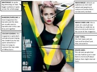
2.
MASTHEAD: its quite
bigattracting an even
bigger audience it goes
across the whole page
COVER LINES:
This attracts people that
are into fashion just in case
there is more stuff about
fashion that might interest
them.
FONT TYPES;
the font type used are
Sans serif and Serif and
they are used to
COLOUR SCHEME: this
magazine is quite dark
and gloomy portraying
the model but she has
quite colourful so
they’re trying to
contrast the two sides
of Miley Cyrus.
MAIN COVER LINE: this is
more of a catch-phrase
attracting an audience as
there is not much text on
the cover of the magazine.
MAIN IMAGE: attracts an
audience as she’s half
naked and people are
curious as to why she is
not decently clothed.
BARCODE/DATELINE: in
most magazines the
barcode and the date
are usually next to
barcode and in this case
they are together