Designers are increasingly using pastel colors in their work for several reasons. Pastel colors are easy on the eyes when viewing digital designs for long periods. They also create a calming effect and inspire feelings of happiness due to color psychology. Additionally, pastel colors from the 1950s and 1980s are trending again as people embrace retro styles mixed with modern elements. For these reasons, pastel colors are expected to remain popular in designs over the next few years.
Moradabad Call Girls - 📞 8617697112 🔝 Top Class Call Girls Service Available
Why are designers using pastel colors for their work?
1. Ram Chary Everi BlogsRam Chary Everi Blogs
Monday, April 27, 2020
Posted by Ram Chary Everi at 12:25 PM
Labels: color psychology, graphic design, modern design, pastel colors
Why are designers using pastel colors for their work?
Ram Chary. In the past, pastel colors have been associated with femininity. However, changes in
trends and culture have shown that these colors don't have to be limited to one gender. For those
wondering what makes a color pastel, it has to be a shade with high lightness and low to medium
saturation. These muted hues have made a statement in countless designs from modern-day
artists and designers.
Why are pastel colors becoming an
aesthetic essential for many?
According to designers, aside from
the fact that these colors are easy on
the eyes, these hues also make
information on screens more readable
and welcoming. As people shift to
digital means, bold and glaring colors
might be more harmful, especially for
those who are on their screens for
hours. Soft and light colors can help
ease the glare. Ram Chary.
Aside from reducing glare, color
psychology suggests that pastel
colors exude a calming effect that is
like springtime. No matter the season,
springtime colors are always in trend.
Even if it is not as bright as other
colors, it can inspire feelings of
happiness, earthiness, and elegance.
Ram Chary.
These days, people are also going
back to basics. In the '80s and '50s,
pastel colors were popular choices for
clothing, interiors, and other designs.
As more people are embracing trends
from the past, they would inevitably encounter hues that are reminiscent of the good old days.
Combining the simple past with modern elements, it seems that pastel colors will continue to
dominate color palettes in the next few years. Ram Chary.
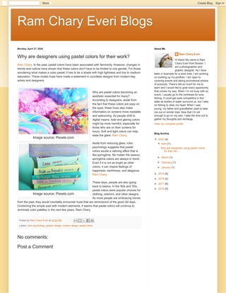
Image source: Pexels.com
Image source: Pexels.com
No comments:
Post a Comment
Ram Chary Everi
Hi there! My name is Ram
Chary Everi from Boston. I
am a photographer and
graphic designer. As I have
been in business for a short time, I am working
on building up my portfolio. I am open to
covering events and taking promotional photos
of products. There’s still so much for me to
learn and I would like to grab every opportunity
that comes my way. When I’m not busy with an
event, I usually go to the northeast for tuna
fishing. It could get quite competitive in this
state as bodies of water surround us, but I take
on fishing to clear my head. When I was
young, my father and grandfather used to take
me out on similar trips. Now that I’m old
enough to go on my own, I take the time out to
gather my thoughts and recharge.
View my complete profile
About Me
▼▼ 2020 (4)
▼▼ April (1)
Why are designers using pastel colors
for their wo...
►► March (1)
►► February (1)
►► January (1)
►► 2019 (5)
►► 2018 (2)
►► 2017 (8)
►► 2016 (5)
Blog Archive
More Create Blog Sign In
2. Older PostHome
Subscribe to: Post Comments (Atom)
Comment as: GoogleAccount
PublishPublish PreviewPreview
Enteryourcomment...
Simple theme. Powered by Blogger.