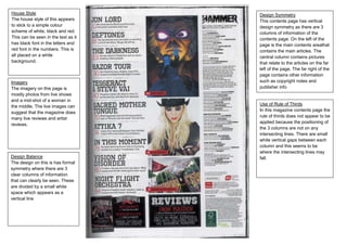
1. House Style Design Symmetry
The house style of this appears This contents page has vertical
to stick to a simple colour design symmetry as there are 3
scheme of white, black and red. columns of information of the
This can be seen in the text as it contents page. On the left of the
has black font in the letters and page is the main contents areathat
red font in the numbers. This is contains the main articles. The
all placed on a white central column contains pictures
background. that relate to the articles on the far
left of the page. The far right of the
page contains other information
Imagery such as copyright notes and
The imagery on this page is publisher info
mostly photos from live shows
and a mid-shot of a woman in
Use of Rule of Thirds
the middle. The live images can
In this magazine contents page the
suggest that the magazine does
rule of thirds does not appear to be
many live reviews and artist
applied because the positioning of
reviews.
the 3 columns are not on any
intersecting lines. There are small
white vertical gaps between each
column and this seems to be
where the intersecting lines may
Design Balance fall.
The design on this is has formal
symmetry where there are 3
clear columns of information
that can clearly be seen. These
are divided by a small white
space which appears as a
vertical line