3. Pitch 3
Mood is a magazine for anyone who wants to further their emotional
education, understand themselves and others better or simply just look
at the world more compassionately. The magazine is best suited to young
adults and upwards but the content is appropriate for any age.
Mood covers a range of topics, split up into the headings of self
understanding, relationships, work, calm and leisure. Under these
headings the magazine aims to provide a mix of challenging and light
hearted content, looking at the big and small emotional problems of life.
For exaple, looking at topics such as how our childhood affects who we
are today, to what teddy bears might be able to teach us about love. This
means that readers could get something different out of each edition
and come back to issues when they feel more ready to face the more
challenging topics.
Mood will be available in independent magazine shops across the UK. A
select amount of articles from each edition will also be made available
online via mood.com. The goal of this will be to attract new audiences by
helping users to understand the approach and feel of the magazine. The
website will also allow readers to sign up to a monthly subscription or
buy individual editions via the online shop. Mood stands out from other
magazines with it’s soft, educational approach and its use of beautiful art
to express emotions that often can be explained through words.
The magazine will come out monthly and cost £9.99 for each individual
edition, or readers could subscribe to the magazine for £80 a year.
Pitch Online presence
Mood’s online presence is an important part of it’s
engagement with users. mood has it’s own website
listing its articles for subscribers. There is also the
ability to order physical copies of the magazine.
The website also includes the ‘mood swing’ podcast
which further explains the topics brought up in
the magazine. The podcast would also be available
on other streaming services such as Spotify and
Apple music.
There is also the ability to recommend book’s via
the bookshelf feature which is a recurring part of
the magazine. This creates interactivity for the
user and a sense of community as readers can help
each other through recommending books that
have helped them.
Pitch 2
4. Design 4
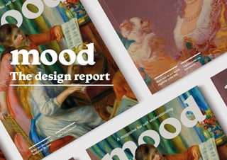
For the masthead I wanted to use a typeface that
came across as trustworthy and approachable, I
wanted to show that the magazine had a serious
message but that it takes a light-hearted stance
on it. For this reason I chose a bold serif font that
has chunky and round strokes. With this typeface
I liked how the two “O”s appear as though they
are tilted slightly on their side. This gives the
masthead a sense of personality and relates to the
irregularity of emotions. This typeface is repeated
throughout the magazine in the article and
section headings to maintain brand identity and
create familiarity and comfort for the reader.
Three different typefaces are used in mood
magazine. VC Cornbread is used for the masthead,
main headings, stand firsts and folios. This serif
with thick strokes was chosen for it’s friendly
appearance and clear ledgibility. It promotes the
values of approachability that the magzine stands
for, particulalry when adressing difficult topics.
Tarif is used for standard body copy, chosen for it’s
unique serifs, it gives the magazine personality
and avoids long texts appearing too intimidating
for the reader. Finally Neuzeit Grotesk is used for
the magazines six main themes. This sans-serif
contrasts to the mainly serifed type of the rest
of the magazine. It is used to clearly differentiate
what content fits into which topic.
Each separate topics is also always displayed in the
same colour to create continuity and recognition
across the magazine. Bright, contrasting colours
are used to create a positive atmosphere across the
magazine, that will leave the reader feeling happy
after reading every issue.
Masthead Typography and colour
mood
Neuzeit Grotesk Bold
VC Cornbread
VC Cornbread
VC Cornbread
Tarif
Design 5
5. Design 7
All imagery within the magazine is paintings
or pieces of art. This decision was made because
art is often used to express emotions that cannot
be portrayed through words. This relates heavily
to the topics discussed in mood. Imagery is used
that directly relates to each article to aid the
user in understanding the content. Imagery that
illicits positive emotions is chosen to maintain
the non-intimidating nature of the magazine.
Whole pages of the magazine are also dedicated
to displaying only imagery to allow the reader to
have a pause point between reading which can act
as a time to reflect on the content of the articles.
These pages can also act as a level of interactivity
with the user because they can be taken out and
framed or used for other creative purposes.
Imagery is mostly unedited except in cases where
the colours of an image have been dull, some
images have also been cropped to create a focus
on a certain object or cut out to create a different
effect which breaks out of the grid.
Image choice and treatment
To ensure consistency and structure across the
magazine a 12 column grid with 8 mm gutter
was used. The gutter worked out to be the same
size as the columns, allowing for lots of freedom
to create different layouts and keep the magazine
interesting throughout. Text is typically placed
in two or three columns per page. A justified
alignment is used for all articles unless the
article involves a different textual structure such
as interviews and questionnaires which are left
aligned to allow for better readability when there
is more type to handle. The grid has been broken
out of in areas to create an exciting dynamic for
the reader and to break up text in areas where it
may otherwise become heavy.
Grid
Design 6
6. Design 9
Design 8
Graphic bars are used to indicate the start and
end of articles. Similar bars are used under
headings for non article pages such as the editor’s
note, contents page and bookshelf. These are in
place to help the reader understand what kind of
content they are about to read which in turn aids
navigation of the magazine.
Navigational devices