Download to read offline


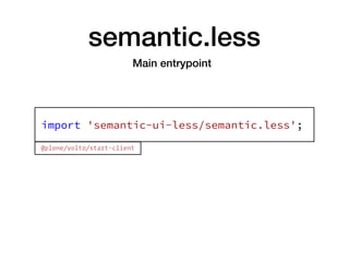
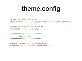
![semantic.less
/* Global */
& { @import "definitions/globals/reset"; }
& { @import "definitions/globals/site"; }
/* Elements */
& { @import "definitions/elements/button"; }
& { @import "definitions/elements/container"; }
& { @import "definitions/elements/divider"; }
& { @import "definitions/elements/flag"; }
& { @import "definitions/elements/header"; }
& { @import "definitions/elements/icon"; }
& { @import "definitions/elements/image"; }
& { @import "definitions/elements/input"; }
& { @import "definitions/elements/label"; }
& { @import "definitions/elements/list"; }
& { @import "definitions/elements/loader"; }
& { @import "definitions/elements/rail"; }
[…]](https://image.slidesharecdn.com/theming-volto-181109051453/85/Theming-Volto-16-320.jpg)
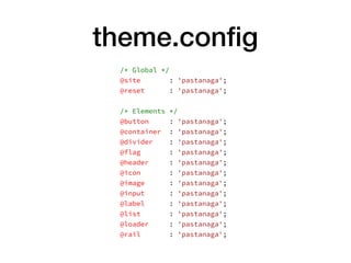
![Toolingprettier
prettier-stylelint
stylelint
stylelint-config-standard
stylelint-config-idiomatic-order
"stylelint": {
"extends": [
"stylelint-config-standard",
"stylelint-config-idiomatic-order",
"./node_modules/prettier-stylelint/config.js"
]
},
package.json
$ yarn add prettier prettier-stylelint stylelint stylelint-config-
standard stylelint-config-idiomatic-order --dev](https://image.slidesharecdn.com/theming-volto-181109051453/85/Theming-Volto-35-320.jpg)


The document outlines theming practices for Plone using React and Semantic UI at the Plone Conference 2018. It discusses the integration of Volto as a modern frontend solution, illustrating its extensibility through various components and customizable themes. Additionally, it covers the workflow and tooling required for effective theming, including configuration details and third-party component integration.


![Tech talk live alfresco web editor [compatibility mode]](https://cdn.slidesharecdn.com/ss_thumbnails/techtalklive-alfrescowebeditorcompatibilitymode-100413053407-phpapp01-thumbnail.jpg?width=640&height=640&fit=bounds)


