CSS3 collapsible/expandable panel for iPhone/Android

Many of you might have worked upon or have used a collapsible panel in one of your projects before reading this post. And the best chances were that the collapsible panel core logic was developed using traditional methods of animating HTML objects using the setTimeout() or the setInterval() methods. Here I have listed down a quick example of building a collapsible/expandable panel using the latest CSS3 technique of transitions. Of course, you have to use a little bit of java script for handling the style elements dynamically. This example is mainly focused oniPhone (iOS) and Android touch devices and targets the mobile web kit browsers. You can also use the same code for desktop web kit browsers such as Chrome and Safari, and a little generalization of the code would let you use the application for all the other browsers supporting the newer CSS3 style rules (e.g. latest version of Firefox).

Recommended
Recommended
More Related Content
Recently uploaded
Recently uploaded (20)
Featured
Featured (20)
CSS3 collapsible/expandable panel for iPhone/Android
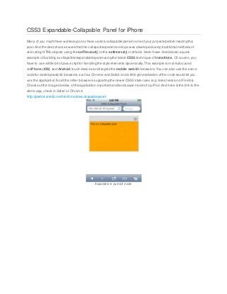
- 1. CSS3 Expandable-Collapsible Panel for iPhone Many of you mighthave worked upon or have used a collapsible panel in one ofyour projects before reading this post.And the bestchances were that the collapsible panel core logic was developed using traditional methods of animating HTML objects using the setTimeout() or the setInterval() methods.Here Ihave listed down a quick example of building a collapsible/expandable panel using the latest CSS3 technique of transitions. Of course,you have to use a little bit of java scriptfor handling the style elements dynamically.This example is mainlyfocused oniPhone (iOS) and Android touch devices and targets the mobile webkit browsers.You can also use the same code for desktop web kit browsers such as Chrome and Safari,and a little generalization ofthe code would let you use the application for all the other browsers supporting the newer CSS3 style rules (e.g. latestversion of Firefox). Check out the images below,ofthe application in portraitand landscape mode ofmyiPod. And here is the link to the demo app,check in Safari or Chrome. http://jbk404.site50.net/html5/mobile/collapsiblepanel/ Expanded in portrait mode
- 2. Collapsed in portrait mode Landscape mode The HTML part The HTML code block necessaryfor the app is below.We have a main div block that holds the header div and the content div. The main idea is to hide the contentdiv when the main div’s heightis reduced for it to collapse and vice versa. Below,I have two images thatwill explain the process better,
- 3. Expanded state of panel Collapsed state of panel <div id="mainHolder"> <div id="header"> <img src="images/collapse1.png" /> </div> <div id="content"> <p>This is a collapsible panel</p> <img src="images/bird.jpg" height="130"/> </div> </div> The CSS/CSS3 part Nothing fancy, very simple and is almostselfexplanatory.Lets look at it, *{
- 4. margin:0; padding:0; } body { font-family:helvetica; font-size:13px; padding:20px; } #mainHolder { width:100%; height:200px; border:1px solid #9a9a9a; background-color:#ffa500; -webkit-transition-delay:0.1s; -webkit-transition-duration:0.2s; -webkit-transition-property:height; } #header { width:100%; height:30px; background-color:#ddd; border-bottom:1px solid #9a9a9a;
- 5. overflow:hidden; } #header img { float:right; } #content { width:100%; display:block; margin:5px; } The main thing to notice is the CSS3 transition properties thatI have used for mainHolder. I have set the height as the CSS3 transition propertyso that whenever there is a change in the heightof mainHolder the transition is smooth and looks continuous over time.Note the other two properties delayfor a delay in start of the transition and durationfor the overall duration of the transition.This will actas an alternative for the traditional setTimeout/setInterval method for animating the collapse and exapansion ofthe main holder.Now, whenever we change the heightof mainHolder,which we will do in our java scriptblock the animation will be smooth and continuous. The JavaScript part I have kept it very simple and easy.I have added comments for clarity. Lets look at it, <script type="text/javascript"> //all the variables var header = null; var content = null; var mainHolder = null; var expandCollapseBtn = null; var heightValue = 0;
- 6. //get the instance of the necessary components header = document.getElementById("header"); content = document.getElementById("content"); mainHolder = document.getElementById("mainHolder"); expandCollapseBtn = header.getElementsByTagName('img')[0]; //initially store the height of mainHolder for later use. heightValue = mainHolder.offsetHeight; //add events header.addEventListener('click', handleClick, false); mainHolder.addEventListener('webkitTransitionEnd',transitionEndHandler,false); //event handler functions function handleClick() { if(expandCollapseBtn.src.search('collapse') !=-1) { mainHolder.style.height = "30px"; content.style.display = "none"; } else { mainHolder.style.height = heightValue + "px";
- 7. } } function transitionEndHandler() { if(expandCollapseBtn.src.search('collapse') !=-1) { expandCollapseBtn.src = "images/expand1.png"; } else{ expandCollapseBtn.src = "images/collapse1.png"; content.style.display = "block"; } } </script> The header gets a click event registered to it, so that when user taps/clicks on the header,the panel either collapses or expands based on its current state.The action is handled in the handleClick function. header.addEventListener('click', handleClick, false); Initialy when the app loads the panel is expanded and the header icon is a minus. Inside the handleClick() function we do a toggling maneouver.Firstwe check if the icon on the right of the header is a minus (collapse), that means now you can collapse the panel by tapping on the header.If it’s a minus then inside the if block we setthe heightof the main holder to 30px which is the heightof the header.The panel then collapses.Also we setthe displayof thecontent div to none. This will not only hide the content area but also will free the space of the contentand let the panel collapse.Similarlyin the else block which is meantfor the plus (expand) icon we setthe height of the main holder again to its initial heightwhich we stored in the heightValue variable. Since there is a change in heightthe effect is smooth and continuous as Ihave already talked about it. This expands the panel once again.So the toggling expand-collapse behavior is implemented. if(expandCollapseBtn.src.search('collapse') !=-1) {
- 8. mainHolder.style.height = "30px"; content.style.display = "none"; } else { mainHolder.style.height = heightValue + "px"; } Now, the change of icon takes place in the next function which is called when each of the transition ends i.e expand to collapse and collapse to expand. To listen to these kind of events we have registered a webkitTransitionEndevent handler.It is a JavaScript event that is synonymous to the CSS3 transition property. mainHolder.addEventListener('webkitTransitionEnd',transitionEndHandler,false); After the end of each transition in heightthe transitionEndHandler function is called which controls the change of the icon. function transitionEndHandler() { if(expandCollapseBtn.src.search('collapse') !=-1) { expandCollapseBtn.src = "images/expand1.png"; } else{ expandCollapseBtn.src = "images/collapse1.png"; content.style.display = "block"; } } Also if you notice in the else block of the function I have set the displayof the contentagain to block. This ensures that after the panel expands the content is displayed.Now,you may ask why the displayof the contentis changed in separate functions.This is because,I have followed the process offirst hiding the content before the panel is
- 9. collapsed and then displaying the content again after the panel is expanded.This is all you need to make a very smooth collapsible/expandable panel.Below is the full code, <!DOCTYPE html> <html> <head> <title>CSS3 Collapsible Panel</title> <meta http-equiv="Content-Type" content="text/html; charset=utf-8" /> <meta name="viewport" content="width=device-width; initial-scale=1.0; minimum- scale=1.0; maximum-scale=1.0;"/> <style type="text/css"> *{ margin:0; padding:0; } body { font-family:helvetica; font-size:13px; padding:20px; } #mainHolder { width:100%; height:200px; border:1px solid #9a9a9a; background-color:#ffa500; -webkit-transition-delay:0.1s;
- 10. -webkit-transition-duration:0.2s; -webkit-transition-property:height; } #header { width:100%; height:30px; background-color:#ddd; border-bottom:1px solid #9a9a9a; overflow:hidden; } #header img { float:right; } #content { width:100%; display:block; margin:5px; } </style> </head>
- 11. <body> <div id="mainHolder"> <div id="header"> <img src="images/collapse1.png" /> </div> <div id="content"> <p>This is a collapsible panel</p> </div> </div> </body> <script type="text/javascript"> //all the variables var header = null; var content = null; var mainHolder = null; var expandCollapseBtn = null; var heightValue = 0; //get the instance of the necessary components header = document.getElementById("header"); content = document.getElementById("content"); mainHolder = document.getElementById("mainHolder"); expandCollapseBtn = header.getElementsByTagName('img')[0];
- 12. //initially store the height of mainHolder for later use. heightValue = mainHolder.offsetHeight; //add events header.addEventListener('click', handleClick, false); mainHolder.addEventListener('webkitTransitionEnd',transitionEndHandler,false); //event handler functions function handleClick() { if(expandCollapseBtn.src.search('collapse') !=-1) { mainHolder.style.height = "30px"; content.style.display = "none"; } else { mainHolder.style.height = heightValue + "px"; } } function transitionEndHandler() { if(expandCollapseBtn.src.search('collapse') !=-1) { expandCollapseBtn.src = "images/expand1.png";
- 13. } else{ expandCollapseBtn.src = "images/collapse1.png"; content.style.display = "block"; } } </script> </html> Do ignore the indentation of the example code blocks in this tutorial, I had some issues with the editor.But anyways, you can try the demo in your touch phone.Let me know if you have better ideas using CSS3.