SlideShare a Scribd company logo
1 of 5
Poster Analysis:  Saw 3D Posters I decided to analyse 3 of the Saw 3D posters together as they all followed a similar layout and style in terms of codes and conventions and textual content. This is a feature I would definitely use in the posters I make as it strengthens the brand identity.
Slogan Kicker Main image Film Title Production Company Dateline Production Company Codes and Conventions
Slogan Kicker Main image Film Title Production Company Dateline Production Company Billing Box Movie Rating Websites Codes and Conventions
Slogan Kicker Main image Film Title Production Company Dateline Production Company Billing Box Websites Codes and Conventions
Analysis All of the posters have one main image in the centre which corresponds with the slogan at the top. The slogans are all colloquial phrases used to describe good films, and are made into puns by having the literal translation shown in the images (e.g. ‘Heart Pounding’ shows a heart being pounded by fists, “Mind Blowing” shows a head being blown to pieces). Including these phrases relates to the teenage audience who often use them, relates to the movie which involves a lot of gore and mutilation of the human body, and shows off the 3D technology by means of multilayered ‘3D’ images. The extremely simple colour scheme of black and white really makes an impact on the audience and accentuates the image and text. The posters all have a very clear eye-flow going from the top to the bottom, giving the viewer all the main information they need to know, and having the website and extra information at the bottom for them to read if they are interested. The bold colour scheme and connotations of violence really attract the target audience.

More Related Content

More from iamama

Generic Conventions
Generic ConventionsGeneric Conventions
Generic Conventions
iamama
 
Website Analysis
Website AnalysisWebsite Analysis
Website Analysis
iamama
 
Website Analysis
Website AnalysisWebsite Analysis
Website Analysis
iamama
 
Generic Conventions: Horror
Generic Conventions: HorrorGeneric Conventions: Horror
Generic Conventions: Horror
iamama
 
EPQ Action Plan
EPQ Action PlanEPQ Action Plan
EPQ Action Plan
iamama
 

More from iamama (7)

Generic Conventions
Generic ConventionsGeneric Conventions
Generic Conventions
 
Website Analysis
Website AnalysisWebsite Analysis
Website Analysis
 
Website Analysis
Website AnalysisWebsite Analysis
Website Analysis
 
Generic Conventions: Horror
Generic Conventions: HorrorGeneric Conventions: Horror
Generic Conventions: Horror
 
EPQ Action Plan
EPQ Action PlanEPQ Action Plan
EPQ Action Plan
 
EPQ Proposal
EPQ ProposalEPQ Proposal
EPQ Proposal
 
EPQ Proposal
EPQ ProposalEPQ Proposal
EPQ Proposal
 

Saw 3D Poster Analysis

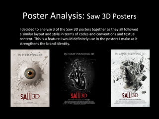
  • 1. Poster Analysis: Saw 3D Posters I decided to analyse 3 of the Saw 3D posters together as they all followed a similar layout and style in terms of codes and conventions and textual content. This is a feature I would definitely use in the posters I make as it strengthens the brand identity.
  • 2. Slogan Kicker Main image Film Title Production Company Dateline Production Company Codes and Conventions
  • 3. Slogan Kicker Main image Film Title Production Company Dateline Production Company Billing Box Movie Rating Websites Codes and Conventions
  • 4. Slogan Kicker Main image Film Title Production Company Dateline Production Company Billing Box Websites Codes and Conventions
  • 5. Analysis All of the posters have one main image in the centre which corresponds with the slogan at the top. The slogans are all colloquial phrases used to describe good films, and are made into puns by having the literal translation shown in the images (e.g. ‘Heart Pounding’ shows a heart being pounded by fists, “Mind Blowing” shows a head being blown to pieces). Including these phrases relates to the teenage audience who often use them, relates to the movie which involves a lot of gore and mutilation of the human body, and shows off the 3D technology by means of multilayered ‘3D’ images. The extremely simple colour scheme of black and white really makes an impact on the audience and accentuates the image and text. The posters all have a very clear eye-flow going from the top to the bottom, giving the viewer all the main information they need to know, and having the website and extra information at the bottom for them to read if they are interested. The bold colour scheme and connotations of violence really attract the target audience.