Character image/ AList Celebrity
Unique Selling Point
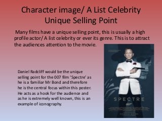
Many films have a unique selling point, this is usually a high
profile actor/ A list celebrity or ever its genre. This is to attract
the audiences attention to the movie.
Daniel Radcliff would be the unique
selling point for the 007 film ‘Spectre’ as
he is a familiar Mr Bond and therefore
he is the central focus within this poster.
He acts as a hook for the audience and
as he is extremely well known, this is an
example of iconography.
3.
Tagline/ Catch Line
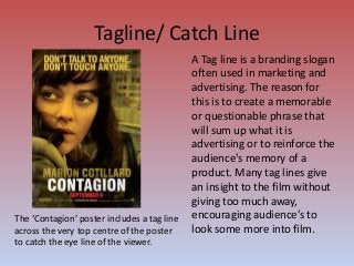
ATag line is a branding slogan
often used in marketing and
advertising. The reason for
this is to create a memorable
or questionable phrase that
will sum up what it is
advertising or to reinforce the
audience's memory of a
product. Many tag lines give
an insight to the film without
giving too much away,
encouraging audience’s to
look some more into film.
The ‘Contagion’ poster includes a tag line
across the very top centre of the poster
to catch the eye line of the viewer.
4.
Film Title
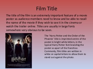
The titleof the film is an extremely important feature of a movie
poster as audience members need to know and be able to recall
the name of the movie if they wish to see it in the cinema or
watch the trailer online. Titles are usually in large fonts
somewhere very obvious to be seen.
The ‘Harry Potter and the Order of the
Phoenix’ title is imprinted centre of the
poster in bright white letters, in the
typical Harry Potter font branding the
poster as apart of the franchise.
Commonly, film titles are written in
white or capital letters to allow them to
stand out against the photo.
5.
Colour Scheme
Movie postersoften have a colour scheme. This makes it easier
to see the genre of the film without it having to be said. For
example, a poster surrounded by grey, red and black would stand
out to be a horror. Colours such as pink and baby blue would link
the poster to a romance. This is all due to the connotations these
colours typically have
A colour scheme can also be used to appeal to certain niche
audiences, for example; a romantic romcom’s primary audience
would be females so they would want to use pretty feminine
colours to appeal to this primary audience.
6.
Credit Block
Many movieposters contain a credit block at the bottom of the
poster to highlight key importance. For example, actors and
institutions that created the film. Such as the: production
company; scriptwriter; music producers; costume designers and
make up artists etc.
Credit block’s are usually kept to a smaller font down at the
bottom of the poster, this is because although it is important
information this information can be found at the start of a film or
through out a trailer as well, so it does not want to distract and
dominate from the main advertisement of the film photo.