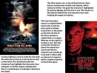
Low key lightingis used to make the character
the main part to look at on the poster as well
as the Island. The matchstick under the
characters face highlights the characters face
and gives it a thriller aspect, implying that
there is something he is looking for relating to
the Island.
The other poster uses a red and black theme, these
colours usually mean trouble and mystery, which
relates to thriller. Yet again the character is highlighted
by low key lighting, but this time in red. The Island is in
the distance behind him and cannot be seen well,
implying the aspect of mystery.
The main characters
name is in capital letters,
which tells us that the
story mainly revolves
around him. In the poster
on the left, the title of
the film is written in
capital letters in orange.
Whereas on the right it is
written in red. This tells
us that the storyline is
about this mysterious
island and that the
character has something
to do with it which adds
an element of suspense
which is highly important
to the thriller genre.