
Recommended
Recommended
More Related Content
More from dessiechisomjj4
More from dessiechisomjj4 (20)
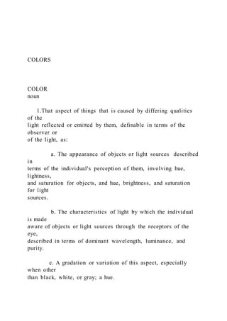
COLORSCOLORnoun 1.That aspect of things that
- 1. COLORS COLOR noun 1.That aspect of things that is caused by differing qualities of the light reflected or emitted by them, definable in terms of the observer or of the light, as: a. The appearance of objects or light sources described in terms of the individual's perception of them, involving hue, lightness, and saturation for objects, and hue, brightness, and saturation for light sources. b. The characteristics of light by which the individual is made aware of objects or light sources through the receptors of the eye, described in terms of dominant wavelength, luminance, and purity. c. A gradation or variation of this aspect, especially when other than black, white, or gray; a hue.
- 2. 2. A substance, such as a dye, pigment, or paint, that imparts a hue. Source: https://www.thefreedictionary.com/color WHITOUT LIGHT, THERE IS NO COLOR. Each color is differentiated from the others by its wavelength. The spectrum of light that humans are able to see is known as the visible spectrum. It ranges from red to violet (or purple). Red is the longest wavelenght, violet is the shortest. White light is composed of the three primaries of light: red, green and blue (RGB). Sources: Foundations of Interior Design, Susan J. Slotkis, 3rd editon, Chapter 3. https://www.freepik.com/premium-vector/visible- light-spectrum-template_6958648.htm PIGMENT For the interior designer, the chemist's focus on color as substance may be of more importance than the physicist's
- 3. focus on color as light. The designer most often deals with color as substance, or matter - in other words, with how color is produced as a reflection of a colored object or surface. When we speak of color substance, we are refereing to pigmentation, such as dyes, colorants, pigments, stains, and paints. The three primaries of color as pigment: red, yellow and blue. Source: Foundations of Interior Design, Susan J. Slotkis, 3rd editon, Chapter 3 and 4. COLOR SYSTEMS - RGB VS. CMYK RGB (Red, Green and Blue) is the color system used in designs and images that will be viewed on a screen (TV, computer, smartphone, tablet...). RGB color system is an additive color system and requires a light source to exist. RGB uses light sources in combination to color designs by adding them together at varying intensities to create the desired hue and to produce the desired effect. The light source influences how the image is perceived by the human eye.
- 4. Source: https://www.uspress.com/page/color-to-use-for- printing-and-design-cmyk-or- rgb#:~:text=CMYK%2C%20however%2C%20is%20the%20go,d esigns%20when%20they're%20printed. CMYK (Cyan, Magenta, Yellow and Black) is the color system used in designs that will be printed or presented in any physical medium (Postcards, brochures, business cards, posters...). “K” is referred to black and is used instead of “B” to prevent confusing it with blue. Black is used to add shades of black, because merging the other colors doesn’t produce a shade of true black. CMYK is a subtractive color system, because it removes white from the medium it’s printed on. CMYK works by blending colors of ink in the printing process. The system blends four colors to create the right color, shade and hue for the desired printed result. VS. It’s important to take any designs made in RGB and convert them to CMYK before printing. https://www.w3schools.com/colors/colors_rgb.asp https://www.w3schools.com/colors/colors_cmyk.asp https://www.w3schools.com/colors/colors_cmyk.asp https://www.w3schools.com/colors/colors_cmyk.asp https://www.w3schools.com/colors/colors_cmyk.asp https://www.w3schools.com/colors/colors_cmyk.asp https://www.w3schools.com/colors/colors_cmyk.asp https://www.w3schools.com/colors/colors_cmyk.asp
- 5. https://www.w3schools.com/colors/colors_cmyk.asp https://www.w3schools.com/colors/colors_cmyk.asp https://www.w3schools.com/colors/colors_cmyk.asp https://www.w3schools.com/colors/colors_cmyk.asp https://www.w3schools.com/colors/colors_cmyk.asp https://www.w3schools.com/colors/colors_cmyk.asp https://www.w3schools.com/colors/colors_cmyk.asp https://www.w3schools.com/colors/colors_cmyk.asp https://www.w3schools.com/colors/colors_cmyk.asp https://www.w3schools.com/colors/colors_cmyk.asp https://www.w3schools.com/colors/colors_cmyk.asp https://www.w3schools.com/colors/colors_cmyk.asp https://www.w3schools.com/colors/colors_cmyk.asp https://www.w3schools.com/colors/colors_cmyk.asp https://www.w3schools.com/colors/colors_cmyk.asp HUE, VALUE AND CHROMA Hue is the family of a color, or the way we distinguish one color. Value is the degree of lightness or darkness of a color. Tint is addition of white to a hue. Shade is addition of black to a hue. Chroma is the purity, saturation, or intensity of a color. Tone is the addition of gray to a hue. Adding gray lowers the chroma. Tone is a muted version of a hue. Source: Foundations of Interior Design, Susan J. Slotkis, 3rd
- 6. editon, Chapter 3. https://www.vectornator.io/blog/color-tone- terminology/ https://www.robertnajlis.com/color-theory/color- values/ COLOR WHEEL A color wheel provides a useful tool for organizing color. Color wheel generally depict 12 pincipal hues. Red is the warmest color, violet is the coolest. Source: Foundations of Interior Design, Susan J. Slotkis, 3rd editon, Chapter 4. https://decoart.com/blog/article/318/color_theory_basics_the_co lor_wheel Three primaries hues: Red, Yellow and Blue. Three secondary hues: Orange, Green and Violet. Six tertiary hues: Yellow-Orange, Yellow-Green, Blue-Green, Blue-Violet, Red-Violet and Red-Orange. PRIMARY COLORS SECONDARY COLORS TERTIARY COLORS COLOR WHEEL
- 7. Source: Foundations of Interior Design, Susan J. Slotkis, 3rd editon, Chapter 4. https://decoart.com/blog/article/318/color_theory_basics_the_co lor_wheel COLOR HARMONY SCHEMES Source: Foundations of Interior Design, Susan J. Slotkis, 3rd editon, Chapter 4. https://sarahrenaeclark.com/ https://www.pinterest.com/pin/319614904806649956/ Monochromatic colors derived from the use of only one hue. A monochromatic color scheme may be devised of hue variations of many different values and chroma levels to avoid monotony. COLOR HARMONY SCHEMES Source: Foundations of Interior Design, Susan J. Slotkis, 3rd editon, Chapter 4. Color, A Course in Mastering the Art of Mixing Colors, Betty Edwards, Chapter 3. https://sarahrenaeclark.com/ https://i.pinimg.com/564x/83/d8/f0/83d8f0e3d01f4c2f1f7e0ebdc b42bee4.jpg
- 8. Analogous colors are any colors lying next to each other on the color wheel. Analogous colors are inherently harmonious because they reflect light waves that are similar. Analogous colors tend to evoke a sence of pemanence, calm, and stability. COLOR HARMONY SCHEMES Source: Foundations of Interior Design, Susan J. Slotkis, 3rd editon, Chapter 4. Color, A Course in Mastering the Art of Mixing Colors, Betty Edwards, Chapter 3. https://sarahrenaeclark.com/ https://i.pinimg.com/564x/3f/4f/ac/3f4facdc29a040aa966a8d379 47af1f2.jpg Complementary colors are pairs of colors that are opposite each other on the color wheel. Complementary colors complete and perfect the central, fundamental role of the primary colors as the theoretical parents and progenitors of all colors. Any two complements contain the complete trio of primaries. COLOR HARMONY SCHEMES
- 9. Triadic colors hues that are combined from a equilateral triangle on the color wheel, in which all three sides are equal. When accomplished through pure chroma, triadic schemes are very active, playful, and cheerful. Creativity is stimulated in the presence of bold primaries. May be consider unadulterated colors brash and primitive. Source: Foundations of Interior Design, Susan J. Slotkis, 3rd editon, Chapter 4. https://sarahrenaeclark.com/ https://www.pinterest.com/pin/319614904806649956/ SIMBOLIC MEANINGS OF COLOR Source: Foundations of Interior Design, Susan J. Slotkis, 3rd editon, Chapter 4. The branch of science that studies the mind and behavior is psychology. Emotional responses may be triggered by memories or percepetions surrounding occurrences expercienced by an individual. It is the meaning of color for an indivudual that is important when we consider the psychology of color. Studies that concentrate on the emotional impact of color are used to market various products, forecast future trends, and help us better understand consumer
- 10. reaction to a color. Understanding the psychological meaning of color includes awareness that color is experienced within context and circunstance. "You've got to try it. You've only got one trip. You've got to remember that." "Color can raise the dead." Iris Apfel Source: https://morningglazziness.com THE END Assignment: Color and Value - Example Fabric Hues (colors): Blue, Green and Red (pink) Fabric Values: 4 values Value Scale: 1 2 3 4
- 11. Painting Color – Hues: Brand Name Code RGB values Hex value LRV RGB composition CMYK composition Saturation percentage Lightness percentage Sherwin Williams Oster Bay SW 6206 171, 176, 165 #ABB0A5 42.39% 67.1% red, 69% green 64.7% blue 2.8% cyan, 0% magenta, 6.2% yellow 31% black 6.5% 66.9%
- 12. Brand Name Code RGB values Hex value LRV RGB composition CMYK composition Saturation percentage Lightness percentage Sherwin Williams Briny SW 6775 8, 127, 141 #087F8D 17.2% 3.1% red, 49.8% green 55.3% blue 94.3% cyan, 9.9% magenta, 0% yellow 44.7% black 89.3% 29.2% Brand Name Code RGB values Hex value LRV RGB composition CMYK composition Saturation percentage Lightness percentage Sherwin Williams
- 13. Major Blue SW 6795 27, 156, 194 #1B9CC2 27.97% 10.6% red, 61.2% green 76.1% blue 86.1% cyan, 19.6% magenta, 0% yellow 23.9% black 75.6% 43.3% Brand Name Code RGB values Hex value LRV RGB composition CMYK composition Saturation percentage Lightness percentage Sherwin Williams Exuberant Pink SW 6840 181, 75, 126 #B54B7E 16.38% 71% red, 29.4% green 49.4% blue 0% cyan, 58.6% magenta,
- 14. 30.4% yellow 29% black 41.7% 50.2% Painting Color – Values: Brand Name Code RGB values Hex value LRV RGB composition CMYK composition Saturation percentage Lightness percentage Sherwin Williams Passive SW 7064 203, 204, 200 #cbccc8 59.97 % 79.6% red, 80% green 78.4% blue 0.5% cyan, 0% magenta, 2% yellow 20% black 3.8% 79.2%
- 15. Brand Name Code RGB values Hex value LRV RGB composition CMYK composition Saturation percentage Lightness percentage Sherwin Williams Online SW 7072 176, 180, 180 #b0b4b4 45.30 % 69% red, 70.6% green 70.6% blue 2.2% cyan, 0% magenta, 0% yellow 29.4% black 2.6% 69.8% Brand Name Code RGB values Hex value LRV RGB composition
- 16. CMYK composition Saturation percentage Lightness percentage Sherwin Williams Software SW 7074 126, 131, 133 #7E8385 22.41 % 49.4% red, 51.4% green 52.2% blue 5.3% cyan, 1.5% magenta, 0% yellow 47.8% black 2.8% 50.8% Brand Name Code RGB values Hex value LRV RGB composition CMYK composition Saturation percentage Lightness percentage Sherwin
- 17. Williams Web Gray SW 7075 100, 105, 108 #64696c 13.91 % 39.2% red, 41.2% green 42.4% blue 7.4% cyan, 2.8% magenta, 0% yellow 57.6% black 3.8% 40.8% Color Schemes: Color Paint Complementary color Triadic colors Analogous colors Monochromatic colors Shade colors
- 18. Tint colors Tone colors Green (Dark grayish green) Sherwin Williams SW 6206 Oster Bay Dark grayish violet #aaa5b0 Dark grayish pink #b0a5ab Dark grayish blue #a5abb0 Dark grayish yellow #b0b0a5 Dark
- 19. grayish lime green #a6b0a5 Dark grayish green #9ea497 Dark grayish green #92988a Dark grayish green #7a8172 Dark grayish green #707768 Grayish green #b5b9af Grayish green #bec2ba Grayish green #acb79f Grayish green #acbd98 Color Paint Complementary color
- 20. Triadic colors Analogous colors Monochromatic colors Shade colors Tint colors Tone colors Blue (Dark cyan) Sherwin Williams SW 6775 Briny Dark red #8d1608 Dark yellow #7f8d08 Dark magenta
- 21. #8d087f Dark blue #083d8d Dark cyan- lime green #088d59 Dark cyan #0995a5 Dark cyan #076975 Dark cyan #076e7a Very dark cyan #065e68 Dark cyan #0990a0 Dark cyan #0aa0b2 Dark cyan #0e7a87 Dark cyan #137682
- 22. Color Paint Complementary color Triadic colors Analogous colors Monochromatic colors Shade colors Tint colors Tone colors Blue (Strong cyan) Sherwin Williams SW 6795 Major Blue Strong red #c2411b
- 23. Strong yellow #9cc21b Strong magenta #c21b9c Strong blue #1b49c2 Strong cyan-lime green #1bc295 Dark cyan #188aac Strong cyan #1eaed8 Dark cyan #198eb1 Dark cyan #1680a0 Strong cyan #1daad3 Bright cyan #24b6e0
- 24. Strong cyan #2497ba Dark cyan #2c93b1 Color Paint Complementary color Triadic colors Analogous colors Monochromatic colors Shade colors Tint colors Tone colors Red (Moderate pink) Sherwin Williams SW 6840
- 26. #a84574 Dark moderate pink #9a3f6b Moderate pink #bb5988 Slightly desaturated pink #c06792 Dark moderate pink #ab557e Mostly desaturated dark pink #a15f7f Final Color Palette:
- 27. Thoughts / Findings and Explanation: After I discovered that the complementary color for Exuberant Pink painting was a moderate cyan-lime green, I looked for a color at Sherwin-Williams paintings that was most similar to hex value #4bb582. I found the painting color SW 6746 Julep that have a similar RGB (32.9%, 66.7%, 50.6%) and CMYK (50.6%, 0%, 24.1%, 33.3%) composition. Although I select an Exuberant Pink complementary color, my decision to incorporate SW 6446 to my final color palette was because I wanted an analogous color scheme as my final result. I want as a final result a color scheme that transmits a pleasing and relaxed vibes, subtle colors where any particular hue would stand out. At the same time, I wanted a strong colors that would create a focal point and that had a visual appealing. For my final color palette, I used the two hues of blue I identified as my matching colors to my fabric (SW 6775 Briny and SW 6795 Major Blue), combined with the green (SW 6446 Julep) that came from Exuberant Pink complementary color scheme. Interior Design Example: At this home office is possible to visualize the same hues that were selected as the final color palette. Briny painting was
- 28. incorporated to the walls and Julep as an accent background to the bookshelf. The addition of the vibrant colors to the room, broke the traditional aspect of the room. The room have classic architecture, like a boiserie on the walls and the carved paneling around the fireplace, but the vivacious colors brings a remarkable contrast to the room. The unexpected color scheme with the traditional pieces, incorporate the idea of an open-minded and creative area, even though it stills gives the impression of trustful and solemn space.