
Recommended
More Related Content
What's hot
What's hot (9)
Viewers also liked
Similar to S&P 500 Index Correlation Analysis Over Time
Similar to S&P 500 Index Correlation Analysis Over Time (10)
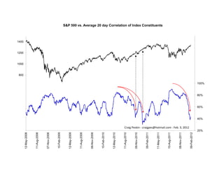
S&P 500 Index Correlation Analysis Over Time
- 1. -200 0 1000 1200 1400 200 400 600 800 12-May-2008 11-Aug-2008 07-Nov-2008 10-Feb-2009 12-May-2009 11-Aug-2009 09-Nov-2009 10-Feb-2010 12-May-2010 11-Aug-2010 09-Nov-2010 09-Feb-2011 11-May-2011 S&P 500 vs. Average 20 day Correlation of Index Constituents 10-Aug-2011 08-Nov-2011 Craig Peskin - craigpes@hotmail.com - Feb. 3, 2012 09-Feb-2012 20% 40% 60% 80% 100% 120% 140% 160% 180%