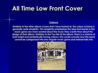
1. All Time Low Front Cover Colours Similarly to the other album covers that I have looked at, the colour scheme is generally quite simplistic. This simplicity emphasises the idea that bands in this music genre are more worried about the music they create than about the design of their album. Similarly to the You Me At Six album, there is a mixture of both bright and aesthetically boring colours. This could connote how this band cannot be categorised into one singular music genre and instead falls into several different ones.
2. All Time Low Front Cover The mixture of colours could also show the mixture in their personality as a band; the bright colours emphasise the fun side whereas the dull browns and beiges could also show that they can be quite serious. The mixture of colours could also link to the title of the album ‘ Nothing Personal ’. For example, the mixture of colours could show that the album is not aimed at anyone in particular; it could be about anyone.
3. All Time Low Front Cover Characters There are only two characters visible on this front cover, a woman's face and a woman's legs, and they are not entirely clear. The image of a woman’s face has been obscured by scribbling over the eyes and the image of the legs do not even show half of the legs, instead showing the ankles and stiletto heels. This could emphasise the idea behind the title; it is not aimed at anyone in particular.
4. All Time Low Front Cover Also, the fact that the images are very stereotypical also emphasise this idea of anonymity; stiletto heels are very stereotypical for women and the image of the face has very feminine qualities about it. There are also many other items featured on the cover, including a pencil, a cassette tape, cigarettes and a cinema ticket.
5. All Time Low Front Cover All of the items featured are very common, everyday items so this could therefore, again signify that this album is not aimed at anyone in particular. Also, none of the items featured on the cover can be directly linked to the band, and this could connote that the album isn’t even about them, it instead has a storyline.
6. All Time Low Front Cover Font & Language As with all the other album covers that I have looked at, the font used for the name of the band is incredibly simplistic and bold. This connotes many different things. Firstly, that the band is the most important thing on this cover. Secondly, this could have been done to ensure that the album could easily be spotted when placed on a shelf in a shop.
7. All Time Low Front Cover And lastly, this simplistic font could have been chosen to show that they are not overly focused on how their product is designed but instead in how their music is put across. The font used for the title of the album is very different. The font is sharper and harsher than that used for the bands name, maybe connoting that this is the way that the album is going to be.
8. All Time Low Front Cover However, the font and the random drawings and scribbles round the edge of the band name and album title could connote the target audience for this band; young, teenage girls and boys.
9. All Time Low Front Cover Layout The layout of this album cover emphasises the importance of the band and the album name as they have been placed in the middle of the cover and everything else has been placed around them. Even the random drawings and scribbles have been placed in a certain way so that they emphasise the band and the album title.
10. All Time Low Front Cover Also, all the items that have been included on this album cover have been partially hidden by this old style wallpaper, almost as if the band are emerging from the background. This could connote how this band are only just being recognised even though they have been around for quite a while.