Email advertising project
•Download as PPTX, PDF•
0 likes•425 views

For this week's project in Internet Marketing, we completed an email advertisement for Dick Sporting Goods and Breast Cancer Awareness. Grade: 95% Award: #1 Project out of both classes (Section 1 & 2)

Recommended
More Related Content
Featured
Featured (20)
Email advertising project
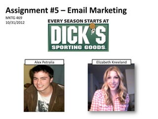
- 1. Assignment #5 – Email Marketing MKTG 469 10/31/2012 Alex Petralia Elizabeth Kneeland
- 2. Target Audience • NFL Fans • Football Players • Cause-motivated Fans & Athletes • Athletic Families
- 3. Subject, To, & From “From” Field • Good Contact Name • Use of Separate From & Reply to: Good for Routing “To” Field Responses to Appropriate DICK’S Employee • Good Personalization • Actual Reply-to Email Address Should Be • Should Have First Name First Recognizable Subject Field • NFL Related Content Not Reflected • Cause-related Motivation • Free Shipping Promotion
- 4. Offers & Calls-to-Action Offer: Free shipping CTAs: Play on sports CTA could be more lingo/simple but prominent effective Second CTA at end of email
- 5. Design & Copy • Postcard layout • Great color scheme • Great main image: Illustrates “toughness” • Cluttered by too much text • Body text is slightly redundant: Too many messages • CTA is particularly small compared to the offer: Gets lost.
- 6. Our Email: Assertive, • Only the concise message background consists of text/Maintains focal image More prominent CTA • Multiple “tough" players displaying pink Clear reminders of main purpose/target goal
- 7. Subject, To, & From • Last Day for Free Shipping! DICK’S Sporting Goods Wears Pink Subject • Jan Ahrens To • DICK’S Sporting Goods <DSGpinkribbon@email.dcsg.com> From
Editor's Notes
- AudienceDICK’S has a whole campaign surrounding “Sport Your Support” with a different sport being a focus for each advertisement. This ad was NFL centric. There is a large background image of a Football player. At the bottom of the promotion is a second advertisement for the “Jersey Report” which asks about which NFL team has the best fans. The target audience clearly seemed to be NFL players and Fans. Since Dick’s Sporting Goods is also very well known for being a market for youth/teens, coaches, and parents of young athletes, the audience was broadened to include families that are involved in sports because of their likeliness to get involved in cause related promotions. There are a lot of fans and athletes who are motivated to spend if they’re purchase helps support a cause, such as Breast Cancer Awareness, in some way and DICK’S is trying to reach that audience with this promotional email.NOTE: By making the football player still look tough wearing pink—it takes away from the stigma of men wearing pink.
- Subject / From / To Subject: “Sport Your Support – Get Free Shipping on Our Pink Ribbon Collection”The email ad seemed primarily aimed at NFL fans and Football Players so I was a bit surprised that there’s no mention of the NFL or Football in the Subject line. If I was a Football player/fan and I only saw something about a Pink Ribbon Collection, I might not be motivated to open the email. However, I would be drawn in with the “Sport Your Support” because the target audience likes to be a part of and support a cause. The Free Shipping is also a great incentive to open the email and (hopefully) buy something; although using the word “Free” in the Subject field might trigger a spam blocker.To: “Ahrens Jan”It’s the full name of the recipient and it’s better than “recipient,” “mailing list,” or “undisclosed” but the first name should have been first: “Jan Ahrens.” Beyond that, I would even think for a sporting goods store, just a first name (no last name) would work well.From: “DICK’S Sporting Goods <DSG@email.dcsg.com>”I like that the name for the contact is the name of the business. I also thought it was great idea to have any replies redirected to a different email than the general DICK’S email address, that way all emails that are redirected will end up at an email specifically associated with this particular email. It will be easier to track and will more efficiently make it to the appropriate department/employee for this email. BUT I didn’t think that the actual reply-to email address was a good idea. It should be made recognizable; like “sportyoursupport@email.dcsg.com” or something similar.
- Offer and Call-to-Action. What is the offer(s)?Dick’s Sporting Goods is offering free shipping on their pink ribbon collection, a product line specifically designed for the financial and awareness support of Breast Cancer Awareness month.Do you believe that this offer was effective? Why or why not?This offer is somewhat effective. Free shipping is definitely an attractive and appealing offer; however, so many companies are throwing around the “free shipping” offer. For example, it seems like every other time I order something from Amazon, I randomly am offered “free shipping”.Perhaps a small discount would be more effective and appealing. Even a mail in rebate could be more attractive and beneficial. It offers a discount, but at the consumer’s effort. Plus, who wants to feel cheap when buying products that support a good cause?What CTA(s) are being used? Was the CTA(s) effective? Why or why not?The call to action is “Join the team”, with the subtext “Together we’ll turn the sports world pink”It is very effective, using plenty of sports lingo while keeping the main idea (breast cancer awareness) in mind.“Shop Now”This is a very basic CTA, but I think reiterating the original subject line (Sport your Support >>)is a little more creative and draws more attention. Maybe even “Sport your Support Now >>” would be pretty ideal.Although, “Shop Now” is very direct and get the point across immediately. Who knows how long the reader will spend on the email? There is a second CTA at the bottom of the email. It’s trying to get readers to check out their “Jersey Report” and it tries to reel in NFL fans by asking which fans rule the NFL. They have to “Check the stats” to find out.
- Creative Design and Copy. (1 slide)What type of layout is being used? Is it effective? What would you suggest be changed and why?The layout is more along the lines of a postcard (Text on bottom and top, picture in the middle).The main image does draw your attention right awayAlthough, there is far too much text. It’s a bit much for just an email that someone is going to open and glance at for a brief few seconds.Reducing the text even to the titles on the picture would be far more effective and less of an eyesore.Is the design effective? Why or why not? The color scheme is great. The pink and white text really stand out on the player’s dark jerseyThe picture of the player is very intense and high quality. It definitely grabs your attention.The gloves and sweat band also really contrast with the rest of the player’s clothes, which really helps the image stand out more.Is the amount of copy (text) working for the purpose of this email? Is it effective? Why or why not? There is far too much text on the screen for the purpose of the email.The purpose is awareness, however they are very redundant in their initial text.They could easily make the “Sport your support” with the ribbon logo the title portion above the player.It would get straight to the point, and would leave a greater opportunity for the main offer and call to action to be noticed more easily.
- Design:We provided an image of an out of focus field, slowly drawing focus to the center point, a food baller’s extended leg in a pink and black shoe.The player looks incredibly tough (veins popping out of arm), yet is wearing pink in hopes of obliterating any negative connotation with the color and the masculinity/toughness of sports.There is also a series of legs down the line, all wearing the pink. The guy in focus is not the only one. This shows adoption of the color pink into the tough attitude associated with sports.Below the main picture are two secondary images. The image on the left illustrates a man grabbing a football with the pink ribbon in the center, complete with the NFL logo as the pin holding it together.The image on the right illustrates a basic, but clean and clear pink ribbon, tied together by Dick’s Sporting Goods. “Breast Cancer Awareness Month” is written alongside of the logo on the left. The clean black on white differentiates the message from the others, almost highlighting the importance of “Breast Cancer Awareness Month”.We kept the Navigation header to keep consistent with the format DICK’S uses in their emails. We wanted it to look familiar enough: providing less work in processing the information so they get to the main message quicker.Offer:The offer is clear, concise, and to the point-no frills to keep with the “tough” theme– much of what the original Dick’s Sporting Goods ad lacked.“BUY PINK. GET FREE SHIPPING.”We kept the offers above ours for Free Shipping over $49 and for the World Series Promotion, because this is the last day of the Pink promotion, so in the event they don’t open the email in time or are uninterested, they still have other relevant promotions that may draw them to our site and make a purchase.Call-to-Action:We also used “Shop now >>” as our CTA. We wanted to keep the clear, concise theme going. We want them to shop and thought the word shop is more inviting than Buy.However, we enlarged the CTA image/click box in order to draw more attention to it.We positioned it a part of the photo where there was no conflict with the original image.It is enlarged upon the grass, making it stand out even more. Unlike the previous “Shop now>>”, which was much smaller and slightly intrusive on the main image.Body:The “Tough Guys Wear Pink” is a simple, but powerful point that even the toughest guys can now embrace pink… both as a fashion statement, and in support of Breast Cancer Awareness.The text is in rough and tough, slightly spray painted block letters – illustrating the rough and tumble mood to the ad’s point.We kept the “Sport Your Support” because it’s a well known saying related to the breast cancer awareness cause used by sports companies and teams--and people would know the Pink we’re talking about is associated with the cause.
- Subject: “Last Day for Free Shipping! DICK’S Sporting Goods Wears Pink”We tried to bring incentive by alerting the recipient that it’s the last day to get the free shipping offer. This means they are more likely to open the email now instead of putting it off. We included the company name because from the lecture notes it seemed more effective than leaving the company name out. The recipient will recognize the company and since this is a mailing list they’ve signed up for the spam block probably won’t block the email even though it includes the word Free.To: Jan AhrensWe couldn’t figure out how to designate how the email recipients name appeared on the email, but our intention was to include the full name, first name first. Because this is also for a cause, we felt we should include the last name to keep it professional.From: DICK’S Sporting Goods <DSGpinkribbon@email.dcsg.com>We had the email come from the company, and not the pink ribbon department or from a person. The CEO is not the face of the company, so there was no point in making the email come from him. We did, however, have the email address be specifically from the pink ribbon department of the company. The recipient will recognize the DSG and the pink ribbon cause will be reinforced being attached the DSG name. The email will also be directed to appropriate department for a quicker and more efficient response time in the case that someone responds to the email.