My target demographicis males and females aged 16-35 (but mostly female). The
younger part of my demographic are in cool, laid back, care free and confident
social groups, and the older part of my audience are in hard working, driven and
passionate social groups. I believe the images in my magazine represent this, as do
the images I have compared them with from existing magazines.
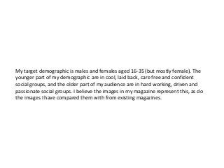
2.
This is mymain cover image compared with Rihanna’s cover of Rolling Stone magazine. I
think these images are similar due to the position of both girls (side on looking at the
camera), and both of their faces are covered by something, whether it be hair or their
hand. I believe both girls (stereotypically) look like they are from a well
respected/popular social group, as they are both quite glamorous and conventionally
pretty. This reflects maybe the younger people within my target demographic, therefore
both images would appeal to them.
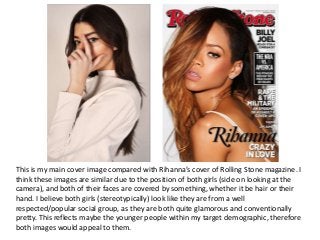
3.
This is mymain contents page image compared with this image of Jessie J on the cover
of Q magazine. They are similar as they are both full body images. However, they differ
in the way that Francesca is not looking at the camera but Jessie is. Their poses are
similar in the way that they are both unusual, but Jessie looks more confident than
Francesca – this is acceptable however, because the article in my magazine is about
Francesca’s ‘new album’ that helped her overcome depression, so it fits well. The image
of Jessie could represent how my younger audience is confident, but the image of
Francesca could suggest that they also have a more private side which reflects pretty
much all teenagers, and the teenagers who would read my magazine.
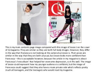
4.
This is mymain double page spread image compared to and existing image of Lorde
from the cover of Rolling Stone Magazine. Both girls look similar due to the colour of
their lipstick and hair colour. Also, the colour of their clothes and the style of their poses
(which convey the cool vibe of the magazines). Again, I think both girls look like they’re
from a highly respected and confident social group which could reflect the people of my
target audience.
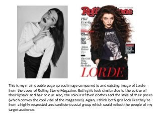
5.
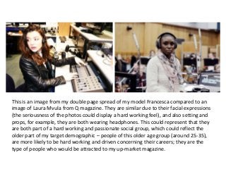
This is animage from my double page spread of my model Francesca compared to an
image of Laura Mvula from Q magazine. They are similar due to their facial expressions
(the seriousness of the photos could display a hard working feel), and also setting and
props, for example, they are both wearing headphones. This could represent that they
are both part of a hard working and passionate social group, which could reflect the
older part of my target demographic – people of this older age group (around 25-35),
are more likely to be hard working and driven concerning their careers; they are the
type of people who would be attracted to my up-market magazine.
6.
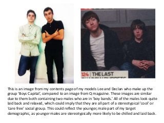
This is animage from my contents page of my models Lee and Declan who make up the
group ‘Boys Capital’, compared to an image from Q magazine. These images are similar
due to them both containing two males who are in ‘boy bands.’ All of the males look quite
laid back and relaxed, which could imply that they are all part of a stereotypical ‘cool’ or
‘care free’ social group. This could reflect the younger, male part of my target
demographic, as younger males are stereotypically more likely to be chilled and laid back.
7.
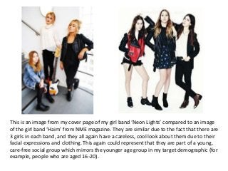
This is animage from my cover page of my girl band ‘Neon Lights’ compared to an image
of the girl band ‘Haim’ from NME magazine. They are similar due to the fact that there are
3 girls in each band, and they all again have a careless, cool look about them due to their
facial expressions and clothing. This again could represent that they are part of a young,
care-free social group which mirrors the younger age group in my target demographic (for
example, people who are aged 16-20).