
Recommended
More Related Content
Similar to Magazine 3 choices
Magazine 3 choices
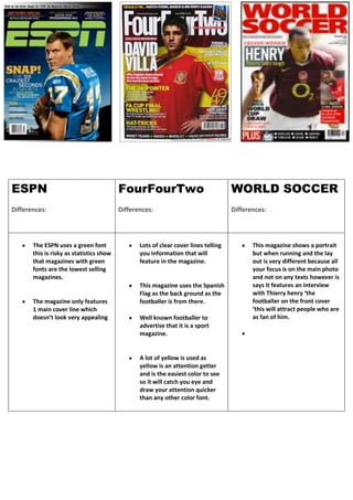
- 1. ESPN Differences: FourFourTwo Differences: WORLD SOCCER Differences: The ESPN uses a green font this is risky as statistics show that magazines with green fonts are the lowest selling magazines. The magazine only features 1 main cover line which doesn’t look very appealing Lots of clear cover lines telling you information that will feature in the magazine. This magazine uses the Spanish Flag as the back ground as the footballer is from there. Well known footballer to advertise that it is a sport magazine. A lot of yellow is used as yellow is an attention getter and is the easiest color to see so it will catch you eye and draw your attention quicker than any other color font. This magazine shows a portrait but when running and the lay out is very different because all your focus is on the main photo and not on any texts however is says it features an interview with Thierry henry ‘the footballer on the front cover ‘this will attract people who are as fan of him.