
Recommended
More Related Content
Similar to Kerrin Lumsden, Diageo
Similar to Kerrin Lumsden, Diageo (20)
More from Samantha Brown
More from Samantha Brown (13)
Recently uploaded
Recently uploaded (20)
Kerrin Lumsden, Diageo
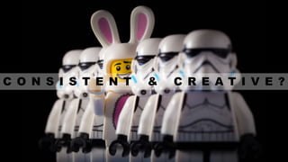
- 1. C O N S I S T E N T & C R E A T I V E ?
- 4. “Consistency is the hallmark of the unimaginative.” - Oscar Wilde
- 5. “Human nature is amenable to startling creativity of the kind practised by great artists, directors, writers, musicians, actors, who know how to touch a chord in humans everywhere” – Lord Saatchi
- 14. K E Y B R A N D A S S E T S
- 24. C R E A T I V E P R I N C I P L E S
- 26. Don’t tell designers what to do, tell them how to feel
- 32. BRAND TRUTH CREATIVE PRINCIPLE THE WORLD’S FIRST LUXURY WHISKY – BLUE LABEL WE ALWAYS WALK WITH STYLE JOHN WALKER DEVELOPED THE ART OF BLENDING & EXPORTED GLOBALLY PROGRESSION IN EVERYTHING WE DO OUR WHISKIES HAVE BIG, BOLD FLAVOURS WE ARE BOLD AND CONFIDENT A HISTORY OF INNOVATIVE PACKAGING WE CREATE ICONIC DESIGNS
- 33. B R A N D W O R L D
- 41. K E Y B R A N D A S S E T S + C R E A T I V E P R I N C I P L E S + B R A N D W O R L D C R E A T I V E C O N S I S T E N C Y
Editor's Notes
- My name is Kerrin Lumsden, and I am a Design Leader at Diageo, and I look after Guinness, Baileys and everything we do in Africa. Today I am going to talk about… …… How our brands must learn to be both consistent and creative in order to succeed
- A long long time ago, I was a designer I was regularly given massive brand manuals, so I would flick through them and pick out my favourite bits, then start designing stuff This, rather obviously did not lead to consistent work on the brand in question, although it was creative If I had slavishly chosen to follow the rules it would have been consistent, but not very creative So the big pile of rules clearly didn’t work! Over the years I have tried to find the right balance between creativity and consistency, usually relying on intuition Recently, we have started to understand and codify the formula for success……
- But let’s start with some context - We live in an increasingly busy and cluttered world We are bombarded with messages all day long, but luckily for us, our brains are brilliant at filtering out almost everything – if they didn’t we simply couldn’t get through each day The role of brands is to cut through this filter and to be noticed.
- To be noticed, firstly brands need to be consistent But as Oscar Wilde notes, consistency can be boring…
- But being noticed isn’t enough, we need to keep being noticed. We stop noticing things once they are predictable, that is the way our brains work, we need brands to surprise and delight us, to grab our attention and give us a clear reason to bond with them. People pay attention to creative work, they let their guard down, the filter is temporarily switched off and they allow themselves to connect emotively
- Great brands exist in culture – not just in their specific categories – we interact with brands in films, in music, in our everyday lives. So for example, Johnnie Walker exists in the real world, not just in the blended whisky category. As culture evolves, our brands also need to evolve, or risk becoming irrelevant The best way to evolve and remain interesting and relevant is to be creative. So the big challenge to brand owners is how can they be both creative and consistent a the same time?
- There are some clues for us to figure out how best to do this Firstly if we look back to the past, our brands often did a pretty good job eg Guinness advertising. No sight of a 200 page brand manual, and on the face of it, a real breadth of ideas, but there is a consistent feel to the work that allowed consumers to recognise it
- There is no rule about how and where to use the logo, or what colour it should be. But there is a consistent FEELING
- Coca Cola have executed the same FEELING for decades When you layer up the consistent use of their logo – you start to build up a clear, recognisable style Consistent enough, creative enough – it feels like they have managed to capture what Coca-cola “means” and can replicate this feeling in their executions
- As is often the case, we can also learn from luxury brands, where creativity has always been at the heart of what they do. While fmcg brands were founded on product focused quality promises, luxury brands are founded on aspirational dreams. Rather than talking about their products “washing whiter than ever” a luxury champagne would say “Be Fabulous” It is this emotional promise that forms the consistency in luxury brands, and this is constantly redefined with creativity
- We can also look into how smaller, entrepreneurial brands remain both consistent and creative They are often built around a founders strong personality, and boldly directed – they “know” when something feels right for the brand because its often an extension of themselves Without a complex organisation and multiple stakeholders, they can remain clear on what their brand is and is not.
- If we go way back in time, Humans developed to understand and communicate with images. In fact, we can understand images 60,000 times faster than text! This has been hardwired into our brains, written communication followed fairly late on in the development of the human race So we need to work with visual images – and we have developed a system for understanding and using our core visual assets across every touchpoint our brands have with consumers
- Why? Because the reality of the drinks market is crowded & confusing It is difficult to stand out, be recognised and connect with consumers Alcohol brands are not necessary for us to survive – they are not rational purchases - they are emotional – so we need to work hard to get consumers to buy us.
- So I will explain our system which we call ‘key brand assets’
- It allows us to develop visual shortcuts for the brand that instantly drive recognisability These “Key brand assets” need to do 2 things: 1. Used consistently over time – look how little the Johnnie Walker striding man has changed over the past 100 odd years 2. Be Distinctive versus the broad competition – how many other whisky or even spirit brands have a similar brand icon???
- On Guinness, we deliberately built up the prominence of the Harp icon on our packaging, glassware and other touchpoints Over the next 10 years, we saw consumers awareness of the Harp increase dramatically so that it is now a visual shortcut to the brand. It had always been there, but it was not enough of a signal for consumers to be clear that it was a Guinness harp rather than say an Irish harp. So the bold and consistent use over many years has really paid off
- To create these assets, we carry out research with consumers to establish what they believe assets are - we are almost never 100% correct in our assumptions. We aim to have 3 KBA’s for all of our brands, in this example we have… The cocktail shaker inspired bottle The red seal And the Tanqueray wordmark We then use our judgement on how to deploy them so that our brands are easily recognisable
- When we develop new brands, like Haig Club, we deliberately focus on 3 assets.
- Once a distinctive logo has been used consistently for many years, it can start to be creative – and still remain recognisable The Chanel logo is so distinctive that it can be played with and executed in many ways
- Icons can carry emotions, they are not JUST visual shortcuts, so let’s treat them with emotion. Think about Football club badges, they are not just a crest on a shirt – they represent so much more
- Global icons eg the Apple logo provoke an emotional response. They are parodied, revered or in some cases despised, but they have become more than visual shortcuts. As these icons have become engrained in popular culture, they have become emotive So when we talk about how to use them, should we not do this in an emotive rather than transactional way?
- So when we explain to agencies how to use our KBA’s, we need to focus on what they mean, what they represent rather than creating endless rues on what not to do. Creatives are more likely to respond and use our assets with love if they feel like custodians for meaningful brands.
- We explain that the Guinness harp icon has been around since 1862, and it will be around long after we have finished working with it. When we explain the heritage and the craft that went into the redesign –we built a physical harp to ensure it was authentic, and used traditional letterpress printing techniques to craft every detail Rule books are less necessary when the importance and meaning of the Harp icon are explained.
- So we finished looking at key brand assets with the challenge of how to think about them in an emotive way. We do this by developing creative principles…
- Which John would you want your brand to be? Hopefully most of us would go for Jonny Depp, because he has an engaging personality And this personality, in brands, is derived from being creatively consistent We use creative principals to bring this creative consistency to brands So if John Major is the result of a 100 page brand manual full of rules, Jonny Depp is the result of creative principles
- If you tell them what to do (the rule book methodology) you don’t get to creativity If we tell them how to approach the problem, how to feel about our brand, they will be creative, and we should give them enough guidance to get to the right results – we do this with creative principals
- Creative principals need to be tied into the DNA of a brand, they need to be grounded and believable Lets look at some examples The London Olympic 2012 identity. The core creative principal here was “inclusivity” As long as the external shape was maintained, anything could be dropped inside the logo – so sponsors loved this approach Importantly, the principal of “inclusivity” is at the heart of the ethos of the games, so it is believable and true to the brand
- Ikea’s creative principal of simplicity comes from their ethos of being humble, honest and human We can see simplicity brought to life in the products, the food in the store and (usually) the instructions – ok they may have some work to do in this area
- Johnnie Walker – one of the key ‘creative principals is ‘progression’ Progression is core to the way the brand developed from a Greengrocer’s shop in Kilmarnock to a global pioneering brand. The ethos of the founder to perfect his recipes, to export his product was passed on to his successors, including today’s team who strive to progress every aspect of the brand. We see ‘progression” brought to life in the angled labels and faceted bottles – semiotically suggesting positive movement Progression is also the underpinning idea behind the long running “Keep Walking” campaign
- - Merchandising displays - progression in the shape and forms
- And our sponsorship of the Mclaren F1 team - the ultimate expression of technical progression mixed with glamour So “progression’ comes across in everything we do
- A brand should aim to have 3 or 4 principles – enough to be rounded and interesting, but few enough to be succinct and consistent These principals should be rooted into the brand. So they can some from our DNA, perhaps inspired by stories from our founders actions. They can come from the ethos of the company (Ikea) or be borne out of long established comms ideas like “Keep walking”
- So that was creative principles, finally, lets look at brand world
- A “brand world” describes the look, tone and feel of a brand– this example is– Mortlach Scotch Whisky We re-launched this 190 year old brand recently, and it was all built around a clear purpose – To “Engineer the extraordinary” The engineering thought comes from the founder, George Cowie, an Engineer by trade who brought his technical flair to the world of whisky, introducing, amongst other things, a unique method of distillation – 2.81 distillation – that gives a unique character. It has been described by experts as being like having 3 distilleries under one roof. So the purpose is founded on a brand truth
- Our brand world took the visual engineering style and brought it to life in a luxurious way
- - We developed the packaging next – and the engineering style is clearly evident in the bottle structures
- - This was a pop-up brand home in Taipei
- - Our POS and visibility materials
- And in this case, we even got to design a new Distillery building There is a clear look, tone and feel of everything that we have created – even though they are different types of execution
- To make this tool more immersive, we can build a VR environment…. This helps to make the brand world more emotive, as it is a more real, more multisensory experience – there is less room for misunderstanding. The sound of a busy welcoming bar, or the song that captures the mood of the brand are vital parts of the tool. Technology is now allowing us to explain our brands in a truly immersive, but affordable way And this tool will allow us to do much more – we can start to judge work in the virtual environment – so on Guinness we can virtually sit in a bar in Lagos then walk into another room and be transported to New York for the next project.
- So I started out looking for the formula for success, and this is it. We start by defining our ‘key brand assets’ – the visual shortcuts for the brand We then define the creative principles – these guide designers in HOW to feel about the brand and how to bring it to life Lastly we build a brand world which visually describes the look, tone and feel All of this will allow us to deliver creative consistency This requires a lot of work and expertise to develop, but it will allow our brands to flourish, so it is an investment well worth making.