1. Positioning
Tone of voice
Typeface 1 Typeface 2
Visual language
Strap line
Photography style
SECONDARY ELEMENTS
Logo
PRIMARY ELEMENTS
BRAND TOOL BOX
Primary colour palette
Secondary colour palette
MAGENTA
80% BLACK 50% BLACK
CYAN BLACK WHITE
The Bridge Rd logo was designed to reflect a modern vibrant
“edginess”. The colours are primary which guarantees cut through
and also adds fashionability. The type face is “now” yet harks back
to neon signs associated with Richmond’s rich retail past. Using
a row of dots representing shops along the strip and a cyan dot
to show that you have “made the find” complete this strong and
memorable mark.
“What a find” perfectly positions Bridge Rd as the shopping
destination that allows you to discover something unexpected.
As so many shopping destinations have become predictable
offering only generic big brand names this positioning demon-
strates our unique selling proposition. And of course being an
expression that is part of our Aussie vernacular helps too.
• Conversational
• Enlightening
• Quirky
• Magical
• Inviting
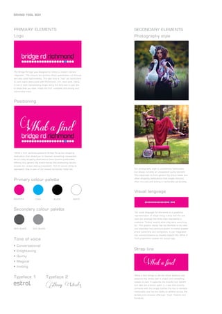
Our photography style is consistently fashionable
but always includes an unexpected quirky element.
This separates us from generic big brand labels and
other shopping destinations that maybe slick but
often are cold and lacking a memorable personality.
The visual language for the brand is a graphical
representation of shops along a strip and the one
cyan dot amongst the white dots represents a
customer ‘finding’ exactly what they were searching
for. This graphic device has the flexibility to be used
and expanded into communications to create greater
brand ownership and recognition. It can integrated
into communications to visually support the ‘What A
Find’ proposition outside the actual logo.
‘What a find’ brings to life the brand essence and
positions the street with a unique and compelling
reason to visit. It captures the brands core benefit
and sets the precinct apart in a way that directly
connects with the target market.The line is ownable,
memorable and has the ability to stretch across the
streets core product offerings:- Food, Fashion and
Furniture.
estrol Many Weatz
2. Magazine Winter
Magazine Summer
BRAND COMMUNICATIONS
Rediscover Bridge Road, Richmond. Now more than
ever, bursting with food, fashion and furniture. Catch
up with friends for an award-winning breakfast. Meet
for a drink at a world-renowned bar after the footy. Find
the perfect outfit at one of the many unique, value-for-
money fashion boutiques. And whether you’re searching
for contemporary or retro décor, you’ll find it at one of
Bridge Road’s eclectic furniture stores. To find out more
visit www.bridgerd.com.au
3. Tennis
Bridge Rd
Tennis
Bridge Rd
Tennis
Bridge Rd Visit Bridge Rd
Richmond for award
winning bars, restaurants
and cafes.Open before
and after the tennis. Click for more information
Social media
Website
DIGITAL
BRAND COMMUNICATIONS
Tactical animated banner ad to coincide with the tennis
4. Tactical press ad to coincide with Christmas
Brand identity guidlines
C 0 M 100 Y 0 K 0
C 0 M 0 Y 0 K100
C100 M 0 Y 0 K 0
CMYK
BRIDGE ROAD LOGO AND STRAPLINE GUIDELINES
PANTONE Pro. Mag. C
MINIMUM LOGO PANEL SIZE
LOGO FONTS
“What a find” is shown in Many Weatz font.
Note: Font has been redrawn in areas to achieve desired look.
1234567890
ABCDEFGHIJKLM
NOPQRSTUVWXYZ
abcdefghijklmnopqrstuvwxyz
BODY COPY FONT
Zurich BT Light Condensed
1234567890
ABCDEFGHIJKLMNOPQRSTUVWXYZ
abcdefghijklmnopqrstuvwxyz
HEADLINE FONT
Zurich BT Condensed
1234567890
ABCDEFGHIJKLMNOPQRSTUVWXYZ
abcdefghijklmnopqrstuvwxyz
23mm
MINIMUM STRAPLINE PANEL SIZE
PANTONE Pro. Cyan C
PANTONE Pro. Black C
PMS
MINIMUM LOGO CLEAR SPACE
(If logo is used in the panel)
23mm
Divide the bottom of the logo panel into
four equal squares. Use the width and
depth of the square to determine clear
space around all sides of the panel.
When Bridge Road logo and strapline are shown in separate panels,
reproduce them in the exact porportions shown below.
The logo can be used without the
Magenta panel if a larger area of
Magenta is used.
An example of this is shown in Fig.1
magazine ad, where the logo is used
on a larger area of Magenta. The
strapline can be reversed out of a
visual, as shown above.
Fig.2 is a pull up banner design also
utilising a larger area of Magenta.
Fig.1
Fig.2
“bridge rd richmond” is shown in estro1 font.
abcdefghijklmnopqrstuvwxyz
MONO STRAPLINE MINIMUM SIZEMONO LOGO MINIMUM SIZE
19mm 19mm
C 0 M 100 Y 0 K 0
C 0 M 0 Y 0 K100
C100 M 0 Y 0 K 0
CMYK
BRIDGE ROAD LOGO AND STRAPLINE LOCKUP GUIDELINES
PANTONE Pro. Mag. C
MINIMUM LOCKUP PANEL SIZE
LOGO FONTS
“What a find” is shown in Many Weatz font.
Note: Font has been redrawn in areas to achieve desired look.
1234567890
ABCDEFGHIJKLM
NOPQRSTUVWXYZ
abcdefghijklmnopqrstuvwxyz
BODY COPY FONT
Zurich BT Light Condensed
1234567890
ABCDEFGHIJKLMNOPQRSTUVWXYZ
abcdefghijklmnopqrstuvwxyz
HEADLINE FONT
Zurich BT Condensed
1234567890
ABCDEFGHIJKLMNOPQRSTUVWXYZ
abcdefghijklmnopqrstuvwxyz
23mm
MONO LOCKUP MINIMUM SIZE
PANTONE Pro. Cyan C
PANTONE Pro. Black C
PMS
MINIMUM LOGO CLEAR SPACE
(If logo and strapline lockup is used
in the panel)
19mm
Divide the bottom of the logo panel into
four equal squares. Use the width and
depth of the square to determine the
clear space around all sides of the panel.
When shown together (in lockup), do not alter the proportions of the Bridge Road logo and strapline cluster. Reproduce exactly as shown below.
Logo and strapline can be used
without Magenta panel if a larger area
of Magenta is used. An example of this
is a pull up banner design (Fig.1).
Fig.1
“bridge rd richmond” is shown in estro1 font.
abcdefghijklmnopqrstuvwxyz
BRAND COMMUNICATIONS