Top profile Call Girls In fatehgarh [ 7014168258 ] Call Me For Genuine Models...
Q1. In what ways does your media product use, develop or challenge forms and conventions of real media products?
1. Q1. In what ways does your media
product use, develop or challenge
forms and conventions of real
media products?
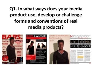
2. Q1. In what ways does your media product use, develop or
challenge forms and conventions of real media products?
Throughout my work, I have always tried to keep the colour style coordinated, by using the
same 3 colours throughout my work. Red, white and black are the three colours I have
used, mainly because they contrast quite nicely. In my double page spread however, I used
gold in some of the work, because there was a certain part I wanted to stand out and also,
as I am focused on the rap genre, gold connotes richness, which many rappers seem to
write about within their lyrics. Within other media products, they always use a specific
colour scheme, and I tried to stick by this conventional way. I also asked the person on my
front cover to wear these specific colours, and luckily he had the perfect jumper for it, black
with red and white stripes to match the colour scheme.
Here you can see that I have used red,
white, and black as a background in my
contents page to keep to the colour
scheme I wanted to keep throughout. On
my double page spread, I put the
background as white and used the other
two colours within the writing and shapes.
3. Q1. In what ways does your media product use, develop or
challenge forms and conventions of real media products?
I found a font that I liked to use throughout my work, but one of the reasons I used
this font, is because there was a wide variety of the font. There was a normal version,
a slim version, a bold version and an extra bold version, which allowed to use all 4
fonts. I used the extra bold ones when I wanted something to stand out more, and
used the skinny version of the font when I wanted something to not stand out too
much. For example, in the mast head of my front cover I used a bold version of the
font. Media products often use the same font throughout their products, or similar
fonts in their magazine.
All of these are using the
different versions of the same
font. You can see that there is a
fairly large difference between
the boldness of the picture at
the top, and the other text,
although one does have an
outline, which made it look
larger. I had to take this into
consideration when deciding
which version of the font to use.
4. Q1. In what ways does your media product use, develop or
challenge forms and conventions of real media products?
On my front cover, the image I used was a medium shot, which I wanted to use to use
to show the full top half of the person and a slight bit of the bottom half. Also, I
wanted to be able to see the majority of his arms, so I thought this picture was perfect
for it. I also wanted him to cover most of the page, so I conventionally put the picture
in front of the mast head, as many large magazines do, because people instantly
recognize their mast head without even reading it, so cover parts of it up doesn’t
really matter too much.
These pictures show how I covered part of
the mast head up with my models head
and hair, but not too much that you
couldn’t read it. One of the pictures shows
the full front cover and the right side
shows the full length of the image I used of
my model.