Beginners Guide to TikTok for Search - Rachel Pearson - We are Tilt __ Bright...
Deconstruction of Q magazine
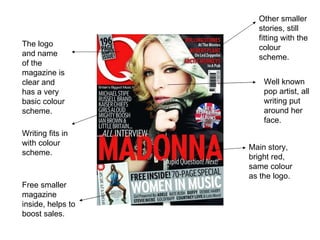
1. The logo and name of the magazine is clear and has a very basic colour scheme. Other smaller stories, still fitting with the colour scheme. Well known pop artist, all writing put around her face. Main story, bright red, same colour as the logo. Free smaller magazine inside, helps to boost sales. Writing fits in with colour scheme.
2. Q Magazine Q magazine is a very successful monthly mainstream music magazine. Q has an older target audience as they have some very in depth interviews and the style in which the magazine is laid out is very sophisticated. Q has a very basic colour scheme making it very noticeable and easy to remember. The colour scheme is red and white and is portrayed in the logo. This colour scheme makes it very recognisable. As the style is quite simplistic it doesn’t portray one genre of music. Q also has many very detailed reviews on many different genres of music.