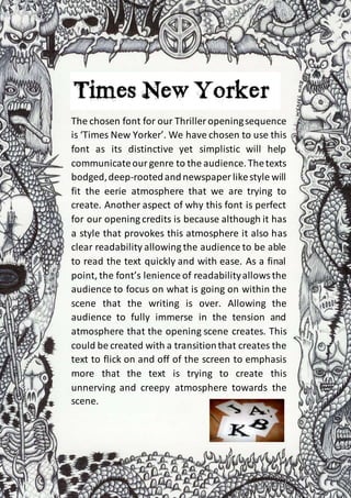
1. The chosen font for our Thriller openingsequence
is ‘Times New Yorker’. We have chosen to use this
font as its distinctive yet simplistic will help
communicateourgenre to the audience.Thetexts
bodged,deep-rootedandnewspaper likestyle will
fit the eerie atmosphere that we are trying to
create. Another aspect of why this font is perfect
for our opening credits is because although it has
a style that provokes this atmosphere it also has
clear readability allowing the audience to be able
to read the text quickly and with ease. As a final
point, the font’s lenience of readabilityallowsthe
audience to focus on what is going on within the
scene that the writing is over. Allowing the
audience to fully immerse in the tension and
atmosphere that the opening scene creates. This
could be created with a transitionthat creates the
text to flick on and off of the screen to emphasis
more that the text is trying to create this
unnerving and creepy atmosphere towards the
scene.