2. Team Name
The BlackJackets team name combines the venerated
yellow jacket with the city’s rich history as a gambling
Mecca. The yellow jacket is one if the most ferocious
insects, feared for its powerful stings. Conversely,
Blackjack is one of the nations most popular card
games, and is almost synonymous with the excitement
of Las Vegas. The union represents the drive of the
team combined with the experience of the fans.
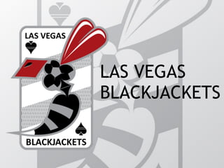
3. Master Logo
The BlackJacket’s master logo incorporates the profile
of a yellow jacket comprised of the four suits in a
deck of cards. The colors red and black mimic the
colors of the suits, and the grey acts as an
intermediary. The shape of the background, the layout
of the text and spade logos, and the crosshatch
pattern are all reminiscent of a playing card. The
soccer ball pattern has been incorporated into the
thorax of the hornet as a club. The two stripes (on the
yellow jacket’s abdomen, on the alternate logo, and
on the background) represent the two cards that a
player is dealt when playing blackjack.
4. Black and White Logo
The Master logo can be easily converted to a
simplified black and white version for promotional
use. The monochrome version retains the integral
aspects of the master logo while allowing for
minimization and economical printing.
5. Alternate Logo
The BlackJackets alternate logo is intended to offer
an additional face to the Las Vegas team that is
equally recognizable as belonging to the city and the
team. Again, the yellow jacket abdominal imagery is
pulled through in the form of the striped spade with
white tip mimicking a stinger. The card suit icons ring
the logo in red which is reminiscent of a poker chip,
the local currency in Las Vegas. The letter “V” is also
included in the negative space between the spade
body and its base, offing and additional piece of lore
on which to build the team.
6. Small Alternate Logo
The small alternate offers the simplest way to
represent the BlackJackets. The small circular patch
still retains the poker chip and yellow jacket imagery
and the two stripes signify the team. This logo is
intended to be used in extremely small places where
the details of the larger logos would be lost.
7. Marketing Opportunities
The short but exciting history of Las Vegas, as well as
the simple but expansive corpus of imagery
surrounding playing cards together offer a limitless
number of marketing opportunities. This also extends
to copy writing, as card games each have a unique
dialect that could be easily integrated into
promotional materials.