Question Seven:
Looking backat your preliminary
task, what do you feel you have
learnt in the progression from it to
the full product ?
2.
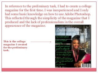
In reference tothe preliminary task, I had to create a college
magazine for the first time. I was inexperienced and I only
had some basic knowledge on how to use Adobe Photoshop.
This reflected through the simplicity of the magazine that I
produced and the lack of professionalism in the overall
appearance of the magazine.
This is the college
magazine I created
for the preliminary
task.
College Magazine
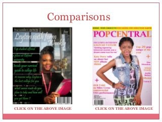
• Asseen on the front cover of my college magazine
I placed my cover lines in black rectangular boxes
which were all different sizes. Looking back on this
decision I realised that this was one of the factors
which contributed to making the appearance of my
magazine look amateur.
• The use of rectangular black boxes also played a part
in disturbing the image of my cover star. This is because
the boxes blended in with her clothing and generally
did not compliment the overall appearance of the
magazine.
• I identified that the use of boxes to place my cover lines in for my college magazine should
not be repeated when creating my own magazine in the main task because it made the
magazine look unprofessional. I disregarded the use of boxes on the front cover of my
music magazine.
•In terms of the placement of particular features on the cover of my college magazine I did
not have extensive knowledge about the conventions of magazines and this resulted in me
placing features such as the barcode and issue number randomly on the front cover where at
the time I thought it was suited to be placed.
5.
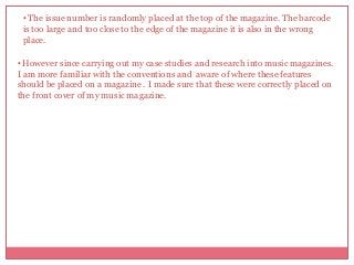
• The issuenumber is randomly placed at the top of the magazine. The barcode
is too large and too close to the edge of the magazine it is also in the wrong
place.
• However since carrying out my case studies and research into music magazines.
I am more familiar with the conventions and aware of where these features
should be placed on a magazine . I made sure that these were correctly placed on
the front cover of my music magazine.
6.
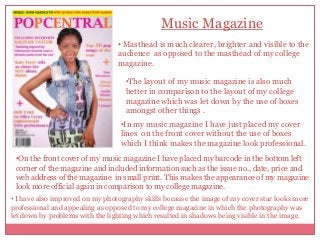
Music Magazine
• Mastheadis much clearer, brighter and visible to the
audience as opposed to the masthead of my college
magazine.
•The layout of my music magazine is also much
better in comparison to the layout of my college
magazine which was let down by the use of boxes
amongst other things .
•In my music magazine I have just placed my cover
lines on the front cover without the use of boxes
which I think makes the magazine look professional.
•On the front cover of my music magazine I have placed my barcode in the bottom left
corner of the magazine and included information such as the issue no., date, price and
web address of the magazine in small print. This makes the appearance of my magazine
look more official again in comparison to my college magazine.
• I have also improved on my photography skills because the image of my cover star looks more
professional and appealing as opposed to my college magazine in which the photography was
let down by problems with the lighting which resulted in shadows being visible in the image.
7.
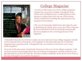
The screenshot abovedisplays the targets that I set for myself in my evaluation
for my college magazine on areas that I wished to improve on in the main task. I
feel that I have been able to achieve all three targets that I have set for myself.
This is evident in the appearance of my music magazine in comparison to my
college magazine and also in the progression that I have made over the period of
carrying out my coursework.
Overall looking back at my preliminary task I feel that I have progressed hugely
over this period of time and this is evident in the magazine that I created for the
main task. I have also been able to learn about, use and extend my knowledge
on a range different technologies which have also been very useful to me and
helped me to improve my skills further .