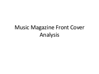
The main imageis
blocking the masthead,
vibe, which tells us that
the brand is well
recognised.
The cover lines are
justified around the
image to make the
image stand out as the
main feature.
The main image is
central of the magazine
which suggests
importance.
Limited amount of font
and colour,
this creates a house
style and
makes the brand
recognisable
A plug is used to
interest the audience
into reading the
magazine.
The strapline reveals
extra information about
the article as well as
creating an interest for
the reader.
The use of a banner
allows information from
the magazine to be
seen when on the shop
shelves which attracts
the reader to buying
the magazine.
The barcode shows that
the magazine can be
bought in shops and not
just read online.
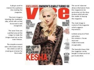
3.
The masthead doesn’tfollow the
trend of most magazines.
The red box stands out against the
white background which makes it
noticeable.
The slogan is "discover good
music" which suggests that the
magazine knows what it's talking
about.
The main image is a medium shot
of Adele.
The image is the largest part of the
cover and grabs the reader's
attention.
Adele is in a seductive pose which
has the effect of seducing the
audience into reading the
magazine.
All of the text used is large when a
celebrity name is used which draws
our attention to the magazine and
will make us buy it.
The magazine doesnt have much
text on the cover, and the text on
the cover is simple and grabs our
attention to interest us in the
topics.
The layout is similar to NME
magazine as all of the text and the
masthead is positioned to the left
this allows the image to take up
more space and draw the reader's
attention to the magazine.
There is a title and article quote on
the main image which relates the
main image and the article.
Adele is one of the biggest names
in music and having an interview
with her and how she has blown us
away will interest the readers as
they will want to know about her
lifestyle.
Having Adele on the front cover
makes her very recognisable and
will be instantly recognised
drawing in a wider audience.
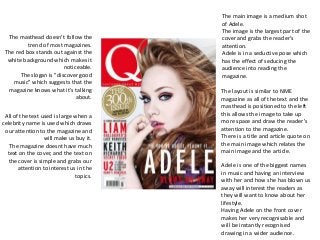
4.
The title ofthe magazine
is covered by the model
which shows the
magazine is well known.
Small tagline informing
readers of another
article in the magazine.
The cover lines are
justified to the left which
makes the magazine look
more organised and the
yellow draws the readers
attention to the
magazine.
The main cover line is
larger than the rest of
the other articles, it is
also the singers name so
your eyes are drawn to
the title as well as the
image making the fans
want to buy it.
The main image is of the
model, the image is a
medium shot. The outfit
carries on the theme of
the front cover.
They’re three different
colours used and they’re
possibly four different
fonts used. The main
image blends with the
theme of the cover. The
colours suggest that the
primary audience is
teenage girls.
The puff slightly covers
the main image and the
colours used blends in
with the background.
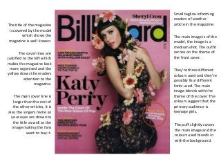
5.
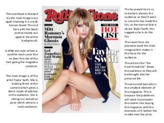
The masthead isblocked
by the main image once
again implying it is a well
known brand. The red
font with the black
outline stands out
against the white
The buzzword hot is in
red which attracts the
audience as they’ll want
to see who has made the
list, as the main article is
about Taylor Swift, this
suggests she is on the
list.
background. The cover lines are
The main image is of the
artist Taylor Swift. She is
looking direct at the
camera which gives a
direct mode of address
to the audience. She is
sitting in a seductive
pose which attracts a
male audience.
placed around the main
image which makes it
the focus for the
audience.
A different style of font is
used for each cover line
as does the size of the
font giving the magazine
variation.
The article title “the
heart break kid” draws
the audience as they will
be brought into her
personal life.
The price and barcode is
the smallest element of
the magazine. This is
because the publishers
will want to persuade
the reader into buying
the magazine with the
elements of it before the
reader sees the price.