Chart Types for Your Dashboard
•
1 like•979 views

Understanding the chart types that are best for your data will allow you to get the most out of your dashboard. Charts can reveal outliers and interesting facts that may be otherwise hidden, and if you are using the wrong type of chart you may not unlock the insights you are looking for.

Recommended
Recommended
More Related Content
Viewers also liked
Viewers also liked (16)
More from Chartio
More from Chartio (8)
Recently uploaded
Recently uploaded (20)
Chart Types for Your Dashboard
- 1. Chart Types for Your Dashboard
- 2. Understanding the chart types that are best for your data will allow you to get the most out of your dashboard.
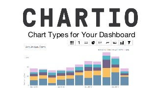
- 3. Visualizing multidimensional data, emphasize the magnitude of change over time and draw attention to trends. You can play with an example here, or a percent area chart example here. Area Chart
- 4. Bar Chart Discrete data, showing the relationship between a part to a whole, categories being compared or generalizations about the data. You can play with an example here, a grouped bar chart here, or a percent bar chart here.
- 5. Funnel Chart Visualize optimizations, dropoffs - which represent the progressive reduction of data, such as the stages in a sales process.
- 6. Line Chart Conveying changes over time, shows how data changes at equal intervals of time. You can play with an example here.
- 7. Pie Chart Show the contributions of data segments as a percentage of a whole. You can play with a pie chart example here.
- 8. Scatter Plot Fine the relationship between two variables, visualize how much one variable is affected by another, view correlations between variables. You can play with the a scatter plot example chart
- 9. Bullet Graph Displaying single values within some quantitative context, compare a primary measure to one or more measures in the context of qualitative ranges of performance.
- 10. Single Value Chart Emphasizing a particular data point and bringing attention to a value such as total revenue, growth or conversion. You can play with a single value chart example here.