Download to read offline
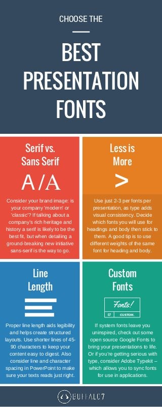

Fonts are extremely important for communicating your messaging effectively, but choosing the best presentation fonts depends on a number of factors. Use our presentation designers' essential tips to help you choose a style that’s right for your presentation aims. For more tips on choosing the best presentation fonts, visit: http://buffalo7.co.uk/best-presentation-fonts/

![SMOKE - The Convenient Truth [1st place Worlds Best Presentation Contest] by ...](https://cdn.slidesharecdn.com/ss_thumbnails/smoke-theconvenienttruth-ep-101028211434-phpapp01-thumbnail.jpg?width=640&height=640&fit=bounds)