Presenting Data with Punch
•
2 likes•734 views

The document discusses best practices for presenting data effectively. It emphasizes that data should be accurate, approachable, and appealing. To be approachable, the data should focus on the main point, provide context, avoid jargon, and explain the data. To be appealing, the presentation should use a simple color scheme, use color to support the message, clear clutter, and use simple and free tools. To be accurate, the presentation should be consistent, clear and specific, use notes when necessary, and cite sources.

Recommended
Recommended
More Related Content
Recently uploaded
Recently uploaded (20)
Featured
Featured (20)
Presenting Data with Punch
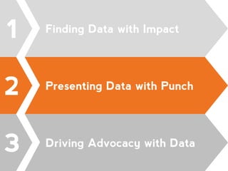
- 1. 2 Presenting Data with Punch @WCA4KIDS #NFPSUMMIT@WCA4KIDS #NFPSUMMIT 3 Driving Advocacy with Data 1 Finding Data with Impact
- 2. Presenting Data That Is: 1.ACCURATE 2.APPROACHABLE 3.APPEALING @WCA4KIDS #NFPSUMMIT
- 3. Accurate RACE AND HISPANIC OR LATINO ORIGIN Percent Margin of Error White 60.40% +/-1.7 Black or African American 13.90% +/-0.6 American Indian and Alaska Native 0.30% +/-0.3 Asian 5.00% +/-0.5 Native Hawaiian and Other Pacific Islander 0.00% +/-0.1 Some other race 15.60% +/-1.6 Two or more races 4.80% +/-1.0 Hispanic or Latino origin (of any race)29.70% +/-0.1 White alone, not Hispanic or Latino 48.10% +/-0.4 @WCA4KIDS #NFPSUMMIT
- 4. Accurate + Approachable @WCA4KIDS #NFPSUMMIT
- 5. Accurate + Approachable + Appealing @WCA4KIDS #NFPSUMMIT
- 7. What is the main point of the data? @WCA4KIDS #NFPSUMMIT
- 8. Which tells the story better? @WCA4KIDS #NFPSUMMIT
- 9. Which tells the story better? @WCA4KIDS #NFPSUMMIT
- 10. Which tells the story better? @WCA4KIDS #NFPSUMMIT
- 11. Focus on the main point. @WCA4KIDS #NFPSUMMIT
- 12. Focus on the main point. @WCA4KIDS #NFPSUMMIT
- 13. Focus on the main point. @WCA4KIDS #NFPSUMMIT
- 16. Explain the data. @WCA4KIDS #NFPSUMMIT
- 17. Explain the data. @WCA4KIDS #NFPSUMMIT
- 19. APPEALING DATA 30.60% 34.80% 34.60% Westchester County (2013), Children under 18 years by age Under 6 years 6 to 11 years 12 to 17 years @WCA4KIDS #NFPSUMMIT
- 20. Use a simple color scheme. @WCA4KIDS #NFPSUMMIT
- 21. Use a simple color scheme. @WCA4KIDS #NFPSUMMIT
- 23. Use color to support your message. @WCA4KIDS #NFPSUMMIT
- 24. Use color to support your message. @WCA4KIDS #NFPSUMMIT
- 25. Use color to support your message. @WCA4KIDS #NFPSUMMIT
- 26. Use color to support your message. @WCA4KIDS #NFPSUMMIT
- 27. Clear the clutter. @WCA4KIDS #NFPSUMMIT
- 28. Use simple (and free!) tools. •Infogr.am •Datawrapper •Piktochart •Canva @WCA4KIDS #NFPSUMMIT
- 29. Use simple (and free!) tools. @WCA4KIDS #NFPSUMMIT
- 30. Use simple (and free!) tools. @WCA4KIDS #NFPSUMMIT
- 31. Use simple (and free!) tools. @WCA4KIDS #NFPSUMMIT
- 32. Use simple (and free!) tools. @WCA4KIDS #NFPSUMMIT
- 35. Be clear and specific. @WCA4KIDS #NFPSUMMIT
- 36. Be clear and specific. @WCA4KIDS #NFPSUMMIT
- 37. Use notes when necessary. @WCA4KIDS #NFPSUMMIT
- 38. Cite your sources. @WCA4KIDS #NFPSUMMIT
- 39. Presenting Data Effectively APPROACHABLE •Focus on the main point. •Provide context. •Avoid jargon. •Explain the data. APPEALING •Use a simple color scheme. •Use color to support your message. •Clear the clutter. •Use simple (and free!) tools. ACCURATE •Be consistent. •Be clear and specific. •Use notes when necessary. •Cite your sources. @WCA4KIDS #NFPSUMMIT