SlideShare a Scribd company logo
1 of 12
Final Evaluation
Does your final product reflect your original intentions?
My original intention was to create my children’s book on an English folktale
called Stumpy’s Tail. The story included a moral, which I researched and
reviewed as being a good feature to be included in a children’s book. After
completing the planning documents required, I began creating pages for the
book. I soon realised that rotascoping and creating the images of the characters
and backgrounds would take a lot of time. I would not be able to complete the
work needed in the time frame I was given. The story involved lots of animal
characters and to rotascope them in a consistent art style would also take me a
long time. The backgrounds I would use involved lots of different countryside
scenes. I then began planning on another story I could create with characters and
scenes that I could create in the time I had.
I finally decided on an African folktale called Spider and the Honey Tree. This
story offered me more chance to show of my rotascoping skills. It only included 2
characters that I would have to create and it involved more objects such as fruit
trees. These objects would not take as long to create and gave me the chance to
add texture and extra bright colours. By using extra sessions at college and extra
time at home, I re wrote my planning documents and create new digital flat plans
for the new chosen story. On these flat plans, I showed the main character as a
person wearing a native African tribe mask. I chose to use this mask for 2
reasons. The first was that I didn’t feel I could create a drawing of the young girl
character of sufficient quality and that would fit in with the consistent art style.
The second reason was because I believed it was stereotypical African. I wanted
to include stereotypical items in my book such as this mask and African animals
as I planned for the parent to use the book as an educational book and teach
their young child about simple African culture. When I began creating my final
pages, I planned to follow the flat plans very closely. An opportunity arose for me
to have my character drawn by an illustrator friend. This is why on my final
pages, the main character (young girl) is not shown wearing a tribal mask. My
planning documents, storyboard and flat plans look slightly different to my final
pages because of getting the young girl illustrated.
These two images show the difference between the flat plan I created for page 1
(left) and my final page 1 (right). The flat plan that I created shows how I was
planning to use tribal mask for my girl character. The final page shows the final
character I created and rotascoped. I feel that my finished product is of better
quality than it would be if I followed my flat plans strictly. I like how the woman
character brings a smiley face and happy emotions to the book.
In terms of answering the initial question, my final product is very different from
my first intentions, as I did not carry on developing the Stumpy’s tail idea.
However, my final product is not majorly different from my intentions once I
started planning developing Spider and the Honey Tree. The overall art style I
intended to use has stayed the same and the skills I used were the skills I
intended to use.
How well have you constructed your images?
One of the key points of my planning document said the book I created should
use bright colours to attract and keep the attention of the child reader. I kept this
point in mind throughout the whole design progress. This point was also another
reason I chose to produce this story as there was lots of opportunities to use
bright colour on items such as the girls clothing and the fruit. I believe I have
thoroughly reached this point. I kept the clothing and jewellery on the main
character bright as where she is stood and what she is doing is important to the
story line. The colours used on the girl and the trees are a contrast to the neutral
colours used on the background. This could direct the reader’s attention away
from the background and towards the subject of the pages. The fruit is shown in
my book as being big and bright, making it more appealing and attractive like it
is to the spider.
I constructed all my images by rotascoping existing images from the Internet.
The young girl was the only image I rotascoped from an image that wasn’t from
the Internet. As I mentioned earlier, my main character (the young girl) was
illustrated by hand and I scanned the sketches and rotascoped over them.
Rotascoping was a skill that I only learnt a few months ago. To rotascope I
followed these steps:
I used the magnetic lasso tool to select the area I was planning to colour. I then
right clicked and selected Layer by Copy. This puts the selection on a new layer. I
then opened the FX panel for this layer. Next I clicked colour overlay and
selected the colour I wanted to the selection to be. I followed these steps for each
part of all the images I created for my Book.
Below is a copy of my first rotascoped image (Hulk Hogan) and one of my recent
rotascopes (The chicken).
I feel that the quality of my rotascopes have improved a lot from the first one I
created. I feel the quality of my final pages is very good, as I have gained lots of
practice and experience with the technique.
How well have you used text to anchor the image?
Before planning what image or scene was going to go each page, I split the final
script up into 10 portions. I then assigned a portion to each page. I then designed
an image for each page. This image would be a basic summary of what was said
in the text. For example, the text is talking about spider being shown the orange
tree and eating all the oranges. The image for this page showed spider running
towards the orange tree and the young girl pointing towards the tree.
While researching other children’s books available on the market, I found the
serif fonts were commonly used. I later discovered that serif founds are proven
to be easier for children and early readers to read and understand. This is from
the ‘flicks’ on the end of each letter, pointing towards the next word.
I used a font named Apple Garamond (Free on DaFont.com). This is a serif font
and I felt it was appropriate to be used for the body of the text. This font has
been rated 4 out of 5 for its ease of reading, this statistic ensured me that it was
an appropriate font for a children’s book
I feel that I have used text to anchor the images pretty well. All my text is all of
appropriate sizes and all located in one of two places. I feel that this makes my
book easy for my target age group to read.
Is your product suitable for your audience?
When I wrote my proposal, I wrote that I was planning to aim my book towards
young children (3-5) but also towards the adult buyer (25-35). Below are my
explanations of why I feel my book is suitable for the target audience.
I believe that my book is suitable for the children audience for these reasons. The
bright colours used on the front cover and throughout the book. Bright colours
are proven to attract the attention of younger children. I have included common
African animals on the front cover and during the book. These animals may be an
interest of the child or intrigue them, as animals might be something they are
learning about at their current age. The main character is shown on my front
cover as being very colourful and happy. This image might attract the child as the
young girl character portrays a warm welcoming effect. The font I have used and
the size of the font may be another feature that interests the child. It is of
appropriate ease of reading for both the parent to read to the child or the child to
attempt to read themselves. The overall length of the book is another feature
that could help with the Childs education.
The book is also suitably made for the adult parent or carer of the child. The
uniqueness of the environment, which the book is set in, may be a selling point
for the adult. The book could be used as an educational tool to introduce their
child to simple African lifestyle and basic typical African animals. The serf fonts
used ensure that the text is simple, clean and easy to read. This is another feature
than can add to the book being used as an educational feature.
While writing the proposal document for my book, I created an audience profile
for both the child and the Adult. Below are the profiles I created:
Child Profile:
Age: 3-5 Years Old
Lives: English speaking countries I.E. England or America
Sex: Male (Potential for female)
Nationality: Any
Education: Nursery/Playgroup/ Primary school
Social Class: Middle (and above)
Adult Profile
Age: 25-35 Years old
Sex: Female
Lives: English speaking country
Education: College/University
Income: £20k +
Social Class: Middle (and above)
To meet my child profile, I included these features. As I mentioned earlier in my
evaluation, I’ve aimed my book towards 3-5 years olds. During production, I
realised that the storyline could not be more orientated towards a certain gender
of child; Because of this I would list my book as a uni-Sex book. I linked the
language and the text used in my book to the ‘lives’ and ‘Education’ section of the
child profile I created. The language I used is all classed as simple English, with
no complicated African vocabulary. The simple language used is easily
understandable and easily teachable if the child doesn’t fully understand the
word. The social class I selected was linked to the thought that families in lower
classes may not have money spare to buy brand new books and toys.
To meet my adult buyer profile, I included these features. By aiming the book
towards 3-5 years olds, the book will be also aimed towards 25-35 year olds, as
the parents of 3-5 years olds will e on average between 25-35. I selected the
gender as female as it would be stereotypically the mother who spends the time
shopping and looking for new items for the child. I have selected the same social
class as I did for the child for the same reasoning as the child. The income I set
was linked to the figure that the average income of a single mother is £20k.
What do you like/dislike about the techniques you have
used?
All the graphics that I have created for my book were made using the same
graphics technique, Rotascoping. I like this technique for a few different reasons.
I like how it allows the user to add their own artistic touch to images. This could
be difficult when performing other computer graphic techniques. Another
feature that I like is how much of an effective way of vectorising images this skill
is. It allows you to create appealing graphic images with a range of different FX
options and styles. Simple changes to these FX can alter the images greatly, i.e.
adding a stroke to your selections can add a cartoon effect to the image. The
simplicity of the process of converting a still photograph to a fully rotascoped
image is another feature I like. By following the simple steps I wrote on a
previous question, anyone with basic Photoshop skills can rotascope an image. If
I needed to create a children’s book or graphic image again, I would strongly
consider using this technique.
My main dislike about rotascoping is the amount of time it creates to complete
images. Converting an image, selection by selection, becomes very time
consuming when you have multiple characters, assets and scenes to create. The
only other thing I dislike about rotascoping is how precise you have to make
your selections. When you first remove the background layer, white gaps will
appear where layers do not overlap.
Overall, I’m impressed with the quality of my final images and book pages.
However, compared with pages from a children’s book currently on the market
such as The Gruffalo by Julia Donaldson, The overall image quality does not look
as professional. If I were to create a children’s book, I would spend time
researching and practising other illustration techniques. Below is a selection
of my rotascopes.
What do you like/dislike about how your final product
looks?
As I mentioned on the previous question, I’m pleased with the quality of my final
images. I feel they are bright, colourful and suitable for a children’s book. I
believe rotascoping all the images was the most effective way of creating my
book. Other techniques such as shape merging would have taken a lot more time
to create the scenes.
If I had the chance to re-create my book, the main thing I would change would be
the consistency of the art style. On some pages, there is a big difference between
the art style of the young girl, spider and the background. This would be because
an illustrator created the young girl; spider was created by me and the
background were exact rotascoped copies of the real photographed landscapes.
To ensure the art style is consistent, I would have all three assets created by the
same person, in their own art style.
Why did you include the content you used?
Images
While I was researching folktales of different cultures on the Internet, I set strict
criteria that the story would have to meet in order to be considered for my
children’s book. The main criteria was that the book, must include minimal
characters. Spider and the Honey Tree only includes 2 characters, meaning it met
the criteria. The images I have created reflect this simple story line. Keeping
minimal characters and simple story lines prevent causing confusion to the child
reader. I feel that my story meets the criteria.
I have kept the backgrounds basic and used mostly neutral colours. These
backgrounds are in contrast to the bright coloured fruit and main characters. The
backgrounds are simple but still easily recognisable. As I have mentioned before,
by keeping the backgrounds neutral and simple, and keeping the characters
bright and colourful, the child’s attention will be directed to the characters.
When I first started developing my story, I planned to use an African tribal mask
on a silhouette body. I later realised that this character may be frightening to the
younger children in my target audience. I then spoke with an illustrator and
together we created the young girl character that can be seen in my final book.
By using a smiley human figure prevents the child audience from being
frightened of the characters.
Fonts
I spent time researching children’s books currently available on the market. I
noticed a few reoccurring features. One of these features was the use of serif
fonts. All 4 of the popular children’s books I researched used serif fonts. I
researched the use of serif fonts in more detail. I discovered that serif fonts have
been proven to be easier to read than sans serif fonts. To
the right is an example of serif and sans serif fonts. I
realised that it would be essential for me to use a serif
font in my book.
I found a font called Apple Garamond online. It is a free
for commercial use serif font. On various websites, it was
been voted easy to read. It is cost effective as it is free to
download for both personal and commercial use. I decided that it would be an
appropriate font to use for the body text of my book. I then had to decide the
placement of the text on each page. I first attempted creating full-page images
with the text incorporated into the image. I realised that this made the text
difficult to read. I finally settled on having a designated text area on each page.
Black text on a white background is the perfect contrast and gives great ease of
reading.
Effects
Rotascoping images is an effective method of illustration for a few
reasons. The main reason being the amount of FX effects you can
apply to a rotascoped selection. To the right is an example of all the
different effects that can be used. The colour overlay selection is the
FX effect used to rotascope images. The main effect besides colour
overlay that I used was stroke. This effect gives you a small thin
2px line around the selection you have rotascoped. Stroke
can be used in two different ways. To outline/separate
and to define edges. To use stroke to outline selections,
I added a black coloured stroke of 2px width. There is an
example of this to the left.
To use stroke to define edges, I used a few slightly different steps. I
added a stroke with a width of 2px. I then changed the colour of the
stroke to a colour a few shades lighter than the colour of the
selection I have rotascoped. There is an example of this to the left.
Colour
The conversation of the colour I was to use arose several times in my proposal
and planning documents. After researching other children’s books and what
makes a good children’s book, I knew using the correct colour combinations and
contrasts was essential. I knew that I needed to make my characters bright
coloured and eye-catching whilst making the background more neutral colours.
However, when I was choosing these neutral colours, I had to ensure that the
colours were not to dull as a dull book would not attract and keep the child’s
attention. I feel that I have used the most appropriate colours for my book and
that I would be ‘attention grabbing’.
What signs, symbols or codes have you used n your
work?
The book I have created only has two characters, the young girl and spider. As I
have previously spoken about, I was planning on using an African tribal mask on
a silhouette body as my young girl character. I planned to do as I thought it was
spark interest in African culture for the child. I later decided that the younger
children in my target audience might see this figure as frightening. I then create
the humble happy young girl character, which can be seen in my final book. I felt
that this character would be more calming and would appeal to the younger
children more. Most of the children’s books that I research aimed at the same
age group were happy themed and not made with the intention of scaring
children. I believe that the change in design of the original young girl character
and the final character I used shows a deeper thought into meanings of my work.
Another aspect of my book that I had to design with the aim of not being
frightening to children was my other character, Spider. Spiders are a very
common fear amongst not only young children but also all age groups. I knew
that during my planning processes I needed to ensure my spider character was a
friendly face than a real spider. I researched a few children’s books currently on
the market that had spider characters, to see how they portrayed this character.
Simple stereotypical spiders were used and I decided that it would be
appropriate to use a spider like this in my book. I settled for the simple oval
body, 6 straight legs and two friendly simple eyes. The thought processes of this
character are linked to the previous paragraph in the fact that most children’s
books aimed at my target age group are generally happy themed and not
intended to scare children.
The locations that my book was set in are another factor, which could be
designed in such a way that could scare a child. The deep African bushes are
filled with lots of animals and bugs that could scare and frighten. I decided to not
include these extra details and make the background scenery neutral and plain
while ensuring that it is not gloomy.
What representations can be found in your work?
When I first started planning my children’s book, I had to choose a story or
folktale, which I would re-create. I decided on an English folktale called stumpy’s
tail. It was set on a very stereotypical English farm. I thought this setting would
be appropriate for the young audience as it was a setting that they would be
more used to than settings used in other books. I finally decided that I would
choose a story set in a completely different culture and setting to Stumpy’s tail. I
then decided on an African tribe folktale called Spider and the Honey Tree. I felt
that this would be a good story to cover as it was set in a culture that the children
in my target audience may not have learnt much about before. I felt that the
inquisitive urge this gave the child would help with the appeal of the book to the
child and parent. I also thought that the book would be appropriate as it gave me
chances to show aspects of the African culture without over complicating it and
causing confusion. I feel that this story does show representations of different
cultures and races without being bias or over complicated.
As my book only involves two characters, I wasn’t presented with the chance to
include different representations of both genders. The only gender covered is
female, as my main character is female. I have created my young girl character to
be inviting to young children. The only negative point I would connect with my
main character would by the small level of over-sexualisation. During personal
reflection on my work, I became aware of the character that could be considered
to over-sexualise for a children’s book. I can only link this to the illustrator’s own
artistic style. If the book was to go on mass production and sale, this over-
sexualisation could possibly affect sales.
What style have you employed in your products?
During the process of researching existing previous children’s books, I was also
research and practicing various digital illustration techniques. A more detailed
breakdown of these techniques can be soon on my blog on the Digital Graphic
Narrative document. I decided that rotascoping the images
needed for my book would be an effective and appealing
technique to use. Whilst pursuing practice in rotascoping, I
started to develop my own distinctive style. This style was too
pick out small individual selections of the original image and colour
them. This gave an effect of the image being built up from many small
coloured selections. This style also gave a visual texture to the images.
An example of my rotascoping style can be seen to the right.
I have previously discussed the point of my work not having a consistent art
style in this evaluation document. I feel like this in-consistency has affected the
overall professional look of my book. This in-consistently has been caused by the
3 main assets of my book being created by 2 different people with different art
styles. If I was given the chance to re-create my book, I would ensure that I
worked closely with the illustrator to ensure that the art styles match from asset
to asset.
What were the strengths and weaknesses of the pre-
production and planning?
During this project, I have spent a large majority of my time completing pre-
production and planning documents and tasks. It is common known knowledge
that behind every successful project, there is a lot of planning involved. The
planning process that I carried out was broken down in multiple smaller steps.
These steps allowed me to manage my time much more effectively. Below I will
explain the steps I followed to complete the pre-production and planning
process.
The very first task I completed was an investigation into different illustration
techniques. The final aim of this step was to choose an adequate technique that
would give me good looking final images. I practiced four different techniques in
total. These were: Shape merging, Rotascoping, Comic Book effect and hand
drawn illustration. I created practice images for each of these techniques. I then
reviewed the quality and decided if they would be appropriate for the images in
my children’s book. In terms of time management, I created all these images in
one day and did not have to use any more extra or spare time to complete this
stage. These practices can be seen on my blog on the Development Pro-Forma
document.
The next step I completed was researching existing children’s books currently on
the market. I was given access to a collection of children’s books aimed roughly
at the same target audience age I was intending to aim my book at. The three
books I researched were: Is there enough room on the bus? By Helen Piers, Hairy
Maclary’s rumpus at the vets by Lynley Dodd and The Gruffalo by Julia
Donaldson. While researching these books, I was looking for reoccurring features
such as colours used, fonts and language used. I began to notice trends such as
the use of serif fonts. I noted these down, as I knew they were essential when
designing and developing a children’s book.
Next, I created an idea generation mindmap. On this mindmap, I considered the
different possibilities of aspects such as different types of stories, layouts, types
of fonts and specification. By considering these techniques in a mindmap, I was
able to review multiple options for each element. This mindmap can also be seen
on my development Pro-Forma. The next pre-production task I completed was
creating moodboards of inspiration and my final chosen idea. I decided that I
would create a folktale book from either English or African Cultures. I collected a
collection of screenshots from currently available books from both cultures. I
also collected some screenshots of current best-selling children’s books. I
compared the graphics of these screenshots to the graphics, which I expected my
final graphics to look like.
For the next stage, I decided on the folktale I was going to develop. It was an
African Folktale called Spider and the Honey Tree. I then conducted a more in-
depth moodboards of aspects I would include when developing my final pages.
These moodboards included font, settings and characters. These moodboards
gave me a better understanding of what my characters and final pages were
going to look like.
Next, I developed my proposal document. In this document, I detailed certain
elements that I was intending to create my book to fit. These included page sizes,
export formats, target audience and production methods. This allowed me to
clearly understand the technical specifications of my book. By completing the
target audience section, I was able to ensure that other aspect of my book were
suitable for the target age group. Next, I received peer feedback on my proposed
ideas. This feedback allowed me to re-plan parts of my ideas that the feedback
didn’t think was totally appropriate for children’s books. The feedback also gave
me suggestions of other elements I could include.
Overall, I feel that my pre-production and planning process generally was
successful. I feel that the level of planning I carried out was reflected in my final
pages. The only criticism I would give would be about changing the design of my
young girl character. I should have realised during the planning process that
using a tribal mask and silhouette combination may frighten the younger
children in my target age group.
Historical and cultural context
Currently on the market, there is a large collection of children’s stories set in
African environments. Books set in this culture give writers and illustrator’s lots
of chance to include elements that would interest young audiences; these
elements include tropical, colourful settings and exotic animals. Below I will
compare my book, Spider and the Honey Tree, to the current bestselling
children’s book set in an African culture, Beatrice’s Goat by Page McBrier.
Beatrice’s Goat is a true story about a girl who wants to go to school but cannot
afford it. She is given a goat by a merchant and manages to use to the goat to
raise enough money to be able to afford school. This book holds similarity to my
books there is two main characters, A young girl and an animal. This book also
has a target audience age group of 4+
Upon looking inside this book, the layout of the book is considerably different to
my book.. The screenshot at the beginning of the next page shows this. The book
is laid out in one page text, one page illustration format. The pages in this book
have a considerable amount more text per page than in my book. Having more
text per page in this book would work well as this book has bigger dimensions
than my book. This would mean, although there is a large section of text, the font
size will be large and easy to read.
The illustrator’s artistic style is different to the art style I used. When creating
my images, I found exiting photographs on the Internet and rotascoped over
them. This meant that most elements of my final pages didn’t match art style as
the original photographs were taken in the same locations and in the same
photographic style. The illustrator of Beatrice’s Goat has created the images by
hand illustrating them and digitally vectored them. This has created a unique art
style for the book.

More Related Content

What's hot

Digital graphics evaluation pro forma
Digital graphics evaluation pro formaDigital graphics evaluation pro forma
Digital graphics evaluation pro formaJacob Cooper
 
Development pro forma
Development pro formaDevelopment pro forma
Development pro formajeny_green
 
Development pro forma
Development pro forma Development pro forma
Development pro forma jeny_green
 
Evaluation Pro Forma
Evaluation Pro FormaEvaluation Pro Forma
Evaluation Pro FormaEthanPayne
 
Development pro forma(3)
Development pro forma(3)Development pro forma(3)
Development pro forma(3)EPAYNE52
 
Digital graphics evaluation pro forma
Digital graphics evaluation pro formaDigital graphics evaluation pro forma
Digital graphics evaluation pro formaEmily Shaw
 
Digital graphics evaluation pro forma
Digital graphics evaluation pro formaDigital graphics evaluation pro forma
Digital graphics evaluation pro formaEmily Shaw
 
Digital graphics evaluation pro forma
Digital graphics evaluation pro formaDigital graphics evaluation pro forma
Digital graphics evaluation pro formaEmily Shaw
 
Development pro forma(3)
Development pro forma(3)Development pro forma(3)
Development pro forma(3)EthanPayne
 
Digital graphics evaluation pro forma
Digital graphics evaluation pro formaDigital graphics evaluation pro forma
Digital graphics evaluation pro formaHarry Williams
 
Development pro forma(3)
Development pro forma(3)Development pro forma(3)
Development pro forma(3)Richard Acaster
 
Digital graphics evaluation pro forma
Digital graphics evaluation pro formaDigital graphics evaluation pro forma
Digital graphics evaluation pro formalaurenthunderchild
 
Digital Graphics Evaluation
Digital Graphics EvaluationDigital Graphics Evaluation
Digital Graphics Evaluationjessstanton17
 
Digital graphics evaluation pro forma
Digital graphics evaluation pro formaDigital graphics evaluation pro forma
Digital graphics evaluation pro formaARealJackdaw
 
Digital Graphics Evaluation Pro Forma
Digital Graphics Evaluation Pro FormaDigital Graphics Evaluation Pro Forma
Digital Graphics Evaluation Pro Formajames-ellis1
 

What's hot (18)

Story book evaluation
Story book evaluationStory book evaluation
Story book evaluation
 
Digital graphics evaluation pro forma
Digital graphics evaluation pro formaDigital graphics evaluation pro forma
Digital graphics evaluation pro forma
 
Development pro forma
Development pro formaDevelopment pro forma
Development pro forma
 
Development pro forma
Development pro forma Development pro forma
Development pro forma
 
Evaluation Pro Forma
Evaluation Pro FormaEvaluation Pro Forma
Evaluation Pro Forma
 
Evalutaion
EvalutaionEvalutaion
Evalutaion
 
Development pro forma(3)
Development pro forma(3)Development pro forma(3)
Development pro forma(3)
 
Digital graphics evaluation pro forma
Digital graphics evaluation pro formaDigital graphics evaluation pro forma
Digital graphics evaluation pro forma
 
Digital graphics evaluation pro forma
Digital graphics evaluation pro formaDigital graphics evaluation pro forma
Digital graphics evaluation pro forma
 
Digital graphics evaluation pro forma
Digital graphics evaluation pro formaDigital graphics evaluation pro forma
Digital graphics evaluation pro forma
 
Development pro forma(3)
Development pro forma(3)Development pro forma(3)
Development pro forma(3)
 
Digital graphics evaluation pro forma
Digital graphics evaluation pro formaDigital graphics evaluation pro forma
Digital graphics evaluation pro forma
 
Development pro forma(3)
Development pro forma(3)Development pro forma(3)
Development pro forma(3)
 
Digital graphics evaluation pro forma
Digital graphics evaluation pro formaDigital graphics evaluation pro forma
Digital graphics evaluation pro forma
 
Digital Graphics Evaluation
Digital Graphics EvaluationDigital Graphics Evaluation
Digital Graphics Evaluation
 
Digital graphics evaluation pro forma
Digital graphics evaluation pro formaDigital graphics evaluation pro forma
Digital graphics evaluation pro forma
 
Digital Graphics Evaluation Pro Forma
Digital Graphics Evaluation Pro FormaDigital Graphics Evaluation Pro Forma
Digital Graphics Evaluation Pro Forma
 
Presentation1
Presentation1Presentation1
Presentation1
 

Similar to Tom Brown Final evaluation

Digital graphics evaluation
Digital graphics evaluationDigital graphics evaluation
Digital graphics evaluationLibby-Wright1
 
Evaluation of Children's book pro forma - personal reflection
Evaluation of Children's book pro forma - personal reflectionEvaluation of Children's book pro forma - personal reflection
Evaluation of Children's book pro forma - personal reflectionEllie Marsh
 
Digital graphics evaluation pro forma (1)
Digital graphics evaluation pro forma (1)Digital graphics evaluation pro forma (1)
Digital graphics evaluation pro forma (1)Sian England
 
Digital graphics evaluation pro forma
Digital graphics evaluation pro formaDigital graphics evaluation pro forma
Digital graphics evaluation pro formaJoeHeadford
 
Digital graphics evaluation pro forma
Digital graphics evaluation pro formaDigital graphics evaluation pro forma
Digital graphics evaluation pro formaRobert Smith
 
Digital graphics evaluation pro forma
Digital graphics evaluation pro formaDigital graphics evaluation pro forma
Digital graphics evaluation pro formaRobert Smith
 
Digital graphics evaluation pro forma james horbury
Digital graphics evaluation pro forma james horbury Digital graphics evaluation pro forma james horbury
Digital graphics evaluation pro forma james horbury james horbury
 
Digital graphics evaluation pro forma
Digital graphics evaluation pro formaDigital graphics evaluation pro forma
Digital graphics evaluation pro formaBailey Mardon-Mowbray
 
Digital graphics evaluation pro forma
Digital graphics evaluation pro forma Digital graphics evaluation pro forma
Digital graphics evaluation pro forma Nicholas Aldous
 
Digital graphics evaluation pro forma
Digital graphics evaluation pro formaDigital graphics evaluation pro forma
Digital graphics evaluation pro formaNicholas Aldous
 
Digital graphics evaluation pro forma
Digital graphics evaluation pro formaDigital graphics evaluation pro forma
Digital graphics evaluation pro formaJamie Ellis
 
Digital graphics evaluation pro forma
Digital graphics evaluation pro formaDigital graphics evaluation pro forma
Digital graphics evaluation pro formaNatalie-Lynch
 
Digital Graphics Evaluation Pro Forma
Digital Graphics Evaluation Pro FormaDigital Graphics Evaluation Pro Forma
Digital Graphics Evaluation Pro FormaNicholas Aldous
 
Digital graphics evaluation pro forma
Digital graphics evaluation pro formaDigital graphics evaluation pro forma
Digital graphics evaluation pro formataygage
 
Dg evaluation pro forma
Dg evaluation pro formaDg evaluation pro forma
Dg evaluation pro formaEllieDawson
 
Digital graphics evaluation pro forma
Digital graphics evaluation pro formaDigital graphics evaluation pro forma
Digital graphics evaluation pro formaOlliePull
 
Tom Brown Development pro forma
Tom Brown Development pro formaTom Brown Development pro forma
Tom Brown Development pro formaTom Brown
 
Digital graphics evaluation pro forma
Digital graphics evaluation pro formaDigital graphics evaluation pro forma
Digital graphics evaluation pro formaENCRES DUBUIT
 
Digital graphics evaluation pro forma
Digital graphics evaluation pro formaDigital graphics evaluation pro forma
Digital graphics evaluation pro formaaa12134455
 

Similar to Tom Brown Final evaluation (20)

Digital graphics evaluation
Digital graphics evaluationDigital graphics evaluation
Digital graphics evaluation
 
Evaluation of Children's book pro forma - personal reflection
Evaluation of Children's book pro forma - personal reflectionEvaluation of Children's book pro forma - personal reflection
Evaluation of Children's book pro forma - personal reflection
 
Digital graphics evaluation pro forma (1)
Digital graphics evaluation pro forma (1)Digital graphics evaluation pro forma (1)
Digital graphics evaluation pro forma (1)
 
Digital graphics evaluation pro forma
Digital graphics evaluation pro formaDigital graphics evaluation pro forma
Digital graphics evaluation pro forma
 
Digital graphics evaluation pro forma
Digital graphics evaluation pro formaDigital graphics evaluation pro forma
Digital graphics evaluation pro forma
 
Digital graphics evaluation pro forma
Digital graphics evaluation pro formaDigital graphics evaluation pro forma
Digital graphics evaluation pro forma
 
Digital graphics evaluation pro forma james horbury
Digital graphics evaluation pro forma james horbury Digital graphics evaluation pro forma james horbury
Digital graphics evaluation pro forma james horbury
 
Digital graphics evaluation pro forma
Digital graphics evaluation pro formaDigital graphics evaluation pro forma
Digital graphics evaluation pro forma
 
Digital graphics evaluation pro forma
Digital graphics evaluation pro forma Digital graphics evaluation pro forma
Digital graphics evaluation pro forma
 
Digital graphics evaluation pro forma
Digital graphics evaluation pro formaDigital graphics evaluation pro forma
Digital graphics evaluation pro forma
 
Digital graphics evaluation pro forma
Digital graphics evaluation pro formaDigital graphics evaluation pro forma
Digital graphics evaluation pro forma
 
Digital graphics evaluation pro forma
Digital graphics evaluation pro formaDigital graphics evaluation pro forma
Digital graphics evaluation pro forma
 
Digital Graphics Evaluation Pro Forma
Digital Graphics Evaluation Pro FormaDigital Graphics Evaluation Pro Forma
Digital Graphics Evaluation Pro Forma
 
Digital graphics evaluation pro forma
Digital graphics evaluation pro formaDigital graphics evaluation pro forma
Digital graphics evaluation pro forma
 
Dg evaluation pro forma
Dg evaluation pro formaDg evaluation pro forma
Dg evaluation pro forma
 
Digital graphics evaluation pro forma
Digital graphics evaluation pro formaDigital graphics evaluation pro forma
Digital graphics evaluation pro forma
 
Tom Brown Development pro forma
Tom Brown Development pro formaTom Brown Development pro forma
Tom Brown Development pro forma
 
Digital graphics evaluation pro forma
Digital graphics evaluation pro formaDigital graphics evaluation pro forma
Digital graphics evaluation pro forma
 
Digital graphics evaluation pro forma
Digital graphics evaluation pro formaDigital graphics evaluation pro forma
Digital graphics evaluation pro forma
 
Childrens books
Childrens booksChildrens books
Childrens books
 

Recently uploaded

(9711106444 )🫦#Sexy Desi Call Girls Noida Sector 4 Escorts Service Delhi 🫶
(9711106444 )🫦#Sexy Desi Call Girls Noida Sector 4 Escorts Service Delhi 🫶(9711106444 )🫦#Sexy Desi Call Girls Noida Sector 4 Escorts Service Delhi 🫶
(9711106444 )🫦#Sexy Desi Call Girls Noida Sector 4 Escorts Service Delhi 🫶delhimunirka444
 
Young⚡Call Girls in Tughlakabad Delhi >༒9667401043 Escort Service
Young⚡Call Girls in Tughlakabad Delhi >༒9667401043 Escort ServiceYoung⚡Call Girls in Tughlakabad Delhi >༒9667401043 Escort Service
Young⚡Call Girls in Tughlakabad Delhi >༒9667401043 Escort Servicesonnydelhi1992
 
Young⚡Call Girls in Uttam Nagar Delhi >༒9667401043 Escort Service
Young⚡Call Girls in Uttam Nagar Delhi >༒9667401043 Escort ServiceYoung⚡Call Girls in Uttam Nagar Delhi >༒9667401043 Escort Service
Young⚡Call Girls in Uttam Nagar Delhi >༒9667401043 Escort Servicesonnydelhi1992
 
FULL NIGHT — 9999894380 Call Girls In Paschim Vihar | Delhi
FULL NIGHT — 9999894380 Call Girls In  Paschim Vihar | DelhiFULL NIGHT — 9999894380 Call Girls In  Paschim Vihar | Delhi
FULL NIGHT — 9999894380 Call Girls In Paschim Vihar | DelhiSaketCallGirlsCallUs
 
FULL NIGHT — 9999894380 Call Girls In Dwarka Mor | Delhi
FULL NIGHT — 9999894380 Call Girls In Dwarka Mor | DelhiFULL NIGHT — 9999894380 Call Girls In Dwarka Mor | Delhi
FULL NIGHT — 9999894380 Call Girls In Dwarka Mor | DelhiSaketCallGirlsCallUs
 
Akbar Religious Policy and Sufism comparison.pptx
Akbar Religious Policy and Sufism comparison.pptxAkbar Religious Policy and Sufism comparison.pptx
Akbar Religious Policy and Sufism comparison.pptxAmita Gupta
 
Authentic # 00971556872006 # Hot Call Girls Service in Dubai By International...
Authentic # 00971556872006 # Hot Call Girls Service in Dubai By International...Authentic # 00971556872006 # Hot Call Girls Service in Dubai By International...
Authentic # 00971556872006 # Hot Call Girls Service in Dubai By International...home
 
Verified # 971581275265 # Indian Call Girls In Deira By International City Ca...
Verified # 971581275265 # Indian Call Girls In Deira By International City Ca...Verified # 971581275265 # Indian Call Girls In Deira By International City Ca...
Verified # 971581275265 # Indian Call Girls In Deira By International City Ca...home
 
❤Personal Whatsapp Srinagar Srinagar Call Girls 8617697112 💦✅.
❤Personal Whatsapp Srinagar Srinagar Call Girls 8617697112 💦✅.❤Personal Whatsapp Srinagar Srinagar Call Girls 8617697112 💦✅.
❤Personal Whatsapp Srinagar Srinagar Call Girls 8617697112 💦✅.Nitya salvi
 
FULL NIGHT — 9999894380 Call Girls In Mahipalpur | Delhi
FULL NIGHT — 9999894380 Call Girls In Mahipalpur | DelhiFULL NIGHT — 9999894380 Call Girls In Mahipalpur | Delhi
FULL NIGHT — 9999894380 Call Girls In Mahipalpur | DelhiSaketCallGirlsCallUs
 
FULL NIGHT — 9999894380 Call Girls In Shivaji Enclave | Delhi
FULL NIGHT — 9999894380 Call Girls In Shivaji Enclave | DelhiFULL NIGHT — 9999894380 Call Girls In Shivaji Enclave | Delhi
FULL NIGHT — 9999894380 Call Girls In Shivaji Enclave | DelhiSaketCallGirlsCallUs
 
GENUINE EscoRtS,Call Girls IN South Delhi Locanto TM''| +91-8377087607
GENUINE EscoRtS,Call Girls IN South Delhi Locanto TM''| +91-8377087607GENUINE EscoRtS,Call Girls IN South Delhi Locanto TM''| +91-8377087607
GENUINE EscoRtS,Call Girls IN South Delhi Locanto TM''| +91-8377087607dollysharma2066
 
AaliyahBell_themist_v01.pdf .
AaliyahBell_themist_v01.pdf             .AaliyahBell_themist_v01.pdf             .
AaliyahBell_themist_v01.pdf .AaliyahB2
 

Recently uploaded (20)

(9711106444 )🫦#Sexy Desi Call Girls Noida Sector 4 Escorts Service Delhi 🫶
(9711106444 )🫦#Sexy Desi Call Girls Noida Sector 4 Escorts Service Delhi 🫶(9711106444 )🫦#Sexy Desi Call Girls Noida Sector 4 Escorts Service Delhi 🫶
(9711106444 )🫦#Sexy Desi Call Girls Noida Sector 4 Escorts Service Delhi 🫶
 
Young⚡Call Girls in Tughlakabad Delhi >༒9667401043 Escort Service
Young⚡Call Girls in Tughlakabad Delhi >༒9667401043 Escort ServiceYoung⚡Call Girls in Tughlakabad Delhi >༒9667401043 Escort Service
Young⚡Call Girls in Tughlakabad Delhi >༒9667401043 Escort Service
 
(INDIRA) Call Girl Jammu Call Now 8617697112 Jammu Escorts 24x7
(INDIRA) Call Girl Jammu Call Now 8617697112 Jammu Escorts 24x7(INDIRA) Call Girl Jammu Call Now 8617697112 Jammu Escorts 24x7
(INDIRA) Call Girl Jammu Call Now 8617697112 Jammu Escorts 24x7
 
Young⚡Call Girls in Uttam Nagar Delhi >༒9667401043 Escort Service
Young⚡Call Girls in Uttam Nagar Delhi >༒9667401043 Escort ServiceYoung⚡Call Girls in Uttam Nagar Delhi >༒9667401043 Escort Service
Young⚡Call Girls in Uttam Nagar Delhi >༒9667401043 Escort Service
 
Dubai Call Girl Number # 0522916705 # Call Girl Number In Dubai # (UAE)
Dubai Call Girl Number # 0522916705 # Call Girl Number In Dubai # (UAE)Dubai Call Girl Number # 0522916705 # Call Girl Number In Dubai # (UAE)
Dubai Call Girl Number # 0522916705 # Call Girl Number In Dubai # (UAE)
 
FULL NIGHT — 9999894380 Call Girls In Paschim Vihar | Delhi
FULL NIGHT — 9999894380 Call Girls In  Paschim Vihar | DelhiFULL NIGHT — 9999894380 Call Girls In  Paschim Vihar | Delhi
FULL NIGHT — 9999894380 Call Girls In Paschim Vihar | Delhi
 
UAE Call Girls # 0528675665 # Independent Call Girls In Dubai ~ (UAE)
UAE Call Girls # 0528675665 # Independent Call Girls In Dubai ~ (UAE)UAE Call Girls # 0528675665 # Independent Call Girls In Dubai ~ (UAE)
UAE Call Girls # 0528675665 # Independent Call Girls In Dubai ~ (UAE)
 
(NEHA) Call Girls Mumbai Call Now 8250077686 Mumbai Escorts 24x7
(NEHA) Call Girls Mumbai Call Now 8250077686 Mumbai Escorts 24x7(NEHA) Call Girls Mumbai Call Now 8250077686 Mumbai Escorts 24x7
(NEHA) Call Girls Mumbai Call Now 8250077686 Mumbai Escorts 24x7
 
Deira Call Girls # 0588312479 # Call Girls In Deira Dubai ~ (UAE)
Deira Call Girls # 0588312479 # Call Girls In Deira Dubai ~ (UAE)Deira Call Girls # 0588312479 # Call Girls In Deira Dubai ~ (UAE)
Deira Call Girls # 0588312479 # Call Girls In Deira Dubai ~ (UAE)
 
FULL NIGHT — 9999894380 Call Girls In Dwarka Mor | Delhi
FULL NIGHT — 9999894380 Call Girls In Dwarka Mor | DelhiFULL NIGHT — 9999894380 Call Girls In Dwarka Mor | Delhi
FULL NIGHT — 9999894380 Call Girls In Dwarka Mor | Delhi
 
Akbar Religious Policy and Sufism comparison.pptx
Akbar Religious Policy and Sufism comparison.pptxAkbar Religious Policy and Sufism comparison.pptx
Akbar Religious Policy and Sufism comparison.pptx
 
Authentic # 00971556872006 # Hot Call Girls Service in Dubai By International...
Authentic # 00971556872006 # Hot Call Girls Service in Dubai By International...Authentic # 00971556872006 # Hot Call Girls Service in Dubai By International...
Authentic # 00971556872006 # Hot Call Girls Service in Dubai By International...
 
Verified # 971581275265 # Indian Call Girls In Deira By International City Ca...
Verified # 971581275265 # Indian Call Girls In Deira By International City Ca...Verified # 971581275265 # Indian Call Girls In Deira By International City Ca...
Verified # 971581275265 # Indian Call Girls In Deira By International City Ca...
 
Dubai Call Girls Service # +971588046679 # Call Girls Service In Dubai # (UAE)
Dubai Call Girls Service # +971588046679 # Call Girls Service In Dubai # (UAE)Dubai Call Girls Service # +971588046679 # Call Girls Service In Dubai # (UAE)
Dubai Call Girls Service # +971588046679 # Call Girls Service In Dubai # (UAE)
 
❤Personal Whatsapp Srinagar Srinagar Call Girls 8617697112 💦✅.
❤Personal Whatsapp Srinagar Srinagar Call Girls 8617697112 💦✅.❤Personal Whatsapp Srinagar Srinagar Call Girls 8617697112 💦✅.
❤Personal Whatsapp Srinagar Srinagar Call Girls 8617697112 💦✅.
 
FULL NIGHT — 9999894380 Call Girls In Mahipalpur | Delhi
FULL NIGHT — 9999894380 Call Girls In Mahipalpur | DelhiFULL NIGHT — 9999894380 Call Girls In Mahipalpur | Delhi
FULL NIGHT — 9999894380 Call Girls In Mahipalpur | Delhi
 
FULL NIGHT — 9999894380 Call Girls In Shivaji Enclave | Delhi
FULL NIGHT — 9999894380 Call Girls In Shivaji Enclave | DelhiFULL NIGHT — 9999894380 Call Girls In Shivaji Enclave | Delhi
FULL NIGHT — 9999894380 Call Girls In Shivaji Enclave | Delhi
 
GENUINE EscoRtS,Call Girls IN South Delhi Locanto TM''| +91-8377087607
GENUINE EscoRtS,Call Girls IN South Delhi Locanto TM''| +91-8377087607GENUINE EscoRtS,Call Girls IN South Delhi Locanto TM''| +91-8377087607
GENUINE EscoRtS,Call Girls IN South Delhi Locanto TM''| +91-8377087607
 
AaliyahBell_themist_v01.pdf .
AaliyahBell_themist_v01.pdf             .AaliyahBell_themist_v01.pdf             .
AaliyahBell_themist_v01.pdf .
 
UAE Call Girls # 971526940039 # Independent Call Girls In Dubai # (UAE)
UAE Call Girls # 971526940039 # Independent Call Girls In Dubai # (UAE)UAE Call Girls # 971526940039 # Independent Call Girls In Dubai # (UAE)
UAE Call Girls # 971526940039 # Independent Call Girls In Dubai # (UAE)
 

Tom Brown Final evaluation

  • 1. Final Evaluation Does your final product reflect your original intentions? My original intention was to create my children’s book on an English folktale called Stumpy’s Tail. The story included a moral, which I researched and reviewed as being a good feature to be included in a children’s book. After completing the planning documents required, I began creating pages for the book. I soon realised that rotascoping and creating the images of the characters and backgrounds would take a lot of time. I would not be able to complete the work needed in the time frame I was given. The story involved lots of animal characters and to rotascope them in a consistent art style would also take me a long time. The backgrounds I would use involved lots of different countryside scenes. I then began planning on another story I could create with characters and scenes that I could create in the time I had. I finally decided on an African folktale called Spider and the Honey Tree. This story offered me more chance to show of my rotascoping skills. It only included 2 characters that I would have to create and it involved more objects such as fruit trees. These objects would not take as long to create and gave me the chance to add texture and extra bright colours. By using extra sessions at college and extra time at home, I re wrote my planning documents and create new digital flat plans for the new chosen story. On these flat plans, I showed the main character as a person wearing a native African tribe mask. I chose to use this mask for 2 reasons. The first was that I didn’t feel I could create a drawing of the young girl character of sufficient quality and that would fit in with the consistent art style. The second reason was because I believed it was stereotypical African. I wanted to include stereotypical items in my book such as this mask and African animals as I planned for the parent to use the book as an educational book and teach their young child about simple African culture. When I began creating my final pages, I planned to follow the flat plans very closely. An opportunity arose for me to have my character drawn by an illustrator friend. This is why on my final pages, the main character (young girl) is not shown wearing a tribal mask. My planning documents, storyboard and flat plans look slightly different to my final pages because of getting the young girl illustrated.
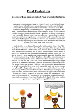
  • 2. These two images show the difference between the flat plan I created for page 1 (left) and my final page 1 (right). The flat plan that I created shows how I was planning to use tribal mask for my girl character. The final page shows the final character I created and rotascoped. I feel that my finished product is of better quality than it would be if I followed my flat plans strictly. I like how the woman character brings a smiley face and happy emotions to the book. In terms of answering the initial question, my final product is very different from my first intentions, as I did not carry on developing the Stumpy’s tail idea. However, my final product is not majorly different from my intentions once I started planning developing Spider and the Honey Tree. The overall art style I intended to use has stayed the same and the skills I used were the skills I intended to use. How well have you constructed your images? One of the key points of my planning document said the book I created should use bright colours to attract and keep the attention of the child reader. I kept this point in mind throughout the whole design progress. This point was also another reason I chose to produce this story as there was lots of opportunities to use bright colour on items such as the girls clothing and the fruit. I believe I have thoroughly reached this point. I kept the clothing and jewellery on the main character bright as where she is stood and what she is doing is important to the story line. The colours used on the girl and the trees are a contrast to the neutral colours used on the background. This could direct the reader’s attention away from the background and towards the subject of the pages. The fruit is shown in my book as being big and bright, making it more appealing and attractive like it is to the spider. I constructed all my images by rotascoping existing images from the Internet. The young girl was the only image I rotascoped from an image that wasn’t from the Internet. As I mentioned earlier, my main character (the young girl) was illustrated by hand and I scanned the sketches and rotascoped over them. Rotascoping was a skill that I only learnt a few months ago. To rotascope I followed these steps: I used the magnetic lasso tool to select the area I was planning to colour. I then right clicked and selected Layer by Copy. This puts the selection on a new layer. I then opened the FX panel for this layer. Next I clicked colour overlay and selected the colour I wanted to the selection to be. I followed these steps for each part of all the images I created for my Book. Below is a copy of my first rotascoped image (Hulk Hogan) and one of my recent rotascopes (The chicken).
  • 3. I feel that the quality of my rotascopes have improved a lot from the first one I created. I feel the quality of my final pages is very good, as I have gained lots of practice and experience with the technique. How well have you used text to anchor the image? Before planning what image or scene was going to go each page, I split the final script up into 10 portions. I then assigned a portion to each page. I then designed an image for each page. This image would be a basic summary of what was said in the text. For example, the text is talking about spider being shown the orange tree and eating all the oranges. The image for this page showed spider running towards the orange tree and the young girl pointing towards the tree. While researching other children’s books available on the market, I found the serif fonts were commonly used. I later discovered that serif founds are proven to be easier for children and early readers to read and understand. This is from the ‘flicks’ on the end of each letter, pointing towards the next word. I used a font named Apple Garamond (Free on DaFont.com). This is a serif font and I felt it was appropriate to be used for the body of the text. This font has been rated 4 out of 5 for its ease of reading, this statistic ensured me that it was an appropriate font for a children’s book I feel that I have used text to anchor the images pretty well. All my text is all of appropriate sizes and all located in one of two places. I feel that this makes my book easy for my target age group to read.
  • 4. Is your product suitable for your audience? When I wrote my proposal, I wrote that I was planning to aim my book towards young children (3-5) but also towards the adult buyer (25-35). Below are my explanations of why I feel my book is suitable for the target audience. I believe that my book is suitable for the children audience for these reasons. The bright colours used on the front cover and throughout the book. Bright colours are proven to attract the attention of younger children. I have included common African animals on the front cover and during the book. These animals may be an interest of the child or intrigue them, as animals might be something they are learning about at their current age. The main character is shown on my front cover as being very colourful and happy. This image might attract the child as the young girl character portrays a warm welcoming effect. The font I have used and the size of the font may be another feature that interests the child. It is of appropriate ease of reading for both the parent to read to the child or the child to attempt to read themselves. The overall length of the book is another feature that could help with the Childs education. The book is also suitably made for the adult parent or carer of the child. The uniqueness of the environment, which the book is set in, may be a selling point for the adult. The book could be used as an educational tool to introduce their child to simple African lifestyle and basic typical African animals. The serf fonts used ensure that the text is simple, clean and easy to read. This is another feature than can add to the book being used as an educational feature. While writing the proposal document for my book, I created an audience profile for both the child and the Adult. Below are the profiles I created: Child Profile: Age: 3-5 Years Old Lives: English speaking countries I.E. England or America Sex: Male (Potential for female) Nationality: Any Education: Nursery/Playgroup/ Primary school Social Class: Middle (and above) Adult Profile Age: 25-35 Years old Sex: Female Lives: English speaking country Education: College/University Income: £20k + Social Class: Middle (and above)
  • 5. To meet my child profile, I included these features. As I mentioned earlier in my evaluation, I’ve aimed my book towards 3-5 years olds. During production, I realised that the storyline could not be more orientated towards a certain gender of child; Because of this I would list my book as a uni-Sex book. I linked the language and the text used in my book to the ‘lives’ and ‘Education’ section of the child profile I created. The language I used is all classed as simple English, with no complicated African vocabulary. The simple language used is easily understandable and easily teachable if the child doesn’t fully understand the word. The social class I selected was linked to the thought that families in lower classes may not have money spare to buy brand new books and toys. To meet my adult buyer profile, I included these features. By aiming the book towards 3-5 years olds, the book will be also aimed towards 25-35 year olds, as the parents of 3-5 years olds will e on average between 25-35. I selected the gender as female as it would be stereotypically the mother who spends the time shopping and looking for new items for the child. I have selected the same social class as I did for the child for the same reasoning as the child. The income I set was linked to the figure that the average income of a single mother is £20k. What do you like/dislike about the techniques you have used? All the graphics that I have created for my book were made using the same graphics technique, Rotascoping. I like this technique for a few different reasons. I like how it allows the user to add their own artistic touch to images. This could be difficult when performing other computer graphic techniques. Another feature that I like is how much of an effective way of vectorising images this skill is. It allows you to create appealing graphic images with a range of different FX options and styles. Simple changes to these FX can alter the images greatly, i.e. adding a stroke to your selections can add a cartoon effect to the image. The simplicity of the process of converting a still photograph to a fully rotascoped image is another feature I like. By following the simple steps I wrote on a previous question, anyone with basic Photoshop skills can rotascope an image. If I needed to create a children’s book or graphic image again, I would strongly consider using this technique. My main dislike about rotascoping is the amount of time it creates to complete images. Converting an image, selection by selection, becomes very time consuming when you have multiple characters, assets and scenes to create. The only other thing I dislike about rotascoping is how precise you have to make your selections. When you first remove the background layer, white gaps will appear where layers do not overlap. Overall, I’m impressed with the quality of my final images and book pages. However, compared with pages from a children’s book currently on the market such as The Gruffalo by Julia Donaldson, The overall image quality does not look as professional. If I were to create a children’s book, I would spend time
  • 6. researching and practising other illustration techniques. Below is a selection of my rotascopes. What do you like/dislike about how your final product looks? As I mentioned on the previous question, I’m pleased with the quality of my final images. I feel they are bright, colourful and suitable for a children’s book. I believe rotascoping all the images was the most effective way of creating my book. Other techniques such as shape merging would have taken a lot more time to create the scenes. If I had the chance to re-create my book, the main thing I would change would be the consistency of the art style. On some pages, there is a big difference between the art style of the young girl, spider and the background. This would be because an illustrator created the young girl; spider was created by me and the background were exact rotascoped copies of the real photographed landscapes. To ensure the art style is consistent, I would have all three assets created by the same person, in their own art style. Why did you include the content you used? Images While I was researching folktales of different cultures on the Internet, I set strict criteria that the story would have to meet in order to be considered for my children’s book. The main criteria was that the book, must include minimal characters. Spider and the Honey Tree only includes 2 characters, meaning it met
  • 7. the criteria. The images I have created reflect this simple story line. Keeping minimal characters and simple story lines prevent causing confusion to the child reader. I feel that my story meets the criteria. I have kept the backgrounds basic and used mostly neutral colours. These backgrounds are in contrast to the bright coloured fruit and main characters. The backgrounds are simple but still easily recognisable. As I have mentioned before, by keeping the backgrounds neutral and simple, and keeping the characters bright and colourful, the child’s attention will be directed to the characters. When I first started developing my story, I planned to use an African tribal mask on a silhouette body. I later realised that this character may be frightening to the younger children in my target audience. I then spoke with an illustrator and together we created the young girl character that can be seen in my final book. By using a smiley human figure prevents the child audience from being frightened of the characters. Fonts I spent time researching children’s books currently available on the market. I noticed a few reoccurring features. One of these features was the use of serif fonts. All 4 of the popular children’s books I researched used serif fonts. I researched the use of serif fonts in more detail. I discovered that serif fonts have been proven to be easier to read than sans serif fonts. To the right is an example of serif and sans serif fonts. I realised that it would be essential for me to use a serif font in my book. I found a font called Apple Garamond online. It is a free for commercial use serif font. On various websites, it was been voted easy to read. It is cost effective as it is free to download for both personal and commercial use. I decided that it would be an appropriate font to use for the body text of my book. I then had to decide the placement of the text on each page. I first attempted creating full-page images with the text incorporated into the image. I realised that this made the text difficult to read. I finally settled on having a designated text area on each page. Black text on a white background is the perfect contrast and gives great ease of reading. Effects Rotascoping images is an effective method of illustration for a few reasons. The main reason being the amount of FX effects you can apply to a rotascoped selection. To the right is an example of all the different effects that can be used. The colour overlay selection is the FX effect used to rotascope images. The main effect besides colour overlay that I used was stroke. This effect gives you a small thin 2px line around the selection you have rotascoped. Stroke can be used in two different ways. To outline/separate and to define edges. To use stroke to outline selections, I added a black coloured stroke of 2px width. There is an example of this to the left.
  • 8. To use stroke to define edges, I used a few slightly different steps. I added a stroke with a width of 2px. I then changed the colour of the stroke to a colour a few shades lighter than the colour of the selection I have rotascoped. There is an example of this to the left. Colour The conversation of the colour I was to use arose several times in my proposal and planning documents. After researching other children’s books and what makes a good children’s book, I knew using the correct colour combinations and contrasts was essential. I knew that I needed to make my characters bright coloured and eye-catching whilst making the background more neutral colours. However, when I was choosing these neutral colours, I had to ensure that the colours were not to dull as a dull book would not attract and keep the child’s attention. I feel that I have used the most appropriate colours for my book and that I would be ‘attention grabbing’. What signs, symbols or codes have you used n your work? The book I have created only has two characters, the young girl and spider. As I have previously spoken about, I was planning on using an African tribal mask on a silhouette body as my young girl character. I planned to do as I thought it was spark interest in African culture for the child. I later decided that the younger children in my target audience might see this figure as frightening. I then create the humble happy young girl character, which can be seen in my final book. I felt that this character would be more calming and would appeal to the younger children more. Most of the children’s books that I research aimed at the same age group were happy themed and not made with the intention of scaring children. I believe that the change in design of the original young girl character and the final character I used shows a deeper thought into meanings of my work. Another aspect of my book that I had to design with the aim of not being frightening to children was my other character, Spider. Spiders are a very common fear amongst not only young children but also all age groups. I knew that during my planning processes I needed to ensure my spider character was a friendly face than a real spider. I researched a few children’s books currently on the market that had spider characters, to see how they portrayed this character. Simple stereotypical spiders were used and I decided that it would be appropriate to use a spider like this in my book. I settled for the simple oval body, 6 straight legs and two friendly simple eyes. The thought processes of this character are linked to the previous paragraph in the fact that most children’s books aimed at my target age group are generally happy themed and not intended to scare children. The locations that my book was set in are another factor, which could be designed in such a way that could scare a child. The deep African bushes are
  • 9. filled with lots of animals and bugs that could scare and frighten. I decided to not include these extra details and make the background scenery neutral and plain while ensuring that it is not gloomy. What representations can be found in your work? When I first started planning my children’s book, I had to choose a story or folktale, which I would re-create. I decided on an English folktale called stumpy’s tail. It was set on a very stereotypical English farm. I thought this setting would be appropriate for the young audience as it was a setting that they would be more used to than settings used in other books. I finally decided that I would choose a story set in a completely different culture and setting to Stumpy’s tail. I then decided on an African tribe folktale called Spider and the Honey Tree. I felt that this would be a good story to cover as it was set in a culture that the children in my target audience may not have learnt much about before. I felt that the inquisitive urge this gave the child would help with the appeal of the book to the child and parent. I also thought that the book would be appropriate as it gave me chances to show aspects of the African culture without over complicating it and causing confusion. I feel that this story does show representations of different cultures and races without being bias or over complicated. As my book only involves two characters, I wasn’t presented with the chance to include different representations of both genders. The only gender covered is female, as my main character is female. I have created my young girl character to be inviting to young children. The only negative point I would connect with my main character would by the small level of over-sexualisation. During personal reflection on my work, I became aware of the character that could be considered to over-sexualise for a children’s book. I can only link this to the illustrator’s own artistic style. If the book was to go on mass production and sale, this over- sexualisation could possibly affect sales. What style have you employed in your products? During the process of researching existing previous children’s books, I was also research and practicing various digital illustration techniques. A more detailed breakdown of these techniques can be soon on my blog on the Digital Graphic Narrative document. I decided that rotascoping the images needed for my book would be an effective and appealing technique to use. Whilst pursuing practice in rotascoping, I started to develop my own distinctive style. This style was too pick out small individual selections of the original image and colour them. This gave an effect of the image being built up from many small coloured selections. This style also gave a visual texture to the images. An example of my rotascoping style can be seen to the right.
  • 10. I have previously discussed the point of my work not having a consistent art style in this evaluation document. I feel like this in-consistency has affected the overall professional look of my book. This in-consistently has been caused by the 3 main assets of my book being created by 2 different people with different art styles. If I was given the chance to re-create my book, I would ensure that I worked closely with the illustrator to ensure that the art styles match from asset to asset. What were the strengths and weaknesses of the pre- production and planning? During this project, I have spent a large majority of my time completing pre- production and planning documents and tasks. It is common known knowledge that behind every successful project, there is a lot of planning involved. The planning process that I carried out was broken down in multiple smaller steps. These steps allowed me to manage my time much more effectively. Below I will explain the steps I followed to complete the pre-production and planning process. The very first task I completed was an investigation into different illustration techniques. The final aim of this step was to choose an adequate technique that would give me good looking final images. I practiced four different techniques in total. These were: Shape merging, Rotascoping, Comic Book effect and hand drawn illustration. I created practice images for each of these techniques. I then reviewed the quality and decided if they would be appropriate for the images in my children’s book. In terms of time management, I created all these images in one day and did not have to use any more extra or spare time to complete this stage. These practices can be seen on my blog on the Development Pro-Forma document. The next step I completed was researching existing children’s books currently on the market. I was given access to a collection of children’s books aimed roughly at the same target audience age I was intending to aim my book at. The three books I researched were: Is there enough room on the bus? By Helen Piers, Hairy Maclary’s rumpus at the vets by Lynley Dodd and The Gruffalo by Julia Donaldson. While researching these books, I was looking for reoccurring features such as colours used, fonts and language used. I began to notice trends such as the use of serif fonts. I noted these down, as I knew they were essential when designing and developing a children’s book. Next, I created an idea generation mindmap. On this mindmap, I considered the different possibilities of aspects such as different types of stories, layouts, types of fonts and specification. By considering these techniques in a mindmap, I was able to review multiple options for each element. This mindmap can also be seen on my development Pro-Forma. The next pre-production task I completed was creating moodboards of inspiration and my final chosen idea. I decided that I would create a folktale book from either English or African Cultures. I collected a collection of screenshots from currently available books from both cultures. I
  • 11. also collected some screenshots of current best-selling children’s books. I compared the graphics of these screenshots to the graphics, which I expected my final graphics to look like. For the next stage, I decided on the folktale I was going to develop. It was an African Folktale called Spider and the Honey Tree. I then conducted a more in- depth moodboards of aspects I would include when developing my final pages. These moodboards included font, settings and characters. These moodboards gave me a better understanding of what my characters and final pages were going to look like. Next, I developed my proposal document. In this document, I detailed certain elements that I was intending to create my book to fit. These included page sizes, export formats, target audience and production methods. This allowed me to clearly understand the technical specifications of my book. By completing the target audience section, I was able to ensure that other aspect of my book were suitable for the target age group. Next, I received peer feedback on my proposed ideas. This feedback allowed me to re-plan parts of my ideas that the feedback didn’t think was totally appropriate for children’s books. The feedback also gave me suggestions of other elements I could include. Overall, I feel that my pre-production and planning process generally was successful. I feel that the level of planning I carried out was reflected in my final pages. The only criticism I would give would be about changing the design of my young girl character. I should have realised during the planning process that using a tribal mask and silhouette combination may frighten the younger children in my target age group. Historical and cultural context Currently on the market, there is a large collection of children’s stories set in African environments. Books set in this culture give writers and illustrator’s lots of chance to include elements that would interest young audiences; these elements include tropical, colourful settings and exotic animals. Below I will compare my book, Spider and the Honey Tree, to the current bestselling children’s book set in an African culture, Beatrice’s Goat by Page McBrier. Beatrice’s Goat is a true story about a girl who wants to go to school but cannot afford it. She is given a goat by a merchant and manages to use to the goat to raise enough money to be able to afford school. This book holds similarity to my books there is two main characters, A young girl and an animal. This book also has a target audience age group of 4+ Upon looking inside this book, the layout of the book is considerably different to my book.. The screenshot at the beginning of the next page shows this. The book is laid out in one page text, one page illustration format. The pages in this book have a considerable amount more text per page than in my book. Having more text per page in this book would work well as this book has bigger dimensions than my book. This would mean, although there is a large section of text, the font size will be large and easy to read.
  • 12. The illustrator’s artistic style is different to the art style I used. When creating my images, I found exiting photographs on the Internet and rotascoped over them. This meant that most elements of my final pages didn’t match art style as the original photographs were taken in the same locations and in the same photographic style. The illustrator of Beatrice’s Goat has created the images by hand illustrating them and digitally vectored them. This has created a unique art style for the book.