Typography Clinic w silvia baz at Ideas Tap HQ
•
3 likes•3,408 views

Some very basic typography principles and terms put together to refresh the memory of designers.

Recommended
More Related Content
Viewers also liked
Recently uploaded
Recently uploaded (20)
Typography Clinic w silvia baz at Ideas Tap HQ
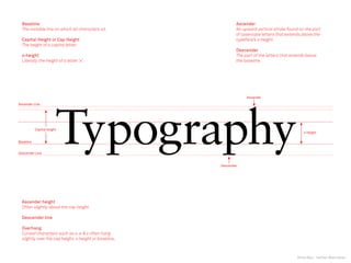
- 1. Silvia Baz | twitter @silviabaz Ascender height Often slightly above the cap height. Descender line Overhang Curved characters such as o, e & s often hang slightly over the cap height, x-height or baseline. Ascender An upward vertical stroke found on the part of lowercase letters that extends above the typeface’s x-height. Descender The part of the letters that extends below the baseline. Baseline The invisible line on which all characters sit. Capital Height or Cap Height The height of a capital letter. x-height Literally the height of a letter ‘x’.
- 2. Silvia Baz | twitter @silviabaz Serif Serif A serif is the little extra stroke found at the end of main vertical and horizontal strokes of some letterforms. Serifs fall into various groups and can be generally described as hairline (hair), square (slab), or wedge. Some special serif-like character parts are spurs and beaks. Serif
- 3. Silvia Baz | twitter @silviabaz Serif Serif A serif is the little extra stroke found at the end of main vertical and horizontal strokes of some letterforms. Serifs fall into various groups and can be generally described as hairline (hair), square (slab), or wedge. Some special serif-like character parts are spurs and beaks. Serif
- 4. Silvia Baz | twitter @silviabaz Serif types Wedge serif Transitional serif Hairline serif Glyphic serif Gothic Oldstyle serif Slab serif (bracketed) Bracketed serif Slab serif (unbracketed) Cursive serif Tuscan serif Sans serif
- 5. Silvia Baz | twitter @silviabaz Leg Leg The lower, down sloping stroke of the K and k is called a leg. The same stroke on R as well as the tail of a Q is sometimes also called a leg. Leg
- 6. Silvia Baz | twitter @silviabaz Leg Leg The lower, down sloping stroke of the K and k is called a leg. The same stroke on R as well as the tail of a Q is sometimes also called a leg. Leg
- 7. Silvia Baz | twitter @silviabaz Leg Leg The lower, down sloping stroke of the K and k is called a leg. The same stroke on R as well as the tail of a Q is sometimes also called a leg. k k k
- 8. Silvia Baz | twitter @silviabaz Arm Arm The arm of a letter is the horizontal stroke on some characters that does not connect to a stroke or stem at one or both ends. The top of the capital T and the horizontal strokes of the F and E are examples of arms. Additionally, the diagonal upward stroke on a K is its arm. Sometimes arm is used interchangeably with bar or crossbar or cross stroke. Arm is often also used to describe the mostly horizontal top stroke of C, double-storey a, G, and other glyphs, to include the finial, terminal, spur, or other elements of the stroke.c Arm
- 9. Silvia Baz | twitter @silviabaz Arm Arm The arm of a letter is the horizontal stroke on some characters that does not connect to a stroke or stem at one or both ends. The top of the capital T and the horizontal strokes of the F and E are examples of arms. Additionally, the diagonal upward stroke on a K is its arm. Sometimes arm is used interchangeably with bar or crossbar or cross stroke. Arm is often also used to describe the mostly horizontal top stroke of C, double-storey a, G, and other glyphs, to include the finial, terminal, spur, or other elements of the stroke.c Arm
- 10. Silvia Baz | twitter @silviabaz Stem Stem (a.k.a stroke) Vertical, full-length stroke in upright characters. Definition: The stem is the main, usually vertical stroke of a letterform. Stem
- 11. Silvia Baz | twitter @silviabaz Stem Stem (a.k.a stroke) Vertical, full-length stroke in upright characters. Definition: The stem is the main, usually vertical stroke of a letterform. Stem
- 12. Silvia Baz | twitter @silviabaz Bar Bar (a.k.a Crossbar) The (usually) horizontal stroke across the middle of uppercase A and H is a bar. The horizontal or sloping stroke enclosing the bottom of the eye of an e is also a bar. Bar
- 13. Silvia Baz | twitter @silviabaz Bar Bar (a.k.a Crossbar) The (usually) horizontal stroke across the middle of uppercase A and H is a bar. The horizontal or sloping stroke enclosing the bottom of the eye of an e is also a bar. Bar
- 14. Silvia Baz | twitter @silviabaz Counter Counter Counter The enclosed or partially enclosed circular or curved negative space (white space) of some letters such as d, o, and s is the counter. The term counter may sometimes be used to refer only to closed space, while partially enclosed spaces in m, n, or h are the aperture.
- 15. Silvia Baz | twitter @silviabaz Counter Counter Counter The enclosed or partially enclosed circular or curved negative space (white space) of some letters such as d, o, and s is the counter. The term counter may sometimes be used to refer only to closed space, while partially enclosed spaces in m, n, or h are the aperture.
- 16. Silvia Baz | twitter @silviabaz Open Counter Open Counter The partially open space within a character that is open on one end. Open Counter
- 17. Silvia Baz | twitter @silviabaz Open Counter Open Counter The partially open space within a character that is open on one end. Open Counter
- 18. Silvia Baz | twitter @silviabaz
- 19. Silvia Baz | twitter @silviabaz Aperture Aperture The partially enclosed, somewhat rounded negative space in some characters such as n, C, S, the lower part of e, or the upper part of a double-storey a. (a.k.a open counter or counter) Aperture
- 20. Silvia Baz | twitter @silviabaz Aperture Aperture The partially enclosed, somewhat rounded negative space in some characters such as n, C, S, the lower part of e, or the upper part of a double-storey a. (a.k.a open counter or counter) Aperture
- 21. Silvia Baz | twitter @silviabaz
- 22. Silvia Baz | twitter @silviabaz Bowl Bowl The curved part of the character that encloses the circular or curved parts (counter) of some letters such as d, b, o, D, and B is the bowl. Some sources call any parts of a letter enclosing a space a bowl, including both parts of a double-storey g and the straight stem on a D or B. The curved strokes of a C are sometimes also referred to as bowls although they aren’t closed. Bowl
- 23. Silvia Baz | twitter @silviabaz Bowl Bowl The curved part of the character that encloses the circular or curved parts (counter) of some letters such as d, b, o, D, and B is the bowl. Some sources call any parts of a letter enclosing a space a bowl, including both parts of a double-storey g and the straight stem on a D or B. The curved strokes of a C are sometimes also referred to as bowls although they aren’t closed. Bowl
- 24. Silvia Baz | twitter @silviabaz Loop & Link Loop In a double-storey g, the loop is the enclosed or partially enclosed counter below the baseline that is connected to the bowl by a link. The enclosed or partially enclosed extenders on cursive p, b, l, and similiar letters are also called loops. Link a.k.a neck The link is that small, usually curved stroke that connects the bowl and loop of a double-storey g. Link Loop
- 25. Silvia Baz | twitter @silviabaz Loop & Link Loop In a double-storey g, the loop is the enclosed or partially enclosed counter below the baseline that is connected to the bowl by a link. The enclosed or partially enclosed extenders on cursive p, b, l, and similiar letters are also called loops. Link a.k.a neck The link is that small, usually curved stroke that connects the bowl and loop of a double-storey g. Link Loop
- 26. Silvia Baz | twitter @silviabaz Spine Spine The main curved stroke of a lowercase or capital S. The spine may be almost vertical or mostly horizontal, depending on the typeface. Spine
- 27. Silvia Baz | twitter @silviabaz Spine Spine The main curved stroke of a lowercase or capital S. The spine may be almost vertical or mostly horizontal, depending on the typeface. Spine
- 28. Silvia Baz | twitter @silviabaz Spine Spine The main curved stroke of a lowercase or capital S. The spine may be almost vertical or mostly horizontal, depending on the typeface.
- 29. Silvia Baz | twitter @silviabaz Spur Spur A small projection off a main stroke. Spur
- 30. Silvia Baz | twitter @silviabaz Spur Spur A small projection off a main stroke. Spur
- 31. Silvia Baz | twitter @silviabaz Tail Tail The descending, often decorative stroke on the letter Q or the descending, often curved diagonal stroke on K or R is the tail. The descender on g, j, p, q, and y are also called tails. Tail
- 32. Silvia Baz | twitter @silviabaz Tail Tail The descending, often decorative stroke on the letter Q or the descending, often curved diagonal stroke on K or R is the tail. The descender on g, j, p, q, and y are also called tails. Tail
- 33. Silvia Baz | twitter @silviabaz
- 34. Silvia Baz | twitter @silviabaz Shoulder Shoulder The curved stroke aiming downward from a stem. The curve at the beginning of a leg of a character, such as in an “m.” Shoulder
- 35. Silvia Baz | twitter @silviabaz Shoulder Shoulder The curved stroke aiming downward from a stem. The curve at the beginning of a leg of a character, such as in an “m.” Shoulder
- 36. Silvia Baz | twitter @silviabaz
- 37. Silvia Baz | twitter @silviabaz Ear Ear Typically found on the lower case g, an ear is a decorative flourish usually on the upper right side of the bowl. Similar to a serif, the ear can be a distinctive, identifying element of some typefaces Ear
- 38. Silvia Baz | twitter @silviabaz Ear Ear Typically found on the lower case g, an ear is a decorative flourish usually on the upper right side of the bowl. Similar to a serif, the ear can be a distinctive, identifying element of some typefaces Ear
- 39. Silvia Baz | twitter @silviabaz
- 40. Silvia Baz | twitter @silviabaz Ligature Ligature Two or more letters are joined together to form one glyph or character.
- 41. Silvia Baz | twitter @silviabaz Ligature Ligature Two or more letters are joined together to form one glyph or character.
- 42. Silvia Baz | twitter @silviabaz
- 43. Silvia Baz | twitter @silviabaz gloat gloat gloat gloat gloat gloat Sabon Mrs Eaves Adobe Caslon Clarendon Futura gloatClarendon Mr Eaves gloatFrutiger gloat TheMix gloatHelvetica gloatCourier gloatRockwell
- 44. Silvia Baz | twitter @silviabaz Type Classification GLOAT GLOAT GLOAT GLOAT GLOAT GLOAT GLOAT gloat gloat gloat gloat gloat gloat gloat Blackletter, 1455 Jenson, 1471 (Venetian) Bembo, 1495 (Venetian) Garamond, c. 1530 Janson Text (Dutch), 1690 Caslon, 1720 Baskerville, 1750 Johann Gutenberg, German Nicholas Jenson, French Francesco Griffo, Italian Claude Garamond, French Nicholas Kis, Hungarian William Caslon, English John Baskerville, English GLOAT gloat gloat First italic, 1501 (no upper case) First italic designed to Francesco Griffo, Italian match roman, c. 1540 1450 1475 1500 1525 1700 1725 1750 BlACKlETTER OlDSTylE TRANSITIONAl e timeline stones aphy y, and way back
- 45. Silvia Baz | twitter @silviabaz Type Classification GLOAT GLOAT GLOAT GLOAT GLOAT GLOAT GLOAT gloat gloat gloat gloat gloat gloat gloat Baskerville, 1750 Bodoni, 1789 Clarendon, 1845 Akzidenz Grotesk, 1896 Helvetica, 1957 Rotis Sans Serif, 1989 Rotis Semi Sans, 1989 John Baskerville, English Giambattista Bodoni, Italian Robert Besley, English German M. Meidinger, E. Hofmann, Swiss Otl Aicher, German Otl Aicher, German GLOAT GLOAT GLOAT GLOAT gloat gloat gloat gloat Didot, 1783 Univers, 1957 Rotis Serif, 1989 Rotis Semi Serif, 1989 Firmin Didot, French Adrian Frutiger, Swiss/French Otl Aicher, German Otl Aicher, German GLOAT GLOAT gloat gloat Memphis, 1929 Futura, 1927 Rudolph Wolf, German Paul Renner, German GLOAT GLOAT gloat gloat Gill Sans, 1928 Meta, 1990 Eric Gill, English Erik Spiekermann, German 1750 1800 1825 1900 1925 1950 2000 TRANSITIONAl MODERN SqUARESERIF SANSSERIF SERIF/ SANSSERIF G E O M E T R I C M O D E l H U M A N I S T M O D E l
- 46. Silvia Baz | twitter @silviabaz Type Classification 2.0
- 47. Silvia Baz | twitter @silviabaz Glossary Typeface The overall design of a type family Gill Sans, Univers & Georgia are all typefaces. Font Referring back to when type was cast in molten metal using a mould, or font. A font is how a typeface is delivered. So you can have both a metal handmade font and a digital font file of the same typeface, e.g Times or Futura. Serif Short strokes at the ends of horizontal and vertical strokes of characters. Generally considered to be easier to read for large quantities of text, and often, but not always, associated with more traditional and older themes. Sans-Serif Taken from the French word sans, meaning ‘without’, sans serif simply means without serifs. Generally, but not always, considered to be associated with modern themes. Slab Serif A typeface with weightier, ‘slab-like’ serifs. Uppercase CAPITAL LETTERS Lowercase non-capital letters Mixed-case A mix of the two above, that conforms to the standard rules of a normal sentence. Sometimes called sentence-case. Title-case Capitalising all of the major words in a sentence. There are various schools of thought as to what defines a ‘major’ word, but it tends to looks neater when connecting words like and, the, to, but, is & my remain lowercase. Display font A typeface or font designed to be used at larger sizes, like headers or on title pages. Usually too intricate or too bold to be legible at small sizes. Body font A typeface or font designed to be used for greater amounts of text (often called ‘body copy’ or ‘body text’). Readable at smaller sizes. Leading The space set above and below lines of text. This text is 9pt in size, with 11pt leading. Kerning The adjustment of the space between individual characters. Good typographers hand-adjust kerning by eye for perfectly balanced spacing. Tracking The adjustment of the overall spacing between characters, usually for larger amounts of text. Taken from: Basic typographic principles: A guide by The Typographic Circle
- 48. Silvia Baz | twitter @silviabaz Kerning Avenue Avenue Kerning The reduction of white space between two characters (inter-character space)
- 49. Silvia Baz | twitter @silviabaz Kerning Kerning The reduction of white space between two characters (inter-character space)
- 50. Silvia Baz | twitter @silviabaz Kerning Kerning The reduction of white space between two characters (inter-character space)
- 51. Silvia Baz | twitter @silviabaz Leading Leading The white space inserted between lines of type to give more readable and attractive appearance. The term is derived from the thin strips of non-printing lead that are used to separate lines of hot metal type. FontFont The Foundry Hoefler & Frere-Jones House 33 Hype for Type Klim Type Foundry Lineto Optimo FontFont The Foundry Hoefler & Frere-Jones House 33 Hype for Type Klim Type Foundry Lineto Optimo FontFont The Foundry Hoefler & Frere-Jones House 33 Hype for Type Klim Type Foundry Lineto Optimo 21pt 16pt 12pt (default) A Big Title with Big Leading A Big Title with Big Leading 60pt (default)Designed 52pt
- 52. Silvia Baz | twitter @silviabaz Letter Spacing A Big Tit le w it h L ots of Space A Big Title with Lots of Space Increased letter spacing Default letter spacing Letter Spacing a.k.a tracking The insertion of additional white space (inter-character space) between characters in a line or body of text to improve the overall appearance of a setting. F o n tF o n t T h e F o un dr y Ho e f le r & Fr e r e - J o n e s Ho us e 3 3 H y p e f o r Ty p e Klim Ty p e F o un dr y L in e t o O p t im o increased spacing FontFont The Foundry Hoefler & Frere-Jones House 33 Hype for Type Klim Type Foundry Lineto Optimo default spacing
- 53. Silvia Baz | twitter @silviabaz Punctuation Basic typographic principles: A guide by The Typographic Circle Hanging quotes Above is an example of 'un-hung' quote marks. Hanging quotes simply means to ensure that any quote marks 'hang' over the straight edge of your type. The negative space created when we don't do this is ugly and creates an uneven looking edge. By hanging our quote marks over the edge – we give ourselves a cleaner, straighter vertical line, which looks much more elegant and considered. “The first rule of Fight Club is: You do not talk about Fight Club.” “The second rule of Fight Club is: You do not talk about Fight Club.” Urgh. Better. The same rule applies to longer copy “Fight Club is a 1999 American film based on the 1996 novel of the same name by Chuck Palahniuk.The film was directed by David Fincher and stars Edward Norton, Brad Pitt, and Helena Bonham Carter. Ed Norton plays the unnamed protagonist, “an everyman” who is discontented with his white-collar job. He forms a “fight club” with soap maker Tyler Durden, played by Pitt, and becomes embroiled in a relationship with him and a dissolute woman, Marla Singer, played by Bonham Carter”. Typeface (above) = Trade Gothic Bold Condensed Basic typographic principles: A guide by The Typographic Circle Hanging quotes Above is an example of 'un-hung' quote marks. Hanging quotes simply means to ensure that any quote marks 'hang' over the straight edge of your type. The negative space created when we don't do this is ugly and creates an uneven looking edge. By hanging our quote marks over the edge – we give ourselves a cleaner, straighter vertical line, which looks much more elegant and considered. “The first rule of Fight Club is: You do not talk about Fight Club.” “The second rule of Fight Club is: You do not talk about Fight Club.” Urgh. Better. The same rule applies to longer copy “Fight Club is a 1999 American film based on the 1996 novel of the same name by Chuck Palahniuk.The film was directed by David Fincher and stars Edward Norton, Brad Pitt, and Helena Bonham Carter. Ed Norton plays the unnamed protagonist, “an everyman” who is discontented with his white-collar job. He forms a “fight club” with soap makerTyler Durden, played by Pitt, and becomes embroiled in a relationship with him and a dissolute woman, Marla Singer, played by Bonham Carter”. Typeface (above) = Trade Gothic Bold Condensed
- 54. Silvia Baz | twitter @silviabaz Punctuation
- 55. Silvia Baz | twitter @silviabaz Punctuation
- 56. Silvia Baz | twitter @silviabaz Type Families one typeface many weights and many different sizes a lot to choose from and to experiment with before you introduce another
- 57. Silvia Baz | twitter @silviabaz Books & online resources BOOKS Type Matters!; Jim Williams Thinking with Type; Ellen Lupton Stop Stealing Sheep; Erik Spiekermann Grid Systems; Josef Muller-Brockmann A Type Primer;John Kane Herb Lubalin; Unit Editions An Essay on Typography; Eric Gill Scripts; Steven Heller Swiss Graphic Design; Richard Hollis Online http://www.papress.com/thinkingwithtype/ http://ilovetypography.com http://www.thetypographyworkshop.com/ http://typocircle.com http://www.istd.org.uk http://welovetypography.com http://typographica.org TYPE FOUNDRIES A2_Type Commercial Type Colophon Dalton Maag FontFont The Foundry Hoefler & Frere-Jones House 33 Hype for Type Klim Type Foundry Lineto Optimo Process Type Foundry Typekit Vllg
- 58. Silvia Baz | twitter @silviabaz Thank you! w e b s i t e www.silviabaz.com t w i t t e r @silviabaz f a c e b o o k silviabazstudio