Mussafah Call Girls +971525373611 Call Girls in Mussafah Abu Dhabi
Stages of production
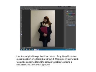
1. I took an original image that I had taken of my friend Iona in a
casual position on a blank background. This came in useful as it
would be easier to blend the colours together to create a
smoother and sleeker background
2. I then increased the brightness/contrast to make the image look
more polished and for the background to distinguish itself from
the main subject.
3. I then slowly increased the contrast which would also help
differentiate the image from the background. This made the
background a lot more pristine and clear.
4. This is the font that I want to use for my magazine. I like the way
that it looks like a doodle and so will be more appealing to my
younger target audience
5. Next, I needed to make it look like the text was behind the
subject. In my mock up I did say that I would want the masthead
in front of the subject but in this case, it made the cover look far
too crowded. I used the lasso and magic eraser tool to get rid of
areas I didn’t need
6. These are the fonts I am going to use on my cover. I decided to go
for a range of block fonts, to more curled fonts. This allows me to
reach a larger number of people as most peoples preferences will
be met
7. This is my magazine so far! Just the fonts and titles put on
8. Next thing to do was to pick a barcode and
a scan code. I simple googled these words
and then chose codes that I thought would
look best.
9. These are the images that I have chosen to show on my front
cover. I chose these in particular due to their vibrant colours and
interesting shooting angles.
10. You wouldn’t think that finding an arrow that was perfect for
what you needed it for would be easy?! Think again. I eventually
found this one to have on my front cover.
12. I decided to use this font as it looked like a teachers handwriting
but was pointing to something quite modern. Something to
perhaps intrigue some potential customers
13. After very little debate during the questionnaires, I used the
Sheldon School logo to have as our own magazine logo. This is
because it will be recognisable to pupils and colleagues. The
colour of the badge has been changed so it isn’t as bold as it
usually is and over-dominate the cover.