Rebranding Case Study - SOS
•
1 like•1,105 views

Case study of rebranding Sherlock's Office Solutions to SOS Computer Training Specialists.

Recommended
More Related Content
Recently uploaded
Recently uploaded (20)
Featured
Featured (20)
Rebranding Case Study - SOS
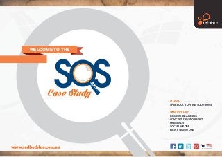
- 1. CLIENT: SHERLOCK’S OFFICE SOLUTIONS WHAT WE DID: LOGO RE-BRANDING CONCEPT DEVELOPMENT PRESS ADS SOCIAL MEDIA EMAIL SIGNATURE WELCOME TO THE Case Study
- 2. LOGO COLOUR PALETTE LOGO RE-BRAND LOGO VERSIONS - GOLD TEXT LOGO VERSIONS - MONO REVERSE LOGO VERSIONS - MONOLOGO VERSIONS - REVERSE LOGO RE-BRAND
- 3. PRESS ADS SHERLOCK’S OFFICE SOLUTIONS CAMPAIGN DEVELOPMENT THE GOAL Sherlock’s Office Solutions had a strong brand that was well known in the marketplace, so we wanted to update and refresh the logo without losing that recognition and integrity. They were also looking for a concept development that would highlight their point of difference and stand out across a number of platforms, both online and offline. THE IDEA Retaining the main structure and colour palette of the existing logo, redhotblue gave the new logo a modern update while also updating the tagline to something more representative of what SOS do – Computer Training Specialists. A campaign message was developed to tie in with this tagline – “experts creating experts”, to reflect the company’s years of experience and quality trainers, along with the variety of professionals that SOS train in becoming proficient. This message was highlighted with a series of black and white images and teamed with a bold prism graphic element. THE RESULT SOS’s new logo and concept development is bold, eye-catching and flexible, while retaining the integrity of the original logo that is well recognised in the marketplace. Their new concept has been implemented across multiple platforms already, and positions SOS as a leader in their field.
- 4. SOCIAL MEDIA SHERLOCK’S OFFICE SOLUTIONS FACEBOOK TIMELINE COVERS To ensure brand consistency, it was important that SOS’s social media platform had visual representation that continued with the campaign.
- 5. EMAIL SIGNATURE SHERLOCK’S OFFICE SOLUTIONS EMAIL TEMPLATE As the majority of correspondence for SOS is done via email, an email footer delivers brand recognition and consistency on this platform.