2. Draft
Copying house
style- title is
the same as
the cover More articles
which are
included
“On the cover” inside the
indicated so people magazine
can find the page
numbers of the
articles which
caught their
attention on the
cover Eye catching
secondary
Subscription leads with
option – for the page
minority who numbers
said they
subscribe on
questionnaire
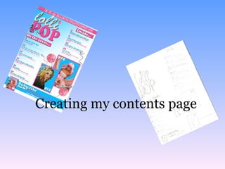
3. I began to put together my contents page after I
had finished my cover page. The house theme
was carried across from the cover to the contents
page therefore the colour schemes (pink, white,
blue), the mastheads, the fonts and the general
lay outs are similar. I wanted to separate the
cover stories from the other inside articles
therefore I added “On the cover…” above the
stories mentioned on the cover and put the
inside articles in the top right corner. I included
secondary leads to the Rita Ora and Nicki Minaj
articles.
I then decided to add a subscription
advertisement to the bottom bar of my page.
This will appeal to my readers who subscribe to
magazines online.
I realised that my contents page was quite empty
and lacked the exciting look of the cover. I
decided that I needed to add more to the page. I
also thought that the background gradient made
the text blend in therefore I changed the
direction.
Draft
4. Revised version To improve the look of the magazine I decided to
add some unique touches such as the lollipop I
used in the masthead (dot above the ‘i’), placed
twice behind the secondary leads. I also added
arrows to give the magazine a handmade look
and to explain the secondary leads further.
I then added a photograph of the magazine
cover to the “Subscribe now” advertisement to
make it look more professional and I also added
a heading “Inside…” to distinguish between the
articles mentioned on the cover and the other
stories within the magazine- I gave both
headings a pink background to follow the cover
style and to make them stand out. I followed the
house style further by adding the top bar and
tagline “The Uk’s No1 magazine for
pop&entertainment news”. I think that overall,
this makes the transition from cover page to
contents page flow much better.