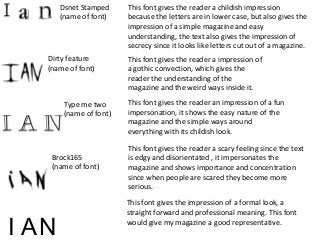
SlideShare a Scribd company logo
1 of 2
Type me two
(name of font)
Dirty feature
(name of font)
Dsnet Stamped
(name of font)
Brock165
(name of font)
This font gives the reader a childish impression
because the letters are in lower case, but also gives the
impression of a simple magazine and easy
understanding, the text also gives the impression of
secrecy since it looks like letters cut out of a magazine.
This font gives the reader a scary feeling since the text
is edgy and disorientated , it impersonates the
magazine and shows importance and concentration
since when people are scared they become more
serious.
This font gives the reader an impression of a fun
impersonation, it shows the easy nature of the
magazine and the simple ways around
everything with its childish look.
This font gives the reader a impression of
a gothic convection, which gives the
reader the understanding of the
magazine and the weird ways inside it.
I AN
This font gives the impression of a formal look, a
straight forward and professional meaning. This font
would give my magazine a good representative.
I have chosen to use font number 4 because
it suits my style of magazine because it gives
a formal expression and will hopefully attract
more customers that appeal to this
magazine, since the abbreviation of the
name of my magazine is I A N it feels
appropriate to use this type of font because
it has that respectable and professional look.
I A
N

More Related Content

Viewers also liked

The future of water treatment is here
The future of water treatment is hereThe future of water treatment is here
The future of water treatment is hereDan Garard
 
Proposed educational strategy to reduce the impact of social and
Proposed educational strategy to reduce the impact of social andProposed educational strategy to reduce the impact of social and
Proposed educational strategy to reduce the impact of social andAlexander Decker
 
The day toby lost his chapstick
The day toby lost his chapstickThe day toby lost his chapstick
The day toby lost his chapstickkailagoodrich
 
Windsor Circle CoffeeForLess EliteSEM Webinar Slides Apr 2014
Windsor Circle CoffeeForLess EliteSEM Webinar Slides Apr 2014Windsor Circle CoffeeForLess EliteSEM Webinar Slides Apr 2014
Windsor Circle CoffeeForLess EliteSEM Webinar Slides Apr 2014WhatConts
 
Dream catchers Native AMerican art
Dream catchers Native AMerican artDream catchers Native AMerican art
Dream catchers Native AMerican artRimkoc
 
Drivers of supply chain performance group 2
Drivers of supply chain performance group 2Drivers of supply chain performance group 2
Drivers of supply chain performance group 2Bhupesh Bindal
 
La dictadura de Primo de Rivera (1923 1930
La dictadura de Primo de Rivera (1923 1930La dictadura de Primo de Rivera (1923 1930
La dictadura de Primo de Rivera (1923 1930profeshispanica
 
Task 9 – narrative structure
Task 9 – narrative structureTask 9 – narrative structure
Task 9 – narrative structureTom-Brett
 
Declining quality of the media and consequences for companies and business re...
Declining quality of the media and consequences for companies and business re...Declining quality of the media and consequences for companies and business re...
Declining quality of the media and consequences for companies and business re...Mark Eisenegger
 
Syllabus
SyllabusSyllabus
Syllabuskrice
 
Services, tools & practices for a software house
Services, tools & practices for a software houseServices, tools & practices for a software house
Services, tools & practices for a software houseParis Apostolopoulos
 

Viewers also liked (16)

Slides for May 26, 2013
Slides for May 26, 2013Slides for May 26, 2013
Slides for May 26, 2013
 
Dr NOH'D SOROUR
Dr NOH'D SOROURDr NOH'D SOROUR
Dr NOH'D SOROUR
 
The future of water treatment is here
The future of water treatment is hereThe future of water treatment is here
The future of water treatment is here
 
MLS Front-Office Efficiency Ratings 2014
MLS Front-Office Efficiency Ratings 2014MLS Front-Office Efficiency Ratings 2014
MLS Front-Office Efficiency Ratings 2014
 
E-portfolios
E-portfolios E-portfolios
E-portfolios
 
Proposed educational strategy to reduce the impact of social and
Proposed educational strategy to reduce the impact of social andProposed educational strategy to reduce the impact of social and
Proposed educational strategy to reduce the impact of social and
 
The day toby lost his chapstick
The day toby lost his chapstickThe day toby lost his chapstick
The day toby lost his chapstick
 
Windsor Circle CoffeeForLess EliteSEM Webinar Slides Apr 2014
Windsor Circle CoffeeForLess EliteSEM Webinar Slides Apr 2014Windsor Circle CoffeeForLess EliteSEM Webinar Slides Apr 2014
Windsor Circle CoffeeForLess EliteSEM Webinar Slides Apr 2014
 
Dream catchers Native AMerican art
Dream catchers Native AMerican artDream catchers Native AMerican art
Dream catchers Native AMerican art
 
Drivers of supply chain performance group 2
Drivers of supply chain performance group 2Drivers of supply chain performance group 2
Drivers of supply chain performance group 2
 
La dictadura de Primo de Rivera (1923 1930
La dictadura de Primo de Rivera (1923 1930La dictadura de Primo de Rivera (1923 1930
La dictadura de Primo de Rivera (1923 1930
 
Task 9 – narrative structure
Task 9 – narrative structureTask 9 – narrative structure
Task 9 – narrative structure
 
Panache india casual kurta pyjamas mens indian ethnic wear
Panache india casual kurta pyjamas mens indian ethnic wearPanache india casual kurta pyjamas mens indian ethnic wear
Panache india casual kurta pyjamas mens indian ethnic wear
 
Declining quality of the media and consequences for companies and business re...
Declining quality of the media and consequences for companies and business re...Declining quality of the media and consequences for companies and business re...
Declining quality of the media and consequences for companies and business re...
 
Syllabus
SyllabusSyllabus
Syllabus
 
Services, tools & practices for a software house
Services, tools & practices for a software houseServices, tools & practices for a software house
Services, tools & practices for a software house
 

More from jasonb139

Inspiration for my chosen genre
Inspiration for my chosen genreInspiration for my chosen genre
Inspiration for my chosen genrejasonb139
 
Developments + drafts for contents page
Developments + drafts for contents pageDevelopments + drafts for contents page
Developments + drafts for contents pagejasonb139
 
Drafts + feedback for double page spread
Drafts + feedback for double page spreadDrafts + feedback for double page spread
Drafts + feedback for double page spreadjasonb139
 
Drafts + feedback for front cover
Drafts + feedback for front coverDrafts + feedback for front cover
Drafts + feedback for front coverjasonb139
 
Image planning done
Image planning  doneImage planning  done
Image planning donejasonb139
 
Image editing done
Image editing   doneImage editing   done
Image editing donejasonb139
 
Colour palette
Colour paletteColour palette
Colour palettejasonb139
 
Double page spread layout
Double page spread layoutDouble page spread layout
Double page spread layoutjasonb139
 
Contents page layout
Contents page layoutContents page layout
Contents page layoutjasonb139
 
Front cover layout
Front cover layoutFront cover layout
Front cover layoutjasonb139
 
Hierachy of fonts needs adding to blog spot
Hierachy of fonts needs adding to blog spotHierachy of fonts needs adding to blog spot
Hierachy of fonts needs adding to blog spotjasonb139
 
Drafts for contents page needs uploading to blogspot
Drafts for contents page needs uploading to blogspotDrafts for contents page needs uploading to blogspot
Drafts for contents page needs uploading to blogspotjasonb139
 
Drafts for front cover needs uploading to blogspot
Drafts for front cover needs uploading to blogspotDrafts for front cover needs uploading to blogspot
Drafts for front cover needs uploading to blogspotjasonb139
 
Fonts for masthead
Fonts for mastheadFonts for masthead
Fonts for mastheadjasonb139
 
Colour palette
Colour paletteColour palette
Colour palettejasonb139
 
Hierachy of typefaces
Hierachy of typefacesHierachy of typefaces
Hierachy of typefacesjasonb139
 

More from jasonb139 (20)

Evaluation
EvaluationEvaluation
Evaluation
 
Inspiration for my chosen genre
Inspiration for my chosen genreInspiration for my chosen genre
Inspiration for my chosen genre
 
Developments + drafts for contents page
Developments + drafts for contents pageDevelopments + drafts for contents page
Developments + drafts for contents page
 
Drafts + feedback for double page spread
Drafts + feedback for double page spreadDrafts + feedback for double page spread
Drafts + feedback for double page spread
 
Drafts + feedback for front cover
Drafts + feedback for front coverDrafts + feedback for front cover
Drafts + feedback for front cover
 
Image planning done
Image planning  doneImage planning  done
Image planning done
 
Image editing done
Image editing   doneImage editing   done
Image editing done
 
Colour palette
Colour paletteColour palette
Colour palette
 
Double page spread layout
Double page spread layoutDouble page spread layout
Double page spread layout
 
Contents page layout
Contents page layoutContents page layout
Contents page layout
 
Front cover layout
Front cover layoutFront cover layout
Front cover layout
 
Layout
LayoutLayout
Layout
 
Hierachy of fonts needs adding to blog spot
Hierachy of fonts needs adding to blog spotHierachy of fonts needs adding to blog spot
Hierachy of fonts needs adding to blog spot
 
Font names
Font namesFont names
Font names
 
Drafts for contents page needs uploading to blogspot
Drafts for contents page needs uploading to blogspotDrafts for contents page needs uploading to blogspot
Drafts for contents page needs uploading to blogspot
 
Drafts for front cover needs uploading to blogspot
Drafts for front cover needs uploading to blogspotDrafts for front cover needs uploading to blogspot
Drafts for front cover needs uploading to blogspot
 
Fonts for masthead
Fonts for mastheadFonts for masthead
Fonts for masthead
 
Colour palette
Colour paletteColour palette
Colour palette
 
Hierachy of typefaces
Hierachy of typefacesHierachy of typefaces
Hierachy of typefaces
 
Layout
LayoutLayout
Layout
 

Fonts for masthead proper one

  • 1. Type me two (name of font) Dirty feature (name of font) Dsnet Stamped (name of font) Brock165 (name of font) This font gives the reader a childish impression because the letters are in lower case, but also gives the impression of a simple magazine and easy understanding, the text also gives the impression of secrecy since it looks like letters cut out of a magazine. This font gives the reader a scary feeling since the text is edgy and disorientated , it impersonates the magazine and shows importance and concentration since when people are scared they become more serious. This font gives the reader an impression of a fun impersonation, it shows the easy nature of the magazine and the simple ways around everything with its childish look. This font gives the reader a impression of a gothic convection, which gives the reader the understanding of the magazine and the weird ways inside it. I AN This font gives the impression of a formal look, a straight forward and professional meaning. This font would give my magazine a good representative.
  • 2. I have chosen to use font number 4 because it suits my style of magazine because it gives a formal expression and will hopefully attract more customers that appeal to this magazine, since the abbreviation of the name of my magazine is I A N it feels appropriate to use this type of font because it has that respectable and professional look. I A N