Beginners Guide to TikTok for Search - Rachel Pearson - We are Tilt __ Bright...
Vanity Fair Cover
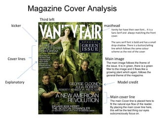
1. masthead Main image Cover lines Model credit Main cover line Third left Vanity fair have their own font... It is a Sans Serif and always matching the front cover. The sans serif font is bold and has a small drop-shadow. There is a button/selling line which follows the same colour scheme as the rest of the cover kicker Explanatory The main image follows the theme of the issue. It is in green, there is a green filter to the image and it flows like a growing plant which again, follows the general theme of the magazine. The main Cover line is placed here to fit the natural eye flow of the reader. By placing the main cover line here, this will be the last thing our eyes subconsciously focus on. Magazine Cover Analysis
2. In this cover, the fonts used are bold and clear. They are all (apart from in the button) san serif and follow a white and gold colour scheme. The font varies in sizes depending on where on the page. This brings out some information and pushes some information to the back. The main image is all green, the outfits worn are also green. The image flows up in an organic way to add emphasis on the “green issue”. The people used are famous stars and will ultimately attract the attention of people when on a shelf... This familiarity will also draw in new readers.