Composition Visuals: Column, Waterfall, Pie, Mondrian
•
0 likes•831 views

This Slideshare presentation is a partial preview of the full business document. To view and download the full document, please go here: http://flevy.com/browse/flevypro/composition-visuals-column-waterfall-pie-mondrian-1836 DOCUMENT DESCRIPTION This presentation focuses on Composition visuals: e.g., 100% Column Charts, Waterfall Charts, Mondrian (AKA Marimekko) Graphs, Pie Charts. ABOUT FLEVYPRO FlevyPro is a subscription service for on-demand business frameworks and analysis tools. FlevyPro subscribers receive access to an exclusive library of curated business documents—business framework primers, presentation templates, Lean Six Sigma tools, and more—among other exclusive benefits.

Recommended
Recommended
More Related Content
More from Flevy.com Best Practices
More from Flevy.com Best Practices (20)
Recently uploaded
Recently uploaded (20)
Composition Visuals: Column, Waterfall, Pie, Mondrian
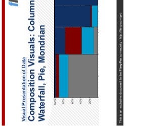
- 1. This is an exclusive document to the FlevyPro community - http://flevy.com/pro Visual Presentation of Data Composition Visuals: Column, Waterfall, Pie, Mondrian 20% 40% 60% 80% 100%
- 2. 2This document is an exclusive document available to Flevy Pro members - http://flevy.com/pro In this deck, we will focus on the first Comparison Type—Composition Composition Comparison Type Composition Item Comparison Time Series Frequency Distribution Correlation Rating COMPARISON TYPE BASIC GRAPH FORMS Line Pie Bar/Column Dot Matrix Booz Ball Item Item Item Item The content on this slide has been partially hidden. FlevyPro members can download the full document here: http://flevy.com/browse/flevypro/composition-visuals-column-waterfall-pie-mondrian-1836
- 3. 3This document is an exclusive document available to Flevy Pro members - http://flevy.com/pro The 100% Column Chart—AKA Stacked Columns—is a great way of visualizing the relative contribution of various factors Composition Visual – 100% Column Chart OVERVIEW 100% columns (stacked columns) are a great way of understanding the relative contribution of different factors Where absolute comparisons are not suitable or informative, the 100% columns allows the reader to understand the relative impact of a number of different factors The 100% columns’ strength lies in the comparison of one area against another TIPS Most important segment goes at the bottom of the column (largest if there is no other basis to choose) Dashed lines between segments emphasize comparison If there are more than 2-3 segments in the data, comparing more than 3 columns becomes difficult State absolute value at the top of each bar Highlight particular areas of focus for the presentation slide USES Cost drivers, profit drivers, product split over time, company split over time Comparing the relative impact of different factors across two different key variables (e.g. turnover, profit) Segmentation analysis and relative returns analysis Relative importance of different segments Investment/ resource/ spend analysis The content on this slide has been partially hidden. FlevyPro members can download the full document here: http://flevy.com/browse/flevypro/composition-visuals-column-waterfall-pie-mondrian-1836
- 4. 4This document is an exclusive document available to Flevy Pro members - http://flevy.com/pro Composition Visual – 100% Column Chart Example EXAMPLE 0% 20% 40% 60% 80% 100% Turnover Operating Profit $4,200 $120 %ofTotal Return on sales (%) 0.8% 3.0% 7.9% 4.8% Turnover and Operating Profit (2015) Distribution Agribusiness Ingredients Petfood The content on this slide has been partially hidden. FlevyPro members can download the full document here: http://flevy.com/browse/flevypro/composition-visuals-column-waterfall-pie-mondrian-1836
- 5. 5This document is an exclusive document available to Flevy Pro members - http://flevy.com/pro Composition Visual – Waterfall Chart OVERVIEW A waterfall chart is one of the most graphic ways to demonstrate the change from one position to another or to provide a breakdown of an aggregate number into its components or to show a change in position It is most frequently used as a descriptor of the causes of financial change. However, it can be just as effective as a conceptual representation of any change TIPS First decide what measures you wish to have on the y-axes. This can be any financial or non financial measure (e.g. ROI, CapEx, working capital, headcount, number of grey walruses etc.). Next, decide on the x-axis. This is nearly always a description of the key drivers causing the change (but may be time or some other stepwise measure). Be careful not to overcomplicate the x-axis by having too many drivers or by making the drivers too complex in themselves. Remember, you are trying to describe the big issues to senior managers, so leave the detailed analysis to the appendix As ever, judicious use of shading should pick out the key message (singular) which will reflected in the tagline message (singular). USES Any situation where it is necessary to numerically describe change or answer the question “what’s the big issue here” Reasons for change in revenue or profitability (e.g. is sales growth organic or via acquisition) Sources of costs saving or description of full-potential sources of value Aspirational description of what is achievable (often in pursuit presentations) As a driver of creative thinking during hypothesis forming The content on this slide has been partially hidden. FlevyPro members can download the full document here: http://flevy.com/browse/flevypro/composition-visuals-column-waterfall-pie-mondrian-1836
- 6. 6This document is an exclusive document available to Flevy Pro members - http://flevy.com/pro Composition Visual – Waterfall Chart Example 1 (Generic) EXAMPLE Change in Return on Assets (2012-15) Return on Assets (Basis Points ) 31 -33 -30 50 110 128 -40 -20 0 20 40 60 80 100 120 140 2012 RoA (Pre Tax) Net Interest Income Other Income OpEx Loan Loss Provision 2015 RoA (Pre Tax) The content on this slide has been partially hidden. FlevyPro members can download the full document here: http://flevy.com/browse/flevypro/composition-visuals-column-waterfall-pie-mondrian-1836
- 7. 7This document is an exclusive document available to Flevy Pro members - http://flevy.com/pro Composition Visual – Waterfall Chart Example 2 (Generic) EXAMPLE Average OPEX Savings in the Year 1 For An Operator Who Has Done Full Outsourcing (% of Network OPEX) 23% 17% 16% 12% 100% 84% 1%6% 23% 4% 4% 9% 3% Total Savings = 15-18% Total Savings = 15-18% Cost breakdown as a % of Total Network OPEX Cost savings as a % of Total Network OPEX The Network Outsourcing Arithmetic Planning & Optimisation +Network management & Operations +Maintenance ( field, preventive etc.)/Inventory =Total Network OPEX -Planning & Optimisation Savings -Network management & Operations Savings - Maintenance (field, preventive etc.) / Inventory Savings =Total Network OPEX after outsourcing +Leases( sites,band with etc.) +License fee/service provider support +Other costs -License fee/service provider support savings +Transition Costs The content on this slide has been partially hidden. FlevyPro members can download the full document here: http://flevy.com/browse/flevypro/composition-visuals-column-waterfall-pie-mondrian-1836
- 8. 8This document is an exclusive document available to Flevy Pro members - http://flevy.com/pro Composition Visual – Waterfall Chart Example (Variations) WATERFALL DOWN Silver Premier, and AARP Drive Club Households 0 500 1,000 1,500 2,000 2,500 3,000 1993 Club Other Lexus Volvo AARP Silver, Member- Third Premier Party Clubs Client House- holds (000) title? Allows focus on each segment in the data Particularly effective if the elements in the data reflect differences in location or time WATERFALL DOWN Inventory Reduction Opportunities Available in the Supply Chain and at the Store Allows focus on each segment in the data Particularly effective if the elements in the data reflect differences in location or time Days of Inven- tory 0 10 20 30 40 50 60 70 Work in Plant Transit Ware- Transit Distri- Transit Retailer Progress house butor title? The content on this slide has been partially hidden. FlevyPro members can download the full document here: http://flevy.com/browse/flevypro/composition-visuals-column-waterfall-pie-mondrian-1836
- 9. 9This document is an exclusive document available to Flevy Pro members - http://flevy.com/pro The Mondrian Graph—AKA Marimekko—adds another dimension to the 100% Column Chart—it is a great way to visualize an “universe” Composition Visual – Mondrian Graph OVERVIEW A mondrian is a strikingly visual method to provide a single picture of the universe under investigation, split along two axes It is effectively a set of 100% bars which are then stretched horizontally Its strength lies in the visual impact of the largest areas, which represent the most significant parts of the universe The mondrian is also known as Marimekko chart TIPS To draw it: −In PowerPoint, draw 100% bars for each main category (i.e. for each title that lies on the x-axis) −Draw a single horizontal 100% bar to represent the proportions of the main categories. Place this above the vertical bars from Step 1 −Ungroup the graph from Step 1 and stretch the vertical bars horizontally Order each bar by size: left-to-right and top-to-bottom (unless you are grouping for a particular purpose) State values at the top of each bar, and always state the total Shade to highlight insight USES Market maps (e.g. by geography, product, company) Post-merger portfolio analysis (e.g. overlap of brands, possible synergies, geographies) Trend analysis - by using pairs of mondrians to see change over time Cost reduction prioritization (e.g. by process, by business group) Labor analysis (e.g. split of necessary / inefficient / unnecessary labor) Substitution analysis The content on this slide has been partially hidden. FlevyPro members can download the full document here: http://flevy.com/browse/flevypro/composition-visuals-column-waterfall-pie-mondrian-1836
- 10. 10This document is an exclusive document available to Flevy Pro members - http://flevy.com/pro Composition Visual – Mondrian Example EXAMPLE Energy Sources and Uses Breakdown 20% 40% 60% 80% 100% 20% 40% 60% 80% 100% Electric power generated for the public Residential and commercial Industrial Transportation The content on this slide has been partially hidden. FlevyPro members can download the full document here: http://flevy.com/browse/flevypro/composition-visuals-column-waterfall-pie-mondrian-1836
- 11. 11This document is an exclusive document available to Flevy Pro members - http://flevy.com/pro A Pie Chart can intuitively portray percentage shares of a whole—however, use it with caution, as it is not appropriate for all types of data Composition Visual – Pie Chart OVERVIEW Pie charts are an intuitive tool for portraying percentage shares of a whole TIPS Best for a single data series Maximum 5-6 segments in the data, unless purpose is to show fragmentation Tends to focus attention on one segment in the data Can use to compare two data series (e.g., year-over-year) −Best if focusing on how one segment differs between the two pies −Stacked column usually better for comparisons The content on this slide has been partially hidden. FlevyPro members can download the full document here: http://flevy.com/browse/flevypro/composition-visuals-column-waterfall-pie-mondrian-1836
- 12. 12This document is an exclusive document available to Flevy Pro members - http://flevy.com/pro Composition Visual – Pie Chart Example EXAMPLE The Traditional Motor Club Is Dominated by AAA Total Current Market Size = $2.4 Billion Shell 1% Cross Country 2% AAA 70% Sears 3% Amoco 7% Allstate 6% Chevron 2% Wards 2% Other 9% The content on this slide has been partially hidden. FlevyPro members can download the full document here: http://flevy.com/browse/flevypro/composition-visuals-column-waterfall-pie-mondrian-1836
- 13. 13This document is an exclusive document available to Flevy Pro members - http://flevy.com/pro Flevy (www.flevy.com) is the marketplace for premium documents. These documents can range from Business Frameworks to Financial Models to PowerPoint Templates. Flevy was founded under the principle that companies waste a lot of time and money recreating the same foundational business documents. Our vision is for Flevy to become a comprehensive knowledge base of business documents. All organizations, from startups to large enterprises, can use Flevy— whether it's to jumpstart projects, to find reference or comparison materials, or just to learn. Contact Us Please contact us with any questions you may have about our company. • General Inquiries support@flevy.com • Media/PR press@flevy.com • Billing billing@flevy.com The content on this slide has been partially hidden. FlevyPro members can download the full document here: http://flevy.com/browse/flevypro/composition-visuals-column-waterfall-pie-mondrian-1836
- 14. 1 Flevy (www.flevy.com) is the marketplace for premium documents. These documents can range from Business Frameworks to Financial Models to PowerPoint Templates. Flevy was founded under the principle that companies waste a lot of time and money recreating the same foundational business documents. Our vision is for Flevy to become a comprehensive knowledge base of business documents. All organizations, from startups to large enterprises, can use Flevy— whether it's to jumpstart projects, to find reference or comparison materials, or just to learn. Contact Us Please contact us with any questions you may have about our company. • General Inquiries support@flevy.com • Media/PR press@flevy.com • Billing billing@flevy.com