SlideShare a Scribd company logo
1 of 8
Media Coursework Evaluation work by Dylan keen
The ways in which my Media product uses, challenges and develops forms and conventions of real media products Using intense magazine research, I was able to recognise the common forms and conventions of genuine media products. Through this research it made it easier to apply them to my own product, depending on what looked best and gave the greatest impact on the audience. Analysing conventions was effective in helping me follow them, but also challenge them.  It can be argued that with certain Hip Hop magazines, the colour scheme is rarely black and white, yet I did manage to analyse an extremely popular VIBE front cover that followed the same colour scheme as my own product. Black and white challenges typical forms of a magazine, as it may not stand out as much, but they are conflicting colours which compliment each other consequently standing out quite effectively. I tried to not copy, but effectively follow the guidelines of similar Hip Hop magazine layouts, as they are proven to be successful.
Representation of particular social groups My media product represents the group of younger adults, possibly ranging from 16-20, either male or female however this particular issue would definitely attract more boys than girls due to the bold, strong, masculine colours and fonts. Also the central artist is male, which sometimes reflects the boys interests in music, yet on the other hand the artist can be viewed as a “sex icon” that a majority of women find attractive, therefore targeting both genders. I used bold, simplistic styles to try and attract my particular social group, who are arguably a niche market audience. The images represent teenage boys as a generalisation appropriately, especially on the contents page with the attention of females.  Boys like to feel in control and dominate, therefore the artist they want to relate to is always dominating and acting powerfully on the page. “Magazine for the people” is supposed to suggest an open audience, where the reader is the ultimate decision maker, as to whether they like or dislike the artist or magazine content, but that phrase is effective in attracting further interest as it involves the reader.  The body language and camera angles for the photographs were all intentional to suggest a theme of rebellion and unique style, reflecting a common feeling in teenage boys today who want to be seen and respected as individuals. Also the black and white is a connotation of “what you see is what you get” – another shared belief that young teenagers use. The black and white ensures that the magazine isn’t complicated, so that all information is straightforward and creative.
WHAT KIND OF MEDIA INSITUTION MIGHT DISTRIBUTE THE MAGAZINE? I would expect regular magazine publishers to distribute my magazine, as they all know what works and what doesn’t as well as what will be successful and what will fail. Web 2.0 would contribute to the distribution of my magazine, as it has many interactive websites that are willing to advertise and attach themselves to particular products. I could see other websites that relate to the Hip Hop genre of music also taking an interest in advertising the magazine, which will increase exposure and sales.
WHO WOULD BE THE AUDIENCE FOR YOUR MEDIA PRODUCT? I have targeted both genders, at a young adult age approximately 16 – 20 who reflect a subtle, understated audience. It is arguably a Niche market as I have not followed all the conventions of a typical Hip Hop magazine, for instance a white male artists as the central topic and a black and white colour scheme. However I have targeted an audience who enjoy music for music’s sake, and are more interested in the stylish substance of the magazine. Challenging colourful colours and replacing them with subdued, serious black and white suggests this magazine is a straightforward product where what you see is what you get. It is also revolving around the idea that “less is more” so that not all the pages are crowded with information wherever possible, but they deliver the appropriate amount of content that truly satisfies the audience. Overall, I wanted to target teenagers with a subtle/ stylish personality, who prefer individual originality over regular magazines.
ATTRACTING AND ADDRESSING THE AUDIENCE First recognising and deciding my audience had to be done before I could figure out how to attract and address them. I had to use the correct colours, fonts, layout, Mise en scene, representation and obvious conventions. The colours I used are clear challenges of the typical colour conventions commonly used on Hip Hop magazines, yet I believe the challenge was appropriate and successful for targeting a Niche version of the overall market. Black and white suggests plain and simple, yet they compliment each other effectively to help fonts and text and image stand out. The image is also distorted, black and white which is almost a representation of the target audience as individual teenagers. The images were all stylish and bold, but the artist was always reasonably distorted which gives off a sense of mystery and seriousness. Common uses of a button flash, and attractive media language like FREE combined to attract my audience, the use of left hand side features also worked, as the more features you can fit, the more people you are reaching out to.
WHAT HAVE YOU LEARNT ABOUT NEW TECHNOLOGIES FROM THE PROCESS OF CONSTRUCTING THIS PRODUCT Over the allotted time to construct our final product, I developed my skills with a few new technologies. Taking into consideration my skills with the Photoshop programme prior to this project, I have learnt an awful lot about how to manipulate images and position them with text effectively. I used to really struggle with Photoshop, but I found that with the help of my peers and YouTube tutorials on the internet my skills began to develop, so that I could get the best out of my images.  Also we worked with the stills camera, and researched into photography and how pictures should be taken, considering lighting, the rule of thirds and mise en scene. Finding out about the rules of photography helped me judge and decide which photographs of my own had the greatest impact when situated on the magazine. Considering body language and camera angles the feeling of individuality was reflected in most of my images. I did some work on Paint as well, which was handy for converting general work into pictures. I did a lot of internet research on fonts, which improved my eye for effective typefaces and what ones suited my genre of music. I also came to terms with using the blog site, as I had never blogged before it was a good experience which I began to enjoy.
LOOKING BACK AT THE PRELIMINARY TASK, WHAT DO YOU FEEL YOU HAVE LEARNT IN THE PROGRESSION FROM IT TO THE FULL PRODUCT? My preliminary task was very simple and didn’t require too much creative flare. The photo’s used for the starter task weren’t given much consideration as to how effective they were, compared to the final product which has research and analysis behind the decisions of photographs. Photoshop wasn’t used as effectively for the preliminary, as the photographs were never considered to be manipulated, nor was the text. I have certainly learnt a lot more about time and effort in relation to Photoshop, where patience is a virtue and the result will eventually come through persistence.  Generally, the photographs I have taken have improved due to the research on photography and learning how the most successful pictures can be taken. For the final full product I noted that design decisions are key to success, where as the preliminary didn’t require as much debate and consideration. I have learnt about conventions, and how it may be a mistake not to follow them, or a risk worth taking to challenge them then achieve a unique style.  I have gradually realised that particular media language is vital on a magazine cover to attract the audience, for instance Free and a skyline with names creates a sense of curiosity to find out more. Its also important to personally address your audience, to make them feel involved and attract them continuously to maintain their interest.

More Related Content

Viewers also liked (9)

Jennifer S. Batchelor Introduction
Jennifer S. Batchelor IntroductionJennifer S. Batchelor Introduction
Jennifer S. Batchelor Introduction
 
Art With Hands
Art With HandsArt With Hands
Art With Hands
 
Api design
Api designApi design
Api design
 
PPT1
PPT1PPT1
PPT1
 
Qué esT2T RiesgodeFractura.com
Qué esT2T RiesgodeFractura.comQué esT2T RiesgodeFractura.com
Qué esT2T RiesgodeFractura.com
 
Densitometria ósea RiesgodeFractura.com
Densitometria ósea RiesgodeFractura.comDensitometria ósea RiesgodeFractura.com
Densitometria ósea RiesgodeFractura.com
 
PPT OF OUR F1 CAR (ANGEL, JUDITH, JOAN AND CLAUDIA)
PPT OF OUR F1 CAR (ANGEL, JUDITH, JOAN AND CLAUDIA)PPT OF OUR F1 CAR (ANGEL, JUDITH, JOAN AND CLAUDIA)
PPT OF OUR F1 CAR (ANGEL, JUDITH, JOAN AND CLAUDIA)
 
Sales Process Evaluation En.Ppsx
Sales Process Evaluation En.PpsxSales Process Evaluation En.Ppsx
Sales Process Evaluation En.Ppsx
 
Sales Process Evaluation.Ppsx
Sales Process Evaluation.PpsxSales Process Evaluation.Ppsx
Sales Process Evaluation.Ppsx
 

C:\Users\Beulah\Documents\A Level Media\Media Coursework Evaluation

  • 1. Media Coursework Evaluation work by Dylan keen
  • 2. The ways in which my Media product uses, challenges and develops forms and conventions of real media products Using intense magazine research, I was able to recognise the common forms and conventions of genuine media products. Through this research it made it easier to apply them to my own product, depending on what looked best and gave the greatest impact on the audience. Analysing conventions was effective in helping me follow them, but also challenge them. It can be argued that with certain Hip Hop magazines, the colour scheme is rarely black and white, yet I did manage to analyse an extremely popular VIBE front cover that followed the same colour scheme as my own product. Black and white challenges typical forms of a magazine, as it may not stand out as much, but they are conflicting colours which compliment each other consequently standing out quite effectively. I tried to not copy, but effectively follow the guidelines of similar Hip Hop magazine layouts, as they are proven to be successful.
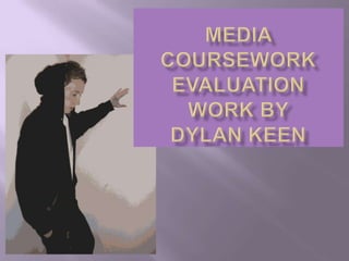
  • 3. Representation of particular social groups My media product represents the group of younger adults, possibly ranging from 16-20, either male or female however this particular issue would definitely attract more boys than girls due to the bold, strong, masculine colours and fonts. Also the central artist is male, which sometimes reflects the boys interests in music, yet on the other hand the artist can be viewed as a “sex icon” that a majority of women find attractive, therefore targeting both genders. I used bold, simplistic styles to try and attract my particular social group, who are arguably a niche market audience. The images represent teenage boys as a generalisation appropriately, especially on the contents page with the attention of females. Boys like to feel in control and dominate, therefore the artist they want to relate to is always dominating and acting powerfully on the page. “Magazine for the people” is supposed to suggest an open audience, where the reader is the ultimate decision maker, as to whether they like or dislike the artist or magazine content, but that phrase is effective in attracting further interest as it involves the reader. The body language and camera angles for the photographs were all intentional to suggest a theme of rebellion and unique style, reflecting a common feeling in teenage boys today who want to be seen and respected as individuals. Also the black and white is a connotation of “what you see is what you get” – another shared belief that young teenagers use. The black and white ensures that the magazine isn’t complicated, so that all information is straightforward and creative.
  • 4. WHAT KIND OF MEDIA INSITUTION MIGHT DISTRIBUTE THE MAGAZINE? I would expect regular magazine publishers to distribute my magazine, as they all know what works and what doesn’t as well as what will be successful and what will fail. Web 2.0 would contribute to the distribution of my magazine, as it has many interactive websites that are willing to advertise and attach themselves to particular products. I could see other websites that relate to the Hip Hop genre of music also taking an interest in advertising the magazine, which will increase exposure and sales.
  • 5. WHO WOULD BE THE AUDIENCE FOR YOUR MEDIA PRODUCT? I have targeted both genders, at a young adult age approximately 16 – 20 who reflect a subtle, understated audience. It is arguably a Niche market as I have not followed all the conventions of a typical Hip Hop magazine, for instance a white male artists as the central topic and a black and white colour scheme. However I have targeted an audience who enjoy music for music’s sake, and are more interested in the stylish substance of the magazine. Challenging colourful colours and replacing them with subdued, serious black and white suggests this magazine is a straightforward product where what you see is what you get. It is also revolving around the idea that “less is more” so that not all the pages are crowded with information wherever possible, but they deliver the appropriate amount of content that truly satisfies the audience. Overall, I wanted to target teenagers with a subtle/ stylish personality, who prefer individual originality over regular magazines.
  • 6. ATTRACTING AND ADDRESSING THE AUDIENCE First recognising and deciding my audience had to be done before I could figure out how to attract and address them. I had to use the correct colours, fonts, layout, Mise en scene, representation and obvious conventions. The colours I used are clear challenges of the typical colour conventions commonly used on Hip Hop magazines, yet I believe the challenge was appropriate and successful for targeting a Niche version of the overall market. Black and white suggests plain and simple, yet they compliment each other effectively to help fonts and text and image stand out. The image is also distorted, black and white which is almost a representation of the target audience as individual teenagers. The images were all stylish and bold, but the artist was always reasonably distorted which gives off a sense of mystery and seriousness. Common uses of a button flash, and attractive media language like FREE combined to attract my audience, the use of left hand side features also worked, as the more features you can fit, the more people you are reaching out to.
  • 7. WHAT HAVE YOU LEARNT ABOUT NEW TECHNOLOGIES FROM THE PROCESS OF CONSTRUCTING THIS PRODUCT Over the allotted time to construct our final product, I developed my skills with a few new technologies. Taking into consideration my skills with the Photoshop programme prior to this project, I have learnt an awful lot about how to manipulate images and position them with text effectively. I used to really struggle with Photoshop, but I found that with the help of my peers and YouTube tutorials on the internet my skills began to develop, so that I could get the best out of my images. Also we worked with the stills camera, and researched into photography and how pictures should be taken, considering lighting, the rule of thirds and mise en scene. Finding out about the rules of photography helped me judge and decide which photographs of my own had the greatest impact when situated on the magazine. Considering body language and camera angles the feeling of individuality was reflected in most of my images. I did some work on Paint as well, which was handy for converting general work into pictures. I did a lot of internet research on fonts, which improved my eye for effective typefaces and what ones suited my genre of music. I also came to terms with using the blog site, as I had never blogged before it was a good experience which I began to enjoy.
  • 8. LOOKING BACK AT THE PRELIMINARY TASK, WHAT DO YOU FEEL YOU HAVE LEARNT IN THE PROGRESSION FROM IT TO THE FULL PRODUCT? My preliminary task was very simple and didn’t require too much creative flare. The photo’s used for the starter task weren’t given much consideration as to how effective they were, compared to the final product which has research and analysis behind the decisions of photographs. Photoshop wasn’t used as effectively for the preliminary, as the photographs were never considered to be manipulated, nor was the text. I have certainly learnt a lot more about time and effort in relation to Photoshop, where patience is a virtue and the result will eventually come through persistence. Generally, the photographs I have taken have improved due to the research on photography and learning how the most successful pictures can be taken. For the final full product I noted that design decisions are key to success, where as the preliminary didn’t require as much debate and consideration. I have learnt about conventions, and how it may be a mistake not to follow them, or a risk worth taking to challenge them then achieve a unique style. I have gradually realised that particular media language is vital on a magazine cover to attract the audience, for instance Free and a skyline with names creates a sense of curiosity to find out more. Its also important to personally address your audience, to make them feel involved and attract them continuously to maintain their interest.