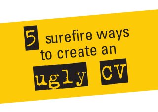
5 surefire ways to create an ugly cv
•
2 likes•951 views

5 surefire ways to create an ugly CV. Want to know how to create a CV that will guarantee it will never get read? Learn how to put people off before they even get past your first sentence!

Recommended
Recommended
More Related Content
Recently uploaded
Recently uploaded (20)
Featured
Featured (20)
5 surefire ways to create an ugly cv
- 1. 5 surefire ways to create an ugly CV
- 2. Want to know how to create a CV that will guarantee it will never get read? ?? ??
- 3. Learn how to put people off before they even get past your first sentence! ?? ??
- 4. Find out how to confuse frustrate readers! ?? ?? &
- 5. Be the first to get thrown in the rubbish, deleted from emails and never get a phone call back ?? ??
- 6. 1. Put Comic Sans to use Now Comic Sans isn’t a bad font. It’s just over-used and badly-used. Now it’s the best way to look unprofessional. Increase your CV’s repellency by including this font. To make a bigger impact, why not use this font in your headings and body content?
- 7. 2. Make everything super colourful! Colour is great. It can direct our eye to headings on a page so we can breakdown a CV for reading. It can also distract and confuse when overused. A surefire way to increase ugliness is to choose a rainbow spectrum of colours and splash them around the page!
- 8. 3.Bad formatting! Using bad formatting is possibly the most effective way to enhance ugliness. Good formatting will make everything easy to read. But to confuse readers you’ll need to have no use of spacing between heading and paragraphs. Be sure to mash everything together. Why use bullet points when you can make a solid paragraph?
- 9. 4.USE CAPS ALOT LET’S SHOUT YOUR MESSAGE REALLY LOUD!! BECAUSE WRITING IN CAPS IS A GREAT WAY TO HURT YOUR READERS EYES. WHAT BETTER WAY TO GET THROWN IN THE BIN? EVEN BETTER, WHY NOT OVER-USE EXCLAMATION MARKS!!! !!
- 10. 5. Slap on the Clip Art Boy, aren’t we grateful to those people who created clip art? It looks super naive and unprofessional and what a great way to convey that you don’t care how your CV looks. So find the ugliest piece of clip art you can find, then get crazy with the copy and paste.