SlideShare a Scribd company logo
1 of 4
The first contents page I will be analysing is the image on the left,
which is a contents page out of the We Love Pop magazine.
There are a variety of images that are related to the genre Pop and
some are presented as close up portraits whilst others are larger and
more dominant. The images are mainly of well known pop artists and
groups like: One Direction, The Wanted, two members of The
Saturdays, JLS etc. These groups/artists are used to attract the readers
and to capture their eye. The girls will be attracted to the image of Una
and Vanessa as the girls are role models for the young girls who seek to
be like them. This will help attract the reader even more as they are
presented as cheerful, glamorous and talented. The sell line “We look
like condoms Una and Vanessa take on our dreaded carrier bag”
attracts the target audience as they will want to read on to find out
what ‘We Love Pop’ asked The Saturday girls to do.
The larger images are captioned with quotes from information inside
the magazine to draw the reader in and convince them to turn to that
specific page. The people in the larger images are represented as
entertaining, wild and sociable. As the images are staged, it looks like
the artists are looking directly at the reader which is luring them in and
causing enigma.
The way the page numbers are used on the images is to anchor the
images to different articles within the magazine. This makes it easy for
the reader to navigate. This is appealing to the reader as if they see an
image they like, they can read what page its on and immediately turn
to the page and read the articles that interest them. Attached to the
images is a little piece of text to give the person who is reading, an
incite on what is inside the article.
The colour spread used on the contents page is a sky blue and bright
orange which are both fresh, bright colours which reflects the youthful
reader. They also make us think of purity and happiness. The colour blue
is the opposite of what the reader may first expect as it’s generally a
masculine colour, however it fits well with the citrusy orange colour. By
using the bright colours effect in each distribution it is creating their brand
identity. The magazine continues to maintain their brand identity by using
their logo on the right hand corner of the page. This is reminding the
reader of what magazine they are reading.
The page uses a bold and basic sans serif font for the sub headings. The
way “WE LOVE THIS…” is been presented, makes it the first thing the
reader sees once opening the magazine as it is in big, black and bold. This
is standing out from the rest of the page. As it is capitalised, it connotes
the headings importance to the reader and the reader should take notice
of it. “INSIDE THIS MONTH...” is also bold, black and sans serif which is
done to attract the readers towards the headings within the contents page
and grab their attention. Both titles are contrasted between the black font
and the white background, causing it to be eye-catching to the reader.
Under the “INSIDE THIS MONTH” heading is a list of some of the most
interesting and important stories within the magazine. This attracts the
reader as young girls don’t like to read through paragraphs of text and as
they will end up becoming bored and disinterested by the amount of
content used on the page. As an alternative, they would rather look at
images of their pop idols presented within the magazine.
There is a row of small images at the bottom of the contents page with a
puff saying “NEW POSTERS”. This is to give the reader an incite of what
posters are included within the magazine. This is attracting the audience
even more, as they may like one of the images and be happy and grateful
they are getting a poster. This links well with the personality of the target
audience as young girls like to decorate their room with artists they look
up to or have a crush on.
The first contents page I will be analysing is the image on the left,
which is a contents page out of the Top of the Pops magazine.
The contents page is laid out simply but effectively. There is no
features that takes up the whole page as there is a lot going on,
though this is represents equal importance of everything that the
magazine consists of.
The use of the front cover image which emphasises the cover stories
which have attracted the reader to begin with. They have used arrows
that are connected to page numbers, making it easier for the reader
to refer to an article that was on the front cover. The main image of
Cher Lloyd is wearing pink which links to the colour scheme and
because the colour pink is known as feminine and girly. This links to
the target audience of pop magazines. It is a good feature to use on
the contents page as this is where the eye of the reader wonders first.
The magazine uses short and snappy subheadings to categorise the
content in groups to make it easier for the reader to navigate. To
create a use of continuity, they have used the same house style as the
front cover. They have used the same font for each subheading which
makes the page more girly and loopy. The use of hearts connotes
femininity. Although it is a music magazine, it has other incorporated
elements that the reader would be interested in. The page represents
that the target audience is interested in boys, celebrity gossip and
shopping. They have used the colours well on the page as pink
connotes femininity and white makes use think of innocence and
purity. The magazine has also used the colour yellow to highlight the
key areas, making them stand out as they feel this is what the reader
will be mostly interest in. This all relates back to the target audience
of young girls.
The mode of address is talking directly to the reader to make them feel
relaxed and give them the sense that the magazine isn’t talking at them but
to them. It is creating a special bond between the reader and the magazine as
it is conversational address, making the reader feel comfortable and
understanding. The masthead uses colloquial language “mag” as this is the
way young teenage girls would speak, informal and slang. This is creating a
friendly tone and environment.
The masthead is the largest text on the contents page which is the first thing
the target audience reads, making them know what the page is about.
“Inside the mag...” is in white text, in a bright pink box. This is carrying the
colour scheme from the front cover, which reflect the femininity of the
reader.
Images are used to make the contents page more interesting, attractive and
to break up the text. The use of some images adds further meaning to the
text. For example, they have used fashion images like shoes with the page
number on the image, to make the reader know where the fashion articles
are, as this may be the only thing they are interested in. There is a circular
image of One Direction which would attract the reader as more young girls
have a crush on them. The use of making the image circular makes the image
more cute and stand out. There is not much information provided in the
image which is enticing the reader to find out what the image is all about.
The magazine is promoting 3D posters which makes their magazine unique.
They are pointing out to the reader what page numbers they are able to
access the posters, as they may be excited to see what 3D posters are
included. This is bringing excitement and enthusiasm as they would feel they
are right next to the artist/band. This is a key convention of including posters
in a music magazine, making it more meaningful and special for the reader

Unlike other music magazines, there is less emphasis on music and gigs and
more emphasis on celebrity and fashion. This suggesting that young girls want
to know information to meet their needs. For example, rather than reading a
concert review, the reader would rather find out what her favourite artist is
wearing or what her boy crush got up to on the weekend.

More Related Content

Viewers also liked

Artist introduction
Artist introductionArtist introduction
Artist introductionbhatty97
 
Contents page overview
Contents page overviewContents page overview
Contents page overviewbhatty97
 
Mise en-scene
Mise en-sceneMise en-scene
Mise en-scenebhatty97
 
Double page spread overview
Double page spread overviewDouble page spread overview
Double page spread overviewbhatty97
 
Codes and conventions
Codes and conventionsCodes and conventions
Codes and conventionsbhatty97
 
Evaluation new
Evaluation newEvaluation new
Evaluation newbhatty97
 
Evaluation new
Evaluation newEvaluation new
Evaluation newbhatty97
 

Viewers also liked (7)

Artist introduction
Artist introductionArtist introduction
Artist introduction
 
Contents page overview
Contents page overviewContents page overview
Contents page overview
 
Mise en-scene
Mise en-sceneMise en-scene
Mise en-scene
 
Double page spread overview
Double page spread overviewDouble page spread overview
Double page spread overview
 
Codes and conventions
Codes and conventionsCodes and conventions
Codes and conventions
 
Evaluation new
Evaluation newEvaluation new
Evaluation new
 
Evaluation new
Evaluation newEvaluation new
Evaluation new
 

More from bhatty97

Camera shots
Camera shotsCamera shots
Camera shotsbhatty97
 
Results on focus group
Results on focus groupResults on focus group
Results on focus groupbhatty97
 
Double page spread analysis
Double page spread analysisDouble page spread analysis
Double page spread analysisbhatty97
 
Costume ideas
Costume ideasCostume ideas
Costume ideasbhatty97
 
Idea presentation
Idea presentationIdea presentation
Idea presentationbhatty97
 
Font analysis
Font analysisFont analysis
Font analysisbhatty97
 
Questionnaire for pop magazines
Questionnaire for pop magazinesQuestionnaire for pop magazines
Questionnaire for pop magazinesbhatty97
 
Costume ideas
Costume ideasCostume ideas
Costume ideasbhatty97
 

More from bhatty97 (8)

Camera shots
Camera shotsCamera shots
Camera shots
 
Results on focus group
Results on focus groupResults on focus group
Results on focus group
 
Double page spread analysis
Double page spread analysisDouble page spread analysis
Double page spread analysis
 
Costume ideas
Costume ideasCostume ideas
Costume ideas
 
Idea presentation
Idea presentationIdea presentation
Idea presentation
 
Font analysis
Font analysisFont analysis
Font analysis
 
Questionnaire for pop magazines
Questionnaire for pop magazinesQuestionnaire for pop magazines
Questionnaire for pop magazines
 
Costume ideas
Costume ideasCostume ideas
Costume ideas
 

Contents page analysis

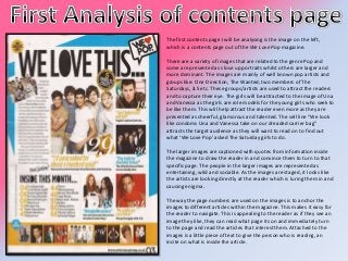
  • 1. The first contents page I will be analysing is the image on the left, which is a contents page out of the We Love Pop magazine. There are a variety of images that are related to the genre Pop and some are presented as close up portraits whilst others are larger and more dominant. The images are mainly of well known pop artists and groups like: One Direction, The Wanted, two members of The Saturdays, JLS etc. These groups/artists are used to attract the readers and to capture their eye. The girls will be attracted to the image of Una and Vanessa as the girls are role models for the young girls who seek to be like them. This will help attract the reader even more as they are presented as cheerful, glamorous and talented. The sell line “We look like condoms Una and Vanessa take on our dreaded carrier bag” attracts the target audience as they will want to read on to find out what ‘We Love Pop’ asked The Saturday girls to do. The larger images are captioned with quotes from information inside the magazine to draw the reader in and convince them to turn to that specific page. The people in the larger images are represented as entertaining, wild and sociable. As the images are staged, it looks like the artists are looking directly at the reader which is luring them in and causing enigma. The way the page numbers are used on the images is to anchor the images to different articles within the magazine. This makes it easy for the reader to navigate. This is appealing to the reader as if they see an image they like, they can read what page its on and immediately turn to the page and read the articles that interest them. Attached to the images is a little piece of text to give the person who is reading, an incite on what is inside the article.
  • 2. The colour spread used on the contents page is a sky blue and bright orange which are both fresh, bright colours which reflects the youthful reader. They also make us think of purity and happiness. The colour blue is the opposite of what the reader may first expect as it’s generally a masculine colour, however it fits well with the citrusy orange colour. By using the bright colours effect in each distribution it is creating their brand identity. The magazine continues to maintain their brand identity by using their logo on the right hand corner of the page. This is reminding the reader of what magazine they are reading. The page uses a bold and basic sans serif font for the sub headings. The way “WE LOVE THIS…” is been presented, makes it the first thing the reader sees once opening the magazine as it is in big, black and bold. This is standing out from the rest of the page. As it is capitalised, it connotes the headings importance to the reader and the reader should take notice of it. “INSIDE THIS MONTH...” is also bold, black and sans serif which is done to attract the readers towards the headings within the contents page and grab their attention. Both titles are contrasted between the black font and the white background, causing it to be eye-catching to the reader. Under the “INSIDE THIS MONTH” heading is a list of some of the most interesting and important stories within the magazine. This attracts the reader as young girls don’t like to read through paragraphs of text and as they will end up becoming bored and disinterested by the amount of content used on the page. As an alternative, they would rather look at images of their pop idols presented within the magazine. There is a row of small images at the bottom of the contents page with a puff saying “NEW POSTERS”. This is to give the reader an incite of what posters are included within the magazine. This is attracting the audience even more, as they may like one of the images and be happy and grateful they are getting a poster. This links well with the personality of the target audience as young girls like to decorate their room with artists they look up to or have a crush on.
  • 3. The first contents page I will be analysing is the image on the left, which is a contents page out of the Top of the Pops magazine. The contents page is laid out simply but effectively. There is no features that takes up the whole page as there is a lot going on, though this is represents equal importance of everything that the magazine consists of. The use of the front cover image which emphasises the cover stories which have attracted the reader to begin with. They have used arrows that are connected to page numbers, making it easier for the reader to refer to an article that was on the front cover. The main image of Cher Lloyd is wearing pink which links to the colour scheme and because the colour pink is known as feminine and girly. This links to the target audience of pop magazines. It is a good feature to use on the contents page as this is where the eye of the reader wonders first. The magazine uses short and snappy subheadings to categorise the content in groups to make it easier for the reader to navigate. To create a use of continuity, they have used the same house style as the front cover. They have used the same font for each subheading which makes the page more girly and loopy. The use of hearts connotes femininity. Although it is a music magazine, it has other incorporated elements that the reader would be interested in. The page represents that the target audience is interested in boys, celebrity gossip and shopping. They have used the colours well on the page as pink connotes femininity and white makes use think of innocence and purity. The magazine has also used the colour yellow to highlight the key areas, making them stand out as they feel this is what the reader will be mostly interest in. This all relates back to the target audience of young girls.
  • 4. The mode of address is talking directly to the reader to make them feel relaxed and give them the sense that the magazine isn’t talking at them but to them. It is creating a special bond between the reader and the magazine as it is conversational address, making the reader feel comfortable and understanding. The masthead uses colloquial language “mag” as this is the way young teenage girls would speak, informal and slang. This is creating a friendly tone and environment. The masthead is the largest text on the contents page which is the first thing the target audience reads, making them know what the page is about. “Inside the mag...” is in white text, in a bright pink box. This is carrying the colour scheme from the front cover, which reflect the femininity of the reader. Images are used to make the contents page more interesting, attractive and to break up the text. The use of some images adds further meaning to the text. For example, they have used fashion images like shoes with the page number on the image, to make the reader know where the fashion articles are, as this may be the only thing they are interested in. There is a circular image of One Direction which would attract the reader as more young girls have a crush on them. The use of making the image circular makes the image more cute and stand out. There is not much information provided in the image which is enticing the reader to find out what the image is all about. The magazine is promoting 3D posters which makes their magazine unique. They are pointing out to the reader what page numbers they are able to access the posters, as they may be excited to see what 3D posters are included. This is bringing excitement and enthusiasm as they would feel they are right next to the artist/band. This is a key convention of including posters in a music magazine, making it more meaningful and special for the reader Unlike other music magazines, there is less emphasis on music and gigs and more emphasis on celebrity and fashion. This suggesting that young girls want to know information to meet their needs. For example, rather than reading a concert review, the reader would rather find out what her favourite artist is wearing or what her boy crush got up to on the weekend.