Call Girls Ludhiana Just Call 98765-12871 Top Class Call Girl Service Available
Contents page analysis
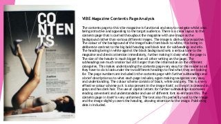
1. VIBE Magazine Contents Page Analysis
The contents page to this vibe magazine is functional and easy to navigate whilst also
being attractive and appealing to the target audience. There is a clear layout to the
contents page that is carried throughout the magazine with one image as the
background rather than various different images. The image is dark and provocative.
The colour of the background of the image fades from black to white, this being in
deliberate contrast to the big bold heading and black text for subheadings and info.
The heading being in white against the black background sets a serious tone to the
magazine and directs attention immediately, further making it clear what the page is.
The size of the header is much bigger than all other writing on the page. The
subheadings are much smaller but still larger than the information on the different
categories. This makes understanding the contents page very easy for the reader as all
they have to do is look under the two different headings to find what they are looking
for. The page numbers are included in the contents page with further subheadings and
a brief description as to what each page includes, again making navigation very easy
and understanding. The colour scheme consists of black, white and grey. This is a very
effective colour scheme as it is also present in the image itself, as the girl is dressed in
greys and has dark hair. The use of capital letters for further subheadings also makes
reading convenient and understandable and use of different font re-enforces this. The
contents page in itself is very uniformed. The text also fits perfectly next to the image
and the image slightly covers the heading, drawing attention to the image. Publishing
data is included.
2. Rolling Stones Contents Page Analysis
The contents page to this Rolling Stones magazine is functional and easy to navigate
whilst also being attractive and appealing to the target audience. There are 3 clear
images on the contents page that indicate what the articles are about. The images
are all very different; one of a rock star in concert, another of an artist on a piano
the other of Barack Obama. The heading being in white against the red block suggests
a not so serious tone to the magazine, directing attention immediately to this and
informing the reader what the page is. The size of the header is bigger than all other
writing on the page. The subheadings are much smaller but still larger than the
information on the different categories. This makes understanding the contents page
very easy for the reader as all they have to do is look under the 3 different sub-
headings to find what they are looking for. The page numbers are included in the
contents page with further subheadings and a brief description as to what each page
includes, again making navigation very easy and understanding. The colour scheme
consists of black, white, grey and red. The use of red and white is in the heading and
subheadings. This is a very effective colour scheme as it draws attention to all
different sections of the contents page, making it all bright and vibrant. The use of
capital letters for further subheadings also makes reading convenient and
understandable and use of different font for different sections re-enforces this. The
contents page in itself is very uniformed. Publishing data is included.
3. Q Magazine Contents Page Analysis
The contents page to this Q Magazine is functional and easy to navigate whilst also
being attractive and appealing to the target audience. There are 2 clear images on
the contents page, one larger image of a famous individual and a smaller one of
two others, indicating what the articles are about. The images are both very
different, one of a young innocent female and the other f two relaxed males. The
heading being in white against the black block suggests a serious tone to the
magazine, directing attention immediately to this and informing the reader what
the page is. The size of the header is slightly bigger than the other writing on the
page. The subheadings are smaller but still larger than the information on the
different categories. This makes understanding the contents page very easy for the
reader as all they have to do is look under the 3 different sub-headings to find
what they are looking for. The page numbers are included in the contents page
with further subheadings and a brief description as to what each page includes,
again making navigation very easy and understanding. The colour scheme consists
of black, white, grey and red. Different block colours of background and different
font in white, black, grey or red are used throughout the contents page , this is a
very effective colour scheme as it draws attention to all different sections of the
contents page, making it bright and vibrant without it becoming child-like. The use
of capital letters for subheadings and headings also makes reading convenient and
understandable. Use of the same font for all sections is deliberate and again
convenient, creating a good layout. The contents page in itself is very uniformed.
Publishing data is included.