
Recommended
More Related Content
Recently uploaded
Recently uploaded (20)
Featured
Featured (20)
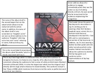
Jay Z "Kingdom Come" Album Poster/Advert
- 1. Direct address allows the audience to engage immediately when they see the poster as Jay-Z is looking directly at them, his eyes would also be at eye level to the audience emphasising the recognition. The header shows the genre of Hip Hop and is also shown in Jay-Z’s clothing as her is wearing a New York Yankees baseball cap at a slant; this is a fashion trend that was developed in the late 90’s – late 00’s and is a contemporary convention of hip hop music. In addition, Jay Z is also wearing a leather bomber jacket with the collar turned up which is also another fashion trend which allows the audience to identify the hip hop genre as it conforms to the representations of hip hop culture. This is Jay-Z own logo which is a bold serif font; this allows the audience to recognise his music, it is features on a majority of his albums and is therefore consistent; allowing the audience to feel a sense of safety conforming to Maslow's Hierarchy of Needs (1954). It is also the largest text which ties the image of Jay-Z directly with his logo which enhances his brand identity. This conforms to Dyer’s Star Theory (1998) which mentions that stars are not the same as performers and carry their own identity. This is the record label that produces the album called ‘Rocafella’ which is closely associated with Jay-Z. The name of the album itself is the second largest font on the advert which allows it to be easily tied with the artists name. In addition, the name of the album itself is very convenient as “kingdom come” can seen as direct address to his audience; “kingdom” referring to his fans and “come” referring to ‘come, follow and buy my album’.