Conventions within my magazine and NME for double page spread
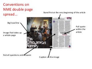
1. Conventions on
NME double page
spread…
Stand first at the very beginning of the article
Big head line
Pull quote
within the
article
Image that takes up
a whole page
Not all questions and answers
Caption on the image
2. Conventions on
my double page
spread…
I used a small caption on my image
I included a
stand first before
my article and
also a big head
line, to make it
conventional
My article does include
some questions and
answers but has quite a lot
of information text too
Pull quote within
my article, this is
conventional
I have also used one
image to take up a
whole page
3. Conventions on my double page
spread…
One main convention within indie magazines is to have a main image
that takes up all of one side within the double page spread, this is
something that I have done too. I then also included a caption on the
image because that is another conventional element.
I placed a pull quote within my article, this breaks the text up and will
also catch the readers attention, this is conventional within an indie
magazine and would be typically seen.
I have a stand first, kicker and a big head line which makes my double
page spread fit in within the indie genre.
My article has some questions and answers in it but also has a lot of
information text which makes it more conventional to the indie genre.
I have also carried on my house style onto my double page spread and
have continued using the colours red and black.