Production review neville brody
•Download as DOCX, PDF•
1 like•158 views

This is a blogg on a production review.
Report
Share
Report
Share

Recommended
Massage And Sex Call Girls In Chandigarh 9053900678 Chandigarh Call Girls
Massage And Sex Call Girls In Chandigarh 9053900678 Chandigarh Call Girls
Massage And Sex Call Girls In Chandigarh 9053900678 Chandigarh Call Girls
Massage And Sex Call Girls In Chandigarh 9053900678 Chandigarh Call Girls
Massage And Sex Call Girls In Chandigarh 9053900678 Chandigarh Call Girls
Massage And Sex Call Girls In Chandigarh 9053900678 Chandigarh Call Girls
Massage And Sex Call Girls In Chandigarh 9053900678 Chandigarh Call Girls
Massage And Sex Call Girls In Chandigarh 9053900678 Chandigarh Call Girls
Massage And Sex Call Girls In Chandigarh 9053900678 Chandigarh Call Girls
Massage And Sex Call Girls In Chandigarh 9053900678 Chandigarh Call Girls
Massage And Sex Call Girls In Chandigarh 9053900678 Chandigarh Call Girls
Massage And Sex Call Girls In Chandigarh 9053900678 Chandigarh Call Girls
Massage And Sex Call Girls In Chandigarh 9053900678 Chandigarh Call Girls
Massage And Sex Call Girls In Chandigarh 9053900678 Chandigarh Call Girls
Massage And Sex Call Girls In Chandigarh 9053900678 Chandigarh Call Girls
Massage And Sex Call Girls In Chandigarh 9053900678 Chandigarh Call Girls
Massage And Sex Call Girls In Chandigarh 9053900678 Chandigarh Call Girls
Massage And Sex Call Girls In Chandigarh 9053900678 Chandigarh Call Girls
Massage And Sex Call Girls In Chandigarh 9053900678 Chandigarh Call Girls
Massage And Sex Call Girls In Chandigarh 9053900678 Chandigarh Call Girls
Massage And Sex Call Girls In Chandigarh 9053900678 Chandigarh Call Girls
Massage And Sex Call Girls In Chandigarh 9053900678 Chandigarh Call Girls
Massage And Sex Call Girls In Chandigarh 9053900678 Chandigarh Call Girls
Massage And Sex Call Girls In Chandigarh 9053900678 Chandigarh Call GirlsChandigarh Call girls 9053900678 Call girls in Chandigarh
Call Girl Dehradun Indira Call Now: 8617697112 Dehradun Escorts Booking Contact Details WhatsApp Chat: +91-8617697112 Dehradun Escort Service includes providing maximum physical satisfaction to their clients as well as engaging conversation that keeps your time enjoyable and entertaining. Plus they look fabulously elegant; making an impressionable. Independent Escorts Dehradun understands the value of confidentiality and discretion - they will go the extra mile to meet your needs. Simply contact them via text messaging or through their online profiles; they'd be more than delighted to accommodate any request or arrange a romantic date or fun-filled night together. We provide –(INDIRA) Call Girl Dehradun Call Now 8617697112 Dehradun Escorts 24x7
(INDIRA) Call Girl Dehradun Call Now 8617697112 Dehradun Escorts 24x7Call Girls in Nagpur High Profile Call Girls
More Related Content
Viewers also liked
Viewers also liked (8)
Globalisasi dan isu antara budaya gerakan freemason
Globalisasi dan isu antara budaya gerakan freemason
L'atelier de formation des enseignants - Exploitation Minière Moderne et Tech...
L'atelier de formation des enseignants - Exploitation Minière Moderne et Tech...
Recently uploaded
Massage And Sex Call Girls In Chandigarh 9053900678 Chandigarh Call Girls
Massage And Sex Call Girls In Chandigarh 9053900678 Chandigarh Call Girls
Massage And Sex Call Girls In Chandigarh 9053900678 Chandigarh Call Girls
Massage And Sex Call Girls In Chandigarh 9053900678 Chandigarh Call Girls
Massage And Sex Call Girls In Chandigarh 9053900678 Chandigarh Call Girls
Massage And Sex Call Girls In Chandigarh 9053900678 Chandigarh Call Girls
Massage And Sex Call Girls In Chandigarh 9053900678 Chandigarh Call Girls
Massage And Sex Call Girls In Chandigarh 9053900678 Chandigarh Call Girls
Massage And Sex Call Girls In Chandigarh 9053900678 Chandigarh Call Girls
Massage And Sex Call Girls In Chandigarh 9053900678 Chandigarh Call Girls
Massage And Sex Call Girls In Chandigarh 9053900678 Chandigarh Call Girls
Massage And Sex Call Girls In Chandigarh 9053900678 Chandigarh Call Girls
Massage And Sex Call Girls In Chandigarh 9053900678 Chandigarh Call Girls
Massage And Sex Call Girls In Chandigarh 9053900678 Chandigarh Call Girls
Massage And Sex Call Girls In Chandigarh 9053900678 Chandigarh Call Girls
Massage And Sex Call Girls In Chandigarh 9053900678 Chandigarh Call Girls
Massage And Sex Call Girls In Chandigarh 9053900678 Chandigarh Call Girls
Massage And Sex Call Girls In Chandigarh 9053900678 Chandigarh Call Girls
Massage And Sex Call Girls In Chandigarh 9053900678 Chandigarh Call Girls
Massage And Sex Call Girls In Chandigarh 9053900678 Chandigarh Call Girls
Massage And Sex Call Girls In Chandigarh 9053900678 Chandigarh Call Girls
Massage And Sex Call Girls In Chandigarh 9053900678 Chandigarh Call Girls
Massage And Sex Call Girls In Chandigarh 9053900678 Chandigarh Call Girls
Massage And Sex Call Girls In Chandigarh 9053900678 Chandigarh Call GirlsChandigarh Call girls 9053900678 Call girls in Chandigarh
Call Girl Dehradun Indira Call Now: 8617697112 Dehradun Escorts Booking Contact Details WhatsApp Chat: +91-8617697112 Dehradun Escort Service includes providing maximum physical satisfaction to their clients as well as engaging conversation that keeps your time enjoyable and entertaining. Plus they look fabulously elegant; making an impressionable. Independent Escorts Dehradun understands the value of confidentiality and discretion - they will go the extra mile to meet your needs. Simply contact them via text messaging or through their online profiles; they'd be more than delighted to accommodate any request or arrange a romantic date or fun-filled night together. We provide –(INDIRA) Call Girl Dehradun Call Now 8617697112 Dehradun Escorts 24x7
(INDIRA) Call Girl Dehradun Call Now 8617697112 Dehradun Escorts 24x7Call Girls in Nagpur High Profile Call Girls
Pakistani Bur Dubai Call Girls # +971528960100 # Pakistani Call Girls In Bur Dubai # (UAE)
Marina Call girls Dubai marina Call girls Jumeirah Call girls
Dubai Jumeirah Call girls Bur dubai Call girls Indian Call girls in bur dubai
Call girls bur dubai hiding a tremendous secret. Al qusais Call girls
Al nahda dubai Call girls Independent Call girls dubai Independent Call girl dubai Russian Call girls in dubai Dubai russian Call girls Young Call girls in dubai Dubai young Call girls
Call girls numbers in dubai How about leaving your father's home, being wealthy, and being able to help your sister? Even though I know what she is going to say won't be good, my ears are ringing. To have this chat, I waited until Dubai Call girls number
Call girls near me dubai Call girls near my hotel Cute Call girls in dubai Model Call girl in dubai
Rent a girlfriend dubai you were eighteen years old. Do you understand what I do, Eden? Since I have no idea, I shake my head and my mind races. She must be some kind of successful businesswoman, I suppose. "I own a business. Do you recognize that? Knowing my best.
She left. She said that Dad told her that Dubai Call girls Call girls dubai Call girls in dubai Call girls at dubai we didn’t need her anymore when he came home. I was sad.Dubai Call girl Call girl dubai Call girl in dubai Indian Call girls dubai Indian Call girl dubai
Can you tell her to come back? I like her.” Her little face is Pakistan Call girls in dubai Pakistani Call girl dubai Dubai Call girls service Dubai Call girl services all pinched. So sweet. Call girl service in dubai Dubai Call girl agency Dubai Call girls agency Verified Call girls dubai But I'm pissed off. How can he Young Call girls in dubai Marina Call girls Dubai marina Call girls Jumeirah Call girls Dubai Jumeirah Call girls Bur dubai Call girls Indian Call girls in bur dubai Call girls bur dubai turn down someone I'm paying for?
“So, who's here with you?” I ask her,Al qusais Call girls Al nahda dubai Call girls Independent Call girls dubai Independent Call girl dubai Russian Call girls in dubai Dubai russian Call girls fervently hoping she wasn’t here alone.
“Dad's downstairs, I think Young Call girls in dubai Dubai young Call girls Call girls numbers in dubai Dubai Call girls number Call girls near me dubai Call girls near my hotel Cute Call girls in dubai Model Call girl in dubai Rent a girlfriend dubai. Foxy sent you some chicken fingers, fries, and apple pie.”
Finally, anyone else would feel Dubai Call girls Call girls dubai Call girls in dubai Call girls at dubai Dubai Call girl Call girl dubai Call girl in dubai Indian Call girls depressed working as a housekeeper, but it’s not that bad. dubai Indian Call girl dubai Pakistan Call girls in dubai Pakistani Call girl dubai Dubai Call girls service Dubai Call girl services Call girl service in dubai Dubai Call girl agency Dubai Call girls agency Verified Call girls dubai Young Call girls in dubai Marina Call girls.Pakistani Bur Dubai Call Girls # +971528960100 # Pakistani Call Girls In Bur ...
Pakistani Bur Dubai Call Girls # +971528960100 # Pakistani Call Girls In Bur ...Business Bay Call Girls || 0529877582 || Call Girls Service in Business Bay Dubai
Recently uploaded (20)
Massage And Sex Call Girls In Chandigarh 9053900678 Chandigarh Call Girls
Massage And Sex Call Girls In Chandigarh 9053900678 Chandigarh Call Girls
Bobbie goods coloring book 81 pag_240127_163802.pdf
Bobbie goods coloring book 81 pag_240127_163802.pdf
DELHI NCR —@9711106444 Call Girls In Majnu Ka Tilla (MT)| Delhi
DELHI NCR —@9711106444 Call Girls In Majnu Ka Tilla (MT)| Delhi
Call Girls in Sakinaka 9892124323, Vashi CAll Girls Call girls Services, Che...
Call Girls in Sakinaka 9892124323, Vashi CAll Girls Call girls Services, Che...
GENUINE EscoRtS,Call Girls IN South Delhi Locanto TM''| +91-8377087607
GENUINE EscoRtS,Call Girls IN South Delhi Locanto TM''| +91-8377087607
FULL NIGHT — 9999894380 Call Girls In Delhi | Delhi
FULL NIGHT — 9999894380 Call Girls In Delhi | Delhi
FULL NIGHT — 9999894380 Call Girls In Uttam Nagar | Delhi
FULL NIGHT — 9999894380 Call Girls In Uttam Nagar | Delhi
(INDIRA) Call Girl Dehradun Call Now 8617697112 Dehradun Escorts 24x7
(INDIRA) Call Girl Dehradun Call Now 8617697112 Dehradun Escorts 24x7
FULL NIGHT — 9999894380 Call Girls In Mahipalpur | Delhi
FULL NIGHT — 9999894380 Call Girls In Mahipalpur | Delhi
FULL NIGHT — 9999894380 Call Girls In Shivaji Enclave | Delhi
FULL NIGHT — 9999894380 Call Girls In Shivaji Enclave | Delhi
Call Girls Ludhiana Just Call 98765-12871 Top Class Call Girl Service Available
Call Girls Ludhiana Just Call 98765-12871 Top Class Call Girl Service Available
FULL NIGHT — 9999894380 Call Girls In Najafgarh | Delhi
FULL NIGHT — 9999894380 Call Girls In Najafgarh | Delhi
FULL NIGHT — 9999894380 Call Girls In Ashok Vihar | Delhi
FULL NIGHT — 9999894380 Call Girls In Ashok Vihar | Delhi
FULL NIGHT — 9999894380 Call Girls In Paschim Vihar | Delhi
FULL NIGHT — 9999894380 Call Girls In Paschim Vihar | Delhi
Pakistani Bur Dubai Call Girls # +971528960100 # Pakistani Call Girls In Bur ...
Pakistani Bur Dubai Call Girls # +971528960100 # Pakistani Call Girls In Bur ...
FULL NIGHT — 9999894380 Call Girls In Kishangarh | Delhi
FULL NIGHT — 9999894380 Call Girls In Kishangarh | Delhi
Production review neville brody
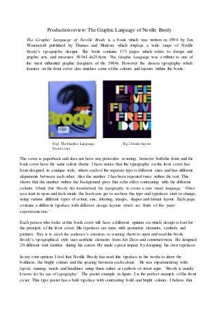
- 1. Production review: The Graphic Language of Neville Brody The Graphic Language of Neville Brody is a book which was written in 1994 by Jon Wozencroft published by Thames and Hudson, which displays a wide range of Neville Brody’s typographic designs. The book contains 175 pages which relate to design and graphic arts, and measures 30.9x1.4x25.6cm. ‘The Graphic Language was a tribute to one of the most influential graphic designers of the 1980s. However the chosen typography which features on the front cover also matches some of the colours and layouts within the book. Fig1 The Graphic Language Fig 2 Inside layout Front cover The cover is paperback and does not have any protective covering; however both the front and the back cover have the same colour theme. I have notice that the typography on the front cover has been designed in a unique style; where each of the separate type is different sizes and has different alignments between each other. Also the number 2 has been repeated twice within the text. This shows that the number within the background gives that echo effect contrasting with the different colours. I think that ‘Brody has transformed his typography to create a new visual language.’ Once you start to open and look inside the book you get to see how the type and typefaces start to change, using various different types of colour, size, lettering, images, shapes and format layout. Each page contains a different typeface with different design layouts which are ‘fruits of five years' experimentation.’ Each person who looks at this book cover will have a different opinion on which design is best for the principle of the front cover. His typefaces are more with geometric elements, symbols and pictures. This is to catch the audience’s attention in wanting them to open and read the book. Brody’s typographical style uses aesthetic elements from Art Deco and constructivism. He designed 20 different font families during his career. He made a great impact by designing his own typefaces In my own opinion I feel that Neville Brody has used this typeface in his works to show the boldness, the bright colours and the spacing between each colour. . He was experimenting with layout, running words and headlines using them rather as symbols or street signs. ‘Brody is mainly known for his use of typography.’ The poster example in figure 2 is the perfect example of the front cover. This type poster has a bold typeface with contrasting bold and bright colours. I believe that
- 2. the type overlaps each other and is placed too to the edge of the page. The colour and style of this writing is really stylish, I love the colours and the blunt, capitalisation of the letters makes it look really bold. Bibliography: The Graphic Language of Neville Brody 2 By John Wozencroft 1994 http://www.slideshare.net/fkgraphicdesign/neville-brody-presentation-2011 http://www.amazon.co.uk/The-Graphic-Language-Neville-Brody/dp/0500277702 http://sylvialondou.blogspot.co.uk/2012_05_01_archive.html