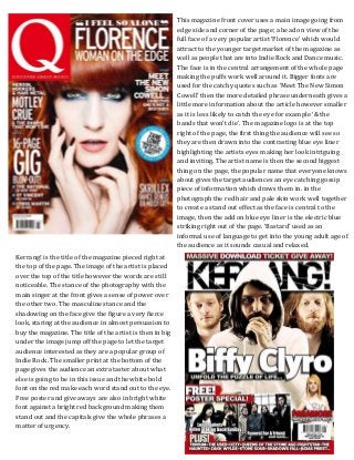
1. This magazine front cover uses a main image going from
edge side and corner of the page; a head on view of the
full face of a very popular artist ‘Florence’ which would
attract to the younger target market of the magazine as
well as people that are into Indie Rock and Dance music.
The face is in the central arrangement of the whole page
making the puffs work well around it. Bigger fonts are
used for the catchy quotes such as ‘Meet The New Simon
Cowell’ then the more detailed phrase underneath gives a
little more information about the article however smaller
as it is less likely to catch the eye for example ‘& the
bands that won’t die’. The magazine logo is at the top
right of the page, the first thing the audience will see so
they are then drawn into the contrasting blue eye liner
highlighting the artists eyes making her look intriguing
and inviting. The artist name is then the second biggest
thing on the page, the popular name that everyone knows
about gives the target audiences an eye catching gossip
piece of information which draws them in. in the
photograph the red hair and pale skin work well together
to create a stand out effect as the face is central to the
image, then the add on blue eye liner is the electric blue
striking right out of the page. ‘Bastard’ used as an
informal use of language to get into the young adult age of
the audience as it sounds casual and relaxed.
Kerrang! is the title of the magazine pieced right at
the top of the page. The image of the artist is placed
over the top of the title however the words are still
noticeable. The stance of the photography with the
main singer at the front gives a sense of power over
the other two. The masculine stance and the
shadowing on the face give the figure a very fierce
look, staring at the audience in almost persuasion to
buy the magazine. The title of the artist is then in big
under the image jump off the page to let the target
audience interested as they are a popular group of
Indie Rock. The smaller print at the bottom of the
page gives the audience an extra taster about what
else is going to be in this issue and the white bold
font on the red make each word stand out to the eye.
Free poster and give aways are also in bright white
font against a bright red background making them
stand out and the capitals give the whole phrases a
matter of urgency.
2. Frank has a very simplistic house style colour scheme to
their magazine; this includes the colours black, white, red,
purple and pink. Again the bigger font is the more
interesting part of the magazine whereas the smaller font is
the details that are less interesting to the eye however
when the target audience is closer up will still read. The
picture is obviously of a famous artist with black hair, make
up and clothing (sticking to the indie rock theme) to
contrast against the white background to make her stand
out and look professional. The eye contact of the audience
catches the eye of the viewer and to the eye follows the
hand gesture round to the brightly coloured name at the
bottom half of the image. A bright red is also used on this
front cover to make it pop against the duller colours in the
background making sure the audience sees this as it is an
exciting article in the magazine that will hopefully make
them buy it. The ‘free’ weekly download in a completely
different shape so the eye can also notice that as it is out of
the ordinary to the other features. As a young generation
are targeted by this genre of magazine free items and gifts
do appeal to audience as they are low on income and
always like to have something that comes with the
magazine they are buying.
This magazine had stuck to a very simplistic
style. The image of the whole Indie Rock popular
band fills the page, the main singer and lead
guitarist in the front as though they are the most
important. The simple clothing gives them a
sense of ordinary and reality which younger
people would relate to. Also the title of the band
is one of the first things you see and as they are a
popular Indie Rock band the target audience will
be very interested in reading about them. The
red and white of the logo makes the word SPIN
stand out against the lightly coloured sky. This
front cover is not overly crowded which makes
the reader wonder what is actually inside as
they do not give much away. There is smaller
print on the right hand side giving a little more
insight into what the audience may expect if they
were to buy this magazine. The ‘Special Edition’
buzzwords stand out to the audience as it seems
as though this image is one of a kid which
attracts the audience into buying it to make
them seem special.
3. NME have stuck to a very exciting and crazy image
relating to younger people with their everyday
lives being rather crazy and stupid. The normal
clothing gives a sense of normality as though
young people can relate to the same crazy
lifestyle. This magazine uses many bright,
different colours to attract the audience’s eye. The
Indie Rock popular band on the front making the
audience want to know more about them. The
blue font around the edge is the bigger font, also
there to catch the eye to make people read about
what would be in this magazine, there is then
smaller white font print underneath giving
information just like on the front of Q magazine.
The separate images of another band and blue
give a nice feature in looking at what else the
audience are buying. Smaller print is used for all
different kinds of insight into the magazine and
symbols are used for example ‘T in the Park’ just
the symbol of the festival gives the target
audience excitement as their interests include
going to these sorts of festivals.
NME have stuck to the house style with this inside
contents page, the capital letters and the black,
white and red colour scheme make it easy to
recognise the pattern and that they go together in
the same magazine. This contents page in split into
parts; the news, radar, reviews, live and features
sections. These are all separated by the black box
with the capital white font that is connected to the
house style still, this helps the audience navigate
around the page more. Page numbers are always in
a different colour and the cover lines are in a bigger,
bolder font than the detailing underneath which is
only a sentence but in normal lettering and not
highlighted. This page also has a side bar and a
skyline which gives in insight into what is going to
be on this page. 2 images are placed on the middle
of the page to keep it interesting and look
professional like a music magazine. Underneath a
small paragraph of news about that week’s issue
and the most interesting news feed that would
make the audience interested into reading more of
the magazine. Mode of address of this contents page
is informal enough to be able to stand out and
become relaxed for a younger audience for example
in the pull quotes.
4. This magazines contents page has taken a different
approach by placing in more images rather than writing.
Each image relates to a page which is illustrated with a
number in the house style of red and the curved corner
with the same font which tells the reader where to find
the article which will relate to the image. ‘Exclusive’ is
the buzzword which is stood out on this page which
make that particular article that it is attached to very
important making the target audience intrigued into
finding out what is so special about that particular
article. The skyline box at the top of the page clearly
outlines what this page is about in the whole magazine
and it a lot outline the date of the issue this magazine has
been released. This contents page’s cover lines are still
the same with the same ideas as the last one; the page
numbers are bigger in a bright colour font, the cover
lines are a lot bigger and bolder compared to the
detailed phrase or sentence giving a little more
information about that article and the ‘Features’ and
‘Regulars’ are different separated parts of the contents
page and this is illustrated with different colours but the
same font type. This magazine has also stuck to the
house style and the title ‘DRUMMER’ clearly lets the
audience know what magazine they are still reading
making it all join and link together perfectly.
This contents page has used lines to separate the
columns of articles that are in the magazine. Different
sections such as ‘Cover Story’, ‘Features’,
‘Competitions’ and ‘Regulars’ are all separated with a
white bar with black capitals in a larger font that the
cover lines which makes it easier for the reader to find
exactly what they are looking for. The title of the
magazine is at the top of the page again sticking to the
house style and the issue date and title of the page are
clearly indicating what the whole page is about. This
contents page is different as they have included an
‘Editor’s Note’ from the editor of the magazine. This
makes an interesting different making a direct
statement to the audience as though talking to them
making a good interaction with the audience. As with
all the other contents pages the cover lines, numbers
and detailed phrases are all different and separated by
the difference in colour and font type including the
numbers and cover lines being bigger and clearer than
the detailed phrases underneath which are in lower
class letters and a different red colour.
5. This magazine is rather boring which its house style
of black and white with the occasional red at the
bottom of the page. The layout is very plain and
boring with square photos everything is very
symmetrical and organised however I don’t think
this fits to my target audience as younger people are
usually a bit messy and like to look at a lot. Pull
quotes are used under each photograph and each
photograph represents an article with the article
page number in big bold black font on a white
square in the bottom corner of the photographs. The
title at the top centre of the page make the audience
know what this page is about. The captions
underneath each photo are 3 different font types
either: bold capitals, italics or normal capitals, this
adds a sense of house style however not interesting
enough for a younger audience. The photographs
aren’t of up to date bands or festivals/gigs they are
one on one photographs, dull clothing, location and
stance. Only colour on the page is the bottom left
hand corner where they are asking for you to pay for
this magazine. Font size is bigger on the pull quotes
and the additional information underneath those is
all the same small bold black capitals. Even though it
may be boring it still is effective and eye catching for
the audience to see.
This Kerrang contents page is a lot more exciting. It
sticks to the house style font of the Kerrang masthead
and places that on the contents at the skyline and also
this week as well as the topics of the different features
that are found in the magazine. This also has an editor’s
note at the bottom speaking out to the reader and letting
the audience know that the audience are put first. Just
like all the other magazines the cover lines, phrases and
numbers are in different colours, fonts and typing styles.
However in this Kerrang issue they have not just put on
one bigger main image but all included smaller symbols
and images relevant to the magazine article including
‘new’, ’30 seconds to mars’ and also a photo of the editor
making it more realistic for the audience to imagine the
editor saying her part. Bring me the horizon are a very
popular and iconic part to indie rock bands and are very
well known in this genre of music. The special offer for
the price of the magazine is a very convincing buy for
the magazine. In the editors section using words such as
‘damn’ and ‘utterly’.
6. On this double page spread Kerrang has still stuck to the house style font of the whole
magazine including it in the ‘New’ headline and the title of My Chemical Romance.
Photography takes up about two thirds of the page showing the exciting life at gigs, live
shows and in the studio. The main text is in two columns and the starting word start with
a hanging indent which makes a clear indication as to where the paragraphing and article
starts. The images are in sepia giving them a dramatic effect and making the white and red
stand out bold on the page, keeping to the house style and giving an effective finish. The
gutter along the right page gives a set of tracks from the artist however in a bold place so
they would be noticed and spotted and also because they aren’t the same to do with the
rest of the piece of text.Kerrang mode of address comes across as informal and casual
making the whole article feel relaxed for the audience. This appeals more to a younger
audience.
7. In this double page spread the magazine has used a blue house style but still stuck to the same
fonts used throughout the pages. These pages include more writing than the last and the
whole of one page is completely filled with a whole image of the band they are interviewing.
The title of the band is the biggest font so the audience are able to tell easily when they have
found the article that they want to read about. The magazine name is still at the top of the
page as a reference and reminder as to the magazine they found this article in. A hanging
indent is used in the columns of the body copy on the opposite page giving information about
the artist that the audience are interested in because they will be popular to that genre of
music and fit to the style of the interests of the audience. The bright blue, white and black all
complement each other by working together to create a colourful and interesting house style
for the audience/reader to look and follow. The image of the band are in a relaxed state just
sitting on the sofa just like any other ordinary person all dressed in ordinary clothing. This
gives a sense of the norm in this photo making the audience relate to them as they are so
relaxed this fits into a younger persona lifestyle as they tend to be very relaxed about
everything as well. The big gutter down the left side of the page gives different artists that the
audience may be interested, as they are reading this article about this particular band they
like there may be other bands like that that the magazine are trying to promote. This mode of
address is so casual and informal making it directly addressed to teenagers. The innuendo of
sex relates to young, reckless and rock genre teenagers. This makes the band sound like
normal teenagers making it a lot more relaxed for the readers.
8. This article on The Vaccines fit in perfectly to the Indie Rock genre instantly appealing to the
target audience of the magazine. This magazine image is very plain but yet effective. The use of
the dull, tea, washed out colours gives the aspect of an old, hipster edge to the genre of
magazine as well as making the blue and the black on the page stand out bright against the back
ground colours making the article and text easy for the audience to read. The title of the band is
the first piece of text to stand out on the page and the hanging indent text underneath has a
carry on from the title. There is then a colourful single hanging indent of one letter as the
paragraphing columns of the body copy come in, giving a clear indication as to where that
comes in. the photograph of the band gives the band a hipster fashion look with the old shirts
and jackets this appeals to the audience as many indie rock fans try and look hipster in their
fashion style. As well as this the odd blue shapes give the magazine a sense of quirkiness which
is very interesting to look at making the whole quirkiness of Indie Rock a new level of interest.
Another article by NME giving that same relaxed mode of address with the informal use of
language and the band speech.
9. This article of Florence out of Florence and the Machine sticks to the genre of Indie
Rock/Dance as well as the whole two pages sticking to the house style of the magazine. The
black, red, white and grey all work well together to complement each other. The red is what
stands out the most with Florence’s hair and the flag that she is sitting on as this fits in with
the USA. Got the love is the title of the piece and the audience instantly know what and who
it is about as this is one of her most popular and famous songs making the USA got the love
a play on words. There is then a short two sentences as a hanging indent, introducing her
before having a singular hanging indent at the start of the body copy making it again easier
to identify the starting of the columns of the article. The image of Florence gives out a
seductive pose as the high heels are on and the short dress in right up her leg with a lot of
flesh showing. This again relates to the audience as the men what to be with her and the
women want to be her. Her red hair and lip stick stand out as seductive and bright against
the page making the figure instantly recognisable. This article is a bit more formal to keep
the representation of Florence a classy working lady not a laid back teenager. Therefore the
article have adapted the mode of address in this way to fit the artist.
10. The red and black contrast together to form the mysterious theme of danger and since this
is a rock chick and the interview is on about the wild personality of this character the
colours fit in with the topic of body copy very well. The white text of the body copy makes it
easy to read against the black background and the read bold questions are highlighted
making it easy to follow through the text. The bright white capital title makes it easy to see
what you will be reading about and ‘WILD’ is in a completely different font as though it has
been scratched onto the page like a wild animal claw has done it, making it a play on words.
The image of Taylor takes up around two thirds of the pages wearing leather with bleach
blonde hair and thick black make up sticking to her style of being a rock chick as well as
being pretty. This pose and features of the image make up a seductive character appealing
to men that want to be with her and women that want to be like her. This mode of address
has changed again as Taylor portrays a bad girl feel therefore the article is more informal
with slang used to create this laid back free girl. She portrays this reckless, sexy rock chick
therefore if the mode of address for more formal it would give the wrong impression of her
as she wants to be passed on as fun and classy.