1. Evaluation Question 1In what ways does your media product use,
develop or challenge forms and conventions of real media
products?
http://www.youtube.com/watch?v=MEHXtIpvuas&feature=youtu.be
Evaluation Question 2 How effective is the combination of your
main product and ancillary texts
In order to create a successful music video, digipak and magazine
advertisement a brand identity was needed in order to link the three products
and make them unique and recognisable. We made sure to make all the
products is easily recognised as being connected through the use of
elements/signifiers such as colour, design, lights and characters from the music
video.
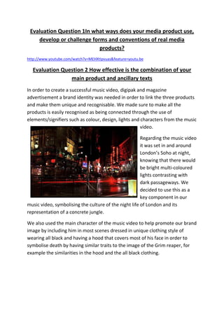
Regarding the music video
it was set in and around
London’s Soho at night,
knowing that there would
be bright multi-coloured
lights contrasting with
dark passageways. We
decided to use this as a
key component in our
music video, symbolising the culture of the night life of London and its
representation of a concrete jungle.
We also used the main character of the music video to help promote our brand
image by including him in most scenes dressed in unique clothing style of
wearing all black and having a hood that covers most of his face in order to
symbolise death by having similar traits to the image of the Grim reaper, for
example the similarities in the hood and the all black clothing.
2. Our music video also includes the brand image
of night timesettings connoting a more adult
themed music video and the feeling of
uncertainty. Something which he carried on in
our Digipak with all of the photographs used are
set at night and also with the magazine advert
which also used a lot of dark colours.
Another component of the music video which
makes it unique and identifiable is the pool
scenes, by incorporating the pool scenes a lot
and as an integral part of the music video it
becomes memorable for the audience and makes our music video unique from
other Dub step music videos.
With the Digipak we decided to build on the brands that we developed in the
music video, such as incorporating the concrete jungle theme by using an
image of a big grey building being lit up with a bright light with trees in the
foreground, giving the connotation of a
concrete jungle with the towering
building having a link to trees that you
would find in a normal jungle. We also
included the image of the main character
in the digipak to further promote him as
the main focus of the music video, as a
kind of
mascot for
the brand.
Our
Digipak
follows the forms and conventions of other
digipaks with the use of a large photo of the
artist on the front in order for it to make the
digipak easier to recognise and identify on
shelves and improve the star image of the
3. artistsomething which was shown in the music video through the heavy use of
the main character in the majority of the scenes. We also followed the
convention of having the same style and colour throughout the whole digipak.
The digipak was created based on a variety of different digipak designs such as
ones by ‘TinieTempah’ and other rap and grime artists’ digipaks. This shows
through the use of the photo of the artist as well as centring of the text
another form and convention we used from analysing other digipaks such as
the use of the parental advisory logo and incorporating aspects of the music
video in the design by adding in an image of a pool table as well an image of a
street sign in Soho
Regarding the magazine advert we included key branding elements that were
present in both the music video and the digipak. A large image of the main
character was included in order to further promote the character of the music
video and make him become more memorable. The main character is seen
positioned on a street late at night which follows the theme we have of the
night life of a city.
We followed the forms and conventions of magazine adverts, such as the use
of a review given on the music video as well as the inclusion of where the
digipak can be brought as these are important
components that must be present in every magazine
advert. However are digipak deviates from the norms
and conventions of
magazine adverts by using
a photo that is different
from the design on the
digipak. I decided not to
follow the normal
convention on this in order
to make the magazine advert purposely different
from other magazine adverts to make it stand out.
We did this to help establish our brand with a
unique style for our magazine advert.
4. Q3. What have you learned from your audience feedback?
From our initial audience research we found that our target audience would be
predominately male between the ages 15-20. We decided this would be our
target audience as the research into the Dub step and Grime music genre
showed that it was male dominated (60%) and our questionnaire confirmed
that Grime was the most popular music genre. By carrying out a questionnaire
we learnt that our music video had to be narrative driven. However20% of
people also liked performance driven music videos so we decided on a fusion
of the two. We also learnt that we could not use too many special effects as
people do not like to see too much of this.We have learnt that we needed to
use a song that had a fast upbeat tempo as that reflected the current music
taste for example Pitbull’s ‘International love’. From our questionnaire it was
also learnt that a male artist would appeal more to our target audience and
that the race of the people involved in the music video was not an important
issue. We therefore incorporated both Black, Asian and White ethnicity.
Our Questionnaires also taught us what to avoid when making a music video in
order to appeal to our target audience. We learnt that our target audience do
not like it when the video is abstract or the story gets too in depth and hard to
follow. We also learnt
that in order to attract
the target audience to
our video would be
best placed on
YouTube, as that is
where the majority of
our target audience
watches music videos.
We also looked into rap
and grime music videos
to see if we could see any reoccurring elements that appear in the majority of
them so that we could include them and create a successful music video.
5. So, all the aspects needed to be incorporated into are product. Firstly we
decided on having the main
character wear a hoodie, as we
knew that hoodies are often
related to youth and crime
culture, an aspect, which relates
to the song we used. We also
used the convention of colours
as we had the main character
dressed in black while the other character the antagonist is seen wearing
white, which is a convention used in many other different medias and it
portrays in a very simplistic way, a force of evil and good. We decided to
simplify connotation of objects, as that is what our target audience likes to see
in music videos.
Regarding the audience positioning we wanted the audience to put themselves
in the position of the main character as they follow him on a night out and
carry out some of the acts a lot
of our target audience might
this was shown to have
succeeded as the results from
the audience feedback tells us
that they did understand the
story and the meaning behind
it. Such acts include excessive
drinking and drug taking and we get to see the ramifications of his actions. We
also get to see just how much of a mental impact of killing someone has on
someone, something that is not really seen in other music videos making our
unique, which we learnt that we succeeded in portraying as our audience
feedback indicated that most people had the preferred reading when viewing
that scene.
With the Mise-en-scene we tried to
make it as realistic as possible as our
target audience likes to see realism
portrayed in music videos. So we used a
6. combination of camera angle and positioning to portray certain things and
make them look realistic. For example for
the scene where the main character flicks
open a knife, we could not use a real knife
as it would not be safe, so we used a flick
out comb that had a metal back that we
faced toward the camera so that all you
could see is the glint of the metal, we
learnt that this was very effective as the audience feedback taught us that they
felt that the video looked professional and realistic. Another instance was the
scene where the main character vomits; we used vegetable soup mixed with
flour in order to get the right consistency and look which we learnt from the
audience feedback that they though it looked realistic.
Once my music video, 16
14
digipak and magazine 12
10
advert was completed I 8
carried out another 6
4
questionnaire in order to Series1
2
get audience feedback and 0
11. Did you think Yes No
see how well I succeeded the props in the
video were
in meeting our realistic?
expectations. My
questionnaire involved fifteen people all of whom were part of my target
audience, and I asked them sixteen questions each gathering both quantitative
and qualitative data.
From the questionnaire I found out that most of my target audience has the
preferred reading on my music video, where they were able to identify with
the main
character, and
understand
the emotions
we are trying
to portray for
example
7. when the main character feels remorse for killing someone and could see that
the video could fit the genre of music and looked professional. The target
audience was also able to follow the story and knew what was happening.
However we found that 48% of people believed that the characters were not
portrayed well, for example some thought that the main character was
portraying young men as being extremely violent and having a short temper,
while others felt that the main character was a bit reserved at times and
should have been acting more out of control. Some of our target audience also
suggested changes that could improve the video such as including more drug
scenes, from this I learned that in order to improve the video I would have to
make it more explicit and have scenes that would shock the audience.
Regarding the Digipak I found that most people would buy it as they felt it
looked professional and that its style represented the mood of the music video
and they said that this is beneficial for them because if they saw it in a shop
then the design would give them an idea of what to expect in the music video.
On the other hand even though the majority of people said they would buy the
digipak, a large amount of people said they would not buy it as they felt that
looked a bit cluttered and had too many themes going on all at once.
The magazine
advert was
received
generally well,
our target
audience felt
that it was
well
constructed,
for example
someone from the questionnaire felt that the photo of the main character was
done well as it made him look sinister. However some people felt that the
advert looked a bit empty and that something was missing from it, but they did
not know what, so I looked more into my research and I improved my
8. magazine advert by including aspects to make it look more professional such as
the inclusion of a review from a famous magazine and a famous musician.
Generally I believe that we produced some successful products. We made sure
to have one main theme that was present in all our products and our target
audience felt that are products matched the genre we were looking at. We also
managed to get 106 views of our video on YouTube and good reviews. I believe
that our products would be promoted by a widespread record label for major
release as I found from my audience feedback that most people were willing to
purchasing other Professor Green songs after viewing our music video. I also
feel as if it would be widely distributed based on the growth of popularity of
the Dub step and Grime music genre it recent times and just how well are
product were received with our target audience.
Q4 How did you use new media technologies in the research, planning,
construction and evaluation stages?
In order to research the genre of Dub step I used websites such as Google and
Wikipedia in order to look up the history of the Genre and find any important
details to include in my music video and Digipak. I also used websites such as
YouTube to analyse other music videos in my similar text analysis, YouTube
was helpful in that I could watch a variety of different music videos all in one
place and for free rather than buying each individual music video in a shop.
After completing my research into my target audience I used Microsoft Excel in
order to compile my data into easy to read graphs. This allowed my work to be
better presented and easier for me to look back on for relevant information.
For the Digipak and Magazine advert design I used search engines such as
Google images in order to find an example of other Magazine adverts and
Digipaks. I also used a search engine called ‘Tin eye’ which is a reverse image
search, it let me
put in an image
and then it would
find where it
came from; this
was helpful in
finding out more
9. information into what I was searching for example when finding out what
magazines the advert I was researching was published in so that I could find
out the target audience of the advertisement.
During the planning stage I used a scanner for when I needed to input my
sketches of the storyboard into the computer as well as the sketches I did of
what I wanted my magazine advert to look like.
As the Director for my group I felt that it was my duty to learn how to use all
technologies involving the shooting of the music video, editing and the
creation of the Digipak and Magazine advert in order to better explain what I
wanted my group to
produce. I studied
the manual of the
camera we used the
Cannon compact HD
cameras. I learnt to
use many of its in
camera functions
such as controlling
the light settings and colour balance, which came in useful when we were
shooting night scenes. However we did encounter some problems with the
focusing of the camera, as the camera is has automatic focusing it had trouble
focusing when we was in a dark place which was a lot as we have many night
scenes. However we resolved this buy shooting a lot of the night scenes under
a street light or other bright source of light, which meant that the camera was
able to focus. I could of used the Cannon X2’s as they had an option that
allowed for a controlled focus however we chose not to use it as the Cannon
compact HD works better in the dark and we knew that the majority of our
scenes would be night scenes.
I also carried out all of the editing, so I had to learn to use the editing software
Final Cut Pro. At first I found that some of the scenes did not flow together
properly so I learnt how to use transitions such as fades and dissolves. I also
learnt how to juxtapose two shots in order to create the effect that someone
has disappeared in mid-air.
10. When I had to create the Magazine advert for my music video I used a Cannon
EO1000D DLSR in order to take the photographs that would make up my
advert. When taking the photos I also used both tungsten light as well as
natural light. In order to construct the magazine advert completely I used the
software Adobe Photoshop CS5. I already had past experience with Adobe
Photoshop CS5 so I did not have too much difficulty in creating the Magazine
advert, however I did learn some new techniques such as changing the
blending options in order to make the photographs blend into each other
rather than overlap.
I also learnt some crucial Blogger techniques such as how to change the
background and design of my blog, in order for it to match the theme of the
song we were working on, I had changed the background to a black colour as it
complemented the theme of darkness that we had in all our products. I also
changed the design so that you could see all the label clouds positioned to the
right of the screen one under each other; this made the blog easier to view and
to navigate between different posts. I also learnt how to upload videos to
YouTube rather than having to upload it to Blogger, this saved a lot of time and
YouTube can process videos a lot quicker so I can upload more work in a
shorter space of time while Blogger would sometimes take all day to upload a
video or may not even work.