1. College Magazine Contents Page Analysis
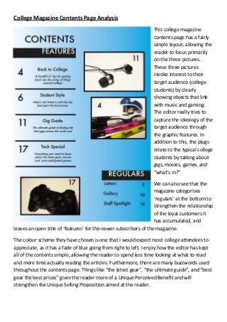
This college magazine
contents page has a fairly
simple layout, allowing the
reader to focus primarily
on the three pictures.
These three pictures
invoke interest to their
target audience (college
students) by clearly
showing objects that link
with music and gaming.
The editor really tries to
capture the ideology of the
target audience through
the graphic features. In
addition to this, the plugs
relate to the typical college
students by talking about
gigs, movies, games, and
“what’s in?”
We can also see that the
magazine categorises
‘regulars’ at the bottom to
strengthen the relationship
of the loyal customers it
has accumulated, and
leaves an open title of ‘features’ for the newer subscribers of the magazine.
The colour scheme they have chosen is one that I would expect most college attendees to
appreciate, as it has a fade of blue going from right to left. I enjoy how the editor has kept
all of the contents simple, allowing the reader to spend less time looking at what to read
and more time actually reading the articles. Furthermore, there are many buzzwords used
throughout the contents page. Things like “the latest gear”, “the ultimate guide”, and “best
gear the best prices” gives the reader more of a Unique Perceived Benefit and will
strengthen the Unique Selling Proposition aimed at the reader.