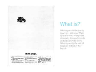
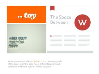
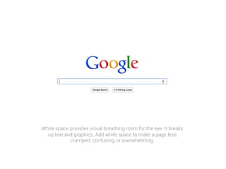
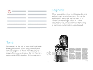
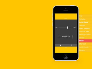
@wicaksonoardhee
White space is the empty
spaces in a design. White
space is used to separate
disparate design elements
and group similar ones.
White space is the lack of
graphics or text in the
layout.
What is?
White space is not always “white” — it is the empty parts
of the page, but if the page has a different background
color that will be the color of the white space.
White space provides visual breathing room for the eye. It breaks
up text and graphics. Add white space to make a page less
cramped, confusing, or overwhelming.
VS
VS
Perhaps it is because the terms used to
describe white space sound negative. White
space is nothing. It's the absence of text;
the absence of images. White space is
emptiness.
It is negative space.
But it's not wasted space.
One of the
hardest concepts
to teach is white space
in design
White space at the micro level (leading, kerning,
and tracking) can help improveor destroy the
legibility of a Web page. If you havea lot of
content you need to get across in a small
amount of space, you can increase the leading
or tracking to make the text easier to read.
Legibility
White space at the macro level (spacing around
the biggestobjects on the page) can convey a
senseof elegance or down-marketquality to a
design. The morewhite space there is the more
expensive and high-quality a design may seem.
Tone
How to
Use Whitespace
Here is an example howthey use
“white space” to their design.
a good approachto using whitespaceis to thinkabout what you would
like to see in a page.
Thinking about improvinguserexperience and focusingon content is
always a good wayto go when designing.
Whitespace can certainlyhelp you deliver the experience that your
client’s readers will enjoy, which usuallyleaves yourclient happywith
the work you’ve done.
Conclusion
@wicaksonoardhee
Follow me

Whitespace Fundamentals

  • 1.
  • 2.
    White space isthe empty spaces in a design. White space is used to separate disparate design elements and group similar ones. White space is the lack of graphics or text in the layout. What is?
  • 3.
    White space isnot always “white” — it is the empty parts of the page, but if the page has a different background color that will be the color of the white space.
  • 4.
    White space providesvisual breathing room for the eye. It breaks up text and graphics. Add white space to make a page less cramped, confusing, or overwhelming.
  • 5.
  • 6.
  • 7.
    Perhaps it isbecause the terms used to describe white space sound negative. White space is nothing. It's the absence of text; the absence of images. White space is emptiness. It is negative space. But it's not wasted space. One of the hardest concepts to teach is white space in design
  • 8.
    White space atthe micro level (leading, kerning, and tracking) can help improveor destroy the legibility of a Web page. If you havea lot of content you need to get across in a small amount of space, you can increase the leading or tracking to make the text easier to read. Legibility White space at the macro level (spacing around the biggestobjects on the page) can convey a senseof elegance or down-marketquality to a design. The morewhite space there is the more expensive and high-quality a design may seem. Tone
  • 9.
    How to Use Whitespace Hereis an example howthey use “white space” to their design.
  • 17.
    a good approachtousing whitespaceis to thinkabout what you would like to see in a page. Thinking about improvinguserexperience and focusingon content is always a good wayto go when designing. Whitespace can certainlyhelp you deliver the experience that your client’s readers will enjoy, which usuallyleaves yourclient happywith the work you’ve done. Conclusion
  • 19.