Downloaded 115 times

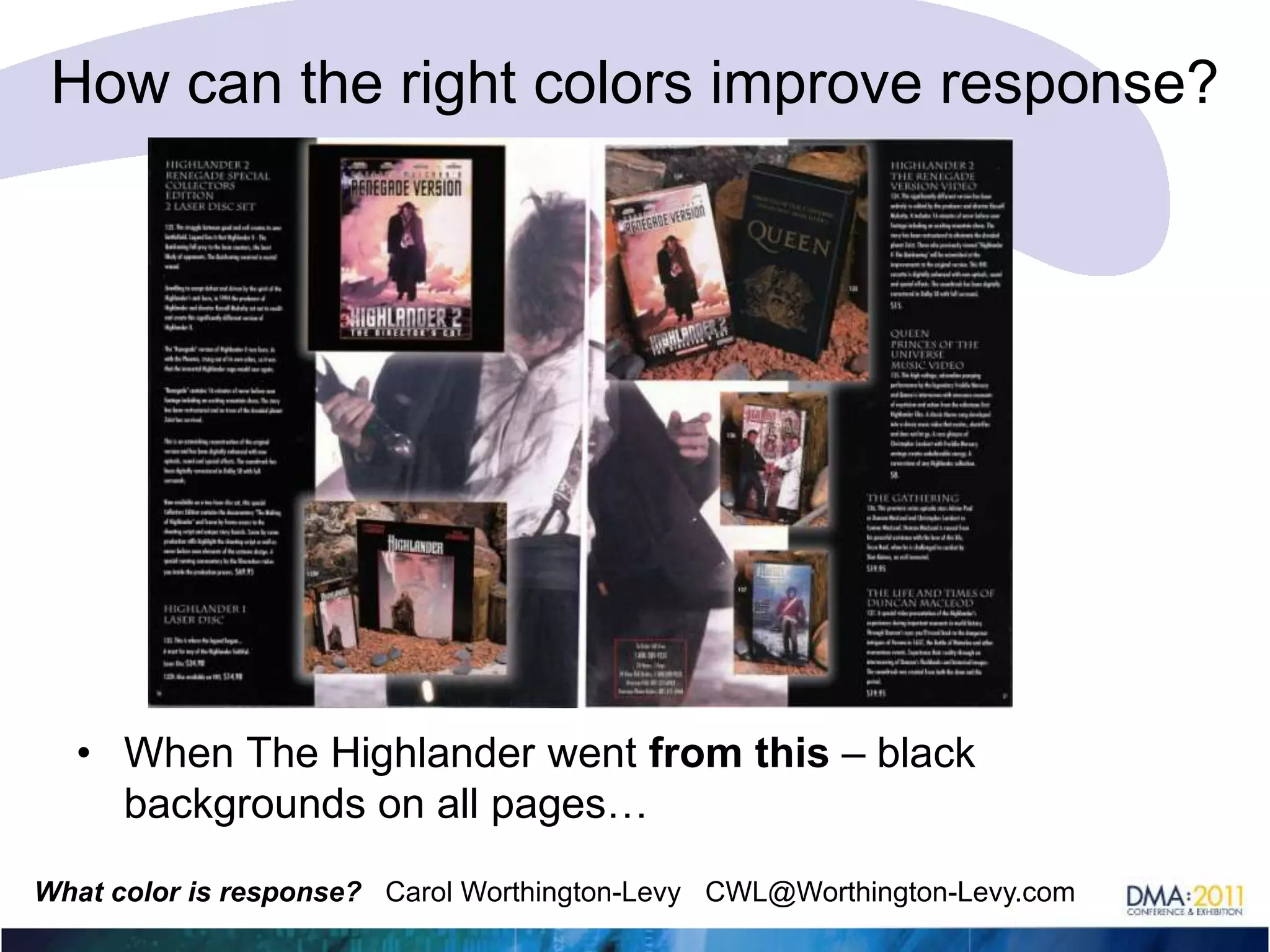
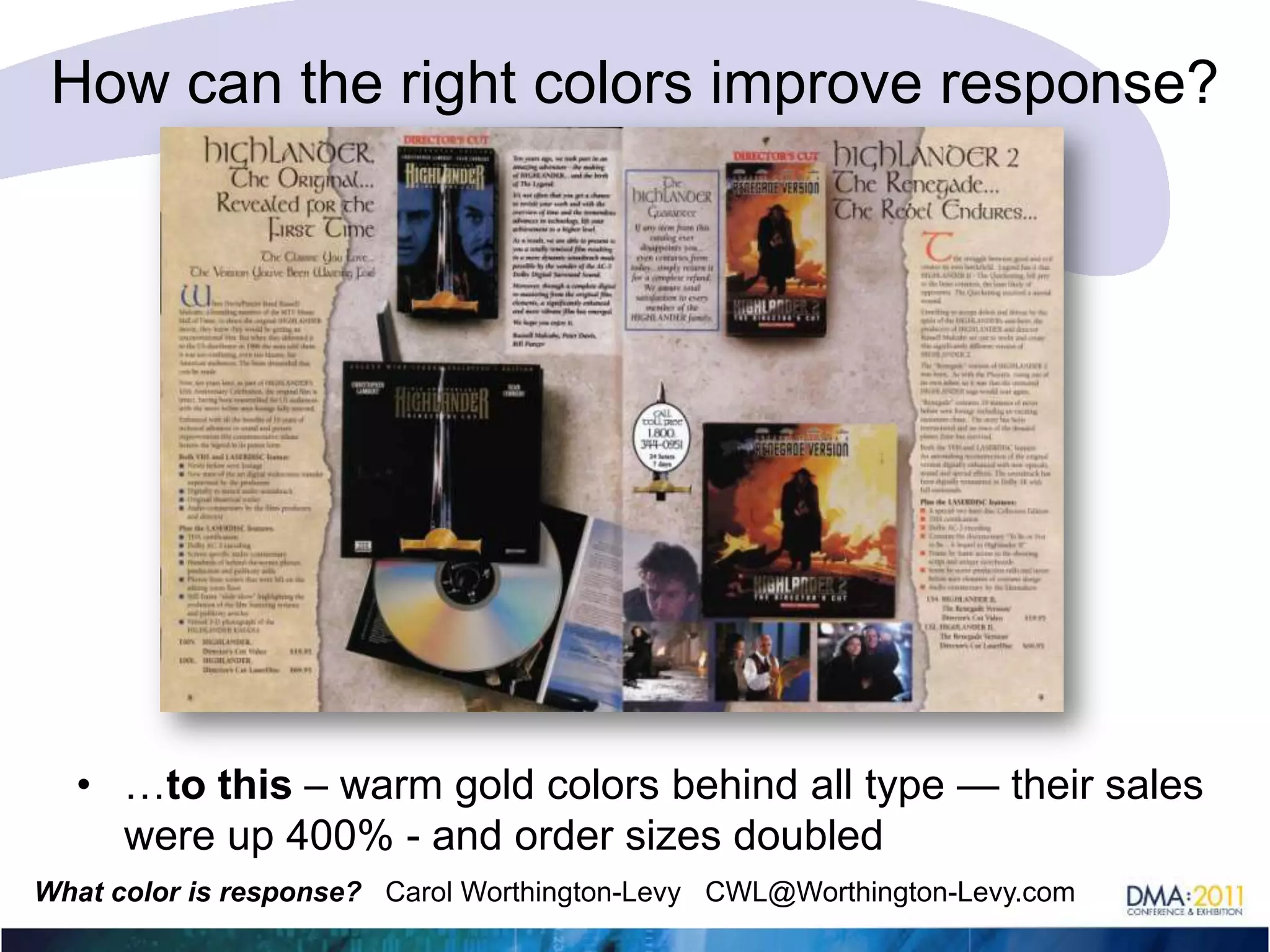
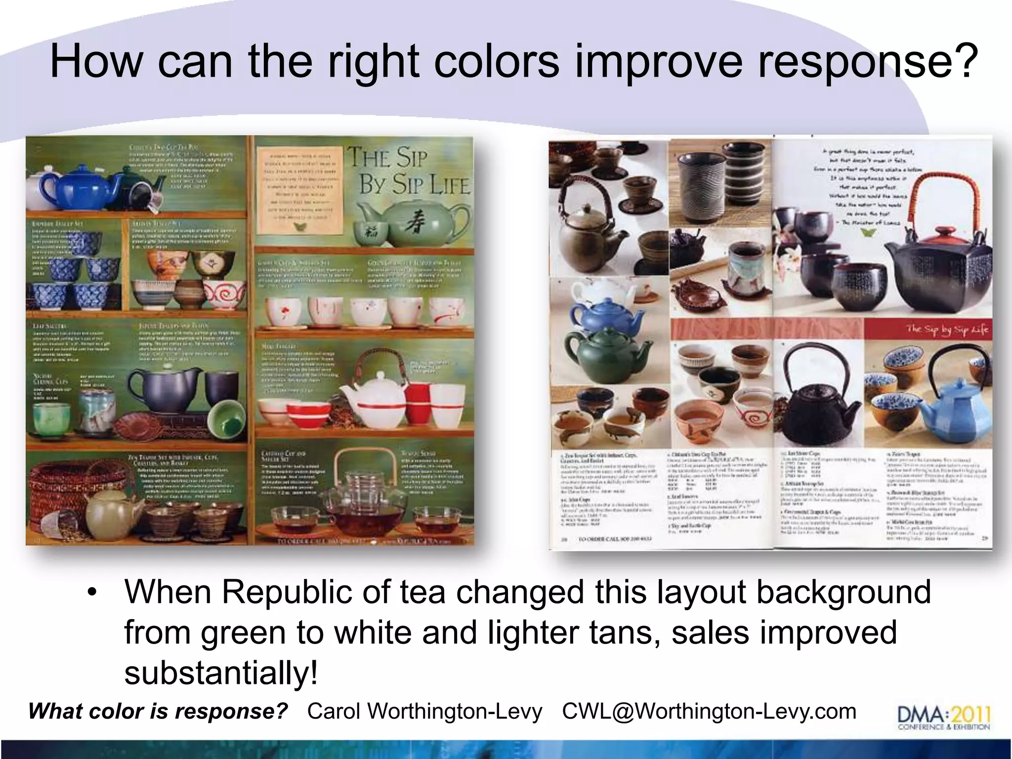
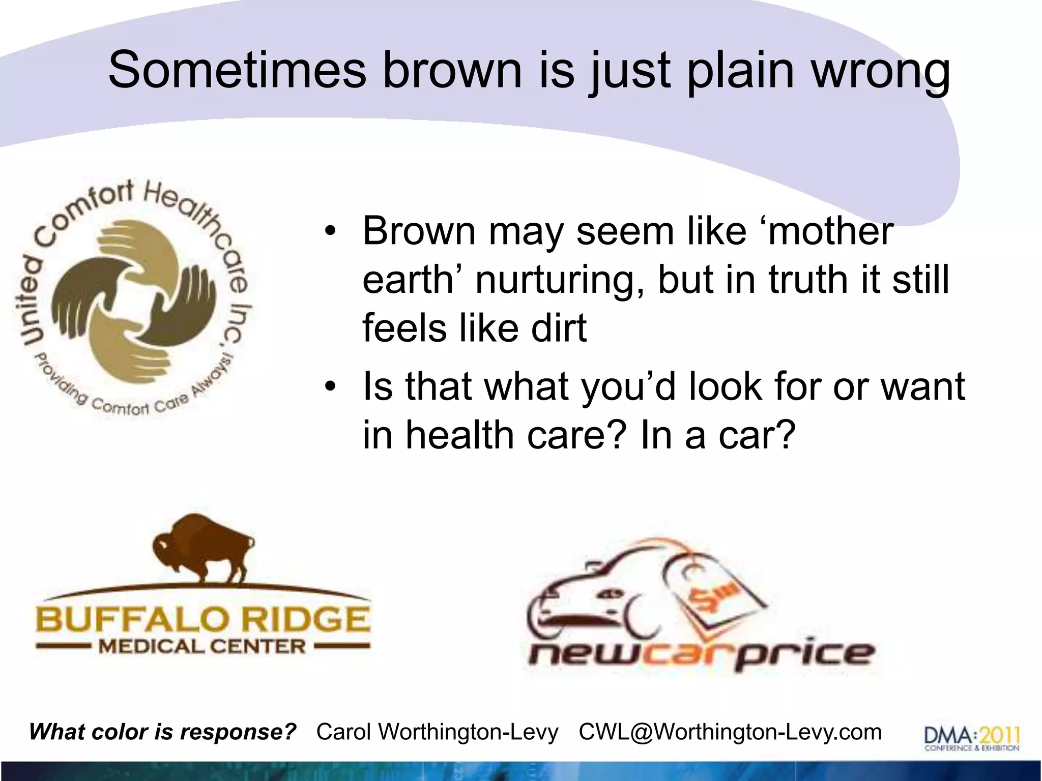
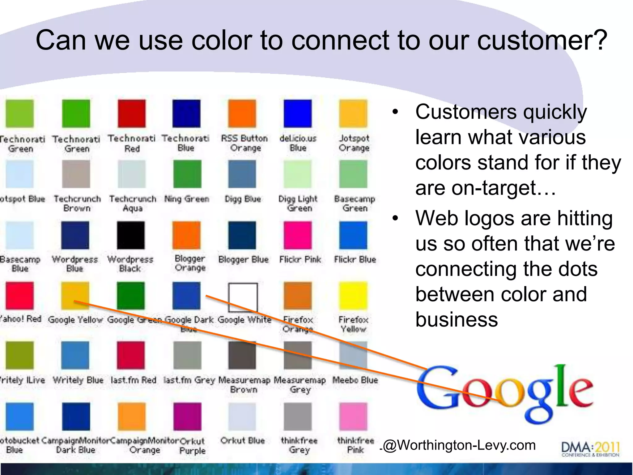
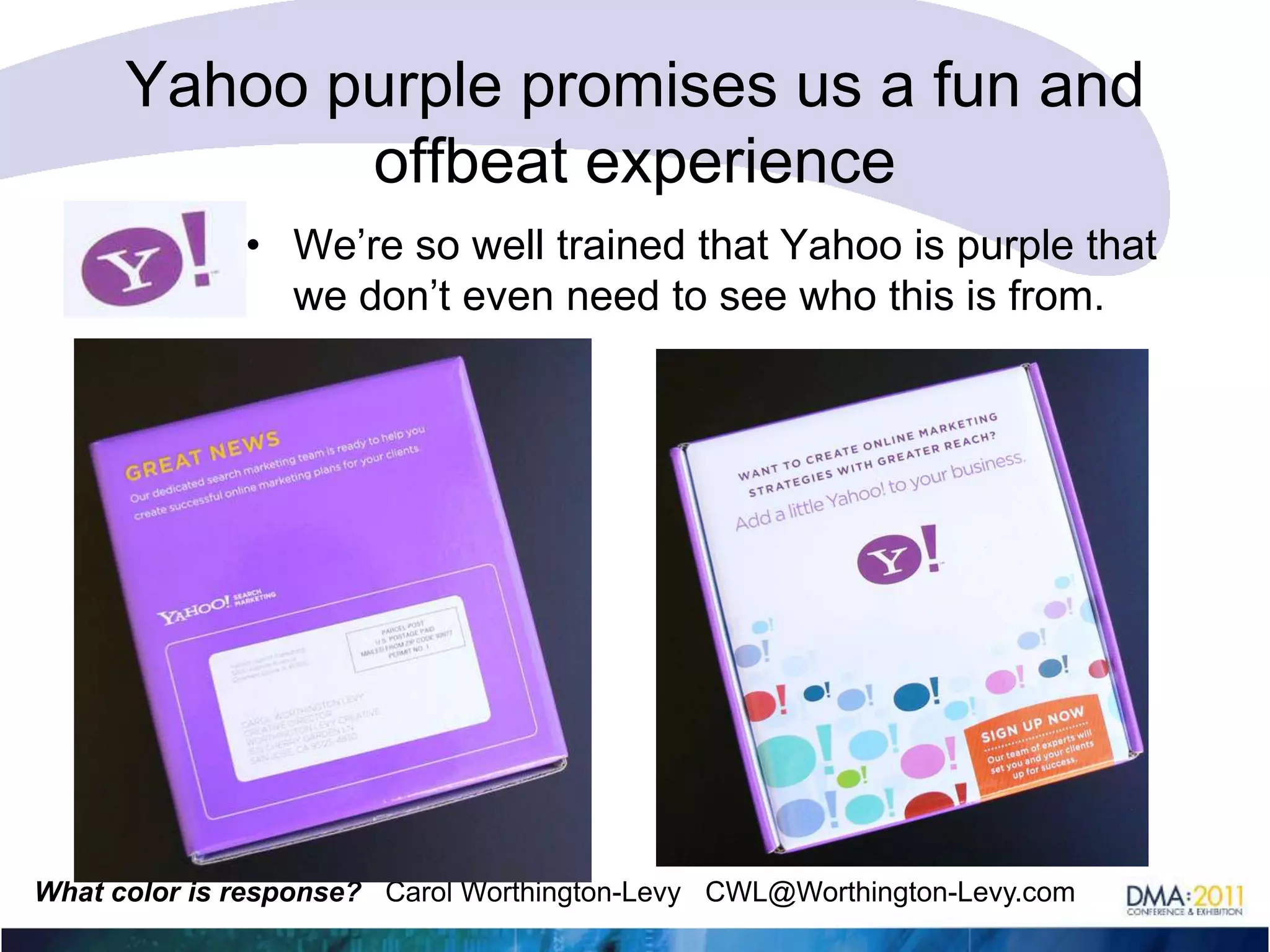
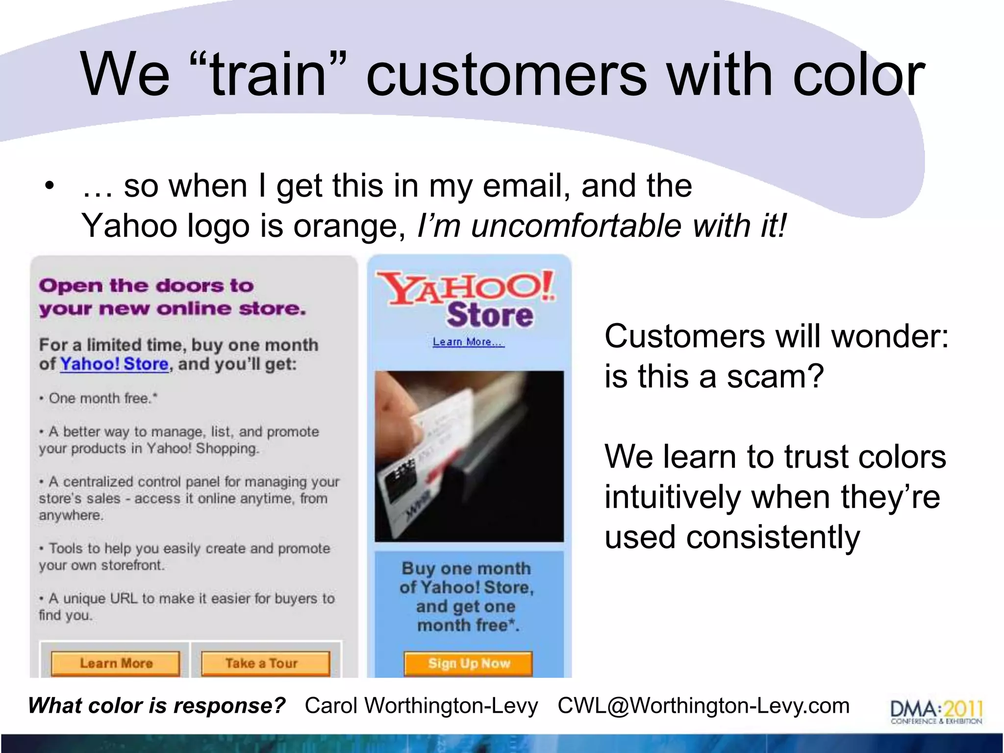
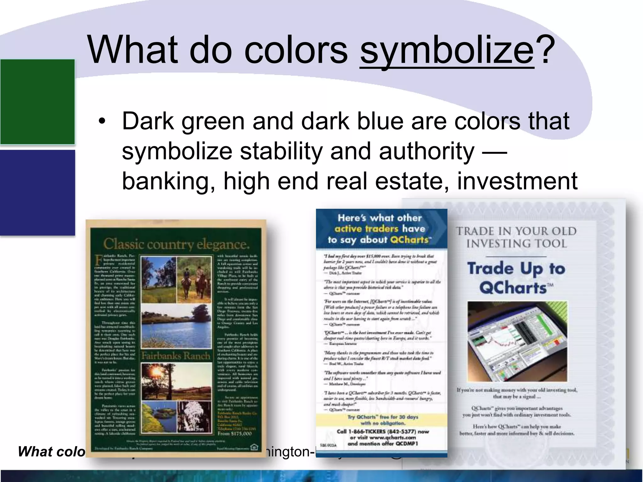
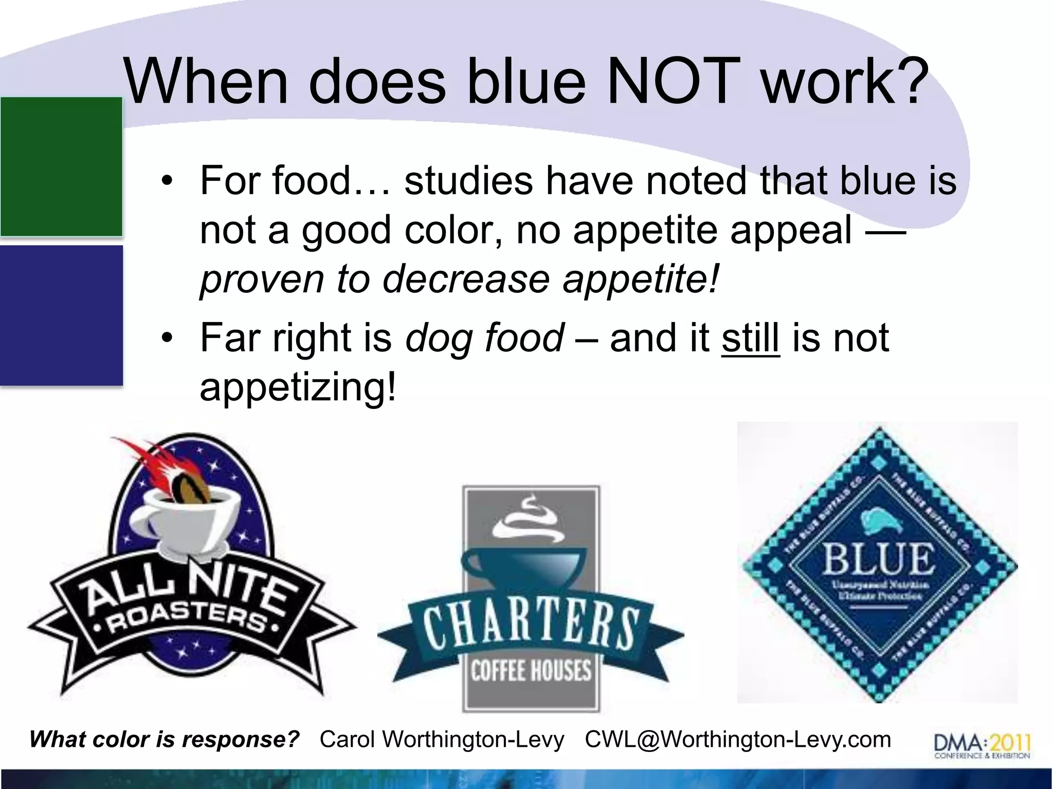
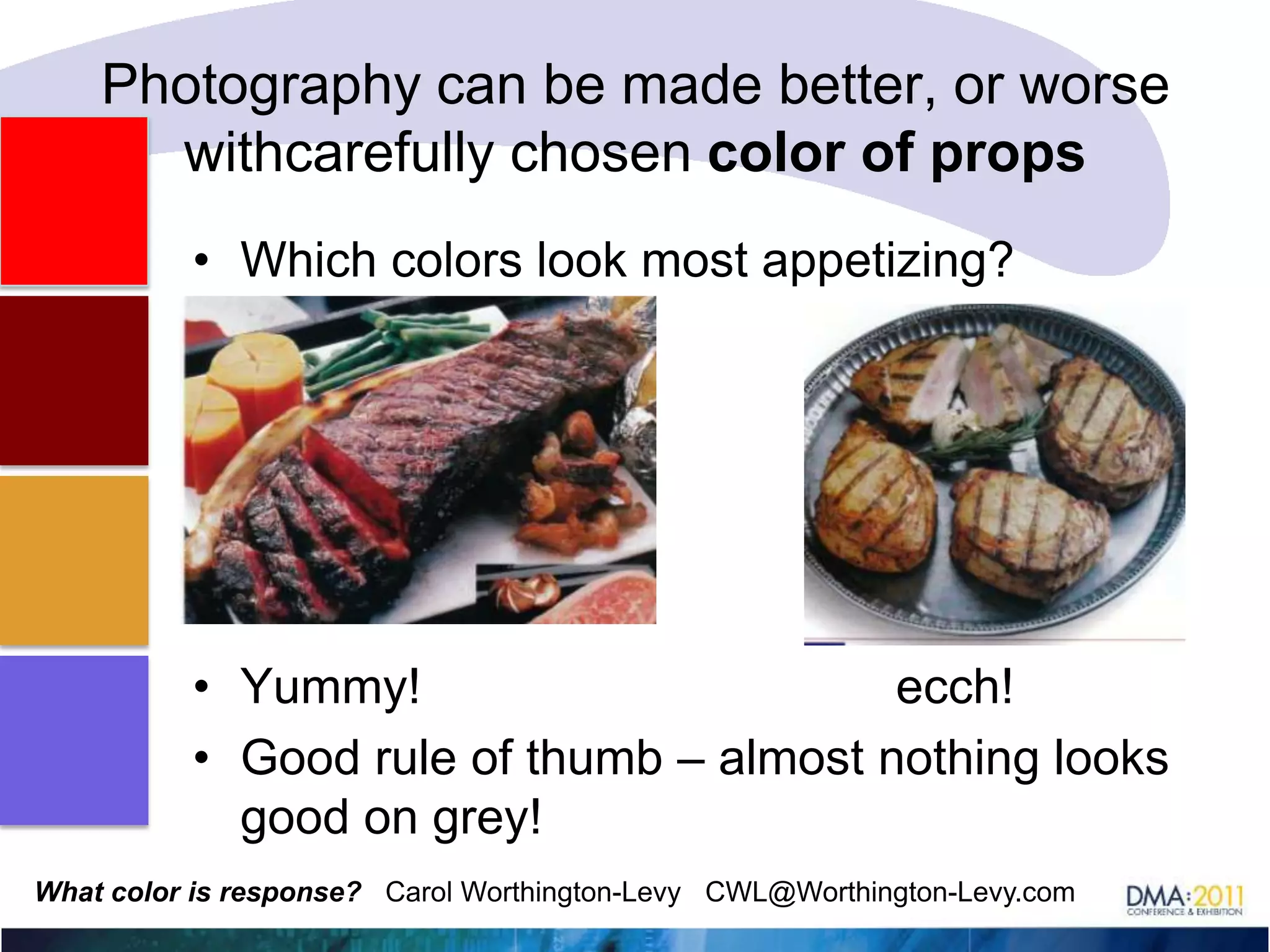
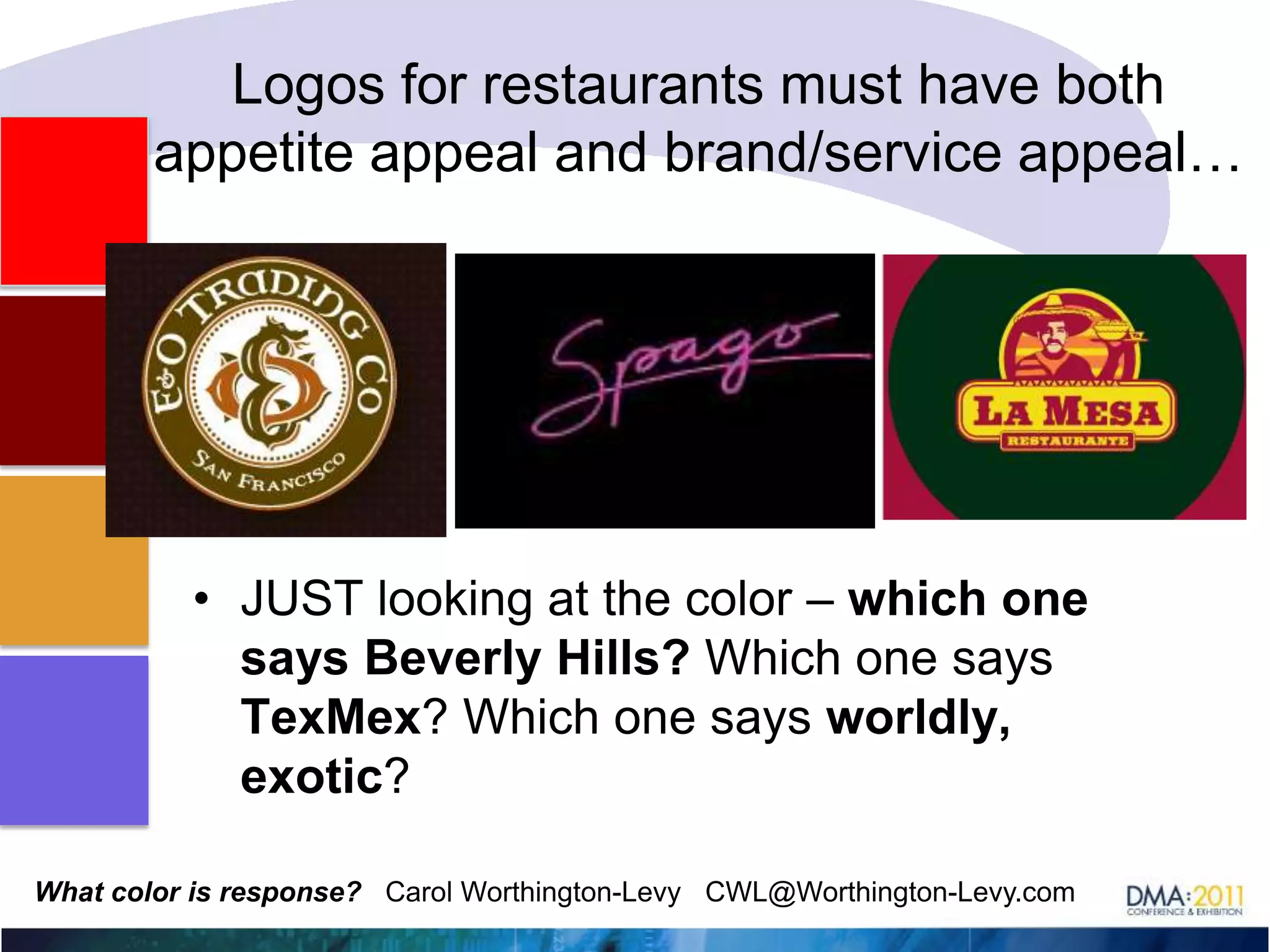
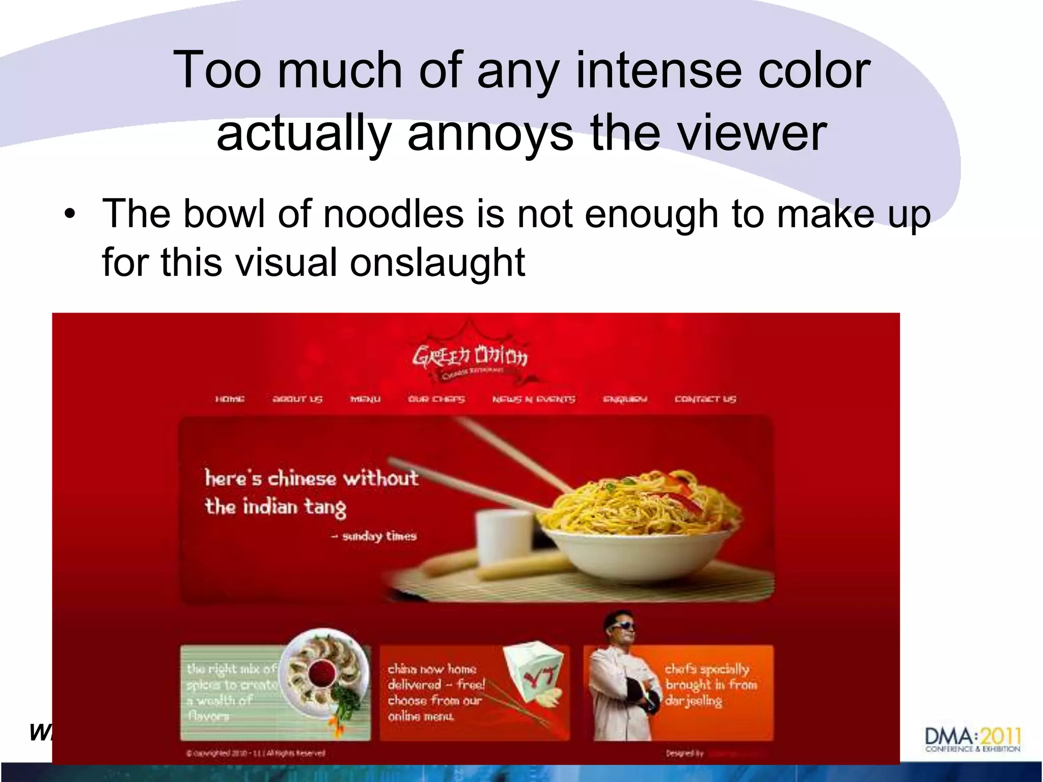
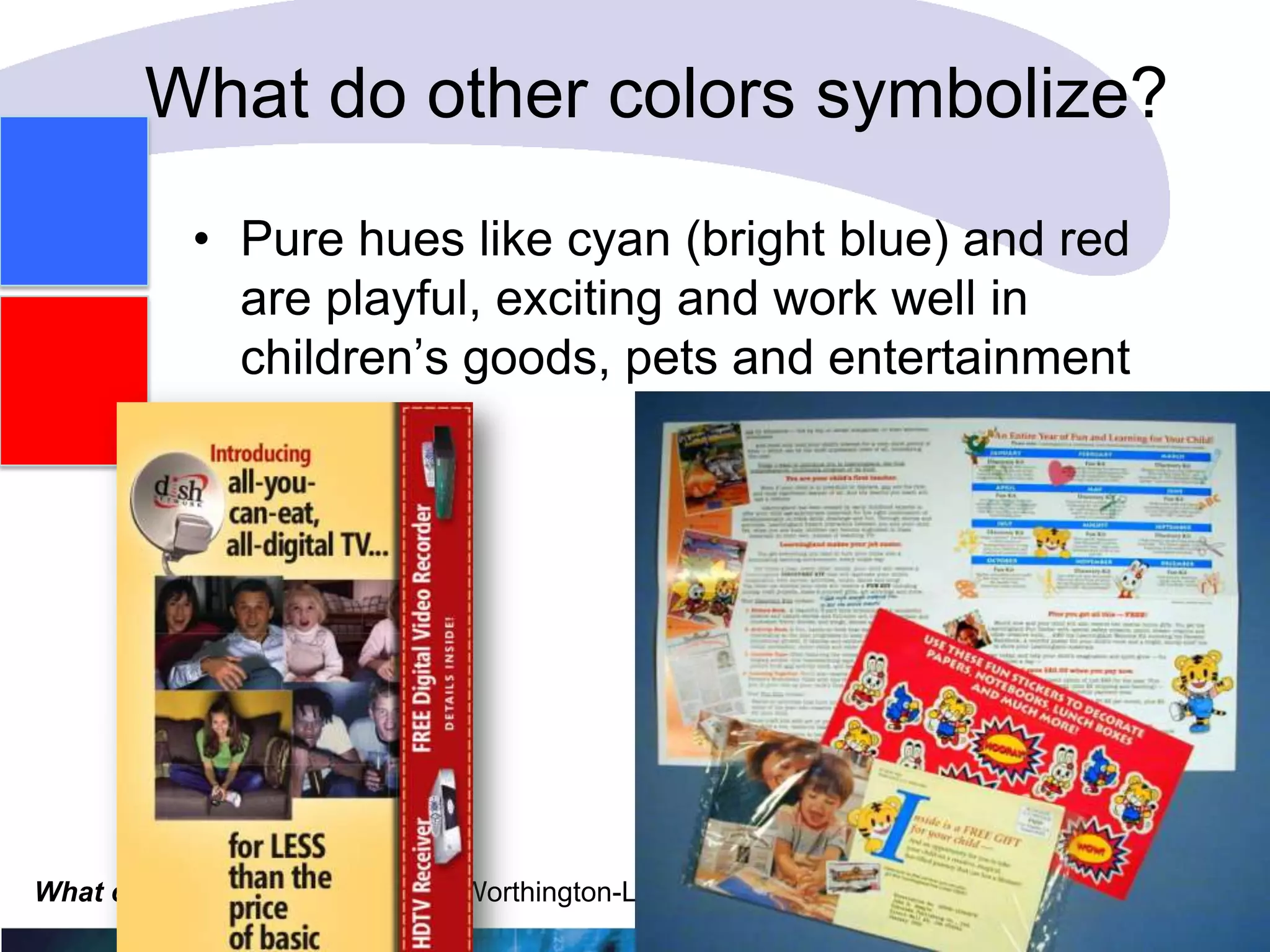
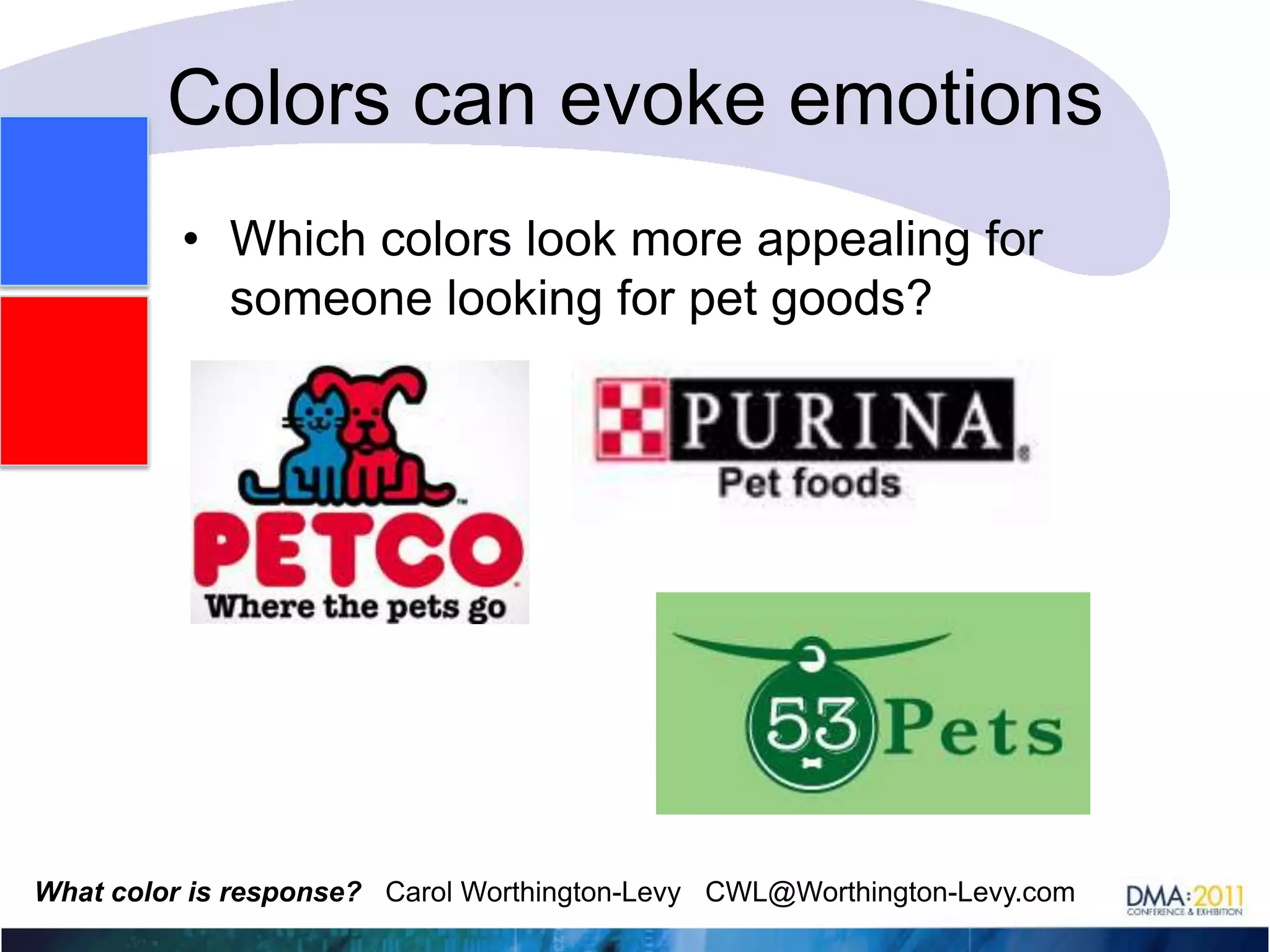
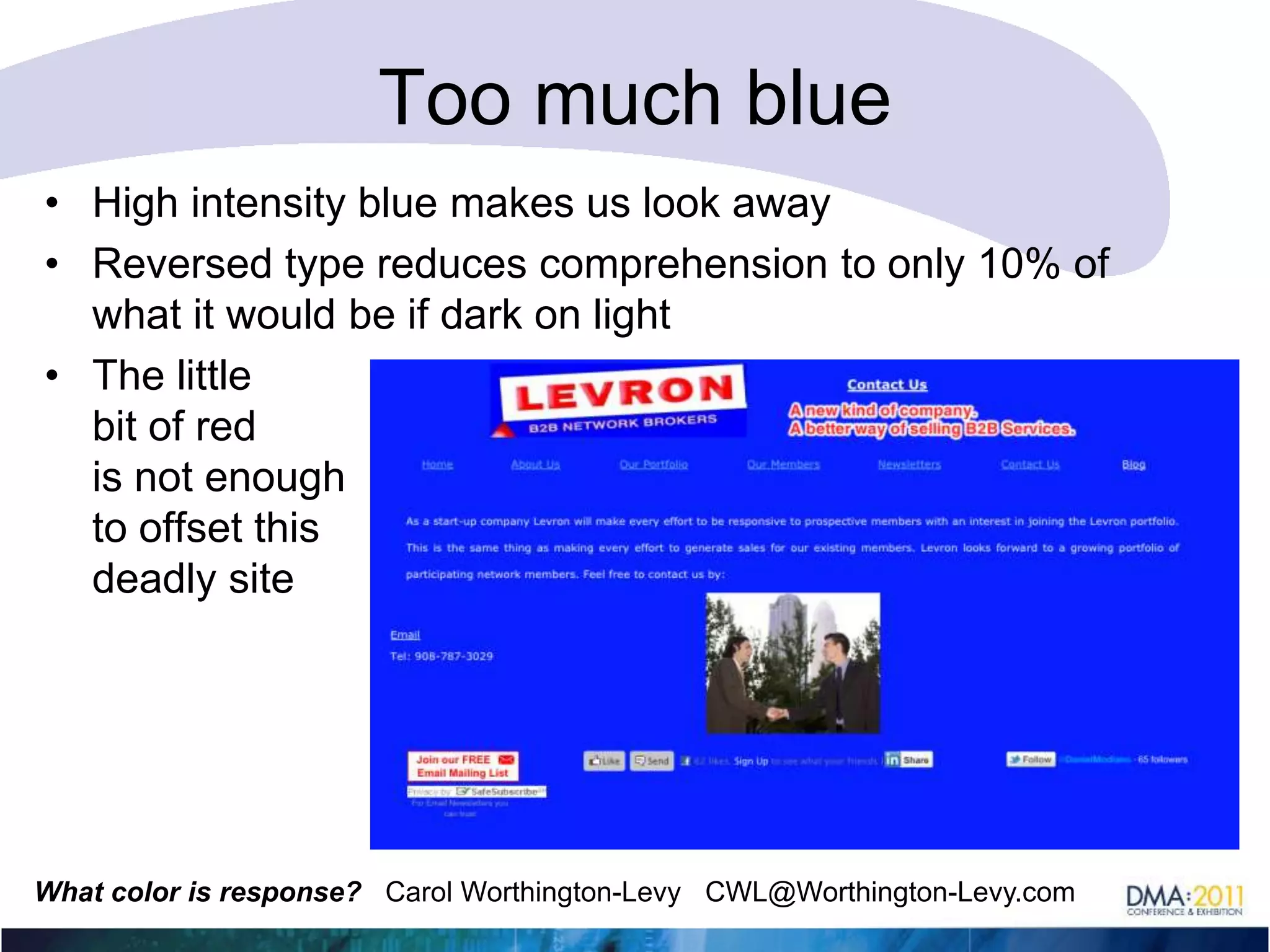
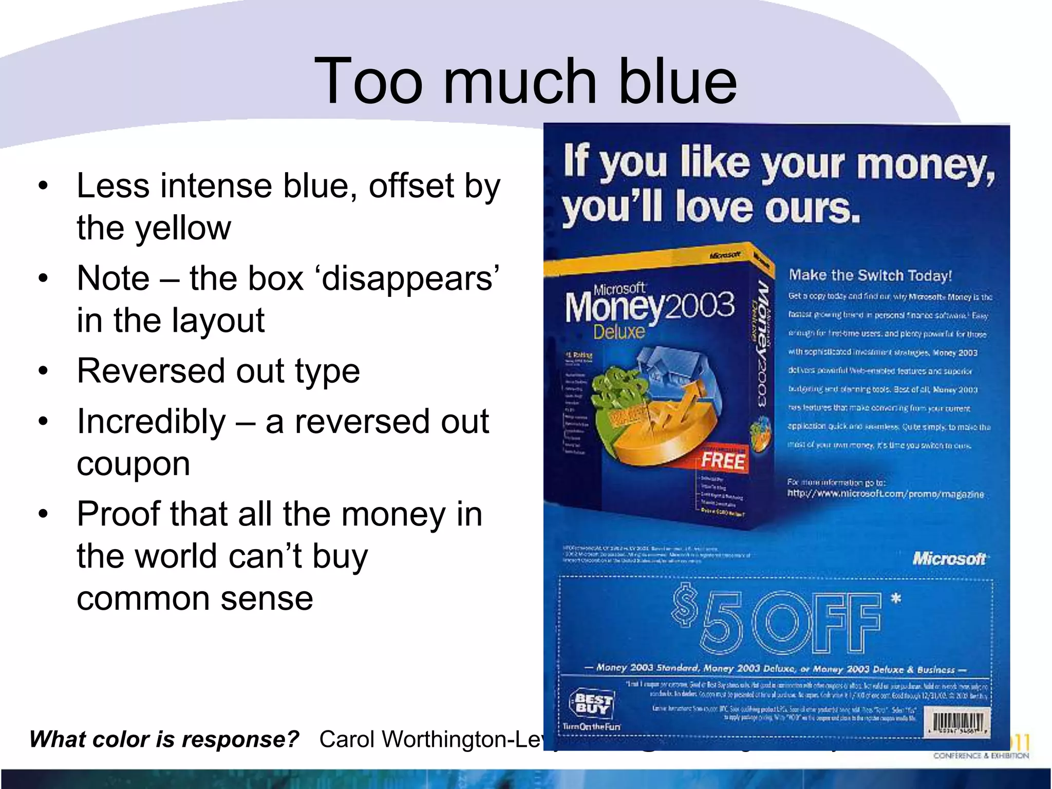
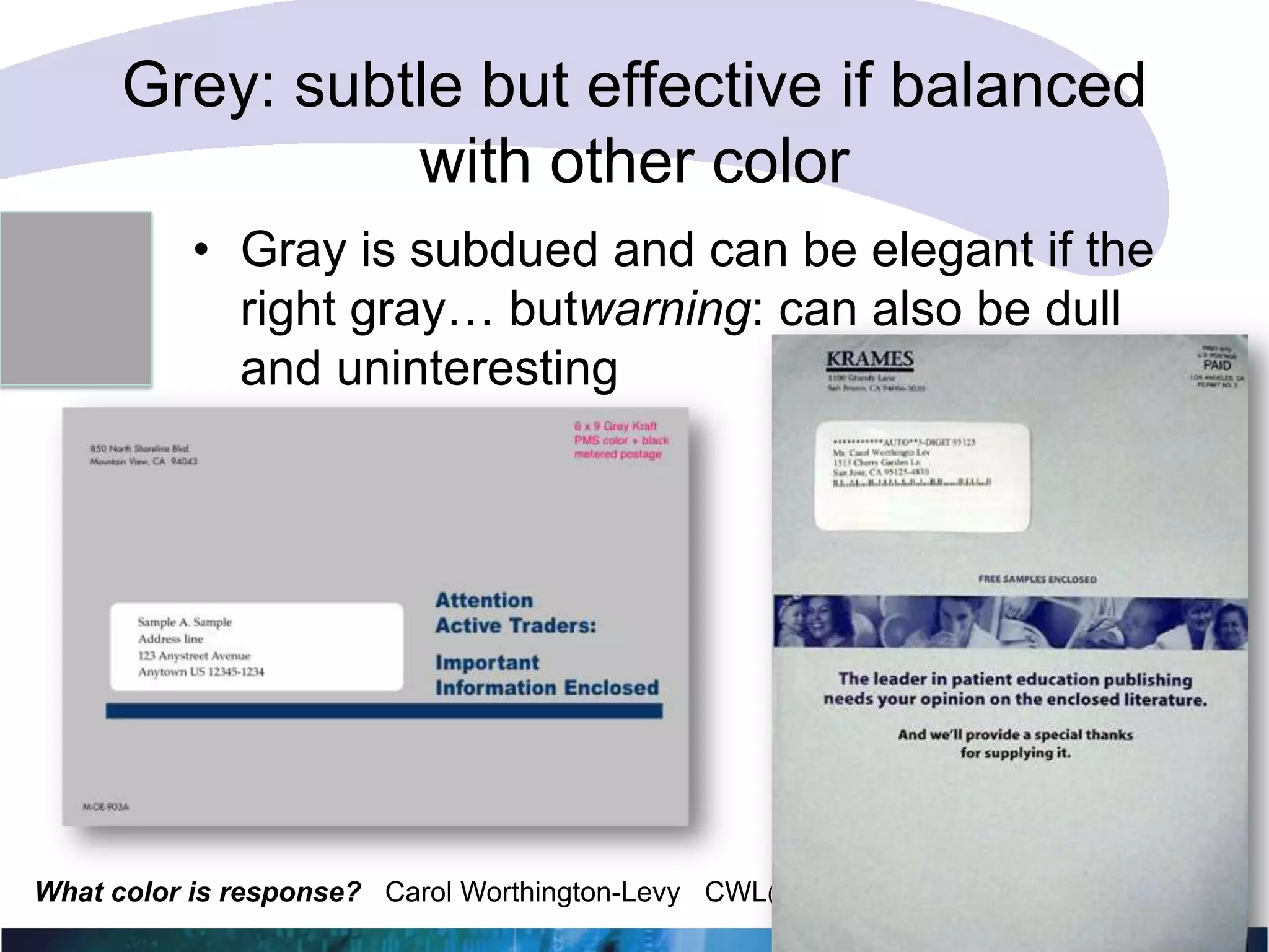

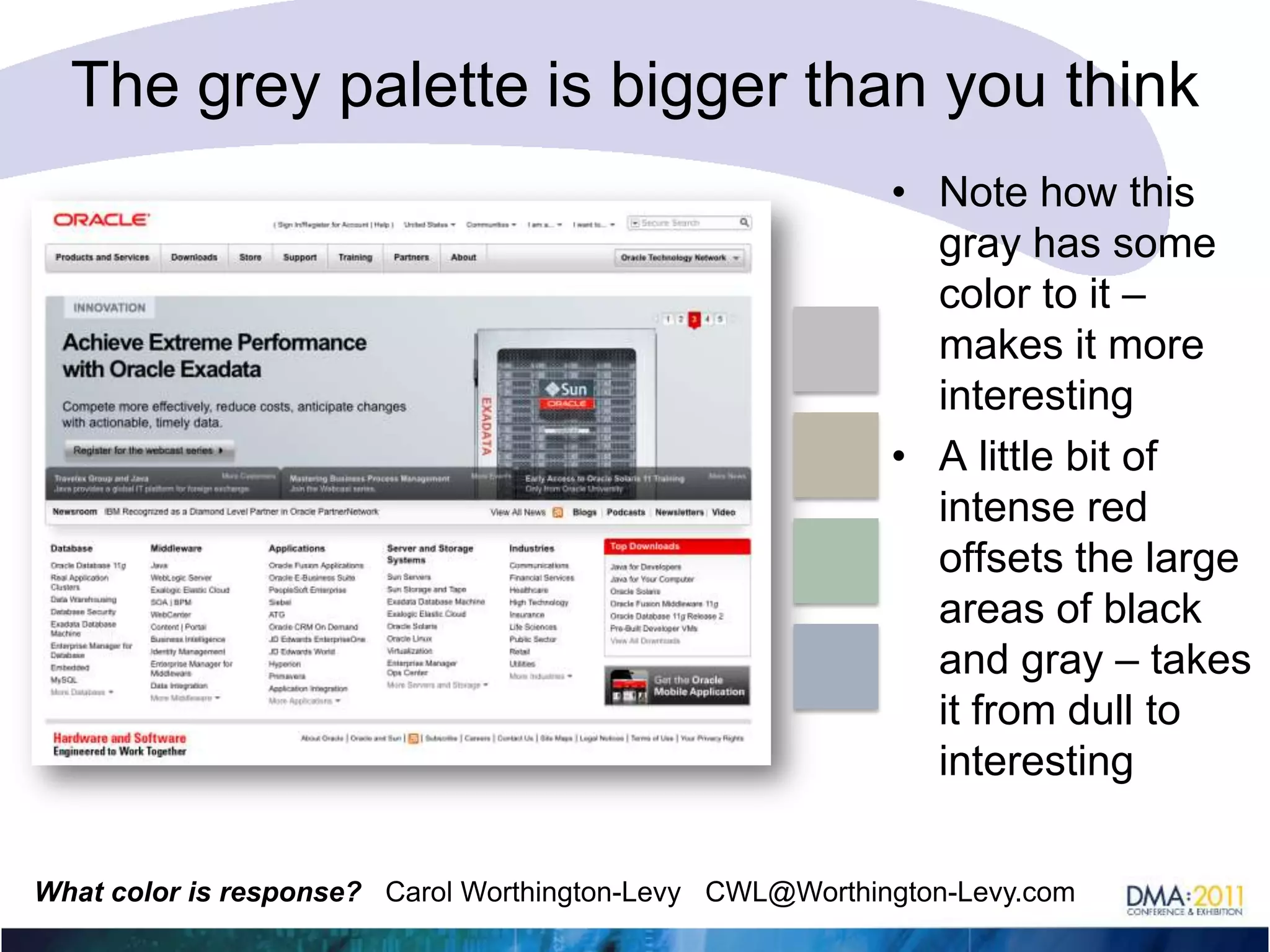
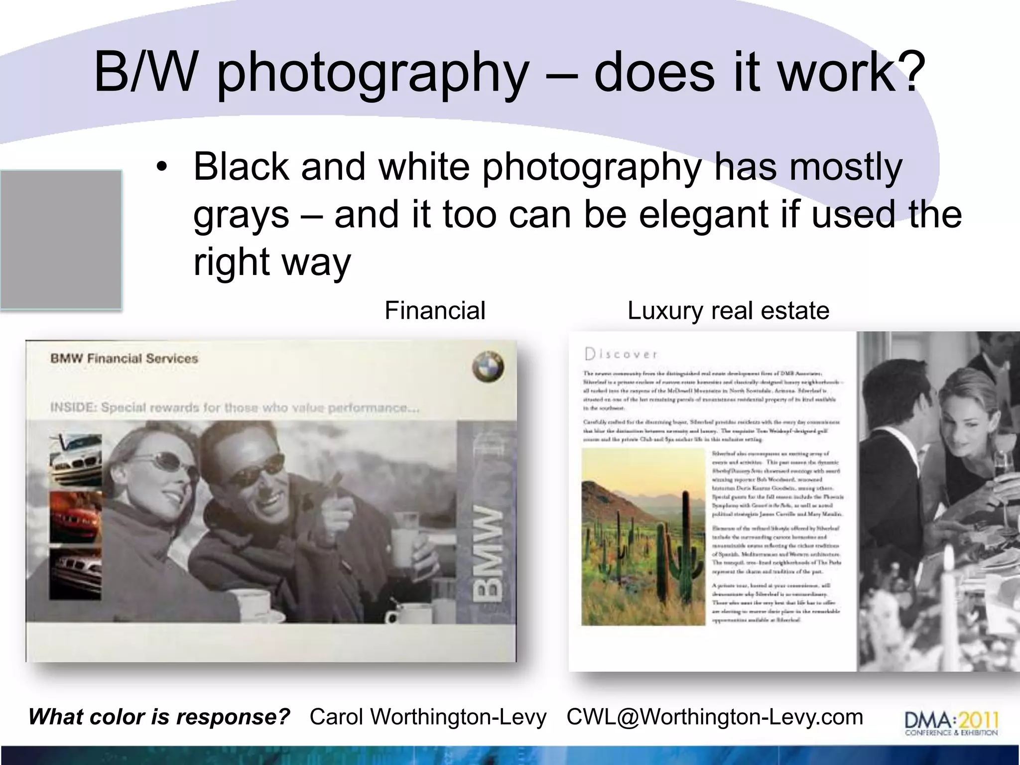
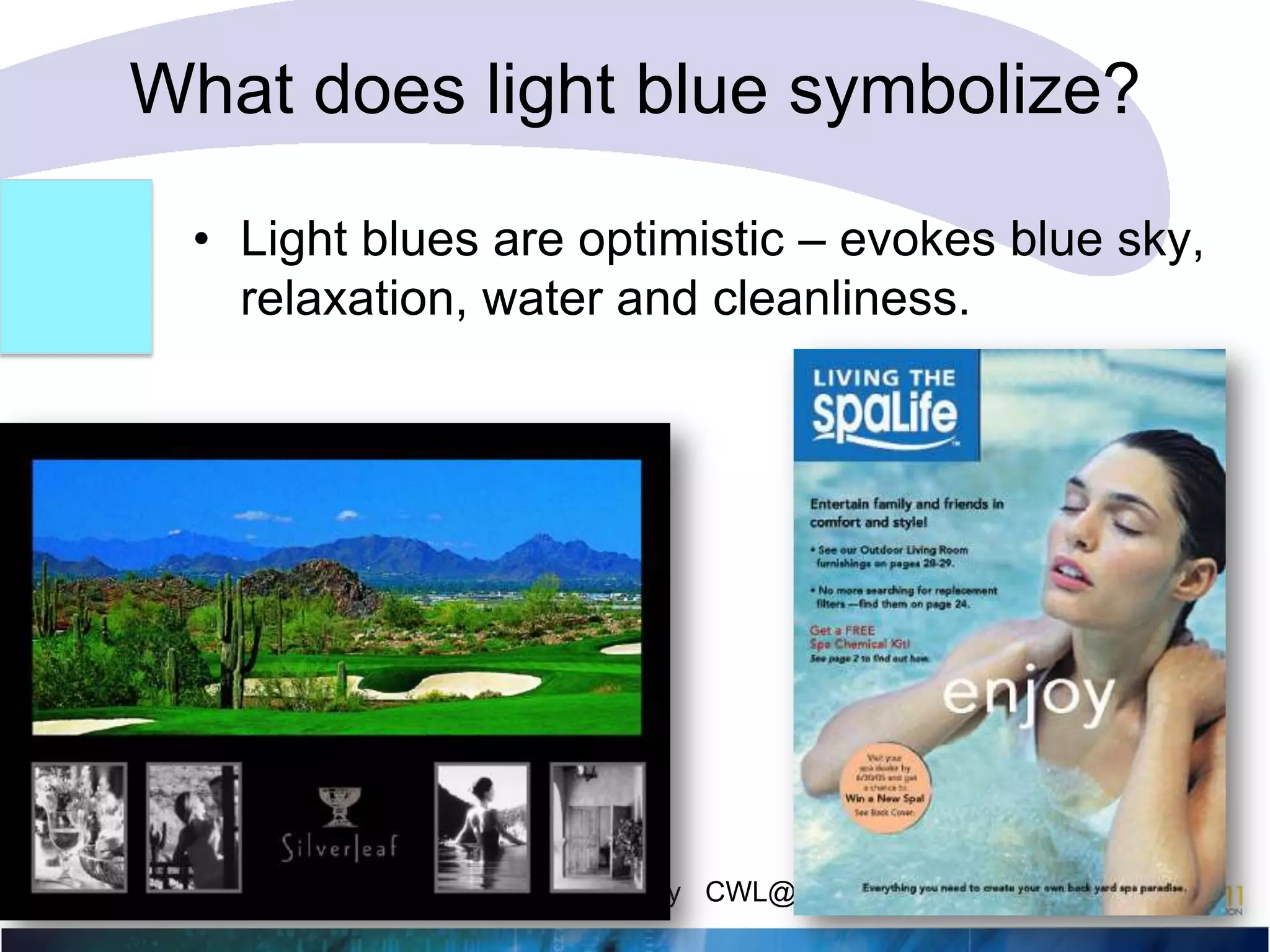
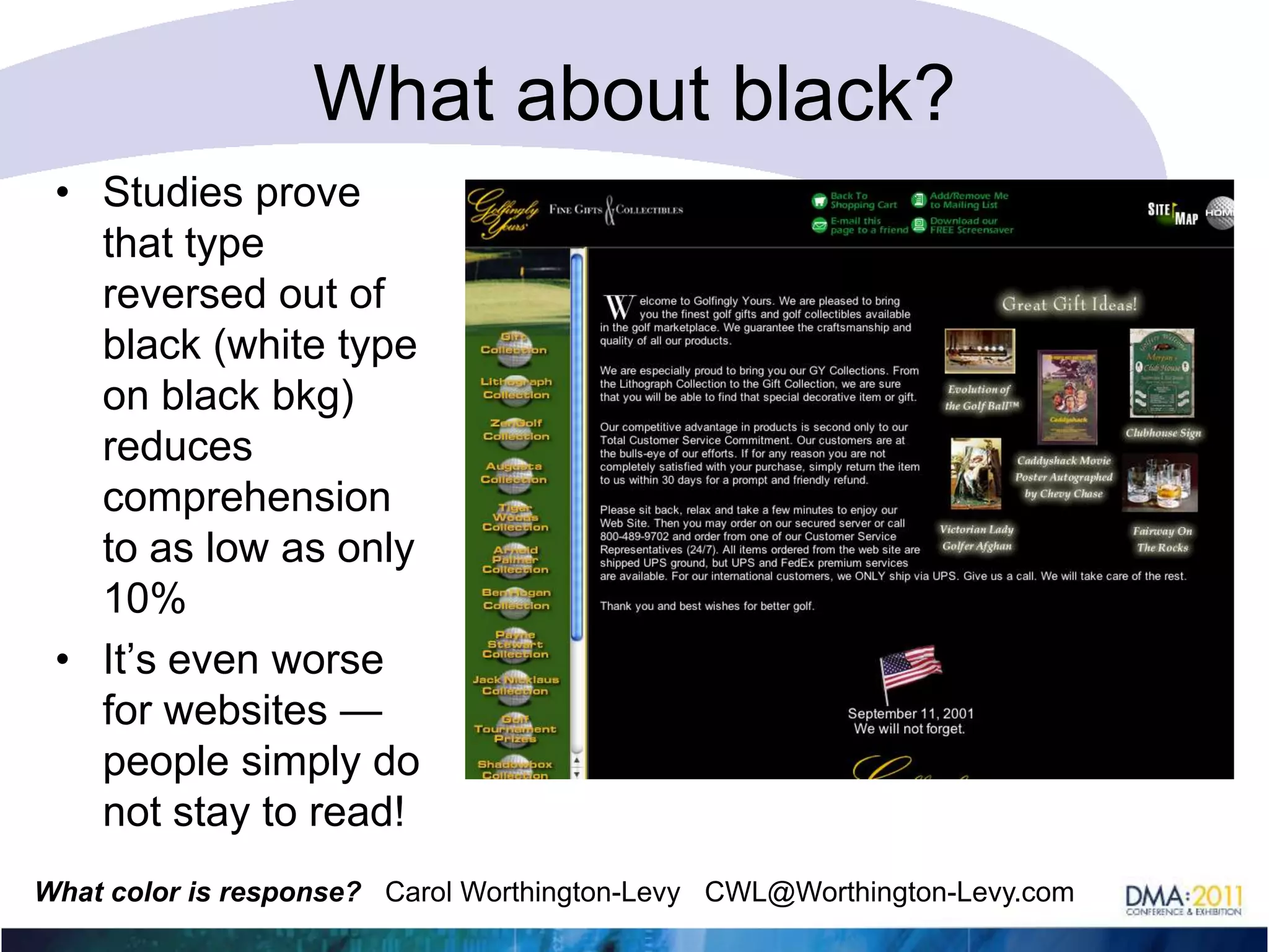
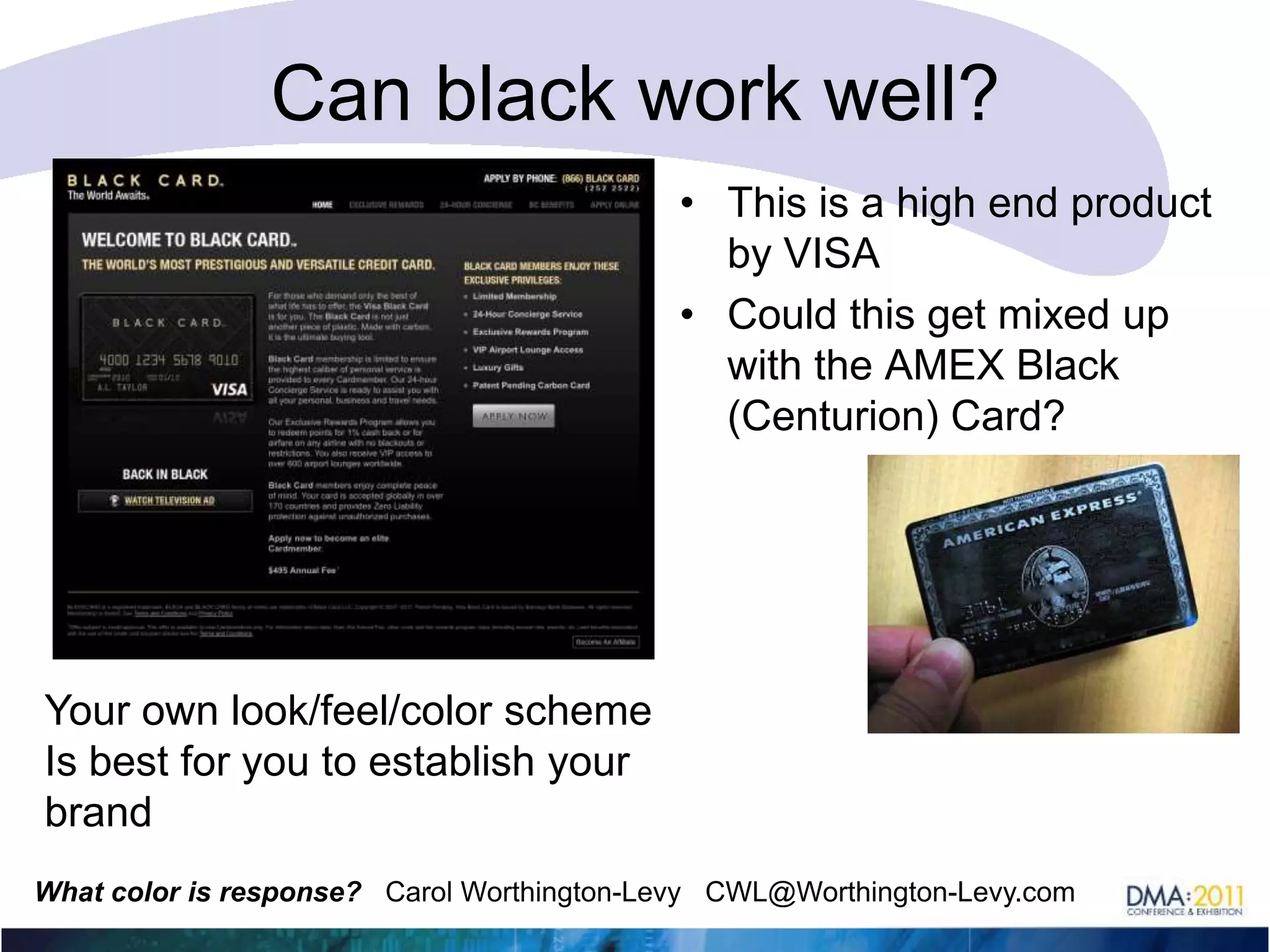
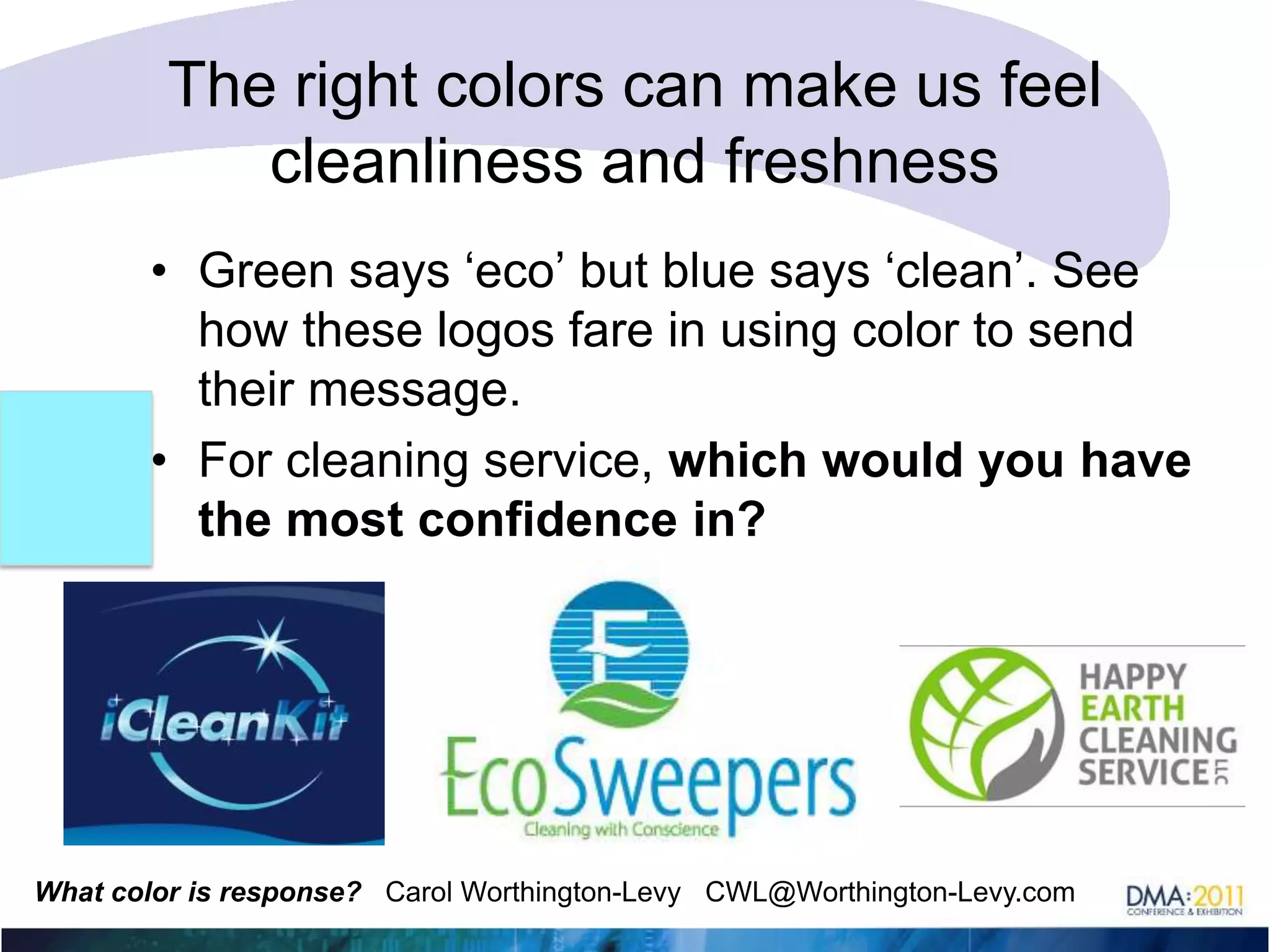

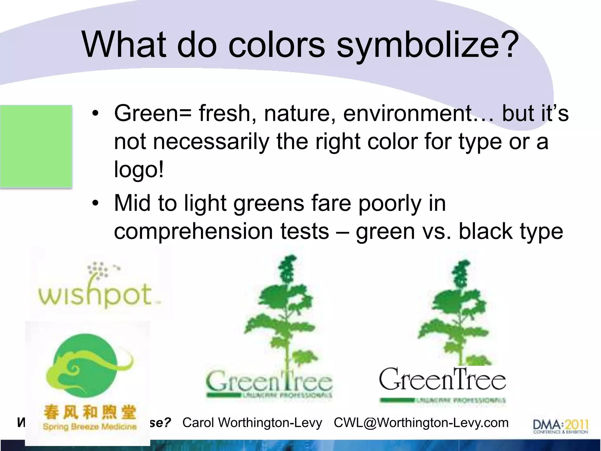
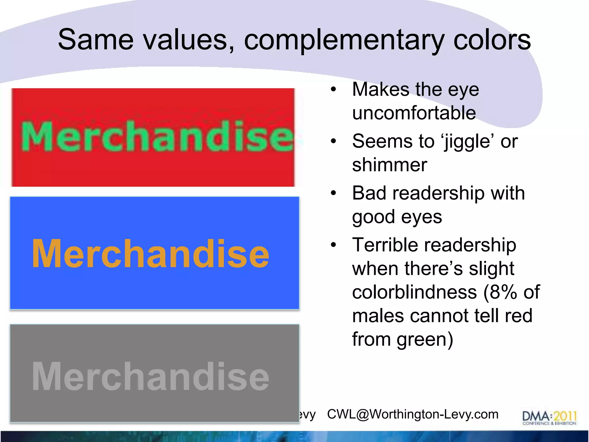
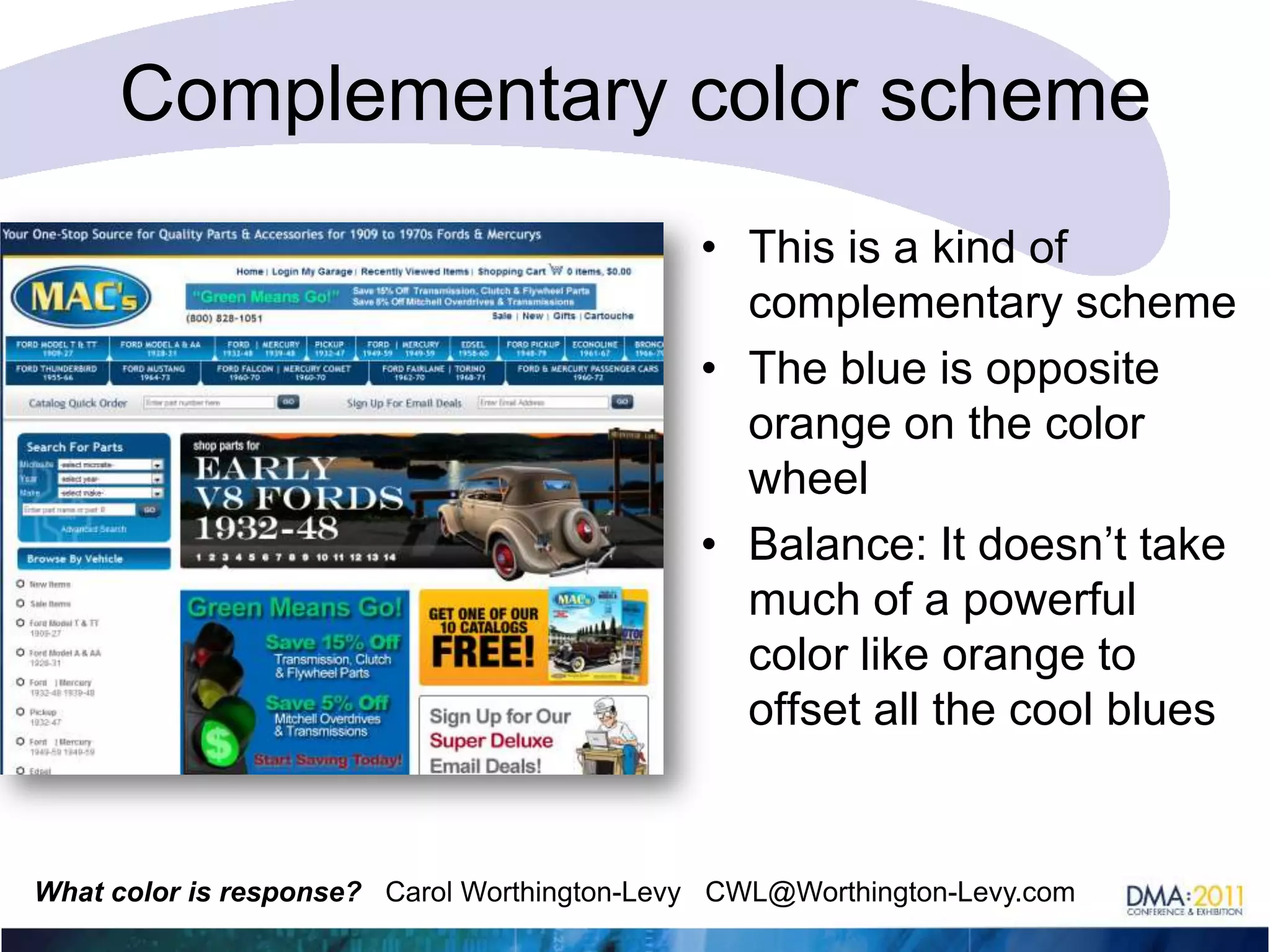

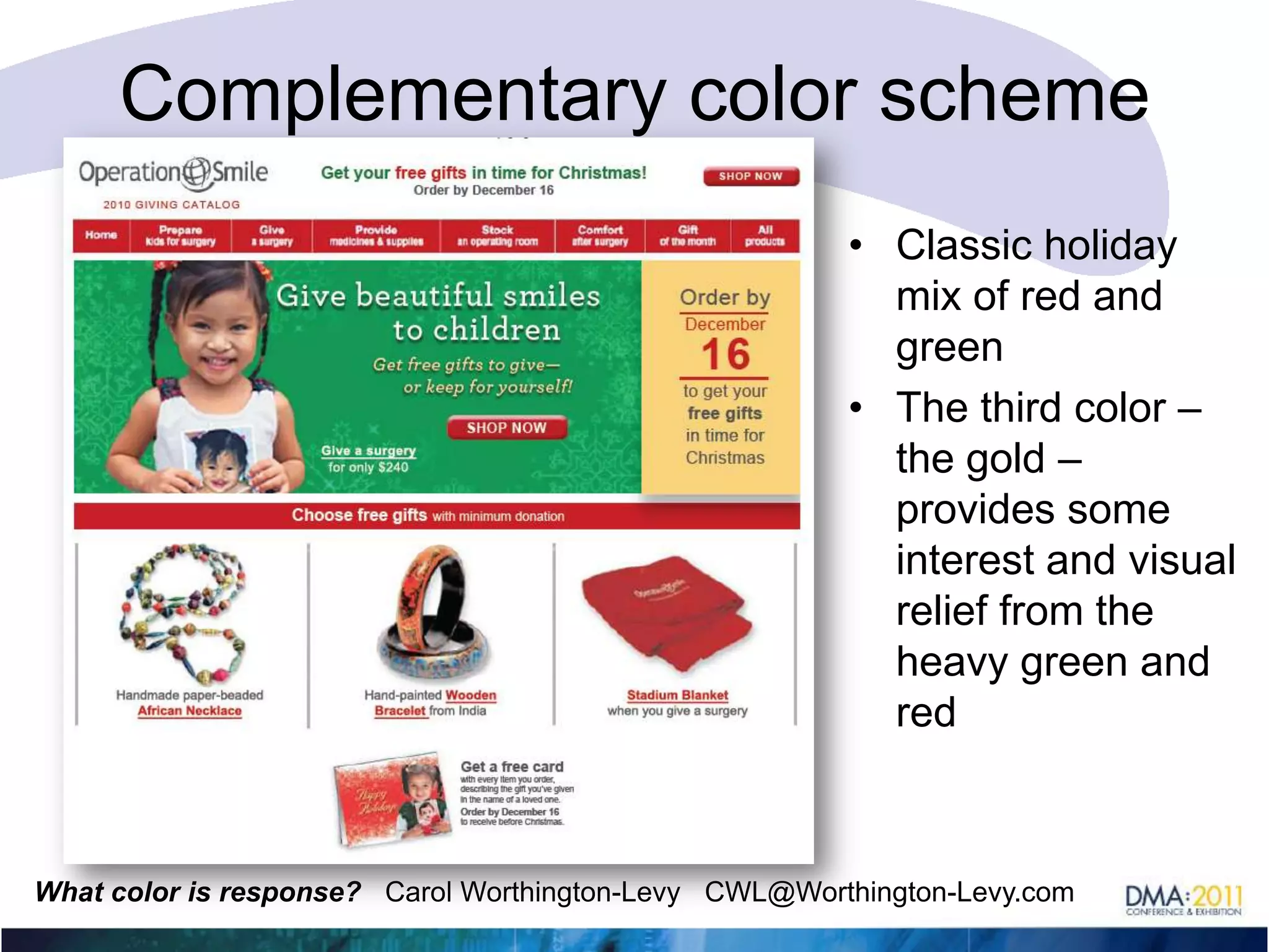
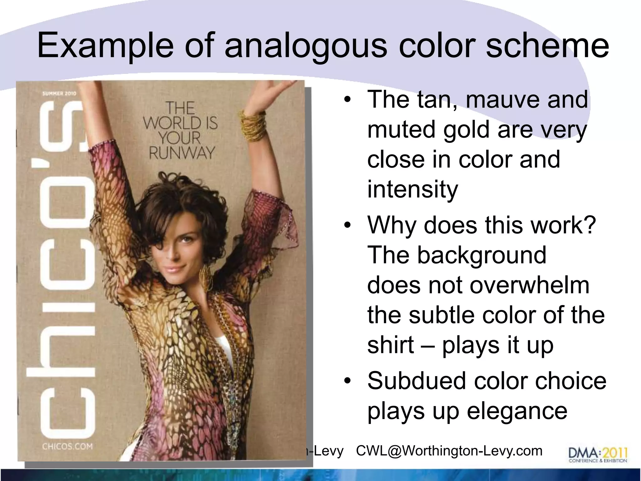
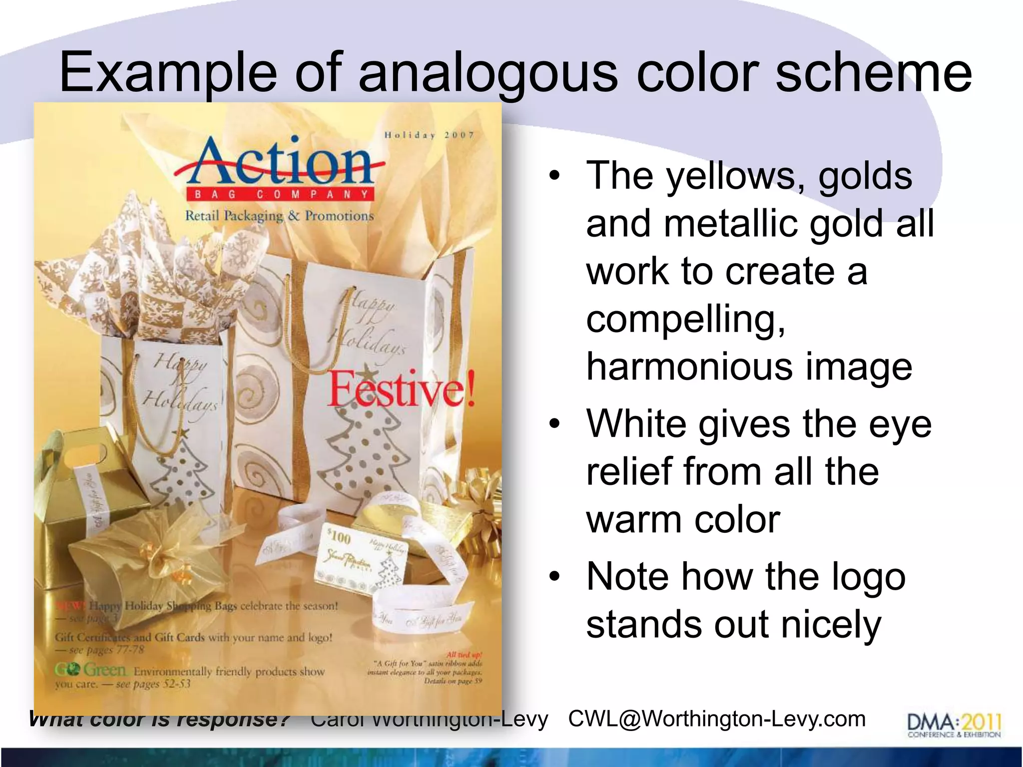
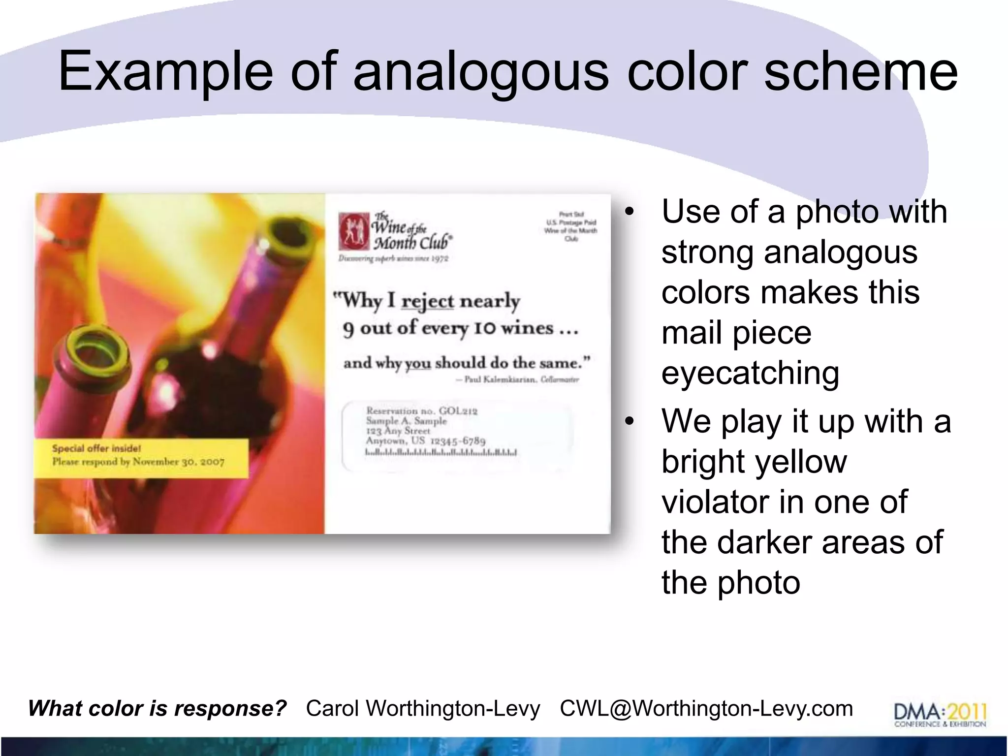
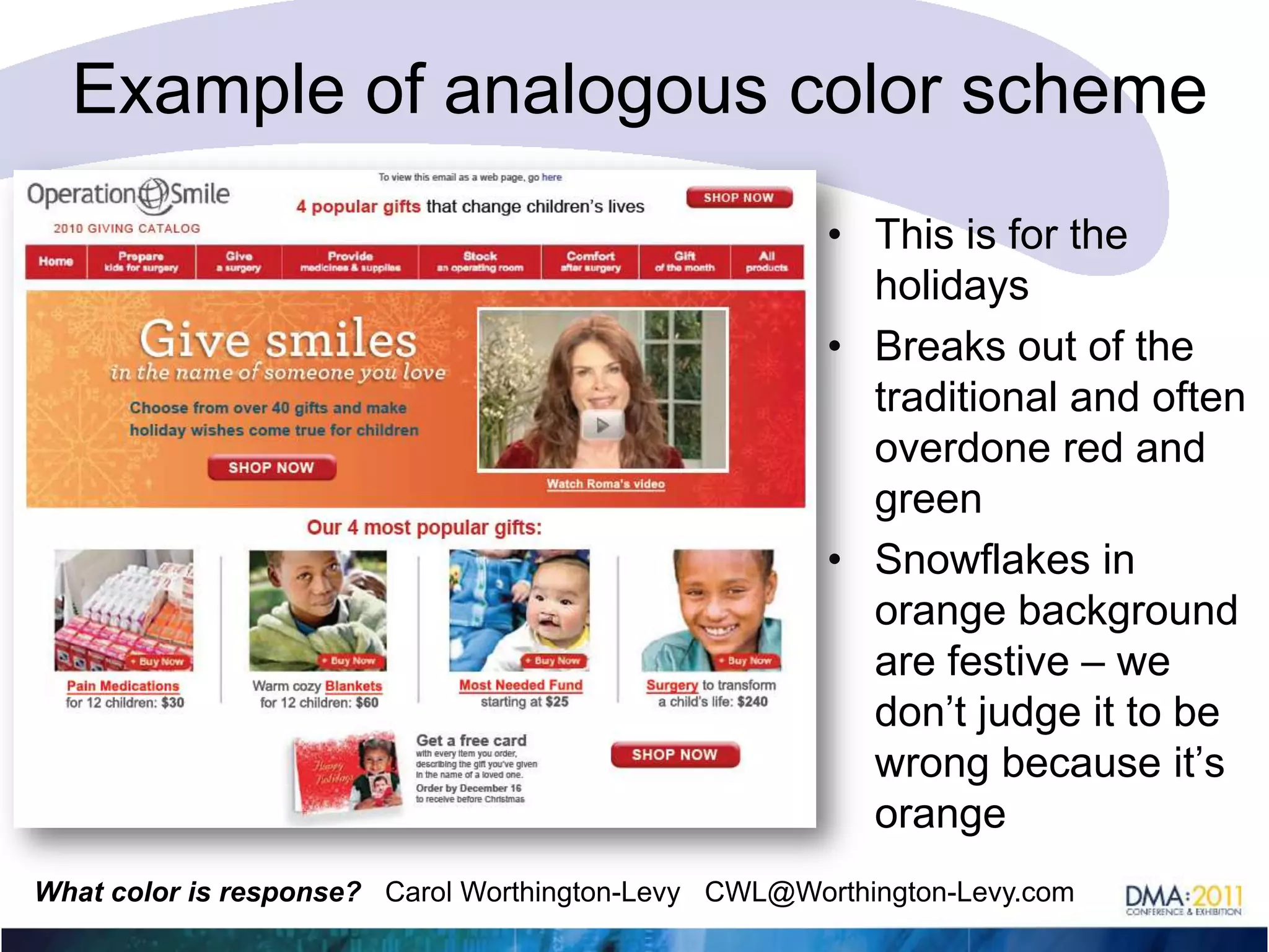
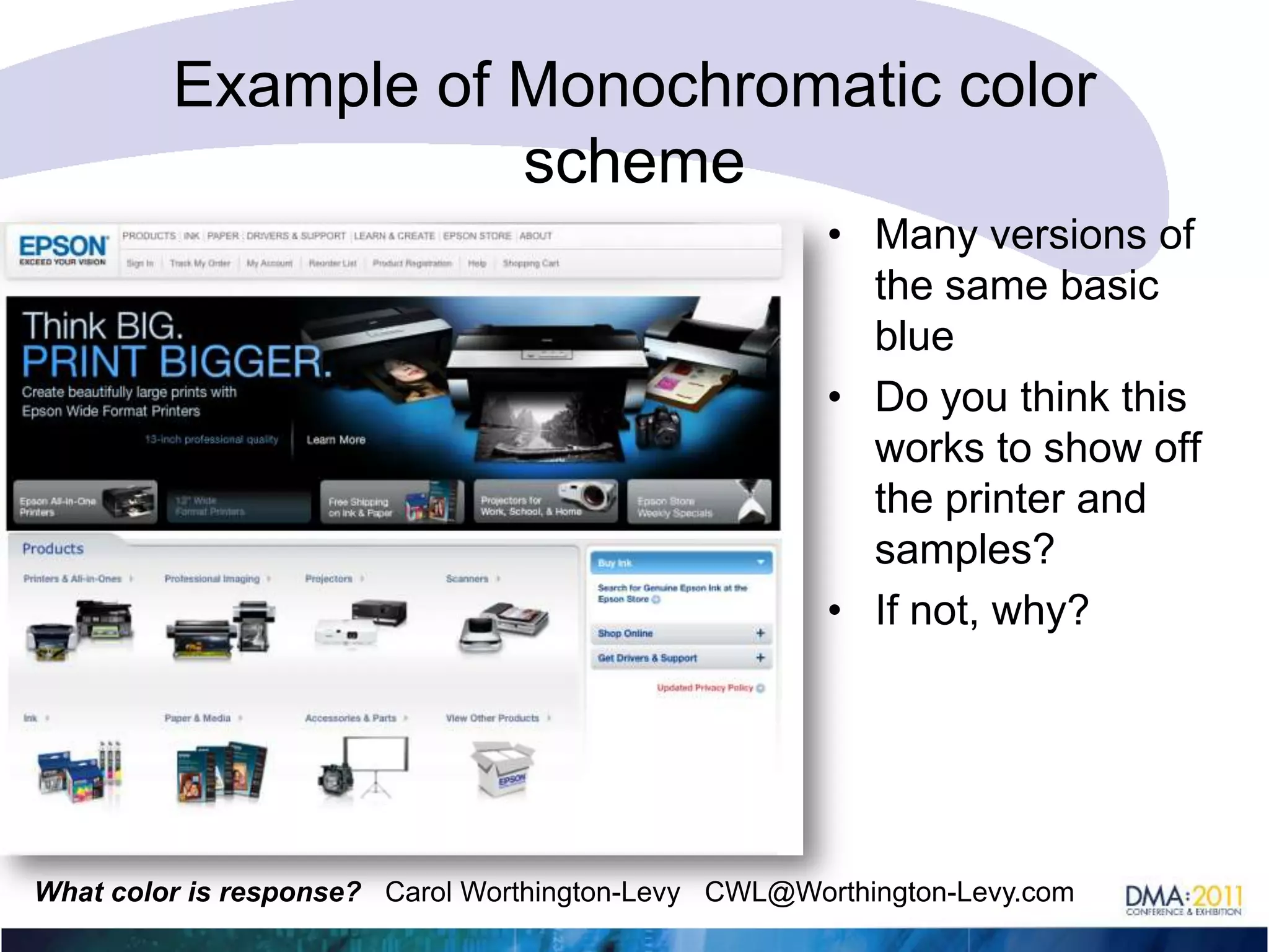
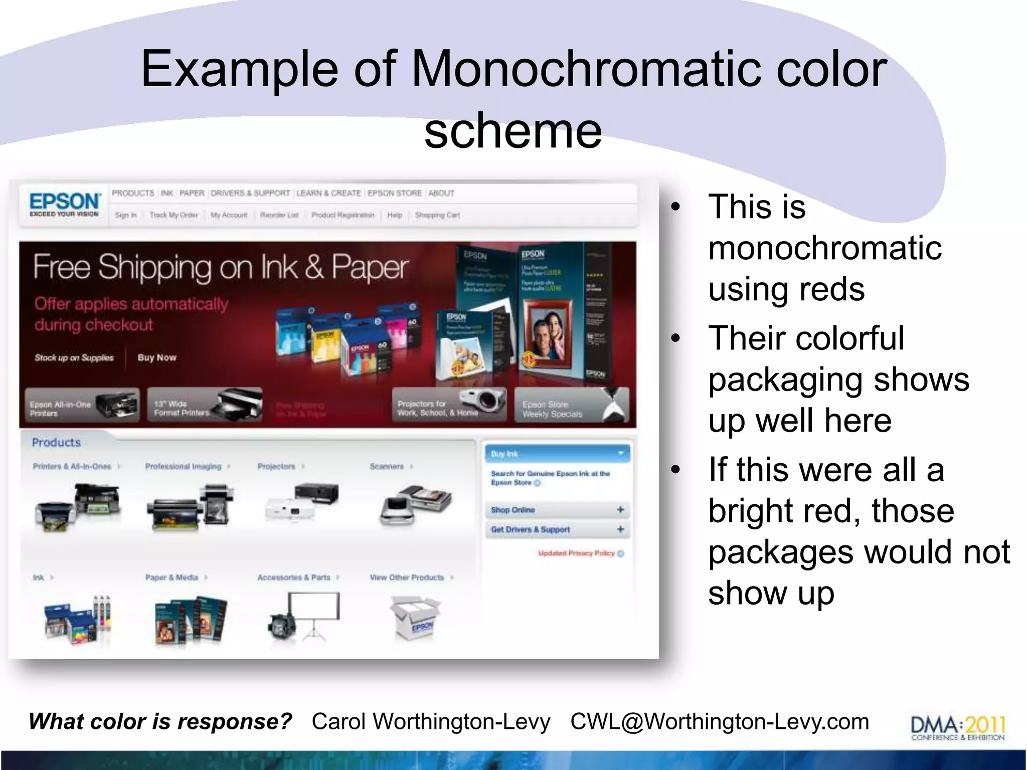
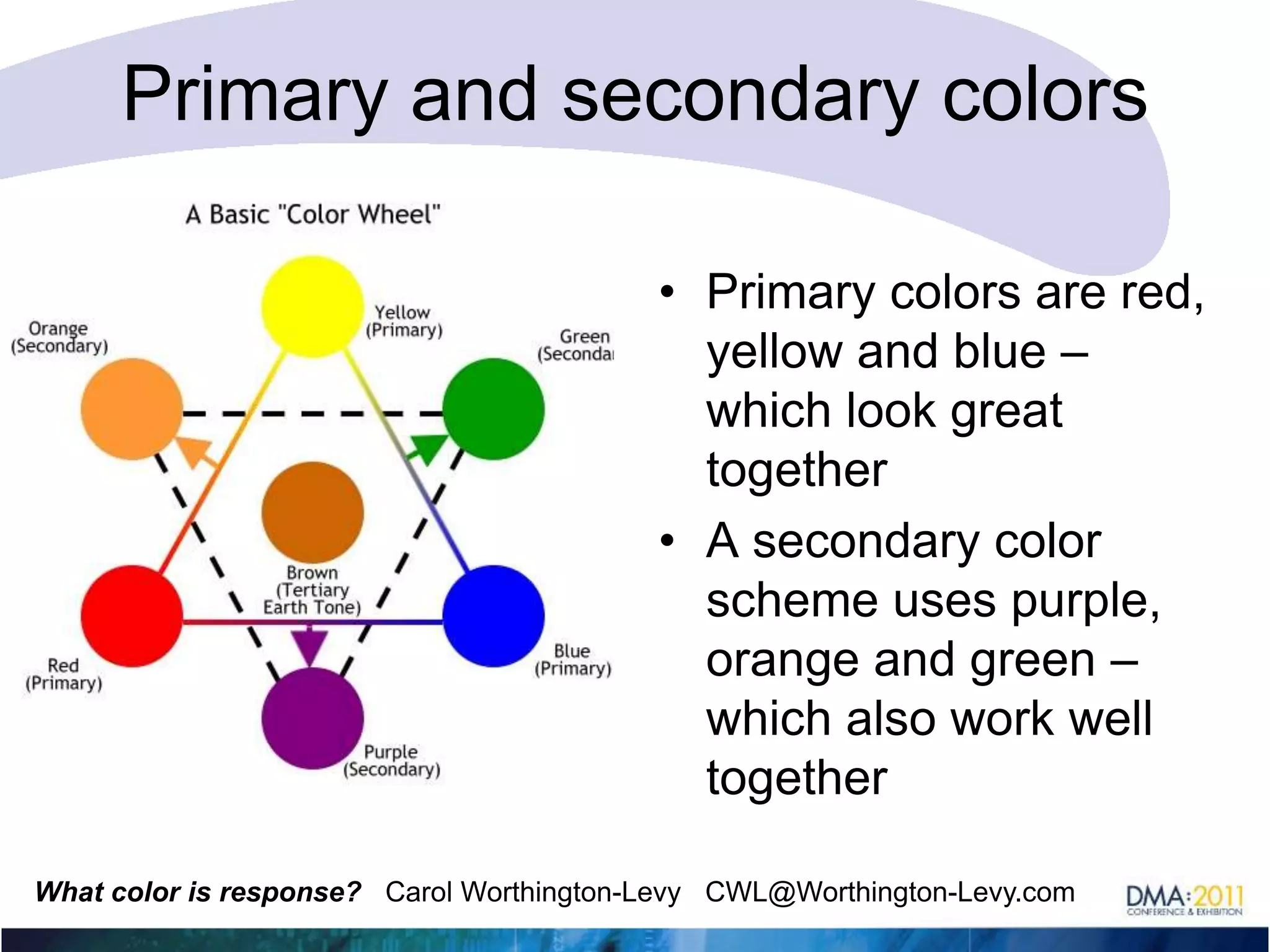
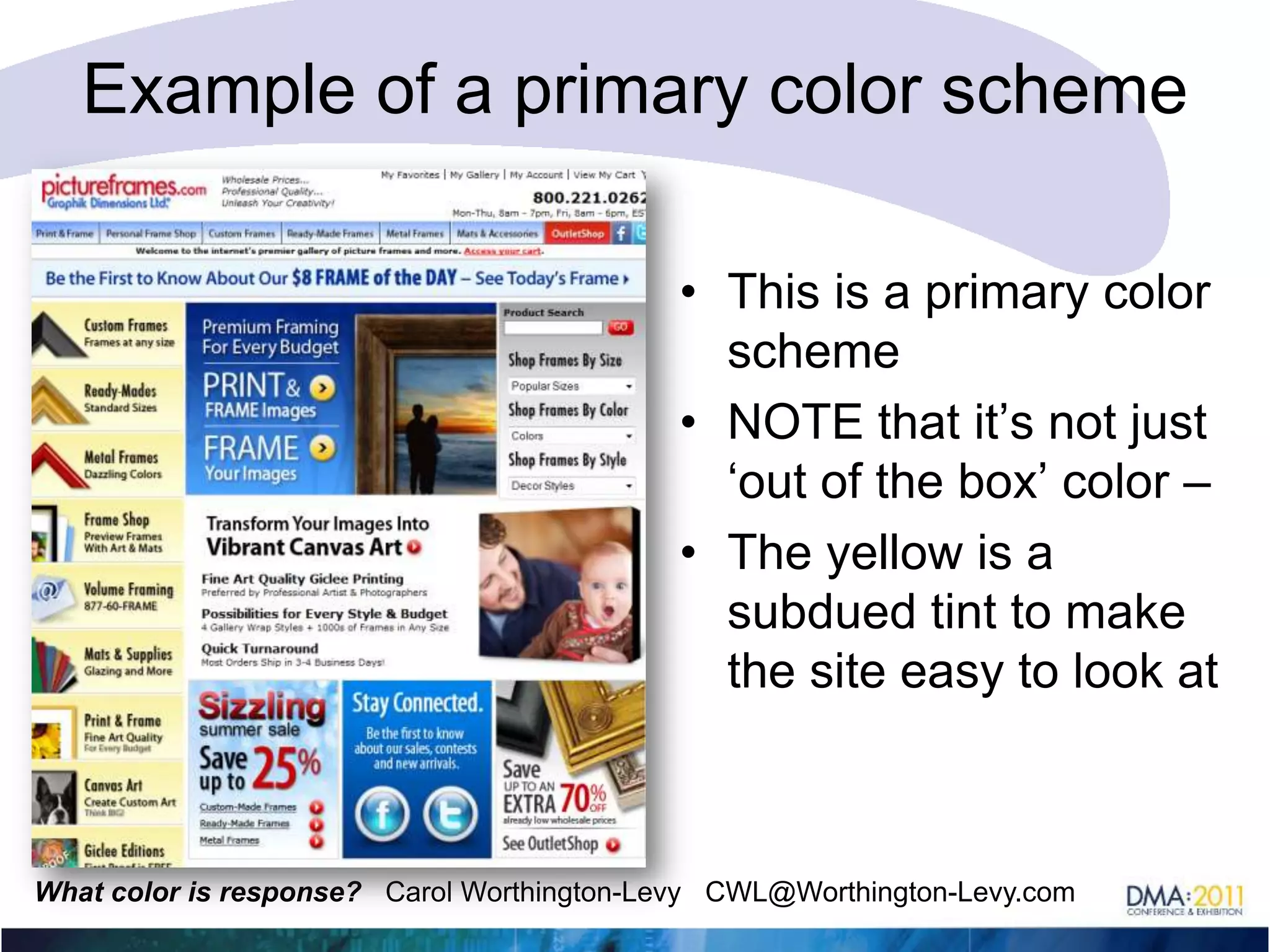
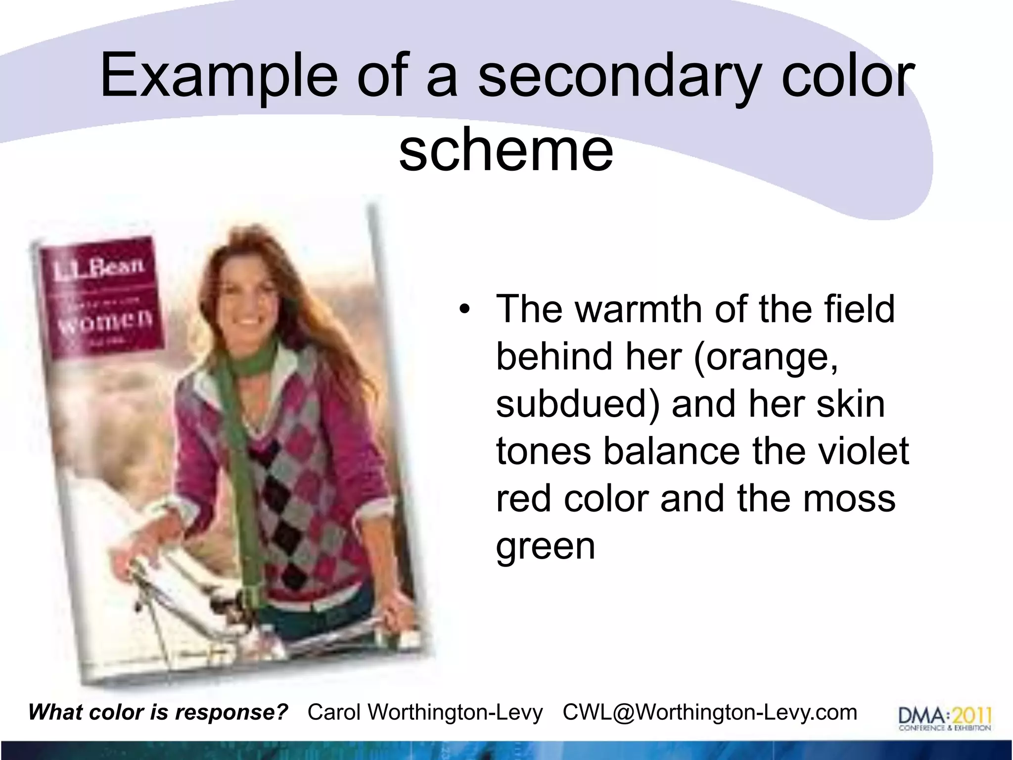
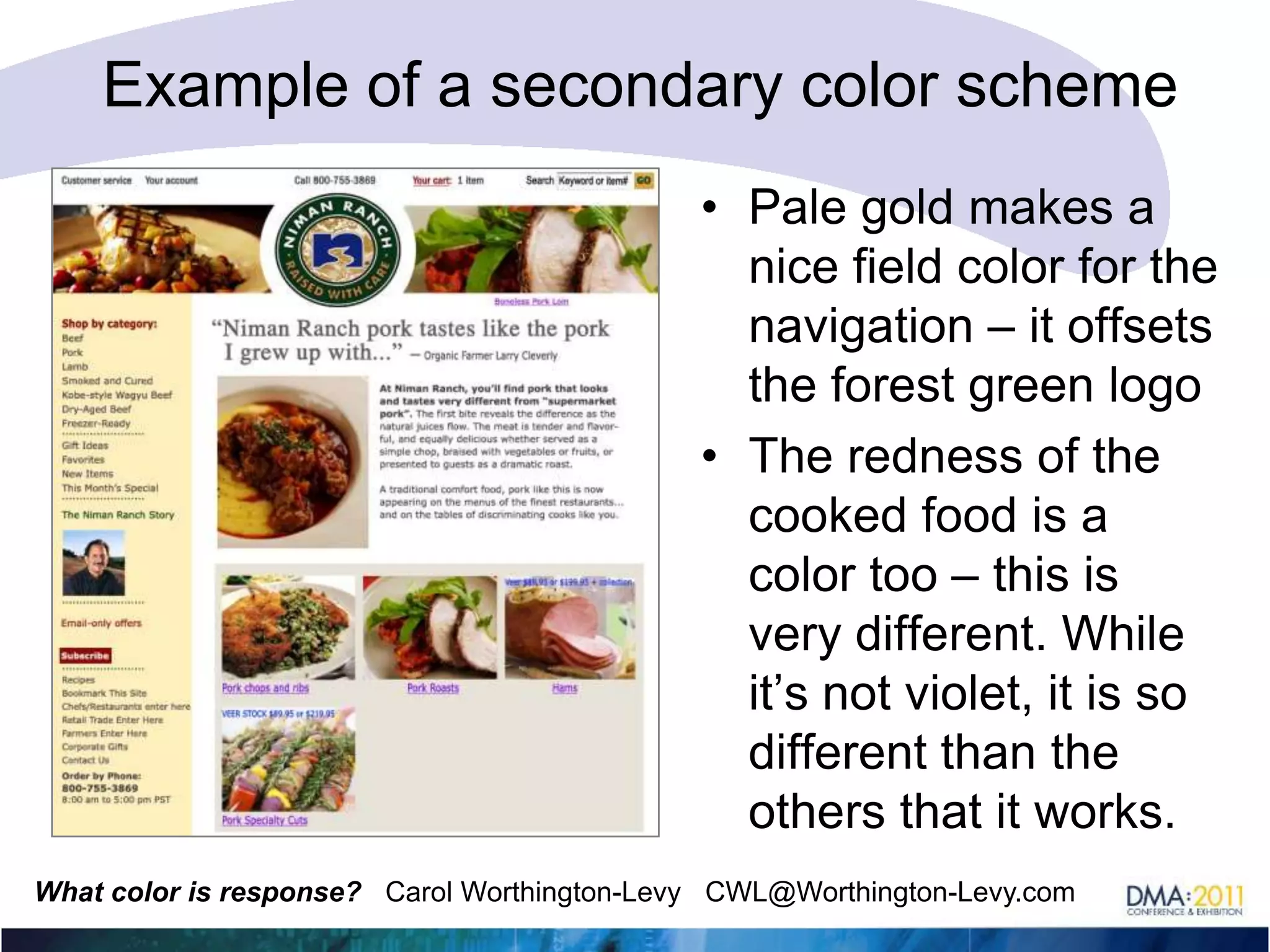
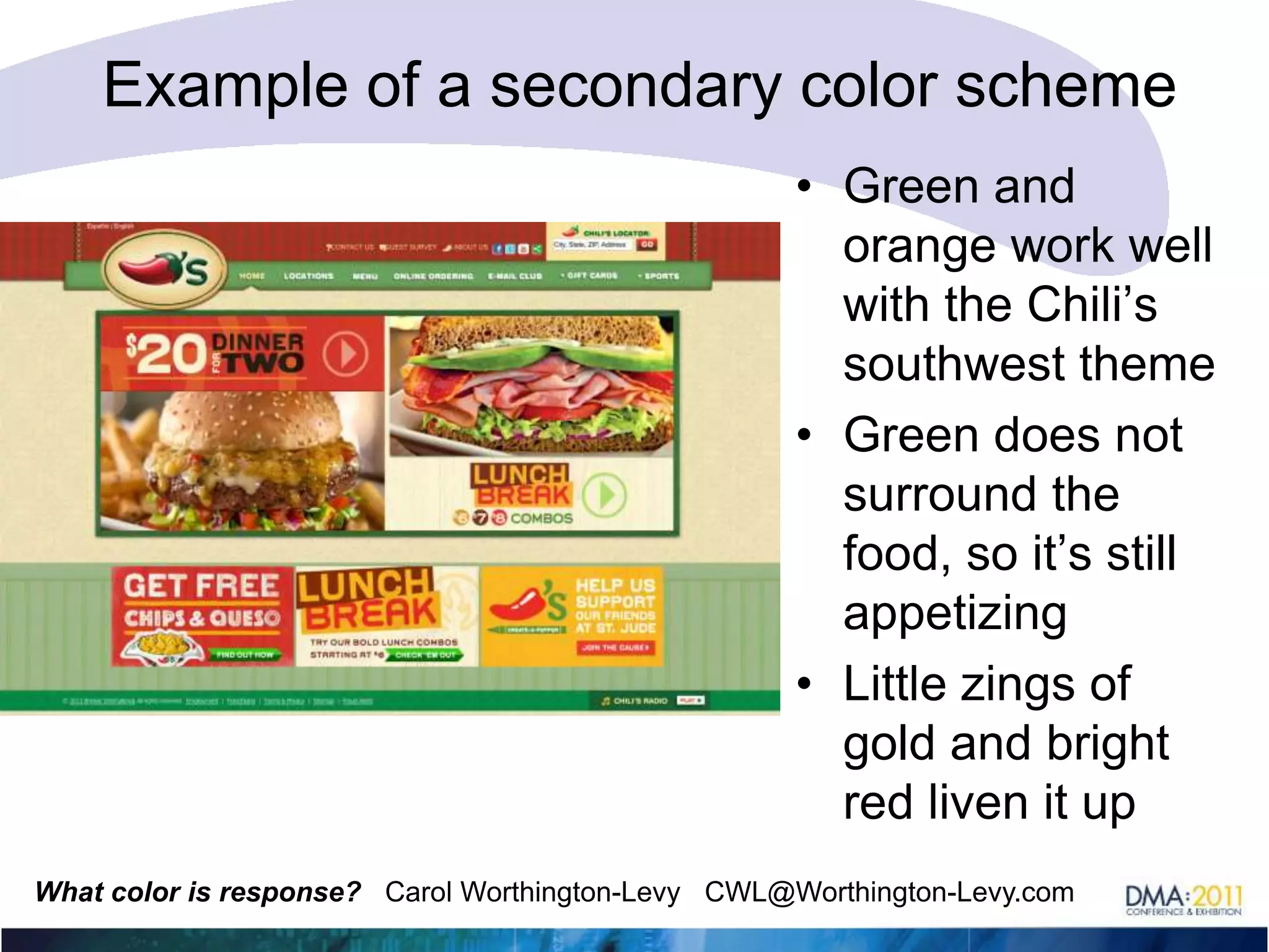
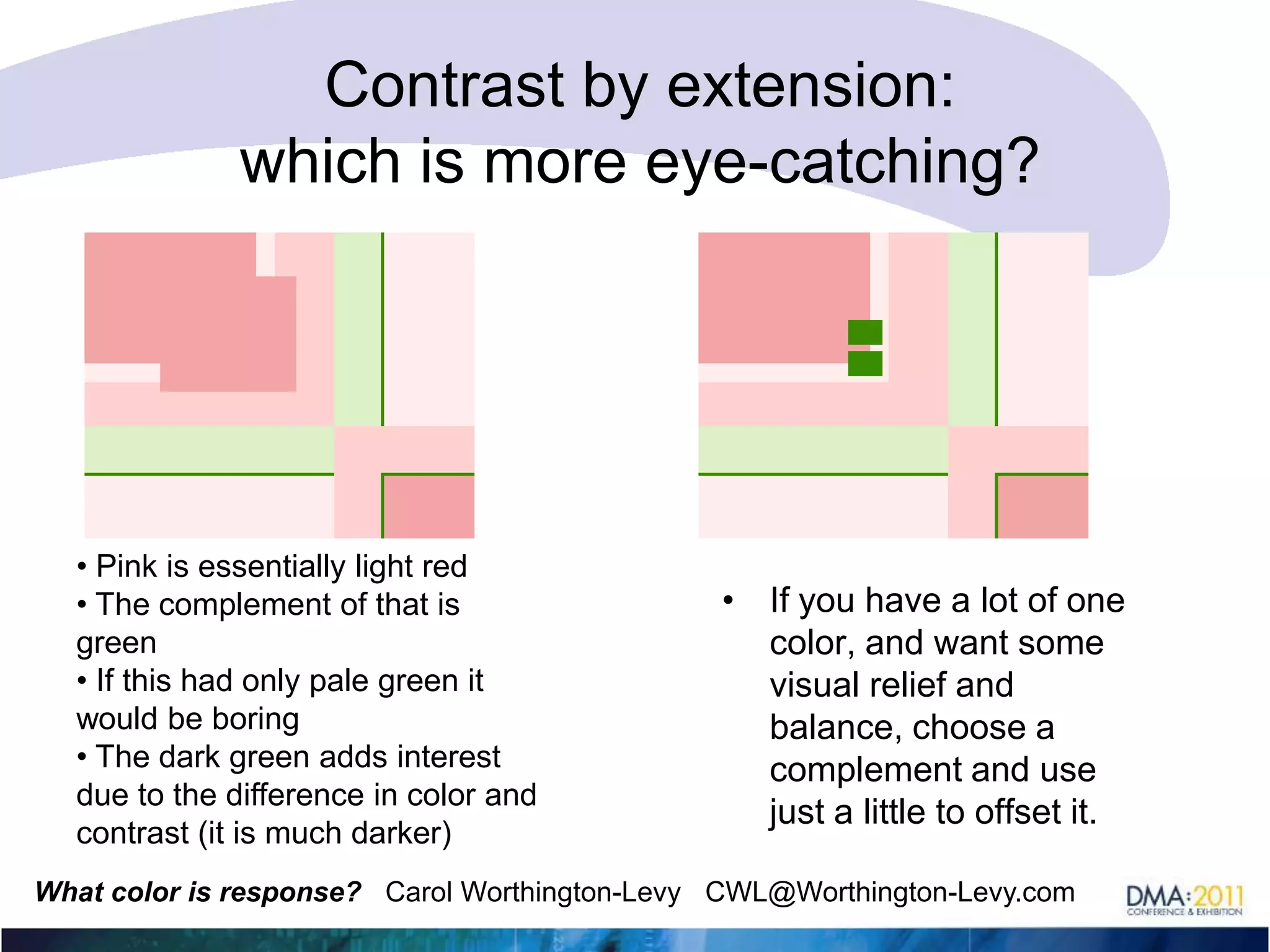
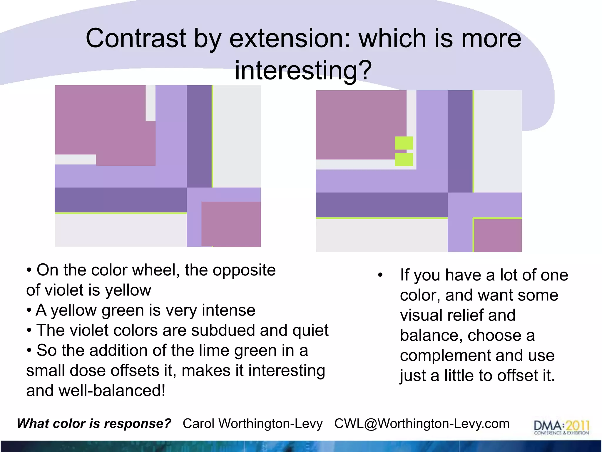
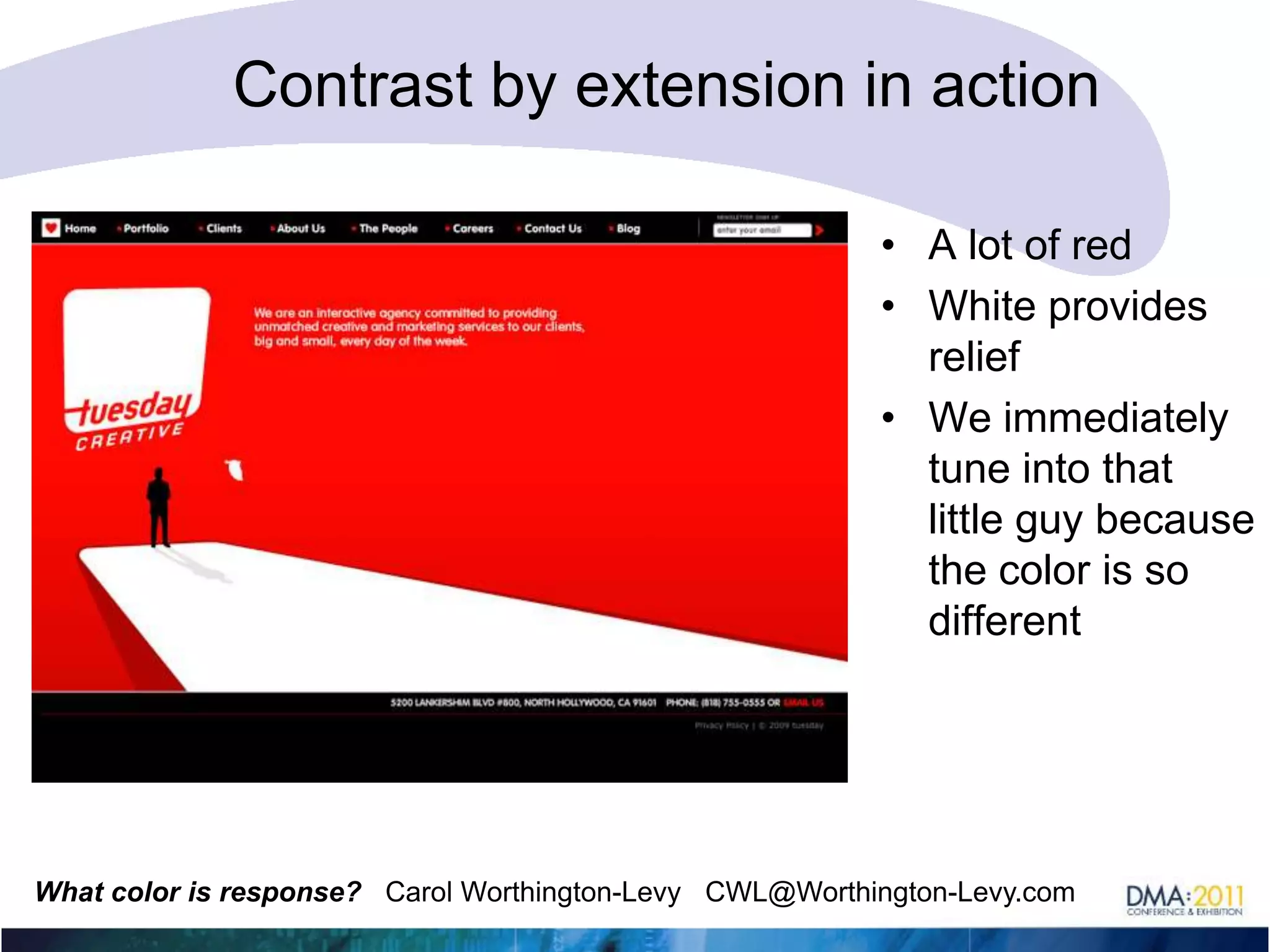
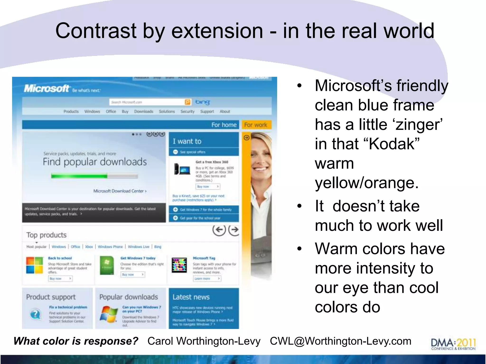
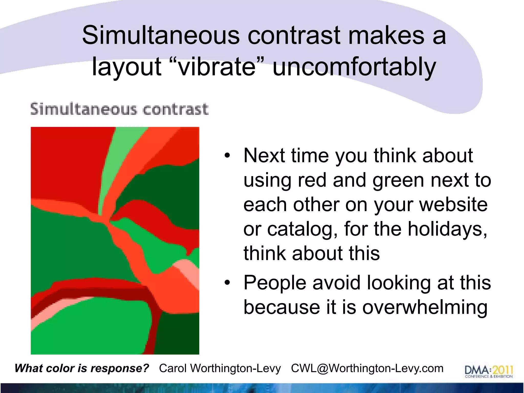
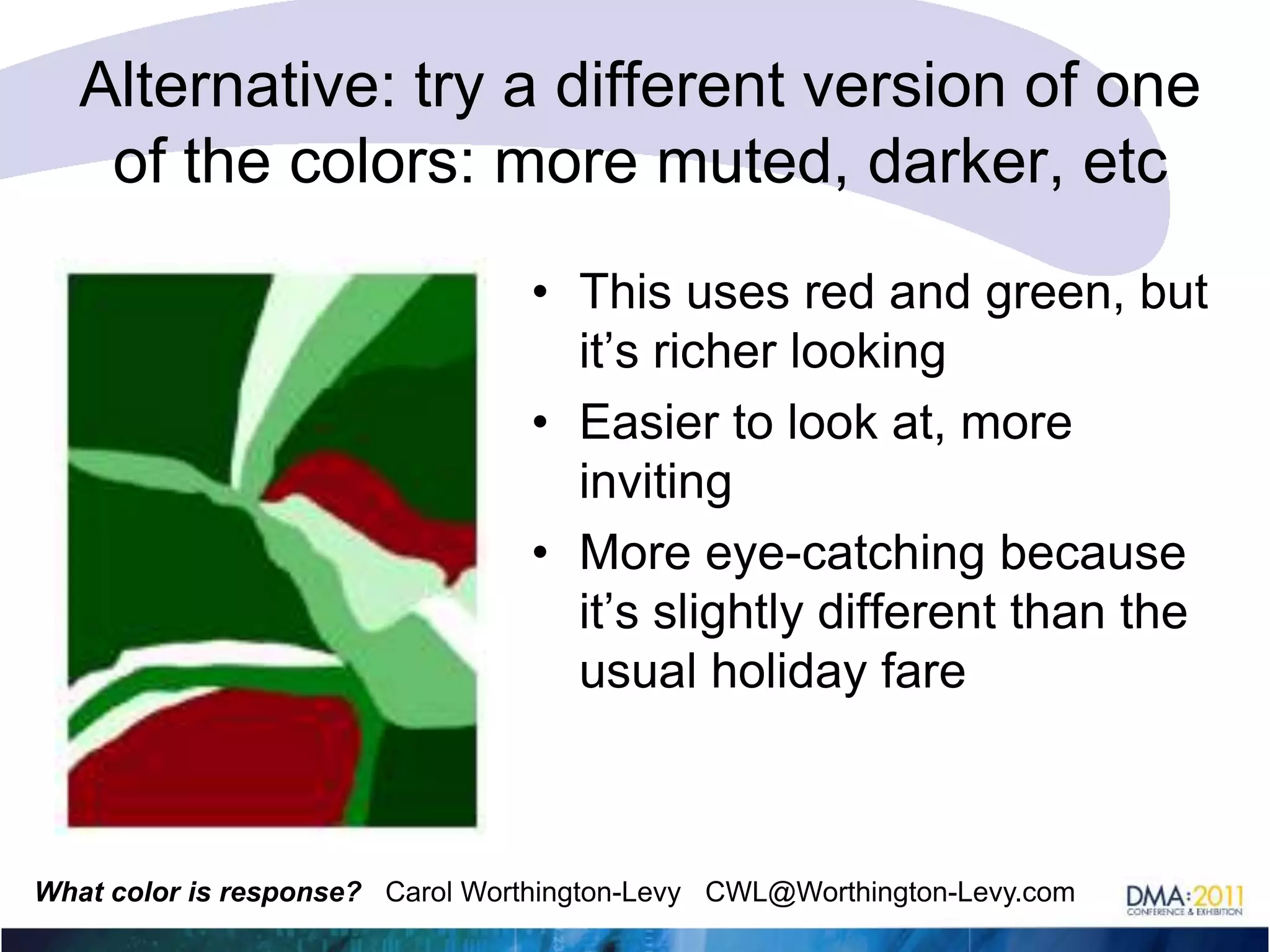
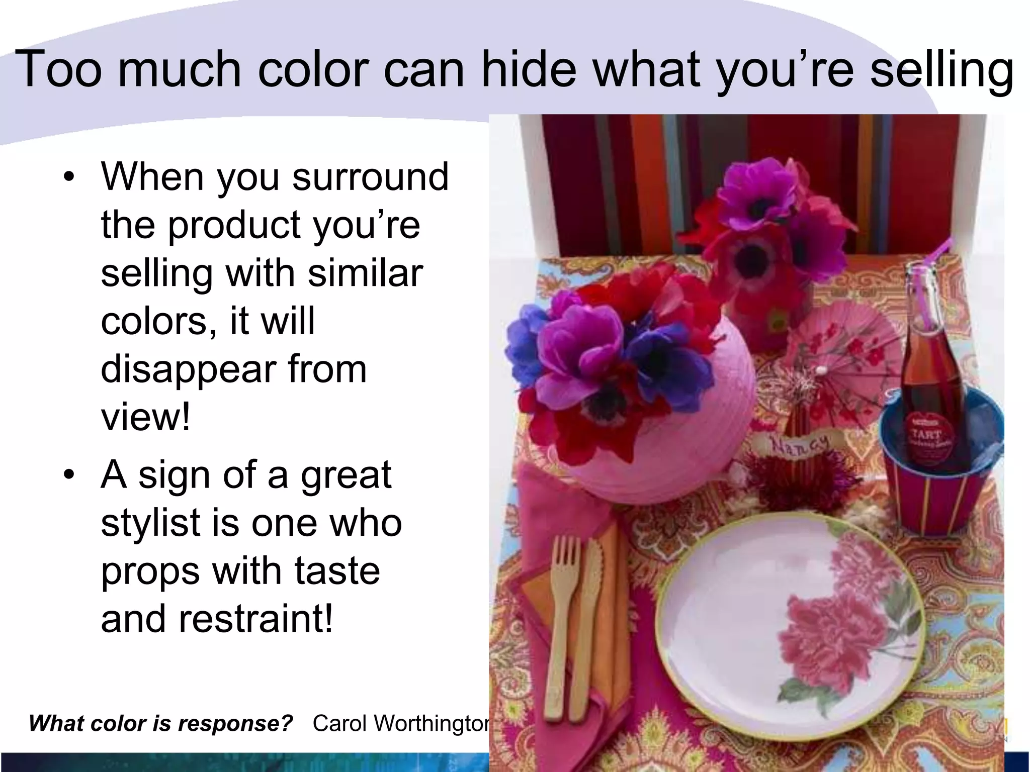
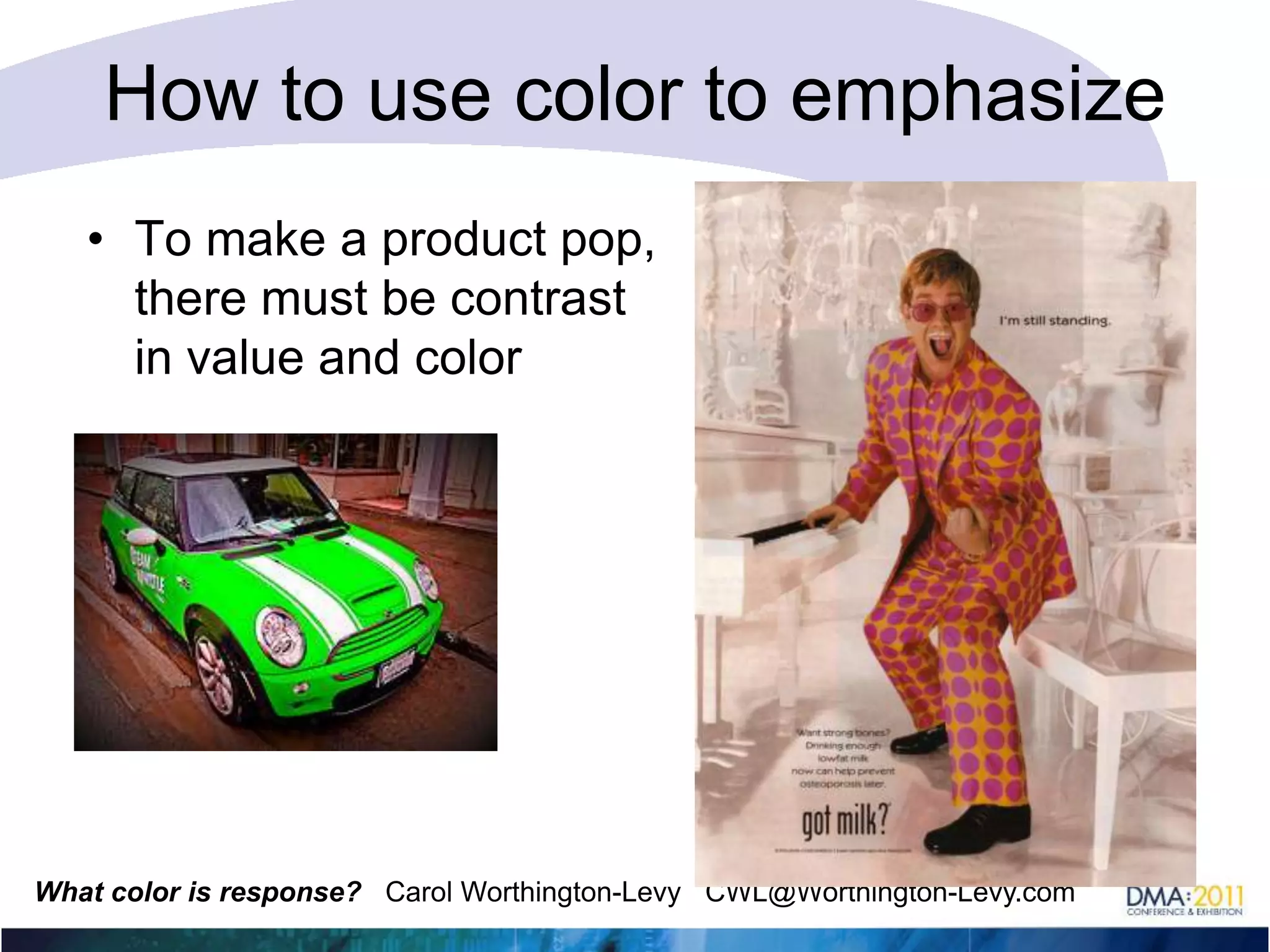
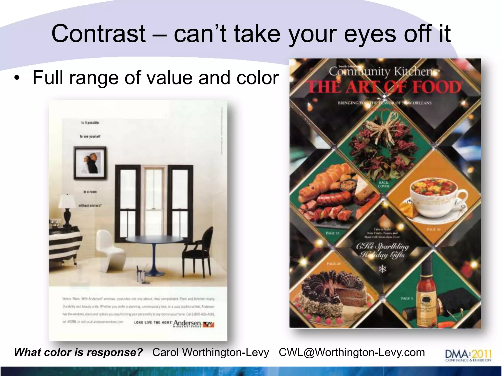
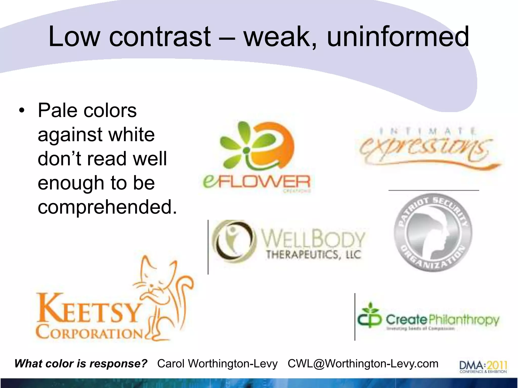
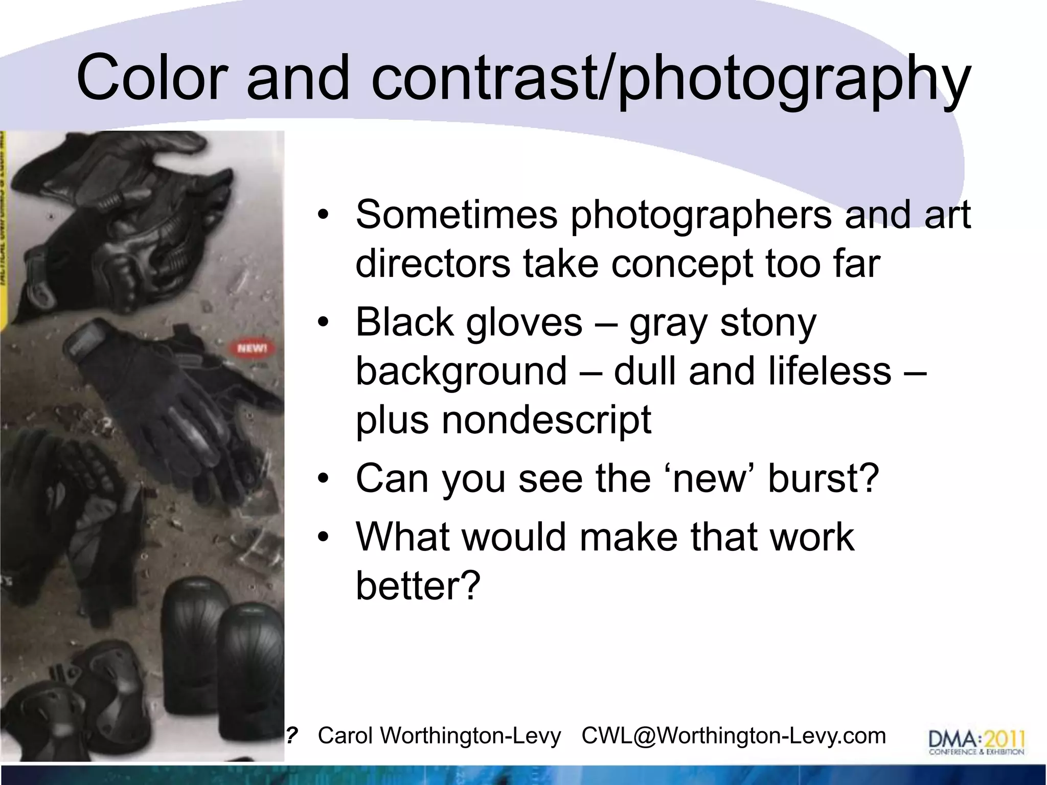
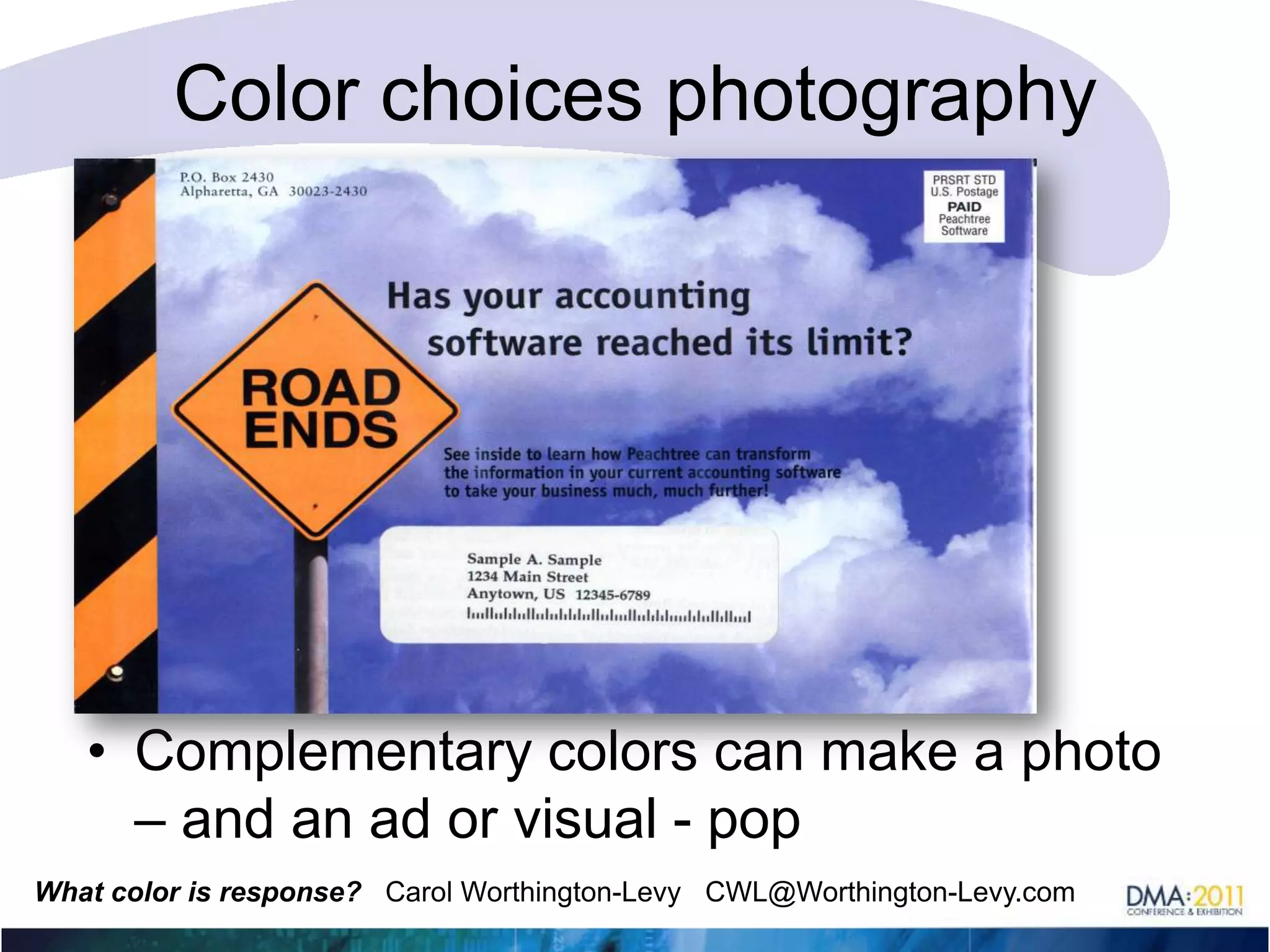
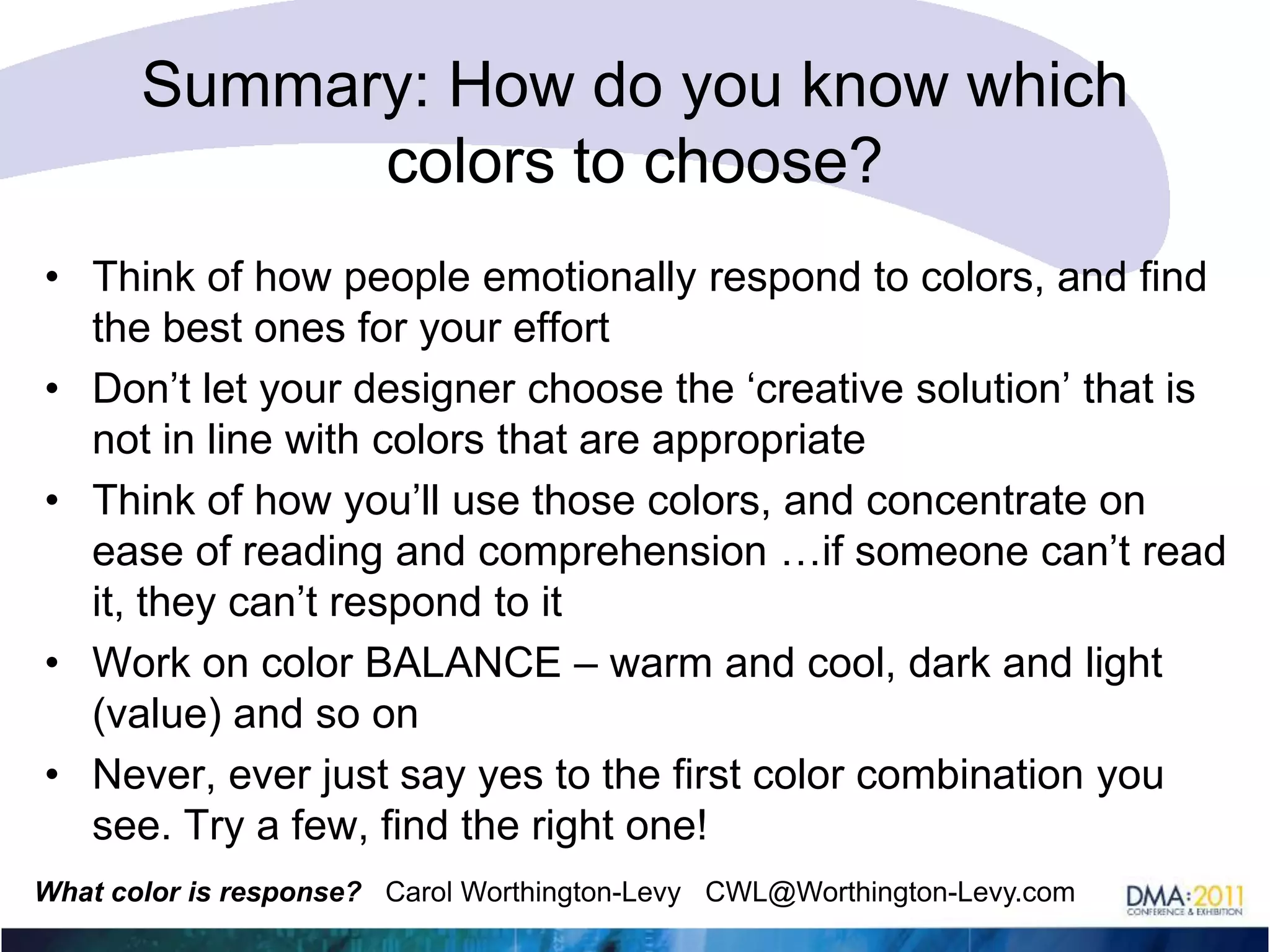

The document discusses how color can impact responses and sales. It provides examples of how changing background colors improved sales, such as a 400% increase for The Highlander when changing from black to gold backgrounds. It also discusses how color conveys meanings and emotions, and how using the right colors that match a brand or product is important. Specific colors are examined in terms of their symbolism and appropriateness for different contexts.


