Download to read offline


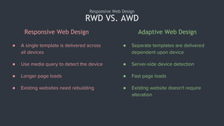
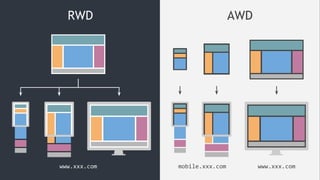
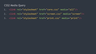

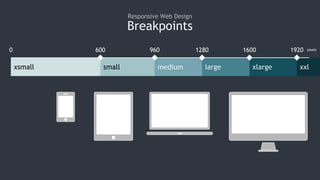
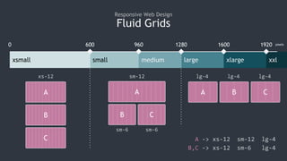
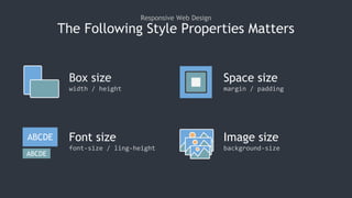
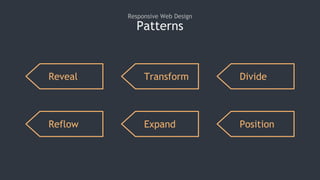


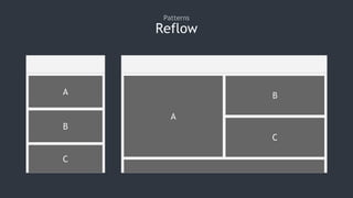


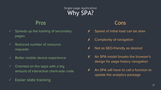
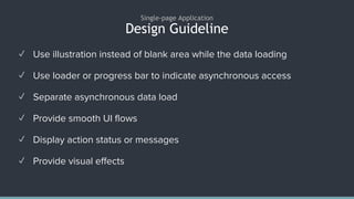


Responsive web design allows a single template to be delivered across all devices by using media queries to detect the device. It allows for longer page loads but existing websites do not need rebuilding. Adaptive web design delivers separate templates for each device through server-side detection, allowing for faster page loads but requiring alterations to existing websites. CSS media queries and breakpoints are important techniques for responsive design, along with fluid grids, modifying box size, spacing, fonts and images based on screen width. Common patterns include revealing, transforming, dividing, reflowing, expanding and positioning content. Single page applications load all necessary code at once allowing speedy secondary page loads but can increase initial load time and complexity.