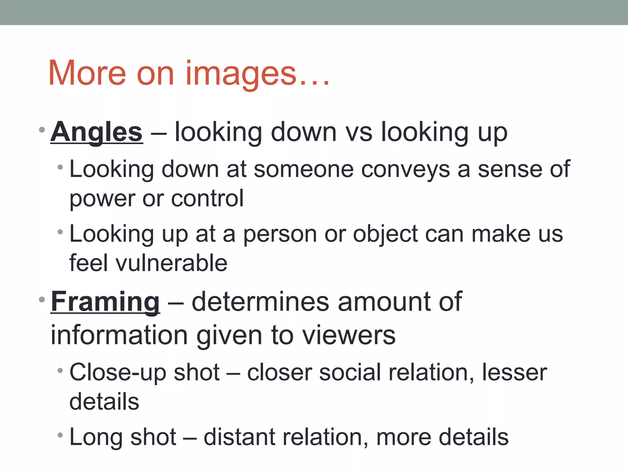
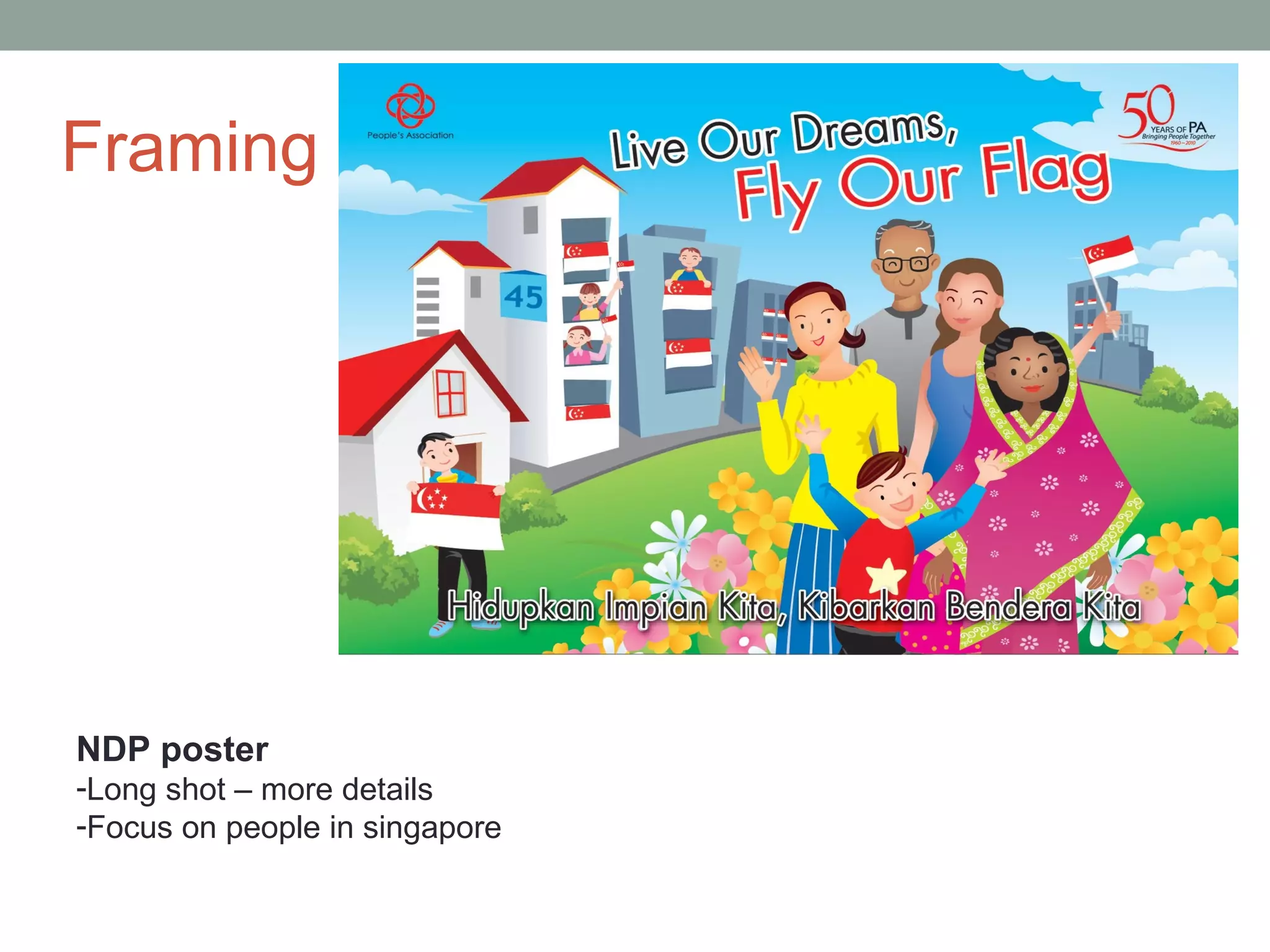
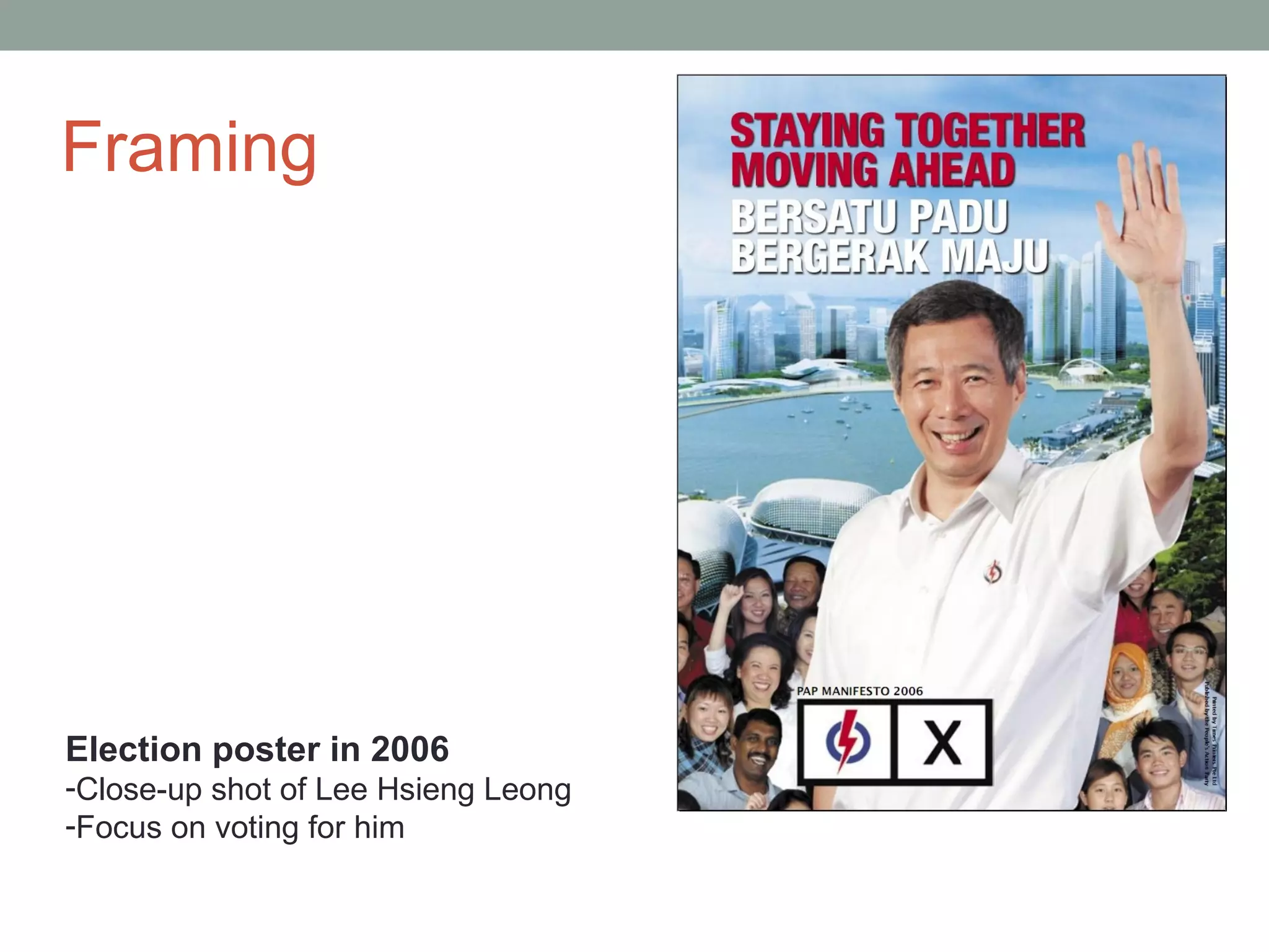
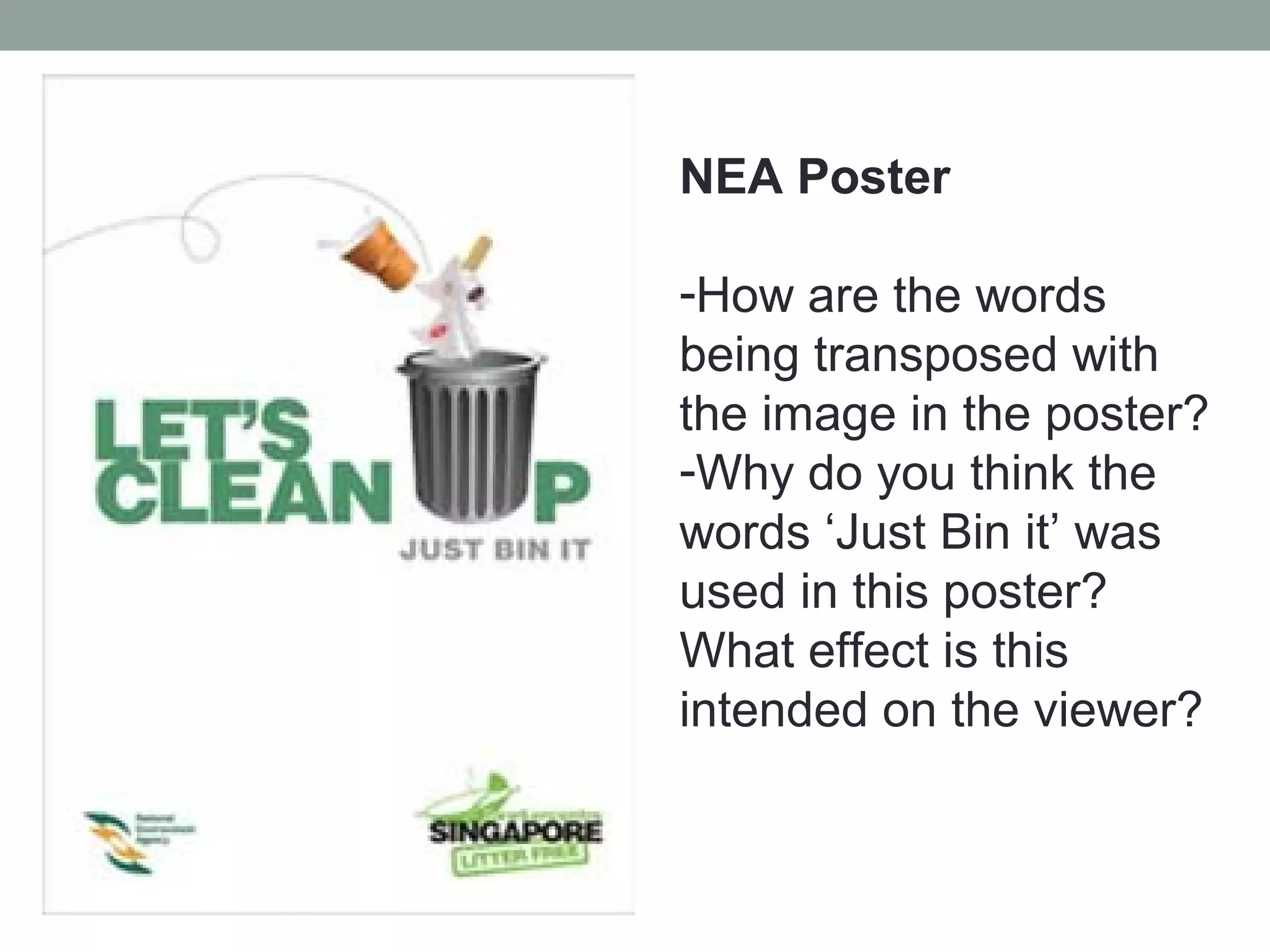
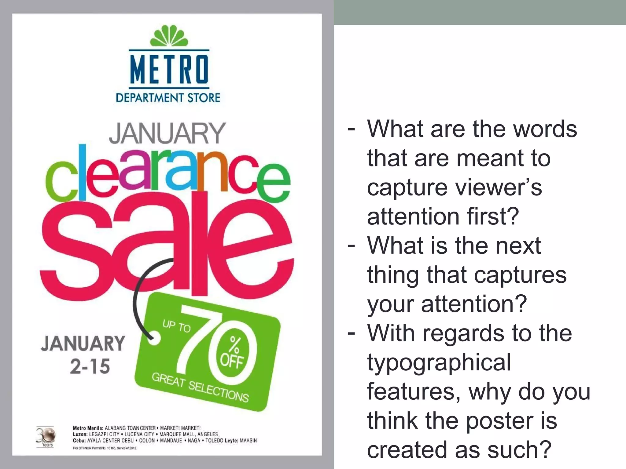
UNDERSTANDING
VISUAL TEXTS
‘O’ Levels Examination
• Section A – Visual Text Comprehension (Paper 2)
• 5 marks
• Skills
  • Understanding of visual texts at literal, inferential & evaluative
      levels
  •   Personal engagement
  •   Engagement with visual impact of material
  •   Engagement with real concepts
  •   Engagement with familiar concepts
  •   Engagement with non-linear layout
Visual texts
• Texts that are created using still or
  moving images
• May or may not contain words
• Television, film, radio, advertising,
  billboards, the Internet, computer games
  and programs, art works such as
  paintings, drawings, sculptures,
  architecture, book covers, illustrations
Visual Text Comprehension
• Understanding images & words in the context it
 is being used
 • Bring life experiences & background knowledge to
  what is being read/viewed
• All visual texts are influenced by the cultures,
 values, ideologies and world views in and
 through which they are created & consumed.
 • Eg. Family photo in your home vs. A family potrait in a
   magazine or
 • Artists’ impression vs. housing agent’s view of a HDB
   estate
How to interpret visual texts?
• We need to first identify the different elements
  that make up the text.
• These include:
 • Images
 • (Colour)
 • words – includes title, headlines, captions
 • Typographical features - type of font, font size
 • Layout – spatial arrangement of different elements in a
   text
Images…
• Images are mental représentations, pictures of
  objects, people or animals or any diagram that
  provides visual information.
• Images in a visual text may contain:
 • People, animals or object participating in an action
 • Flow charts, maps or labelled images showing a
   concept or an idea
 • Symbols or icons
What does this
image show?

-Concept/idea
-Desire to show
unity between
young & old
-Unity between
different races
also
What does this
image show?

-An action – ex –
offender trying to
remove the label
from his back
-Stereotype –
tattooed people are
offenders
More on images…
• Angles – looking down vs looking up
 • Looking down at someone conveys a sense of
   power or control
 • Looking up at a person or object can make us
   feel vulnerable
• Framing – determines amount of
information given to viewers
 • Close-up shot – closer social relation, lesser
   details
 • Long shot – distant relation, more details
Framing


NDP poster
-Long shot – more details
-Focus on people in singapore
Framing


Election poster in 2006
-Close-up shot of Lee Hsieng Leong
-Focus on voting for him
Words (Includes titles, headlines,
captions)
• Who is the target audience when
  something is said?
• Why are certain words used over others?
• What information is being conveyed in
  words?
• Literal, Inferential, Evaluative
  understanding of words in text
NEA Poster

-How are the words
being transposed with
the image in the poster?
-Why do you think the
words ‘Just Bin it’ was
used in this poster?
What effect is this
intended on the viewer?
Words (Includes titles, headlines,
captions)
 • Title – main topic of the poster
 • Headline – main statement that tells the
   main message of the poster ; usually the
   text in the largest and boldest font
 • Captions – It is the typed text under
   photographs explaining the image and
   usually in one sentence
Typographical features - font type
 and size
• Are the fonts in capital letters or non-
  capitalised letters?
• Are some words intentionally larger or
  smaller for any reason? Why?
• Usually determines the reading paths of
  the reader/viewer.
 • Reader/viewer will tend to be attracted to the
   larger fonts used in the text.
 • Usually for words that are meant for emphasis.
- What are the words
  that are meant to
  capture viewer’s
  attention first?
- What is the next
  thing that captures
  your attention?
- With regards to the
  typographical
  features, why do you
  think the poster is
  created as such?
Layout
• Placement of elements in text can influence
  the meaning of the image.
• Types of placement:
 • Top/bottom – top contains the ‘attention-grabber’;
   bottom contains new information
 • Left/right – left side contains information that is
   understood; right side presents new information
• Note: not all of these ‘codes’ apply to every
 image – images are shaped according to
 purpose and effect their creators wish to
 achieve.
Top/bottom
• Top – attention-
  grabber (Visual
  + words)
• Bottom – more
  information
  about the deal
  that Burger King
  is offering
• Left side –
  reported
  natural
  disasters in
  the country
• Right side
  –
  information
  about the
  services
  they are
Remember
this?
• Advertorial by
  Watsons
• Study the placement
  of the image with the
  products that
  Watson’s is trying to
  sell. Notice that the
  testimonies of the
  experts are placed
  before the products
  they are selling.
• Why do you think the
  layout is as such?
Recap…
• Different elements of visual texts:
 • Images
 • (Colour)
 • words – includes title, headlines, captions
 • Typographical features - type of font, font size
 • Layout – spatial arrangement of different elements
  in a text
Task
• Kingsway Unit 3 Paper 2

Visual text comprehension

  • 1.
  • 2.
    ‘O’ Levels Examination •Section A – Visual Text Comprehension (Paper 2) • 5 marks • Skills • Understanding of visual texts at literal, inferential & evaluative levels • Personal engagement • Engagement with visual impact of material • Engagement with real concepts • Engagement with familiar concepts • Engagement with non-linear layout
  • 3.
    Visual texts • Textsthat are created using still or moving images • May or may not contain words • Television, film, radio, advertising, billboards, the Internet, computer games and programs, art works such as paintings, drawings, sculptures, architecture, book covers, illustrations
  • 4.
    Visual Text Comprehension •Understanding images & words in the context it is being used • Bring life experiences & background knowledge to what is being read/viewed • All visual texts are influenced by the cultures, values, ideologies and world views in and through which they are created & consumed. • Eg. Family photo in your home vs. A family potrait in a magazine or • Artists’ impression vs. housing agent’s view of a HDB estate
  • 5.
    How to interpretvisual texts? • We need to first identify the different elements that make up the text. • These include: • Images • (Colour) • words – includes title, headlines, captions • Typographical features - type of font, font size • Layout – spatial arrangement of different elements in a text
  • 6.
    Images… • Images aremental représentations, pictures of objects, people or animals or any diagram that provides visual information. • Images in a visual text may contain: • People, animals or object participating in an action • Flow charts, maps or labelled images showing a concept or an idea • Symbols or icons
  • 7.
    What does this imageshow? -Concept/idea -Desire to show unity between young & old -Unity between different races also
  • 8.
    What does this imageshow? -An action – ex – offender trying to remove the label from his back -Stereotype – tattooed people are offenders
  • 9.
    More on images… •Angles – looking down vs looking up • Looking down at someone conveys a sense of power or control • Looking up at a person or object can make us feel vulnerable • Framing – determines amount of information given to viewers • Close-up shot – closer social relation, lesser details • Long shot – distant relation, more details
  • 10.
    Framing NDP poster -Long shot– more details -Focus on people in singapore
  • 11.
    Framing Election poster in2006 -Close-up shot of Lee Hsieng Leong -Focus on voting for him
  • 12.
    Words (Includes titles,headlines, captions) • Who is the target audience when something is said? • Why are certain words used over others? • What information is being conveyed in words? • Literal, Inferential, Evaluative understanding of words in text
  • 13.
    NEA Poster -How arethe words being transposed with the image in the poster? -Why do you think the words ‘Just Bin it’ was used in this poster? What effect is this intended on the viewer?
  • 14.
    Words (Includes titles,headlines, captions) • Title – main topic of the poster • Headline – main statement that tells the main message of the poster ; usually the text in the largest and boldest font • Captions – It is the typed text under photographs explaining the image and usually in one sentence
  • 15.
    Typographical features -font type and size • Are the fonts in capital letters or non- capitalised letters? • Are some words intentionally larger or smaller for any reason? Why? • Usually determines the reading paths of the reader/viewer. • Reader/viewer will tend to be attracted to the larger fonts used in the text. • Usually for words that are meant for emphasis.
  • 16.
    - What arethe words that are meant to capture viewer’s attention first? - What is the next thing that captures your attention? - With regards to the typographical features, why do you think the poster is created as such?
  • 17.
    Layout • Placement ofelements in text can influence the meaning of the image. • Types of placement: • Top/bottom – top contains the ‘attention-grabber’; bottom contains new information • Left/right – left side contains information that is understood; right side presents new information • Note: not all of these ‘codes’ apply to every image – images are shaped according to purpose and effect their creators wish to achieve.
  • 18.
    Top/bottom • Top –attention- grabber (Visual + words) • Bottom – more information about the deal that Burger King is offering
  • 19.
    • Left side– reported natural disasters in the country • Right side – information about the services they are
  • 20.
    Remember this? • Advertorial by Watsons • Study the placement of the image with the products that Watson’s is trying to sell. Notice that the testimonies of the experts are placed before the products they are selling. • Why do you think the layout is as such?
  • 21.
    Recap… • Different elementsof visual texts: • Images • (Colour) • words – includes title, headlines, captions • Typographical features - type of font, font size • Layout – spatial arrangement of different elements in a text
  • 22.

Editor's Notes

  • #14 Letter u is replaced with a rubbish bin – to show how ‘cleaning up’ can be done Just bin it – inspired by nike slogan. Creation of sense of familiarity with the audience to encourage them to throw rubbish in it respecti
  • #17 Clearance sale – big fonts/colours used 70% Emphasis on the clearance sale which has up to 70% discount
  • #21 Testimonies by experts given first so that audience will have the impression that Watson’s has expert knowledge of hair Image of girl with great hair put alongside product to influence the audience to buy those products – i.e. if you buy these, you will have such greatlooking hair.