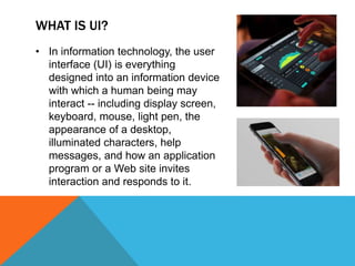
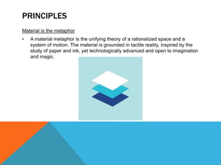
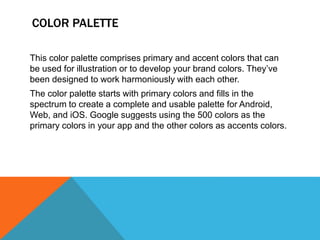
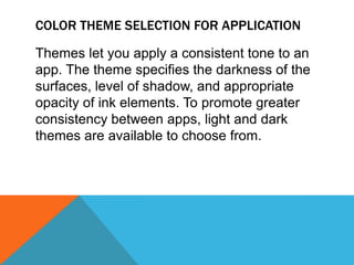
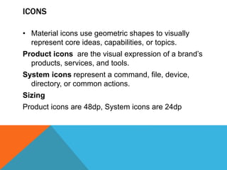
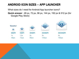
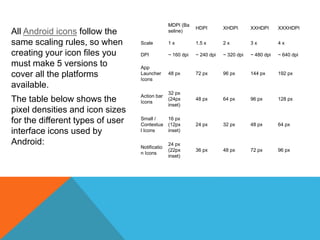
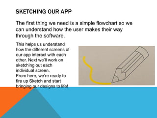
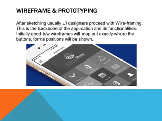
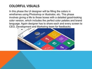
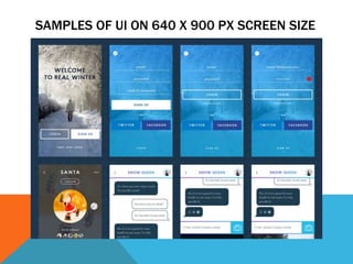
By:-
AASHISH UPPAL
WHAT IS UI?
• In information technology, the user
interface (UI) is everything
designed into an information device
with which a human being may
interact -- including display screen,
keyboard, mouse, light pen, the
appearance of a desktop,
illuminated characters, help
messages, and how an application
program or a Web site invites
interaction and responds to it.
GOALS?
• Create a visual language that synthesizes classic
principles of good design with the innovation and
possibility of technology and science.
• Develop a single underlying system that allows for
a unified experience across platforms and device
sizes. Mobile precepts are fundamental, but touch,
voice, mouse, and keyboard are all first-class input
methods.
PRINCIPLES
Material is the metaphor
• A material metaphor is the unifying theory of a rationalized space and a
system of motion. The material is grounded in tactile reality, inspired by the
study of paper and ink, yet technologically advanced and open to imagination
and magic.
Bold, graphic, intentional
• The foundational elements of print-based design – typography, grids, space,
scale, color, and use of imagery – guide visual treatments. These elements
do far more than please the eye. They create hierarchy, meaning, and focus.
Deliberate color choices, edge-to-edge imagery, large-scale typography, and
intentional white space create a bold and graphic interface that immerse the
user in the experience.
• An emphasis on user actions makes core functionality immediately apparent
and provides waypoints for the user.
DIMENSIONS FOR UI
DIMENSIONS OF ANDROID DEVICES
UI FOR DIFFERENT SCREEN SIZES
COLOR PALETTE
This color palette comprises primary and accent colors that can
be used for illustration or to develop your brand colors. They’ve
been designed to work harmoniously with each other.
The color palette starts with primary colors and fills in the
spectrum to create a complete and usable palette for Android,
Web, and iOS. Google suggests using the 500 colors as the
primary colors in your app and the other colors as accents colors.
EXAMPLE OF USING COLOR SCHEME
Example of a color
palette using two
purple hues from the
primary palette and
one accent green
hue.
DARK TEXT ON LIGHT BACKGROUND
COLOR THEME SELECTION FOR APPLICATION
Themes let you apply a consistent tone to an
app. The theme specifies the darkness of the
surfaces, level of shadow, and appropriate
opacity of ink elements. To promote greater
consistency between apps, light and dark
themes are available to choose from.
1. Status bar
2. App bar
3. Background
4. Cards/Dialogs
Dark Theme
ICONS
• Material icons use geometric shapes to visually
represent core ideas, capabilities, or topics.
Product icons are the visual expression of a brand’s
products, services, and tools.
System icons represent a command, file, device,
directory, or common actions.
Sizing
Product icons are 48dp, System icons are 24dp
ANDROID ICON SIZES – APP LAUNCHER
What sizes do I need for Android App launcher icons?
Quick answer : 48 px, 72 px, 96 px, 144 px, 192 px & 512 px (for
Google Play Store)
All Android icons follow the
same scaling rules, so when
creating your icon files you
must make 5 versions to
cover all the platforms
available.
The table below shows the
pixel densities and icon sizes
for the different types of user
interface icons used by
Android:
MDPI (Ba
seline)
HDPI XHDPI XXHDPI XXXHDPI
Scale 1 x 1.5 x 2 x 3 x 4 x
DPI ~ 160 dpi ~ 240 dpi ~ 320 dpi ~ 480 dpi ~ 640 dpi
App
Launcher
Icons
48 px 72 px 96 px 144 px 192 px
Action bar
Icons
32 px
(24px
inset)
48 px 64 px 96 px 128 px
Small /
Contextua
l Icons
16 px
(12px
inset)
24 px 32 px 48 px 64 px
Notificatio
n Icons
24 px
(22px
inset)
36 px 48 px 72 px 96 px
STYLES
• When using illustration and photography to enhance the user
experience, choose images that express personal relevance,
information, and delight.
UNITS AND MEASUREMENTS
• The number of pixels that fit into an inch is referred to as “pixel density.” High-
density screens have more pixels per inch than low-density ones. As a result,
UI elements (such as a button) appear physically larger on low-density
screens and smaller on high-density screens.
• Screen resolution refers to the total number pixels in a display.
• screen density = screen width (or height) in pixels / screen width (or
height) in inches
High
Density
Screen
CARDS ARE FLEXIBLE
Cards are easily arranged into flexible layouts and
scalable UI forms itself nearly automatically.
Content like news articles with rich visuals and mixed
sources create a great opportunity to use staggered
list-style approach to create visually pleasing, content
rich screens.
USER DELIGHT
Going for good app to a great app requires more than
just nice scalable UI. You need to delight your users.
In case of Onefootball a lot of details were added to
the app to push it from being good to great.
In a football app the right place to start making users
delighted is the team page. Onefootball app affords
each team a fully themed page. A fan of any team will
immediately recognize the color theme and prominent
team logo.
WHAT ARE WE BUILDING?
Before we get started, we need to know what we’re
designing. We don’t need to bust out the pencil and
paper or fire up Sketch just yet. We just need to
brainstorm the overall functions of the app.
HOW DO WE BUILD IT?
To get started, we’ll use pencil and paper and start
sketching out these various app functions. Once these
drawings are finalized, we’ll move over
to Photoshop and start breathing life into them.
SKETCHING OUR APP
The first thing we need is a simple flowchart so we
can understand how the user makes their way
through the software.
This helps us understand
how the different screens of
our app interact with each
other. Next we’ll work on
sketching out each
individual screen.
From here, we’re ready to
fire up Sketch and start
bringing our designs to life!
WIREFRAME & PROTOTYPING
After sketching usually UI designers proceed with Wire-framing.
This is the backbone of the application and its functionalities.
Initially good b/w wireframes will map out exactly where the
buttons, forms positions will be shown.
COLORFUL VISUALS
In this phase the UI designer will be filling the colors in
wireframes using Photoshop or illustrator, etc. This phase
involves giving a life to those boxes with a detailed good-looking
color version, which includes the perfect color palates and brand
language. Again designer has to share each and every screen to
CEO, Development and Marketing team for feedbacks.
SAMPLES OF UI ON 640 X 900 PX SCREEN SIZE
REFERENCES
• https://think360studio.com/why-designers-should-follow-user-experience-
process-for-a-product-startup/
• http://blog.careerfoundry.com/ui-design/how-to-design-a-mobile-app-using-
user-interface-design-principles
• https://material.google.com/

User interface (UI) for mobile applications

  • 1.
  • 3.
    WHAT IS UI? •In information technology, the user interface (UI) is everything designed into an information device with which a human being may interact -- including display screen, keyboard, mouse, light pen, the appearance of a desktop, illuminated characters, help messages, and how an application program or a Web site invites interaction and responds to it.
  • 4.
    GOALS? • Create avisual language that synthesizes classic principles of good design with the innovation and possibility of technology and science. • Develop a single underlying system that allows for a unified experience across platforms and device sizes. Mobile precepts are fundamental, but touch, voice, mouse, and keyboard are all first-class input methods.
  • 5.
    PRINCIPLES Material is themetaphor • A material metaphor is the unifying theory of a rationalized space and a system of motion. The material is grounded in tactile reality, inspired by the study of paper and ink, yet technologically advanced and open to imagination and magic.
  • 6.
    Bold, graphic, intentional •The foundational elements of print-based design – typography, grids, space, scale, color, and use of imagery – guide visual treatments. These elements do far more than please the eye. They create hierarchy, meaning, and focus. Deliberate color choices, edge-to-edge imagery, large-scale typography, and intentional white space create a bold and graphic interface that immerse the user in the experience. • An emphasis on user actions makes core functionality immediately apparent and provides waypoints for the user.
  • 7.
  • 8.
  • 9.
    UI FOR DIFFERENTSCREEN SIZES
  • 10.
    COLOR PALETTE This colorpalette comprises primary and accent colors that can be used for illustration or to develop your brand colors. They’ve been designed to work harmoniously with each other. The color palette starts with primary colors and fills in the spectrum to create a complete and usable palette for Android, Web, and iOS. Google suggests using the 500 colors as the primary colors in your app and the other colors as accents colors.
  • 12.
    EXAMPLE OF USINGCOLOR SCHEME Example of a color palette using two purple hues from the primary palette and one accent green hue.
  • 13.
    DARK TEXT ONLIGHT BACKGROUND
  • 14.
    COLOR THEME SELECTIONFOR APPLICATION Themes let you apply a consistent tone to an app. The theme specifies the darkness of the surfaces, level of shadow, and appropriate opacity of ink elements. To promote greater consistency between apps, light and dark themes are available to choose from.
  • 15.
    1. Status bar 2.App bar 3. Background 4. Cards/Dialogs Dark Theme
  • 16.
    ICONS • Material iconsuse geometric shapes to visually represent core ideas, capabilities, or topics. Product icons are the visual expression of a brand’s products, services, and tools. System icons represent a command, file, device, directory, or common actions. Sizing Product icons are 48dp, System icons are 24dp
  • 17.
    ANDROID ICON SIZES– APP LAUNCHER What sizes do I need for Android App launcher icons? Quick answer : 48 px, 72 px, 96 px, 144 px, 192 px & 512 px (for Google Play Store)
  • 18.
    All Android iconsfollow the same scaling rules, so when creating your icon files you must make 5 versions to cover all the platforms available. The table below shows the pixel densities and icon sizes for the different types of user interface icons used by Android: MDPI (Ba seline) HDPI XHDPI XXHDPI XXXHDPI Scale 1 x 1.5 x 2 x 3 x 4 x DPI ~ 160 dpi ~ 240 dpi ~ 320 dpi ~ 480 dpi ~ 640 dpi App Launcher Icons 48 px 72 px 96 px 144 px 192 px Action bar Icons 32 px (24px inset) 48 px 64 px 96 px 128 px Small / Contextua l Icons 16 px (12px inset) 24 px 32 px 48 px 64 px Notificatio n Icons 24 px (22px inset) 36 px 48 px 72 px 96 px
  • 20.
    STYLES • When usingillustration and photography to enhance the user experience, choose images that express personal relevance, information, and delight.
  • 21.
    UNITS AND MEASUREMENTS •The number of pixels that fit into an inch is referred to as “pixel density.” High- density screens have more pixels per inch than low-density ones. As a result, UI elements (such as a button) appear physically larger on low-density screens and smaller on high-density screens. • Screen resolution refers to the total number pixels in a display. • screen density = screen width (or height) in pixels / screen width (or height) in inches
  • 22.
  • 23.
    CARDS ARE FLEXIBLE Cardsare easily arranged into flexible layouts and scalable UI forms itself nearly automatically. Content like news articles with rich visuals and mixed sources create a great opportunity to use staggered list-style approach to create visually pleasing, content rich screens.
  • 25.
    USER DELIGHT Going forgood app to a great app requires more than just nice scalable UI. You need to delight your users. In case of Onefootball a lot of details were added to the app to push it from being good to great. In a football app the right place to start making users delighted is the team page. Onefootball app affords each team a fully themed page. A fan of any team will immediately recognize the color theme and prominent team logo.
  • 27.
    WHAT ARE WEBUILDING? Before we get started, we need to know what we’re designing. We don’t need to bust out the pencil and paper or fire up Sketch just yet. We just need to brainstorm the overall functions of the app.
  • 28.
    HOW DO WEBUILD IT? To get started, we’ll use pencil and paper and start sketching out these various app functions. Once these drawings are finalized, we’ll move over to Photoshop and start breathing life into them.
  • 29.
    SKETCHING OUR APP Thefirst thing we need is a simple flowchart so we can understand how the user makes their way through the software. This helps us understand how the different screens of our app interact with each other. Next we’ll work on sketching out each individual screen. From here, we’re ready to fire up Sketch and start bringing our designs to life!
  • 30.
    WIREFRAME & PROTOTYPING Aftersketching usually UI designers proceed with Wire-framing. This is the backbone of the application and its functionalities. Initially good b/w wireframes will map out exactly where the buttons, forms positions will be shown.
  • 31.
    COLORFUL VISUALS In thisphase the UI designer will be filling the colors in wireframes using Photoshop or illustrator, etc. This phase involves giving a life to those boxes with a detailed good-looking color version, which includes the perfect color palates and brand language. Again designer has to share each and every screen to CEO, Development and Marketing team for feedbacks.
  • 32.
    SAMPLES OF UION 640 X 900 PX SCREEN SIZE
  • 33.